File
advertisement
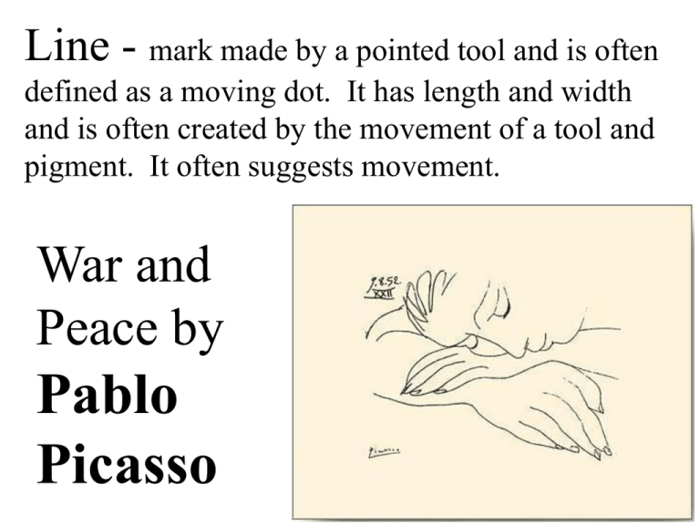
Line - mark made by a pointed tool and is often defined as a moving dot. It has length and width and is often created by the movement of a tool and pigment. It often suggests movement. War and Peace by Pablo Picasso Four Horsemen of the Apocalypse by Albrect Durer L I N E Study of a Child by Francois Boucher Shape - an area contained within a implied line. Shapes have length and width and can be geometric or free form. Design in painting is basically the planned arrangement of the shapes in a work of art. Woman Looking in a Mirror by Pablo Picasso Geometric shapes combined with the primary colors. Composition with Red, Yellow, and Blue by Piet Mondrian Form describes the threedimensional aspects of objects that Rose and Driftwood take up by Ansel Adams space. Eye by M.C. Escher Color - depends on light because it is made of light. Color has three properties: Hue - names of the colors. Value - refers the the lightness and darkness of a hue. Intensity - refers to the purity of a hue. Warm colors advance and cool colors recede in a painting. Map by Jasper Johns Value - refers to the light and the dark of a picture. Value contrasts help us understand a 2-D work of art. High Key - light values and minimum contrast. Low Key - dark valued hues and little value contrast. Thundercloud, Unicorn Peak by Ansel Adams Value changes help us “feel”the shape of an object Springtime by Pierre Auguste Cot V a l u e Study of a Child by Francois Boucher Texture - surface quality both simulated and actual of a piece of art. Simulated textures occur when a smooth painting surface appears textured. Actual textures happen all around us in our environment - brick wall, gravel path, tree bark, cat’s fur, a burlap sack, etc. View of Arles with Irises by Vincent van Gogh Waterlilies by Claude Monet has a heavy application of pigment which produces a rough actual texture. S P A C E Birds on a beach by Ansel Adams Space - actual space is a 3-D volume that can be emptied or filled with objects. Space that appears three-dimensional in a two-dimensional is an illusion that creates a “feeling” of actual depth. Christina’s World by Andrew Wyeth Balance - distribution of visual weight in a work of art. It is the visual equilibrium of the elements that causes the total image to appear balanced. Symmetrical - when elements on both sides of a vertical line appears to be equal in shape, weight, value, and color. Asymmetrical involves two sides that are different, but yet they are in visual balance. Circular Forms, Soleil No. 3 by Robert Delaunay Aspen Jazz by James Rosenquist - it is an example of triadic color balance. Threshing Wheat by Thomas Hart Benton - is an example of value balance. Movement - directs viewers through the painting, often to focal areas. This visual passage or linkage can be directed along lines, shapes, edges, and colors. As lines and shapes move our eyes across a surface, interruptions occur. Our eyes skip across these interruptions in a process called closure. The Scream by Edvard Munch Guernica by Pablo Picasso Broadway Boogie Woogie by Piet Mondrian Rhythm - is the repetition of visual movement of the elements. Variety is essential to keep rhythms exciting and active and to avoid monotony. Regular Rhythm - is the repetition of elements that are the same or nearly the same. Irregular Rhythm - is the repetition of elements throughout the painting but without any exact duplication. Radiant Light by Albert Kahn Les Demoiselles d’Avignon by Pablo Picasso is an example of rhythm using shapes and line. C O N T R A S T Nighthawks by Edward Hopper displays a contrast between the lights and darks of the café during the evening. Contrast - refers to the differences in the elements. Contrasts in a picture create visual excitement and add interest to the work. Value Contrast is most evident when black is next to white. Gas, 1939 by Edward Hopper Emphasis -used to create dominance and focus in their work. Artists can emphasis each of the elements to achieve dominance. Artists often use focal areas (centers of interest) to place emphasis on the most important aspect of a work. The Dance Class by Edgar Degas Subject matter is sometimes used to emphasis the way an artist feels or to depict something shocking to the viewer. Saturn Devouring his Child by Francisco Goya Pattern uses the art elements in a planned or random repetitions to enhance surfaces of paintings or sculptures. Pattern increases visual excitement by enriching surface interest. Scent by Jasper Johns Fabrics often have regular or planned patterns because certain elements are repeated with accuracy. Planned patterns are also used by architects to create surface interest (windows, doors, ledges) Patterns are also in our environments, flowers, fruits, vegetables, leaves, grass, and shells. Apple Blossoms by Georgia O’keefe Visual Unity is one of the most important aspects of a welldesigned piece of art. Unity - cohesive quality that makes an art work feel complete and finished. Visual unity - in a painting can be developed by clustering elements or by placing them closing together. In Starry Night by Vincent van Gogh he uses swirling brush strokes and a dominance of cool colors to unify the painting.
