Middle School 27J T-Shirt Contest Febraury 2014
advertisement
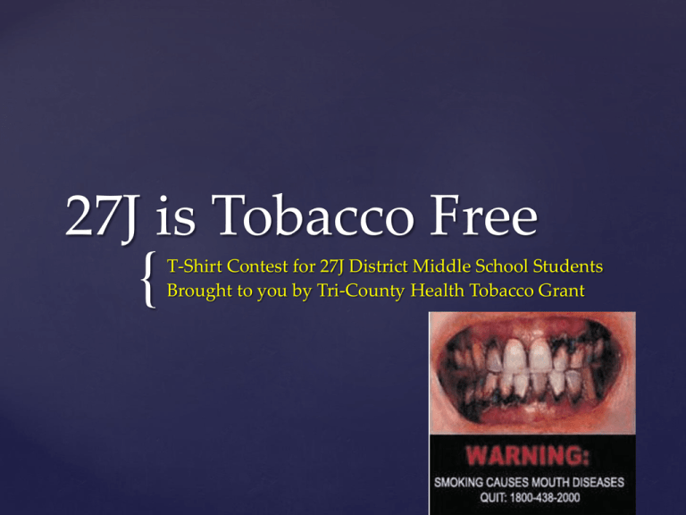
27J is Tobacco Free
{
T-Shirt Contest for 27J District Middle School Students
Brought to you by Tri-County Health Tobacco Grant
Did you know?
Nicotine is a highly
addictive drug
Smoking can harm lungs
and reduce oxygen
available for muscles.
Smoking harms not just the
smoker, but everyone around
them. It’s called secondhand
smoke.
http://www.tobaccofree.org/clips/VideoAddicti
veness.htm
http://www.tobaccofree.org/clips/VideoJoeChe
mo.htm
Short Informational Videos
Our goal is to help middle school
students in 27J become more
aware of our school’s policies and
become proactive and prevent
tobacco use with our students.
Our Goal:
This tobacco free T-Shirt
contest is to get the
awareness out to middle
school students
It is to help STOP and
prevent tobacco use and to
promote healthy lifestyles.
What is this contest all
about?
•
•
•
•
•
•
•
•
•
•
Your design must be inspired for the Tobacco Grant T-Shirt Contest.
Your design can include: Pictures, phrases or logos created by YOU!
Your design must be school appropriate and follow school policy.
Your design will only be on the FRONT of the T-Shirt.
Your design may contain a maximum four (4) colors.
Your design must be ORIGINAL.
• Reproduction of works of art in the collection is not allowed, as it
might infringe on the original artist's copyright.
T-shirt color is white.
You may submit only 1 design to be fair to all students.
By submitting a design, you are guaranteeing that you hold rights to
everything on it (THAT IT IS ORIGINAL), and that it does not contain any
copyright material.
Design should not exceed 8 ½” x 11” inches.
Design Guidelines &
Rules
All submissions must be accompanied by the official Tobacco
Grant T-Shirt Contest Entry Form.
Electronic submissions should include the completed form as an
attachment with the following information: Name, School,
Teacher’s Name, and Grade
By submitting, you agree that if your design wins, it may be used
on other promotional items in the future.
We reserve the right to make adjustments to the winning design.
You must submit your design by Friday, February 14th OR Monday,
February 17th (Staff vote on date).
Entries will be judged and voted upon by HOSA Prairie View High
School students.
By submitting you are agreeing to all contest rules.
Submission Agreement
All 4 middle schools in 27J will participate
1st place winning school will receive a poster for cafeteria/school
with the winning design printed on it
1st place winning advisory class for each middle school will win
a healthy snack party
1st place winning school will receive T-Shirts with the winning
design
1st place winning student will receive a $25 gift card to Target
2nd place student will receive a $20 gift card to Target
3rd place student will receive a $15 gift card to Target
1st place winning school, teachers/staff will receive a healthy
snack party at a staff meeting of their choice
Winning Class…
Good t-shirt design
Here are a couple basic things to keep in mind when designing a
t-shirt:
1. AVOID SQUARES AND RETANGLES
The human body is not hard edged (yeah I know you’re
ripped but the other folks wearing your shirts aren’t…).
Outlining something with a square or rectangle can be
boring. DON’T BE BORING.
GOOD!
2. APPAREL IS A MOVING TARGET – BE LEGIBLE.
Graphic apparel is moving target. Make it easy
to get your message out. Make it easy to read
and understand. Think big, think simple, think
easy. You only have a few second where
someone will be looking at your shirt. Make it
count!
NO!
Yes!
3. KEEP IT SIMPLE
Keep it simple and strong . That way no one can
miss what you are trying to say. Don’t
overcomplicate your ideas. It’s a message not a
pile of images.
NO!
Yes!
4. CONTRAST
Dark gray on black is not going to work. Subtlety is cool
and can be an effective design concept but make sure
your design stands out;. It doesn’t have to be loud –
just clear. Think of using opposite colors. Don’t overlap
dark on dark, or light on light, etc.
NO!
Yes!
• FONTS
The right font can make or break a design.
Also take into consideration of spacing each
character correctly so your text is clear and
not “muddy” .
• See the next few slides for how to do this

