How long before we see life expectancy falling in some areas of the
advertisement
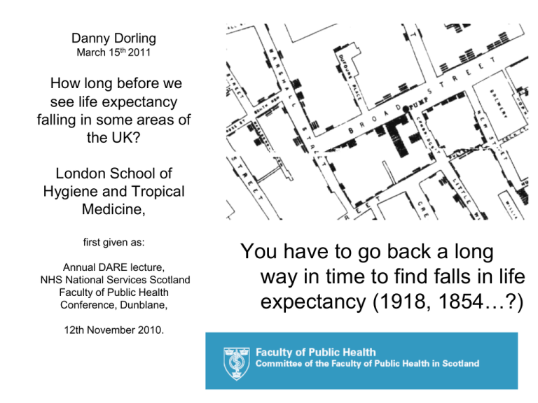
Danny Dorling March 15th 2011 How long before we see life expectancy falling in some areas of the UK? London School of Hygiene and Tropical Medicine, first given as: Annual DARE lecture, NHS National Services Scotland Faculty of Public Health Conference, Dunblane, You have to go back a long way in time to find falls in life expectancy (1918, 1854…?) 12th November 2010. 1 How long before we see life expectancy falling in some areas? Danny Dorling University of Sheffield DARE lecture, NHS National Services Scotland Faculty of Public Health Conference, Dunblane, 12th November 2010 (apologies for the busy slides – lots to say) Why should we be concerned that falls are possible? Because expectancy has hardly been rising in some areas. How will we first know that they are occurring? When ONS/GRO(S) release data for a district showing a fall When will we be sure as to the reasons? Depends: The reasons, or the reasons underlying the reasons? Where might life expectancy fall first? That is not so easy to answer, maybe where it is artificially high? What should we do to stop it? Don’t do what they do in affluent countries where there are falls We need not see falls in areas in our lifetimes. Or the first may be this year 2 I think it is our choice, the key is how well we resist divisive social policies. With Bethan Thomas I’ve been working on a new atlas with a new map G la sg o w E d in b u rg h N e w c a s tl e S u n d e r la n d M id d le s b r o u g h and with George Davey Smith we found that by 2007 inequalities in Hull death rates were higher than any time since 1921 B ra d fo rd B l a ck p o o l Leeds B o lto n M anc hester S h e ffi e ld L iv e rp o o l D e rb y Stoke N o t tin g h a m N o rw ic h L e ic e s te r C a m b rid g e B i r m in g h a m C o v e n tr y O xf o rd Sw ans ea C a r d i ff S w in d o n B ri sto l Ip sw ic h L u to n O u te r London In n e r S o u th e n d See: Thomas, B., Dorling, D. and Davey Smith, G. (2010). Inequalities in premature mortality in Britain: observational study from 1921 to 2007, BMJ, Friday 23rd July. http://www.sasi.group.sh ef.ac.uk/publications/20 10/ThomasDorlingDave ySmith_2010_BMJ.pdf Here are the major towns and cities by built-up area. You need to understand this map to know what the next slide is showing you. London 3 R e a d in g Dov er Budget cuts to come. 2010–2011 reduction in main revenue grant allocations (%), local authorities, England Reduction in main revenue grant allocations 2010-11 (%) -2.0 -1.7 – -1.0 -0.9 – -0.8 -0.7 -0.6 -0.5 – -0.1 0.0 This is a map of the future of ‘just’ £6 billion cuts Claimant count change July 09 - July 10 (%) -1.5 – -1.1 -1.0 – -0.6 -0.5 – -0.1 0.0 – 0.3 0.4 – 0.7 Recent changes in unemployment claimant geography This is a map of the past (09-10). Not of the 490,000+ one million (?) to come Job cuts in last 4 year For what I think are the real reasons behind the reasons, New Zealand is an ideal place to look: See Jane Kelsey’s explanation of how the country was used as a natural experiment for policies later exported to places such as the UK in: ‘The New Zealand Experiment (1997 2nd ed.): She says: “Ultimately, the people of New Zealand have to decide what kind of society they wish to live in, and work together to create it. In the meantime, other countries, governments and peoples who are being told that they too have no alternative to the corporate agenda should learn from New Zealand's tragic mistake.” http://www.converge.org.nz/pma/apfail.htm Take somewhere a long way away where they have asked sensible questions for a long time in their censuses, such as where were you living five years ago and do you smoke? (in 1981, 1996 and 2006). Reasons behind the reasons Pearce, J.R. and Dorling, D. (2010). The Influence of Selective Migration Patterns Among Smokers and Nonsmokers on Geographical Inequalities in Health, Annals of the Association of American Geographers, First published on: 18 March 2010. http://www.sasi.group.shef.ac.uk/publications/ 2010/PearceDorling_2010_AnnalsAAG.pdf 5 Pure migrant contribution Lived outside Auckland in 1976 (and never smoke by 1981) 12,018 1,587 Lived outside Auckland in 1976 (and smoked in 1981) (28% immigration) 10,431 Males in Auckland in 1981 Lived Outside NZ in 1976 108,711 3,705 (denominator for -1.17%) Lived Outside NZ in 1976 3,264 Ex-Smokers Ignored from herein 27,492 Never Smoked in 1981 Never Smoked: Lived in Auckland in 1976 Lived Elsewhere in 1981 Smoked: Lived in Auckland in 1976 Lived Elsewhere in 1981 Smoked in 1981 44,568 41,229 34,584 36,651 Difference (net increase in never smoked) 3,339 But this is just the men, in one area, in one of three time periods with smoking data (the 1981, 1996 and 2006 NZ censuses). So repeat…. 2 x 3 x 21 times Less…….. Difference (net net gain in never smoked over still smoking) 1,272 = -1.17% net Difference (net increase in smokers) 2,067 315 Thus this despite 6 Net new male smokers in Auckland Superficial Reasons Areas that loose smokers tend to have higher life expectancy. This is not surprising. But if the migration patterns tighten then expectancies diverge, as in NZ. 78 Male life expectancy (2001) Auckland is the white dot amongst the 21 district health boards of NZ shown here. 79 77 76 75 74 73 72 -3% -2% -1% 0% 1% Sm oking m igration balance (m ale) as a proportion of the total population 1976-81 7 2% Underlying reasons – increased social polarisation by area over time. Take the x axis of the last diagram and compare it over the three time periods for which we have data on smoking for how more closely net-smoker-migration patterns now correlate over time. The answer is more strongly in recent years: 2.0% -2.5% -2.0% -1.5% -1.0% 0.0% -0.5% 0.0% 2.0% 0.5% 1.0% 1.5% -10.0% -8.0% -6.0% -4.0% -2.0% 0.0% 0.0% 2.0% -2.0% -2.0% -4.0% -4.0% -6.0% -6.0% -8.0% -8.0% -10.0% Internal + immigration smoking migration balance 1976-1981 verses 1991-96 -10.0% -12.0% Internal + immigration smoking migration balance 1991-96 8 verses 2001-06 Back to the UK: when was it last as bad – today the gap between the very worse and best-off districts for men and women averaged is ‘around’ 12.4 years when men and women’s experiences are combined – when was it last so wide? • Men and women today have a combined averaged life expectancy of 74.3 in Glasgow as compared to 88.7 in the Royal Borough of Kensington and Chelsea. Therefore the gap between an affluent enclave of London and one of the most economically run down of cities in Western Europe is now twelve years, 17% additional years of life, whereas in the 1880s an extra ten years on top of an expectancy of thirty six was an additional 28% (20072009 data). Over the very long period we cannot compare relative indexes of inequality – but the extreme gap has tended to follow these recently. • We have to go back to the1880s to find greater gaps than those found today. The lowest life expectancy recorded in the country then was just thirty-six years in Liverpool. In Bristol it was then ten years higher. [Szreter, S. and Mooney, G., 1998, Urbanization, mortality, and the standard of living debate: new estimates of the expectation of life at birth in nineteenth-century British cities, Economic History Review, 51, 1, 84-112 (table 1). In Liverpool registration district itself, life expectancy in the 1880s was only 29 years of life, some 19 years lower than the 48 years recorded then in the affluent Clifton district of Bristol (ibid, table 2). In Glasgow in earlier years similarly low rates as in Liverpool were recorded, as low as age 27 around 1840 (ibid, table 5). Infant mortality was key to determining these low overall ages, dragging average life expectancies down as so many died in that first year. Manchester’s life expectancy for 1801 to 1850 was the lowest I have ever seen, calculated at 25.3 years, affecting a population of 235,000 people in 1841, Ibid: Szreter and Mooney (table 3).]9 Inequalities in health & wealth • • Inequality, in survival chances to age 65 in Britain, 1918-2005+ [BMJ] The age-sex standardized mortality ratios for those under 65 can be compared by area back to the situation around 1920 and are found to have reached a peak then and in the later 1930s which is only being exceeded today in terms of how much worse off the chances of those in the areas with poorest health are compared to the average and how much better-off the best-off tenth are. Income inequality (X axis) verses Health These geographical changes in inequalities (Y axis) in Britain, 1918-2005 inequalities in health have tracked social changes in inequalities in incomes very closely over the period 1918-2005 except for during the 1930s when inequalities in income fell but inequalities in health rose as jobs went. The very rich then became poorer, but "1931" the effect took another decade to be transferred to health. Each square here 10 is the year of a general election. 32% 30% 28% 26% 24% 22% 20% 18% 16% 0% 2% 4% 6% 8% 10% 12% 14% 16% 18% 20% Polarisation in politics and income Income Inequality, share held by richest 1%, 1918-2005+ Just over half of the reduction in income inequalities measured from 1918 to 1978 occurred before World War Two. Since 1978 all that has now been reversed. The very latest city bonuses will have taken us back to the early 1920s gilded age maxima inequality. But back then life expectancy in an area fell when there were pit disasters, otherwise there were mostly differential Electoral Inequality, Segregation Index improvements everywhere. of Tory voters, 1918-2005+ Similarly, political polarisation has fallen from 1918 until October 1974 and has then risen ever since, including in 2010. Only a ‘coupon’ election in 2015 could emulate 1918. (Sources: Dorling, D., 2010, Injustice, why social inequalities persists, Bristol: Policy Press). Sources: ‘Injustice’ Chapter 5 + New Statesman (2010) 11 When inequalities are high victims are blamed We reduced inequalities in the past by blaming the system, not victim. In the future we should expect to continue to see people exercising lifestyle choices that are harmful, such as going into businesses similar to advertising cigarettes and finding it easier to target children living in poorer areas by putting up hoardings just outside the school exclusion zone; or exercising the lifestyle choice to sell cheap alcohol, the worst of our drugs. However, I think we will start to curtail such damaging profiteering. People will become less susceptible to the argument of blaming individuals for the behaviour that others try to sell them, of seeing differences in smoking, drinking and diet across the country as some sign of a map of personal weakness…. rather than these being the target marketing areas of the wickedly unscrupulous. 12 So, when should we expect to see life expectancy fall in an area? All the trends appear to be pointing towards that eventuality “Big variation in life expectancy” When last year’s “latest figures” were released on 21 October 2009 at 9:30 am, for the first time in many years the BBC chose not to report the rise. Instead it lead with “Swine flu vaccination under way” and then “Big variation in life expectancy ”. The ONS press release was titled “Life expectancy continues to rise”. In fact, what was reported in the figures that October, just over a year ago, was an acceleration in recorded health inequalities, and a fall in life expectancy for men in Glasgow, but not one that was “significant”. The story was illustrated with the image of a baby. http://news.bbc.co.uk/1/hi/health/8317986.stm 13 What the BBC should have said is: “Acceleration in the growth of income inequalities across the UK” 11.5 years for women 14 14 13 13 Difference between best and worst-off districts by life expectancy (years): People 12.45 years Difference between best and worst-off districts by life expectancy (years): Females 12 11 10 9 12 8 7 11 6 1999 2000 2001 2002 2003 2004 2005 2006 2007 2008 10 13.6 years for men 9 14 13 Difference between best and worst-off districts by life expectancy (years): Males 12 8 11 10 7 9 8 6 7 1999 2000 2001 2002 2003 2004 2005 2006 2007 2008 6 1999 2000 2001 2002 2003 2004 2005 2006 2007 2008 “Inequalities in health – latest figures by area (district gap)” Gap in years between the average life expectancy in the worse-off district of Britain and the best-off, all, women, men, Source: ONS various years Only recorded ‘fall’ is in Glasgow of 0.1 years – within confidence limits (although do not have too much confidence in those!) 14 19 October 2010: ONS release – which should have said: “rapid deceleration in growth of health inequalities during 2009” Some 364 days later – a day before the Comprehensive Spending Review the next set of data is released with the following interpretation from ONS: “Life expectancy at birth Life expectancy results for 2007–09 showed a similar geographic pattern to previous years, with inequalities persisting across the UK. The South East, South West and East of England continued to have the highest life expectancies at birth” Source: Life expectancy at birth and at age 65 by local areas in the United Kingdom, 2007–09; http://www.statistics.gov.uk/pdfdir/liex1010.pdf 15 Daily Mail headline of October 20 – was it wrong? “The gap that cheats Scots out of 13 years; life expectancy shorter north of the Border” • • Daily Mail (London, England), The, Oct 20, 2010 Byline: Alan Roden Scottish Political Reporter “THE gap between life expectancy in parts of the West of Scotland and SouthEast England has widened to more than 13 years, according to 'damning' new figures. A baby boy born today in Glasgow will, on average, live for 71.1 years, compared to 84.4 years in London's Kensington and Chelsea.” However, this is 13.3 years (84.4-71.1) but the gap for men had been 13.6 years a year earlier (84.3-70.7). So was the gap growing or shrinking? 16 Initially it did appear as if the gap narrowed: When comparing 2006-2008 with 2007-2009 For the extreme areas, for men then women, respectively, life expectancy rose from 70.7 to 71.1, 77.2 to 77.5, in Glasgow and from 84.3 to 84.4, and 88.8 to 89.0 in Kensington & Chelsea. We will not know for at least a year whether this change at the extremes is indicative of wider trends, or remains (because the data is not disseminated fast). (Glasgow men in 2005-6: 70.8) For women the gap reduces from 11.6 to 11.5 years. For men the gap reduces from 13.6 to 13.3 ONS, 2009, Life expectancy at birth and at age 65 by local areas in the United Kingdom, 2006-08, released 21 October 2009, London: Office of National Statistics. http://www.statistics.gov.uk/pdfdir/liex1009.pdf. ONS, 2010, Life expectancy at birth and at age 65 by local areas in the United Kingdom, 2007-09, realsed 19 October 2010 London: Office of National Statistics: http://www.statistics.gov.uk/pdfdir/liex1009.pdf 17 But then there is a ‘1984’ style footnote in the latest figures about past statistics simultaneously being revised : “Figures for 2000-02 to 2006-08 have been updated due to revisions in the England and Wales mid-year population estimates for 2002 to 2008 (published by ONS in May 2010)” Note – no revisions in Scotland – in Glasgow the improvements stands • http://www.statistics.gov.uk/StatBase/Product.asp?vlnk=8841 So: For the extreme areas, for men then women, respectively, life expectancy rose from 70.7 to 71.1, 77.2 to 77.5, in Glasgow and from 84.1(was .3) to 84.4, and 88.7 (was .8) to 89.0 in Kensington & Chelsea. For men still a drop from 13.4 to 13.3 – so the Daily Mail was wrong For women the gap remains at 11.5 years at both periods. For both sexes simply combined the gap falls from 12.45 to 12.40 years…. 18 There were no headlines claiming: “Gordon’s last year his best!” The reason was partly the complexity of revisions, but also the sense of failure. “ Duffy: – but all these eastern Europeans coming in, where are they flocking from? Brown: A million people come in from Europe, but a million British people have gone into Europe, you do know there’s a lot of British people staying in Europe as well. So education, health and helping people, that’s what I’m about.” The Times, 28/4/2010. The education gap was found earlier in the year to have closed significantly, and, on the day before the Comprehensive Spending Review came the first ever evidence of the geographical health gap closing by a fraction. None of that mattered because Brown did not say: “Eastern Europe, dear Lady”. Step back and look at non-over lapping time periods 2004-2006 to 2007-2009: For the extreme areas, for men then women, respectively, life expectancy rose from 70.5 to 71.1, 77.0 to 77.5, in Glasgow and from 83.1* to 84.4, and 87.2* to 89.0 in Kensington & Chelsea. The gap grows from 11.4 to 12.4 years, the acceleration is removed. (* now revised to 83.0 and 87.1 apparently so 11.5 to 12.4) 19 What do we see overall rather than just at the extremes? Life expectancy in years by district, all UK 2004-2006 (x axis) and change to 2007-2009 (y axis) using data from just before the very latest revisions 4.0 Inequalities were slowly rising, although we now think that may have ended, at least for a moment, in 2009. It does look as if a hiatus had been reached. 3.0 2.0 1.0 0.0 -1.0 -2.0 68 70 72 74 76 78 80 82 84 20 However, for men – here are the most significant changes 2004-6 to 2007-2009: Merthyr Tydfil 74.6 (73.7-75.5) was 75.5 (-0.9) (But, revised down in earlier years to 75.4) and rises of at least 1.9 years above LCL in: Westminster 83.4 (82.8-83.9) was 80.2 (+3.2) South Cambs. 81.6 (81.1-82.2) was 79.2* (+2.4) Harrow 81.2 (80.8-81.7) was 78.9 (now 79) (+2.3) (* now 79.4) 21 For women – changes in the same areas which suggests that the fall is not across the board, but in London the rises were: Merthyr Tydfil 79.3 (78.4-80.3) was 79.1 (+0.2) So an improvement where men fell. And, in comparison to the men: Westminster 86.5 (86.0-87.0) was 84.0 (+2.5) South Cambs. 84.5 (84.0-85.0) was 84.2 (+0.3) Harrow 84.6 (84.1-85.0) was 83.1 (+1.5) (all 2004-2006 original to 2007-2009) 22 Then came the spending review October 20th 2010 – we were told how savings would be made: • • One of the first announcements was that new tenants of council and other social housing will now have to pay at least 80 percent of market prices in rent. In one stroke millions of low paid families are to be excluded from living in hundreds of towns, cities and villages where they no longer earn enough to “deserve” to be. There are many threats being made to have to take any job or be made to “volunteer” for no pay. • Housing benefit will not be paid for people under the age of 35 who live alone—this previously applied only to those under 25. • There would be a 10 percent cut in council tax benefit for those who cannot afford to live in certain areas. • The immediate question asked was: Are the few remaining people living on modest incomes near affluent suburbs or in economically successful towns and villages to be cleansed away? 23 It could be the greatest threat to health inequalities • The best-off fifth of society will lose just 1 percent of their entitlements to public services and spending, the lowest losses of any group. • A million people currently on employment and support allowance due to ill health will each lose £2,000 a year if they cannot find a job. • With the state pension age rising rapidly to 66 years, only those with private provision can now retire at the normal age. Public sector pensioners will have £1.8 billion removed from them by 2014-15. Pension credits will be frozen for three years. • No family on benefits is to receive more than the income of an average family in work, no matter what the circumstances of their children. If you are poor—or are made poor when you lose your job or have a pay cut forced on you— and have three or more children, you may need to leave your town for a new life in a cheaper area, away from where the remaining well paid work is. • People with worse health will have to move to poorer areas. • This is a recipe to increase inequalities between areas as fast as possible. I think it makes everyone worse off, so is in the saddest sense ‘fair’, but only in its likely stupidity of outcome. 24 Conclusion – keep asking why are 16 or 20 countries better? Everyone is worse off because there is less social solidality, more fear: • The latest UN report lists those European countries currently having a higher life expectancy than the UK as: Iceland (almost 82 years), Switzerland, Italy, France (81 years), Sweden, Spain, Norway, Austria (to almost 80 years), the Netherlands, Germany, Ireland, Malta, Cyprus, Finland, Belgium and Luxembourg. People also live for longer than in Britain in Australia, Canada and New Zealand (and especially Japan), but not in the United States (where comparable life expectancy is only 79.1 years) Of the richest 25 nations in the world the UK is the 4th most unequal by income inequality (90:10 ratio UNDP figures). • People do live slightly shorter lives now in Greece (but not by 2010 EU data), Portugal (more economically unequal than the UK), Denmark (where smoking is still very common) and in Slovenia (78.2 years). All these figures are from Table H of the most recent UNDP human development report (2009) and purport to be for around the year 2007. • Life expectancy is up in the UK, but increased economic inequality here would be expected to move our rank position below one of these four countries next, to slip from 20th place to 21st or 22nd out of 25. If that happens then there will be falls in life expectancy in some areas. … we have just moved below Greece, and the cuts there are far more equitable than here… (salaries cut rather than jobs 25 and mostly benefits going…) •
