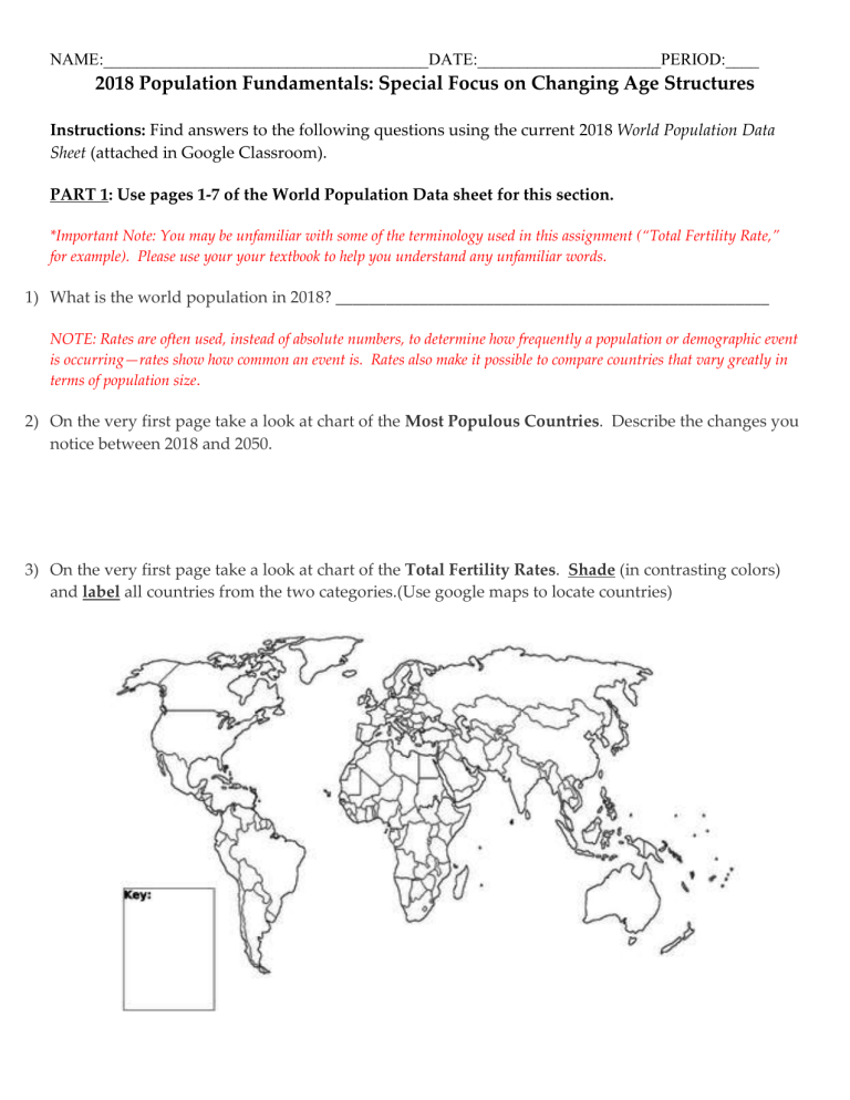
NAME:_______________________________________DATE:______________________PERIOD:____ 2018 Population Fundamentals: Special Focus on Changing Age Structures Instructions: Find answers to the following questions using the current 2018 World Population Data Sheet (attached in Google Classroom). PART 1: Use pages 1-7 of the World Population Data sheet for this section. *Important Note: You may be unfamiliar with some of the terminology used in this assignment (“Total Fertility Rate,” for example). Please use your your textbook to help you understand any unfamiliar words. 1) What is the world population in 2018? ____________________________________________________ NOTE: Rates are often used, instead of absolute numbers, to determine how frequently a population or demographic event is occurring—rates show how common an event is. Rates also make it possible to compare countries that vary greatly in terms of population size. 2) On the very first page take a look at chart of the Most Populous Countries. Describe the changes you notice between 2018 and 2050. 3) On the very first page take a look at chart of the Total Fertility Rates. Shade (in contrasting colors) and label all countries from the two categories.(Use google maps to locate countries) 2 4) Turn to page 2. Explain, in detail why the world population is “getting older.” What is one interesting thing you notice on the graph at the bottom of the page? 5) Turn to page 3 (about how each population structure creates a different challenge). To the right of each category discuss how each type of dependency would create its own unique challenges. What broad regional generalizations can you make by looking at the map on the page? 3 6) Turn to page 4. Summarize how investing in education can power economic growth. 7) Turn to the next page. Why is old-age labor force participation decreasing for men in developing regions? 8) Turn to page 6. Discuss why the United States is facing challenges addressing poverty for: Children (less than 18 years old): Older Adults (over 65): 4 PART 2: USE THE LARGE CHART IN THE DATA SHEET FOR THE FOLLOWING ANSWERS (Remember, you may need to scroll down to the second half of the chart to find what you are looking for). NOTE: MAJOR world regions are indicated in ORANGE. SUB-REGIONS are indicated in PURPLE and BLUE. COUNTRIES are indicated below in alphabetical order by region. 9) At the very top of the chart on p. 8 you will see “More Developed,” “Less Developed,” (also known as “Developing”) and “Least Developed.” a) How many millions are “More Developed”? _______________________ b) How many millions are “Less Developed”? _______________________ c) How many millions are “Less Developed excl. China”? ______________________ d) How many millions are “Least Developed”? _______________________ What pattern do you notice about the infant mortality rate (green column) for these 4 different groups of countries? 10) Look at “Rate of Natural Increase” What trends do you notice among the world sub-regions? 11) Look at “Infant Mortality Rate.” Name a few countries that have a high Infant Mortality Rate.____________________________________ Name a few countries that have a low Infant Mortality Rate.____________________________________ 12) Look at Net Migration Rate. Negative numbers means more people are leaving and positive numbers mean more people are arriving in that country. In two complete sentences describe some of the trends you observe throughout the world. 13) Total Fertility Rate refers to the average number of babies born to a woman in her lifetime in that country. Which regions have the highest TFR? Which regions have the lowest TFR? 5 PART 3: YOUR COUNTRIES – Use your MDC and your LDC for the following chart. Use the table from the 2018 Population Data Sheet to gather information about your country. Label your countries in the spaces below: My MDC: My LDC: The crude birth rate (CBR) is the annual number of births per 1,000 population. 1. What is your country’s CBR? 2. What is your country’s CBR? 3. How does it compare with other countries in 4. How does it compare with other countries in the region? the region? The crude death rate (CDR) is the annual number of deaths per 1,000 population. 5. What is your country’s CDR? 6. What is your country’s CDR? 7. How does it compare with other countries in 8. How does it compare with other countries in the region? the region? The infant mortality rate measures the number of deaths each year to infants less than 1 year of age per 1,000 live births. 9. What is your country’s IMR? 10. What is your country’s IMR? 6 11. How does it compare with other countries in the region in terms of IMR? 12. How does it compare with other countries in the region in terms of IMR? The total fertility rate (TFR) is the average number of children a woman would have if she maintained today's level of childbearing throughout her reproductive years. 13. What is your country’s TFR? 14. What is your country’s TFR? 15. How does it compare with other countries in 16. How does it compare with other countries in the region? the region? 17. Look at the entire table. What surprised you the most or caught your attention with regard to the % of women ages 15-49 using contraception (birth control)? 18. What is the life expectancy for Males: 19. What is the life expectancy for Females: Males: Females: The % Urban describes the amount of people in your country living in cities. 20. What is the % urban in your MDC? 21. What is the % urban in your MDC? 7 22. Why do you think MDCs typically have more % urban than LDCs? The age and sex structure of a population refers to the number or proportion of males and females who are in each age category. Age-sex structure tells us about a population's past trends in fertility, mortality, and migration. It also provides information about the population's potential for future growth. The greater the proportion of people in the younger-adult age groups, the greater the potential for more births and population growth. The # of people in a population below the age of 15 and those over the age of 64 compared to rest of the population is known as the dependency ratio. 23. (Look at the last column of the table). How does 24. (Look at the last column of the table). How does your country compare to the rest of the world in terms of its dependency ratio (does it have many youth or many old people)? your country compare to the rest of the world in terms of its dependency ratio (does it have many youth or many old people)? 25. What are the possible implications of your dependency ratio (having either a youth or an old-age dependent nation)? 26. What are the possible implications of your dependency ratio (having either a youth or an old-age dependent nation)? 8
