How to Construct a Line Graph: A Step-by-Step Guide
advertisement
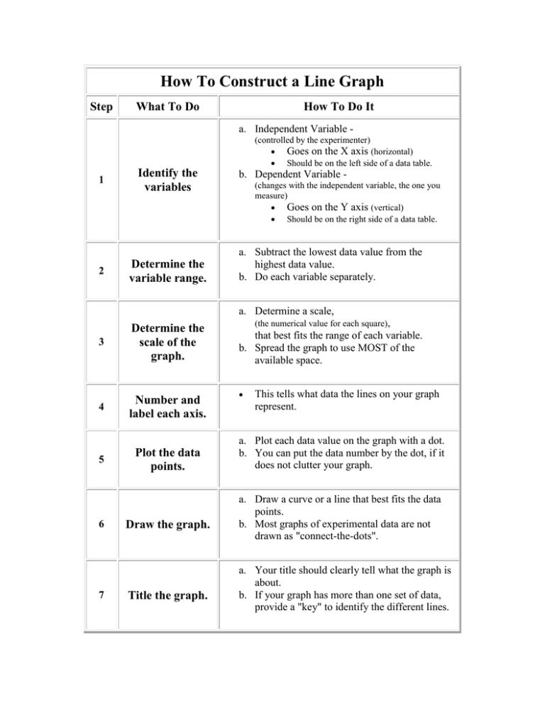
How To Construct a Line Graph Step What To Do How To Do It a. Independent Variable (controlled by the experimenter) Goes on the X axis (horizontal) Should be on the left side of a data table. 1 2 Identify the variables Determine the variable range. b. Dependent Variable (changes with the independent variable, the one you measure) Goes on the Y axis (vertical) Should be on the right side of a data table. a. Subtract the lowest data value from the highest data value. b. Do each variable separately. a. Determine a scale, 3 Determine the scale of the graph. 4 Number and label each axis. 5 6 7 Plot the data points. Draw the graph. Title the graph. (the numerical value for each square), that best fits the range of each variable. b. Spread the graph to use MOST of the available space. This tells what data the lines on your graph represent. a. Plot each data value on the graph with a dot. b. You can put the data number by the dot, if it does not clutter your graph. a. Draw a curve or a line that best fits the data points. b. Most graphs of experimental data are not drawn as "connect-the-dots". a. Your title should clearly tell what the graph is about. b. If your graph has more than one set of data, provide a "key" to identify the different lines.
