zoya template 48x24inch
advertisement
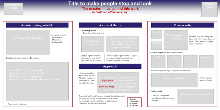
Title to make people stop and look Institutional logos Affiliation logos The masterminds behind this work Institutions, affiliations, etc. A central theme An interesting subtitle Some key motivating figure Some main points -Introduction -Motivation -Background -… Main results Some key points - Keep them short and crisp Some figures or diagrams Example If figures are side-by-side, take care to align the edges. Otherwise, it is super noticeable. Some figures or diagrams Example Describe only the main points here. Don’t get bogged down in details. You can always explain details in person. Another important point or take-away Some important points or take-aways… Figure caption or some explanatory text. Don’t pack this full of content. Another figure caption or text. Align it to corresponding figure, and with neighboring poster elements. All figures should be relevant Approach Some relevant figures or graphs - Leave lots of space for visuals - Reduce amount of text used - Make font on any labels, axes, captions big Paper citation or references As much as possible try to keep spacing consistent. A thought or heading… Some space for text Minimize number of different fonts used throughout poster. Some figures with some elements highlighted to focus viewer’s attention. Try to keep within the color scheme of the whole poster. Avoid visual dissonance. Be consistent with style. If you use a particular font style in multiple places (e.g. italics, color), it should be for the same reasons. e.g. to highlight concepts or definitions or applications, etc. Otherwise, keep the style uniform. Contact information or website or QR code Some more results Another thought or remark or heading Finish strong! Leave the viewer with something to think about or consider. Some figures or diagrams
