Meaning Mechanics Lecture 2 - Overview – Planning
advertisement
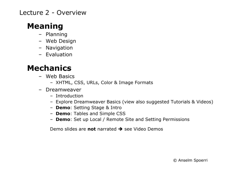
Lecture 2 - Overview
Meaning
–
–
–
–
Planning
Web Design
Navigation
Evaluation
Mechanics
– Web Basics
– XHTML, CSS, URLs, Color & Image Formats
– Dreamweaver
–
–
–
–
–
Introduction
Explore Dreamweaver Basics (view also suggested Tutorials & Videos)
Demo: Setting Stage & Intro
Demo: Tables and Simple CSS
Demo: Set up Local / Remote Site and Setting Permissions
Demo slides are not narrated see Video Demos
© Anselm Spoerri
Narrative Structures
© Anselm Spoerri
Planning 1
Define Web Audience
– Who is your target audience?
– What do you want the site to accomplish?
Break Site into Categories
– Create Outline - Goal, Organization
– Create Simple Web Site Plan
– Hierarchy & hyperlinks
– Use sticky notes or Flowchart
© Anselm Spoerri
Planning 2
Collect & Organize Material
– Organizing files by folders
– Asset folder for images, sounds, videos, animations etc.
– Save source files
– File Name - lowercase, short, no spaces or special characters
– “myinterests” vs. “my_interests” vs. “my interests”
– Title web pages
Local Structure = Remote Structure
– Same folder and file structure on local & remote machines
– Home page = "index.html“
– “index.html” stored in folder “main”
– “http::/www.site.com/main/” will display “index”
– If home page has different name, then it needs to be named
© Anselm Spoerri
Web Design Overview
Sources
– Steve Krug’s “Don't make me think!”
– Alison Head’s “Design Wise”
– Yale Web Style Guidelines
Guiding Principles
User Behavior
Basics
Home Page
Lack of Control
Search & Testing
© Anselm Spoerri
Web Guiding Principles
Diversity of Users & Rapid Change
– Diverse users, diverse computers, diverse skills, diverse …
– Rapid evolution of technology and expectations
– Short attention span
Common Sense
– No right way to design
Make it short
– More likely to be used and remembered
Don't make me think
– Get rid of question marks - each item has clear purpose
Make it work at a glance
– People have little time
Support intented task - manage expectations
© Anselm Spoerri
Web User Behavior
© Anselm Spoerri
Web User Behavior
(cont.)
© Anselm Spoerri
Web User Behavior
(cont.)
© Anselm Spoerri
Web User Behavior
(cont.)
© Anselm Spoerri
Web User Behavior
(cont.)
© Anselm Spoerri
Web User Behavior
Scan pages
(cont.)
- don't read them
Look for anything = Search Interest
Decide quickly
– Eye-tracking studies
Choose first “reasonable item”
Muddle through
– Don't figure out how things work
Resist forming models
Stick to what works
© Anselm Spoerri
Web Design - Basics
Stay above the fold
800 X 600 good
© Anselm Spoerri
Web Design – Basics
(cont.)
© Anselm Spoerri
Web Design – Basics
(cont.)
© Anselm Spoerri
Web Design – Basics
(cont.)
© Anselm Spoerri
Web Design – Basics
(cont.)
© Anselm Spoerri
Web Design – Basics
(cont.)
Design for scanning, not reading
– Visual Hierarchy
– Visual contrast - size, bold, color
– Important things = Visually prominent
– Related things = Spatially close, Nested
– Avoid “noise"
– Leverage Conventions
– Clear what's clickable
– Use underline and/or color coding
Less is more
– Cut ½ of words, then cut ½.
© Anselm Spoerri
Home Page Design
Home Page
– Identity & Mission, Hierarchy, Search, Timely Content,
Short-cuts, Registration.
– Everybody wants a piece
Answers Easily
– What can I do here?
– Why should be here?
– Where do I start?
Tagline is Important
– Clear, informative, concise
– Differentiated, clear benefits
– Personable, lively, sometimes clever
Problems with Pull-downs
– Hard to scan, Twitchy
– Have to seek them out
© Anselm Spoerri
Web Design – Lack of Control
Experience not the same
Limited Control over Web Display
Visual Appearance depends on
–
–
–
–
–
–
Type of computer - Windows vs. Mac
Monitor color resolution
Speed of Internet connection
Browser: Microsoft vs. Firefox vs. Safari - don't support same features
Default font may be different
Styles may differ
© Anselm Spoerri
Web Design – Search & Testing
Search Options
– Confuse and increase chances for failure
– Seldom worth the additional cognitive cost
– Amazon has no options at first - first experience is successful.
Typical Problems
– Users are unclear on the concept
– Words users are looking for aren't there
– There is too much going on
Great Site requires Testing
© Anselm Spoerri
Web Site Navigation 1
"Back" clicked 30-40%
Easy to figure out
“You are here”
Things at current level
Return to higher-levels and home page
Easy search and indexes
Easy feedback
Persistent navigation creates comfort
– “Home” and “forms” pages can be exemption
© Anselm Spoerri
Web Site Navigation 2
Top-level Navigation
–
–
–
–
Top Row or Left Column
Icons, image-maps, textual, pull-down
Highlight or color currently selected
To frame or not to frame?
Second-level Navigation
– Below Top Line or Left Column
Breadcrumbs
– SCILS > Information Library Studies > Courses > Graduate
Novel Navigation Metaphors
– TheBrain
– Star Tree for FlashKit by Inxight Software
© Anselm Spoerri
User Behavior – Summary
Scan pages - don't read them
Look for anything = Search Interest
Decide quickly
Choose first “reasonable item”
Muddle through
Don't figure out how things work
Resist forming models
Stick to what works
© Anselm Spoerri
Design Implications
Scan pages - don't read them
• Design for Scanning
Make text short - cut words
• Make page work at a glance
Sufficient left margin,
640x480 = main message
• Create Visual Hierarchy
Look for anything = Search Interest
Decide quickly
Choose first “reasonable item”
• Make obvious what you can do on a page
Muddle through
Don't figure out how things work
Resist forming models
• Don't make users think
Stick to what works
• Repetition & Consistency
• Make obvious what is clickable
Get rid of question marks
Each item = clear purpose
Grid Layout, Easy Navigation, Graphics,
Color Coding, Typography
© Anselm Spoerri
Evaluation Overview
Sources
– Krug, S. - "Don't Make Me Think!"
– Head, A. - "Design Wise."
– Williams, R. & Tollett, J. - "The Non-Designer's Web Book."
Questions
–
–
–
–
Audience
Task
Navigation
Functionality
© Anselm Spoerri
Evaluation – Task
Support tasks users need to accomplish?
Support both experienced and
inexperienced users?
User expectations meet?
© Anselm Spoerri
Evaluation – Audience
Who is the site for?
Who are the intended users?
What do users want to accomplish?
What are the needed skills?
Good fit with skills of intended users?
What tasks are users trying to accomplish?
© Anselm Spoerri
Evaluation – Navigation
What site is this?
(Site ID)
What page am I on?
(Page name)
What are the major sections of this site?
– Sections - tabs
What are my options at this level?
– Local navigation
Where I am?
– "You are here" indicators or breadcrumbs
– Easily find your way? back home? other sections?
How can I search?
© Anselm Spoerri
Evaluation – Navigation
(cont.)
© Anselm Spoerri
Evaluation – Functionality 1
Instantly understand what site is about?
Understand what you can do?
"Look & feel" enticing? Want to explore?
Main functions easily accessible?
Easy to use?
Links clear where they will take you?
© Anselm Spoerri
Evaluation – Functionality 2
Instant Visual Hierarchy?
– Or visually too busy?
Text easy to read?
Graphics easy to understand?
Large site - site map, index or search?
Help available and useful?
Download times reasonable?
© Anselm Spoerri
Evaluation – Example & Exercise 1
Amazon
– Evaluation
(of earlier version of site, but analysis still applies)
Exercise 1
– Evaluate website of your choice.
Choose a site that could serve as a model
and/or contain relevant information for your final project.
– Be concise and insightful in your evaluations
© Anselm Spoerri
Mechanics – Web Basics: XHTML
XML = Language for creating other languages
– Custom markup language that contains tags for describe the data
that they contain.
– If a tag identifies the data, then the data becomes available for
other tasks.
– Not as lenient as HTML.
XHTML = HTML rewritten in XML
XHTML: Keep code Consistent & Well Structured
Use “Transitional” XHTML in Dreamweaver
– Allows for the use of deprecated tags
Notation: Dreamweaver = DW
© Anselm Spoerri
Mechanics – Web Basics: XHTML
(cont.)
Body of (X)HTML document encloses Content of Web page.
Required in XHTML:
• The head and body tags and Closing </p> tag.
Dreamweaver includes required tags & declarations.
Naming Elements
• id=“name” or class=“name”
Useful with div (content blocks) and span (inline text) elements
Breaking up a Page into Divisions (DIV)
Creating a Line Break: <br />
Hierarchical Structure of Web pages
•
Elements contained inside another element (latter = parent, former = child)
© Anselm Spoerri
Mechanics – Web Basics: XHTML
(cont.)
Two methods for creating Web Page Layout
• Tables : easy to create, modify and format in DW.
• CSS: create, modify and maintain in DW.
Structure Your Pages
• Divide logical sections of document into div elements
Produces “linear / natural flow” of divs
• Use header elements (h1, h2 …)
• Use comments
/* hello world */
Ordered & Unordered Lists easy to create in DW.
© Anselm Spoerri
Mechanics – Web Basics: CSS
CSS = Cascading Style Sheets
• Collection of Formatting Rules
• Control Appearance of web page: blocks and text
• Ensure a more Consistent Treatment of Page Layout
and Appearance in Browsers
• Separation of Content from Presentation
– Easier to Maintain Appearance since Make Change
in Single Location
– Simpler and Cleaner HTML code shorter loading times
© Anselm Spoerri
Mechanics – Web Basics: CSS
(cont.)
CSS Style Sheet stored
a) External CSS style sheet
(.css file linked to page and using a link or an @import rule in
the head section of a document).
b) Internal (or embedded) CSS style sheet
(included in style tag in head portion of an HTML document).
c) Inline styles
(defined within specific tag instance in HTML document)
Using Inline styles is not recommended.
CSS Rule = Selector and Block of Declarations
Enclosed by {...} brackets and separated by ;
Declaration = Property: Value;
© Anselm Spoerri
Mechanics – Web Basics: CSS
(cont.)
CSS
• Control Text properties
Specific fonts and font sizes; bold, italics, underlining, and text
shadows; text color and background color; link color and link
underlining; etc.
• Control Format & Position of Block-level Elements
Set margins and borders for block-level elements; position them in a
specific location; add background color; float text around them; etc.
• Liquid layouts: expand/contract based on Browser width.
• Easy to apply Same Layout to Whole Site and only
need to modify external CSS file.
• Minus: Not all browsers support CSS the same way.
DW helps to identify Compatibility Issues
© Anselm Spoerri
Mechanics – Web Basics: URL
URL - uniform resource locator
– "http://www.abc.com/aaa/bbb/ccc.html"
– "http://" - hypertext transfer protocol - scheme
– "www.abc.com/" - server name - domain name, owner, host
– "/aaa/bbb/ccc.html" - path through folder hierarchy
URL Basics
– Absolute URL
– "http://www.abc.com/aaa/bbb/ccc.html"
– "Complete street address"
– Info located on external server
– Relative URL
– "../../../xxx/yyy.htm"
– "../" = up 1 level => up 3 levels, then subdir "xxx" to get to "yyy.htm"
– "Direction to neighbor's house"
– Anchor (same page), Internal (local)
Default “Home” Page = index.html
– Keeps out prying eyes out of directories (also instructor :).
© Anselm Spoerri
Mechanics – Color
Large Areas = Low Saturation = Subtle color
Background / minor elements = Subtle pastel colors
Small Areas = High Saturation = Bold color
Maximum emphasis = Bold, saturated primary colors
© Anselm Spoerri
Mechanics – Color
(cont.)
RGB Color used by Monitor
– Direct Light, Not Reflected
Indexed Color
– Limited Selection of Colors: up to 256 colors
– To Reduce File Size
– Color not in the Palette is Approximated and “Dithered”
Creating Web-Safe Colors
– All combinations of 0%, 20%, 40%, 60%, 80%, 100%
for Red, Green and Blue
– 6to3 = 216 colors
– Affects Illustrations, Drawings more than Photographs
– Fireworks has Web-safe Palette
© Anselm Spoerri
Mechanics – Web Graphics
Bitmapped or Raster Graphics
– Paint and Photo Programs
Object or Vector-based Graphics
– Draw and Illustration Programs
– Use Mathematical Representation for Shapes
– Used to Create Original Artwork
Artwork Converted into Bitmap using
Fireworks
Anti-aliasing (smoothing)
– Increases file size
© Anselm Spoerri
Mechanics – Image File Formats
GIF
–
–
–
–
–
–
Cross Platform & Lossless Compression
Indexed Colors: few GIFs need all colors, reduce it manually
Transparency (so no white box around graphic)
Interlacing & Progressive Download
Create Animations
Best for
– Images with Large Areas of Solid Color, Simple Illustrations
– Small Photos or thumbnails
JPEG
–
–
–
–
–
Cross Platform & LOSSY Compression
Progressive JPEG
No transparency
No Animation
Best for
– Photos: Millions of Colors and Subtle Changes
© Anselm Spoerri
Mechanics – Save Image for Web
RGB Mode
72 ppi
Indexed Color Mode
Reduced Color Palette
– Adaptive Palette
Interlaced
© Anselm Spoerri
Dreamweaver - Introduction
Three Views
Design View | Code View | Design & Code View
Create Page Content & Layout
– Enter and Insert Content
– Text, Images, Flash etc.
– Specify CSS (external and internal)
– Page Properties
– Standard Mode (and Expanded Mode)
– Edit & Modify Tables
– AP Elements
Interaction & Behaviors
– Rollovers, Imagemaps, Navigation Bars
– Linking images and behaviors
Site Management
– "Local site" mirrors "Remote site"
© Anselm Spoerri
Dreamweaver – Create Visual Hierarchy
You can use in Standard Mode
1
Standard Table
[today]
Standard Mode
Regular Columns and Rows
2
AP Elements
“Irregular” Columns and Rows
to create
Layout
and
Visual Hierarchy
© Anselm Spoerri
Formatting Precedence – “Table Rules”
Cell Format
overwrites
Column / Row Format
overwrites
Table Format
BUT
Table Width / Height
Column
or
Row
or
constrains
Cell Width / Height
If Table “Width” unspecified, then column widths unconstrained!
© Anselm Spoerri
Demo – Specify Default Text Format & Visual Guides
Specify Default Text Format
– Modify > Page Properties
– Use Sans Serif Typeface
– Creates Internal CSS style sheet
Visual Guides
– Ruler
– View > Ruler
– Visual Grid
– View > Grid > select “Show Grid” and “Snap-to-grid”
– View > Grid > Edit Grid (to edit grid)
© Anselm Spoerri
Demo: Create and Edit Standard Table
Select “Standard Mode”
– View > Table Mode > select “Standard Mode”
or Select “Layout” in Insert bar and click “Standard” icon
Insert Table
– Insert > Table: in dialog box specify number of columns and rows
Format Columns / Rows / Cells
– Select columns / rows / cells using dragging
– Edit entries in Property Inspector for selected items
Table: CellPad, CellSpace, Align, Border (which will apply for all cells)
Merge Cells
– Select cells to be merged
– Modify > Table > Merge Cells
Insert Row / Column
–
Modify > Table > “Insert Row” or “Insert Column” or “Insert Row or Column”
(latter gives you most control)
© Anselm Spoerri
Demo: Format Standard Table
W and H fields
– Specify width & height of table as pixels or % of browser window
– If “Width” unspecified, then column widths are unconstrained!
– Usually don't need to set table height
CellPad
– Amount of space between content of a cell and cell boundary
CellSpace
– Amount of space between each layout cell
Align
– Default = “Left”
Border
– Specify in pixels thickness of border
© Anselm Spoerri
Demo: Table Management
Tag Bar
(bottom border of selected file)
Use it to select specific layout elements
Clicking on <table> selects table
Clicking on <tr> selects row
Clicking on <td> selects cell
Expanded Mode
Temporarily adds cell padding and spacing to tables
and increases the tables’ borders to make editing easier.
Select View > Table Mode > Expanded Tables Mode
or
In Layout category of the Insert bar, click Expanded Tables button
© Anselm Spoerri
Demo: Site Management
Create folder “mpcourse”
Open “mpcourse” folder
Create folders “ex1” … “ex5”
Launch Dreamweaver
© Anselm Spoerri
Demo: Site Management in CS4
(cont.)
– Site > New Site
– Select “Advanced” Tab
– Select “Local Info” Category
– Local Info > Site Name = “MPcourse” for this demo
– Local Info > Local Root Folder = “MPcourse” in “My Documents”
– Select "Remote Info" Category in New Site Dialog
– Select "FTP" in pull-down Access menu
– FTP Dialog
–
–
–
–
–
FTP Host =“eden.rutgers.edu”
Host Directory = “public_html”
Login = “yourusername”
Password = “yourpassword”
Make sure to check the “Use Secure FTP” box
– Connect to Server
– Select "Connect to Remote" icon or "Site > Connect"
– Transfer files to server
– Manually
– File : drop onto file
OR drop into folder that contains file you want to up/download
– Folders: drop into folder that contains folder you want to up/download
© Anselm Spoerri
Demo: Site Management in CS5
(cont.)
– Site > New Site
– Select “Site”
– Site > Site Name = “MPcourse” for this demo
– Site > Local Site Folder = “MPcourse” in “My Documents”
– Select “Servers" Category in New Site Dialog
– Click on + (Add new server)
– Specify Server Name
– Select “SFTP" in pull-down “Connect using” menu
– SFTP Host =“eden.rutgers.edu”
– Login = “yourusername”
– Password = “yourpassword”
– Root Directory = “public_html”
Test and if successful Save
– Connect to Server
– Select "Connect to Remote" icon
– Transfer files to server
– Manually
– File : drop onto file
OR drop into folder that contains file you want to up/download
– Folders: drop into folder that contains folder you want to up/download
© Anselm Spoerri
