Data presentation
advertisement
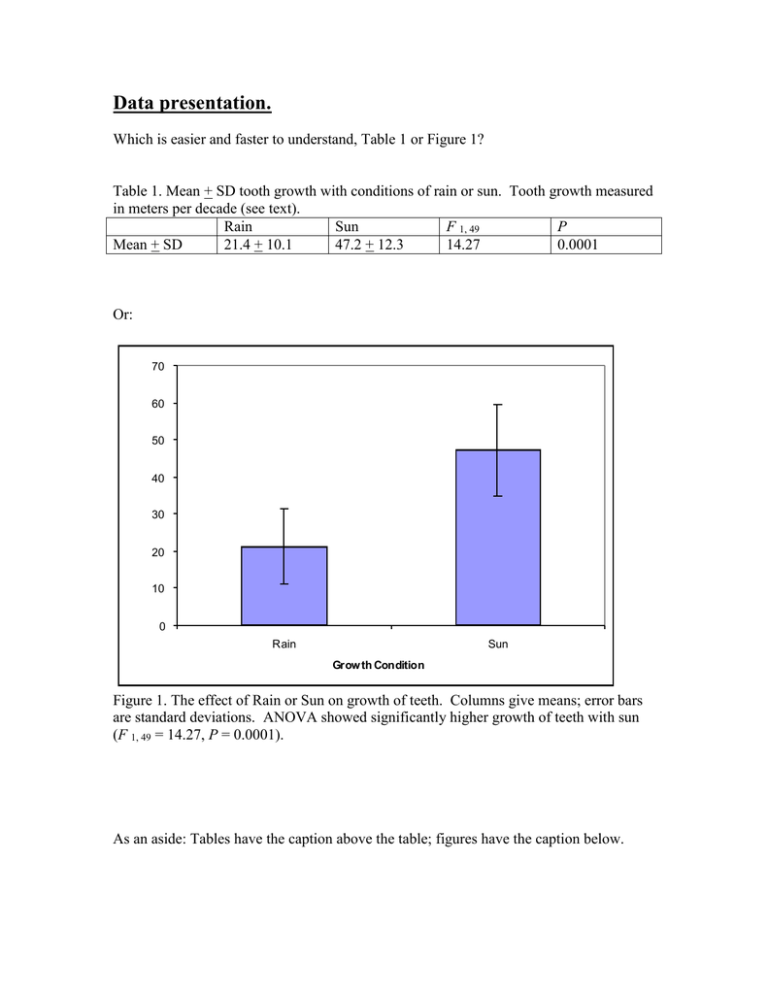
Data presentation. Which is easier and faster to understand, Table 1 or Figure 1? Table 1. Mean + SD tooth growth with conditions of rain or sun. Tooth growth measured in meters per decade (see text). Rain Sun F 1, 49 P Mean + SD 21.4 + 10.1 47.2 + 12.3 14.27 0.0001 Or: 70 Tooth growth (meters/deca de) 60 50 40 30 20 10 0 Rain Sun Grow th Condition Figure 1. The effect of Rain or Sun on growth of teeth. Columns give means; error bars are standard deviations. ANOVA showed significantly higher growth of teeth with sun (F 1, 49 = 14.27, P = 0.0001). As an aside: Tables have the caption above the table; figures have the caption below. Creating graphs or charts in Excel. Examples of several types will be given, as these may be most immediately useful to you and if you know how to do these, you can usually generalize the commands to other sorts of graphs. Note, however, that versions of Excel differ slightly in the formatting commands used, as may Mac and PC versions of Excel. This handout was prepared with MS Excel 2000 for Mac. Column Data with error bars (as in example above). Put the column headings, means, and SD’s in columns like this: Use the mouse to highlight the column headings and the means like this: Then hit the autochart button which looks like this It can be found on the toolbar which looks like this: If you got that, this should appear: So far so good, eh? This panel shows the various default types of charts Excel can easily provide. Click on the Press and Hold to View Sample button, and you should see a basic preview of your chart, minus error bars and other details. Click Next, and the Next again until you see the following kind of panel into which you can enter the axis labels (in most circumstances you won’t want to use chart titles): Don’t hit Next yet (or if you did, you can click Back). Instead click on the Gridlines tab so that this appears: Click the checked box Major gridlines in order to get rid of those annoying gridlines. Then click on the Legend tab to see this: And again de-select the legend by clicking the Show legend box (unless you want a legend on the particular type of graph you are making). Then click Next. Hit finish, and the basic chart should appear on your Excel spreadsheet. Well, if you are like me, and the grey-colored background drives you nutso, double click on it and this will appear: If you want a backround color, pick one under the Area color panel. If you want it gone, as I do, click the None circle, and then OK. Better! What about Error Bars? Double click on a column until you see this appear: You can change the color of the columns here, as well as some other bits and pieces. We want to click the tab that says Y Error Bars so we see this: Near the bottom are two boxes for custom error bars, the + and – boxes. You type your error values into these boxes separated by commas, as so: Then hit OK and your chart should reappear complete with error bars. If there are too many numbers for your royal laziness to type into the boxes, you can instead hit the button to the right of the + box that looks like this: and this will appear: You can then use the mouse to select the data from your sheet that fit in the box like this: Hit the Return key and do the same for the – error bar box. What laziness!! It is so easy! So you should now see your chart complete with error bars: You can edit all sorts of things on the chart, e.g. the type fonts, etc. etc. by clicking or double clicking on them and tinkering with the options available to you. If you have an experiment with two factors, e.g. Rain versus Sun and Dogs versus Parrots you can set up the data like this: Highlight the means Hit the same autochart button as before and follow the same basic steps outlined above to get a chart like this. Note that I didn’t bother to fully label the axes, but you surely would; I also decided that the legend was useful in this case. When specifying which error bar values go with which column, be careful to get them right. Excel will do whatever you tell it to do, not whatever you want it to do. Regression or correlation continuous data graphs. So you think that perhaps elephants have big ears because ears are sexually selected traits [you know what they say about elephants with big ears…..]. Anyway, so you have a continuous predictor and continuous response data, like these: And you can do your regression statistics, but you want to show the functional relationship you think you have found. Try this, use the mouse to highlight the data and then hit the autochart button as before, but now hit the XY Scatter chart type. Click Next, get rid of those pesky legends and gridlines as you did before, label the Axes, and then keep clicking Next until you have a graph appear on your spreadsheet. Double click on the chart background to change the chart Area color as you did before. Now you may notice that the data points are a bit hard to see. If you double click on a data point, all of them light up and you get options for how to change them, this sort of box: On the right side are the options for displaying the data markers. Play around with whatever marker scheme you like. I picked round filled circles that are of size 10 points, like this: And so my graph looks like this: Sexy elephant ears? Well, maybe. Suppose you want to display the line of best fit as determined by your statistical program? How might this be done? Well, if you know the equation for the line of best fit from the statistical output (or from using the Excel intercept and slope functions as done here by me) then you can use that information to get the predicted level of the response variable as a function of the predictor variable. So here I have calculated the predicted sexiness of elephants as a function of their observed ear length. Predicted sexiness = intercept + slope*(ear length), so if the intercept is –0.0119797 sexiness units and the slope is + 0.00517297 sexiness units per unit of ear length, then, for example, an elephant with an ear length of 4.003 has a predicted sexiness of about 0.00872886. You can calculate the predicted sexiness for each level of ear length, as so: Then, you highlight all three columns, click the autochart wizard button, select the XY scatter chart option, click Next, click Next again, get rid of the legend and the gridlines and add the axis labels, click next and then finish. You should have gotten something like this: This shows your data, as well as the predicted values. Now, double click on a predicted data point (not one of your observed points). On the panel that appears, on the right hand side, under Marker select none. Then on the left hand side, under Line select custom and pick a line color (also left hand side) such that the panel that appears looks like this: Click OK, and see what appears! There is your graph, complete with a line of best fit. Voila!!! It is as easy as paying a bunch of tuition money and being sensible enough to take my class, and then there you have it folks, more skills than ever before! One last type of graph. Because both ANOVA and Regression assume normally distributed data, it is useful to have a way to look at the distribution of your data. It might also be useful to show other people how your data are distributed. The most traditional method is the histogram, which shows number of observation on the vertical Y axis, against classes of values on the X axis. So you measure a bunch of things with the following result: Wow, a bunch of data! Note that the data are sorted from lowest to highest. You should sort your data in order to make a histogram BUT DO NOT JUST WILLY-NILLY SORT THE ONE COLUMN YOU ARE WORKING WITH BECAUSE THEN YOU MAY LOSE ALL ASSOCIATED COLUMNS OF DATA!!!!!! Copy the column of data you are planning on working with to a different worksheet, so that you don’t mess up your entire projects worth of work by sorting things wrong. Best yet, work with a separate copy of the whole data set. Leave another disk copy at home, on your computer, under the bed whatever. Just don’t foul up your real data set. That said. With the one column of data copied and pasted to a separate worksheet for safety, you can simply highlight the whole column and then click the A-Z sort button on the Excel toolbar. It looks like this: . Then you can see your minimum and maximum data points as well as get a sense of how widely distributed they are. You need to do this because you pick the categories for the histogram. Excel calls them ‘bins’. So my pretend data for this example range from near 0 to just under 2.25. So I chose categories of every 0.25 units in order to give me about 10 bins. I entered those bins in a nearby column, as so: Now, under the Tools menu, down at the bottom, is Data Analysis. If it isn’t there, then you have to add it by going under the tools menu to Add ins and mking sure that the Analysis Tool Pak is selected as an option. Once you can find Data Analysis under the Tools menu, select it and then select Histogram. Click OK and something like this should appear: Put your data range into the Input range box. You can do this by putting the curso in the data box, then taking the mouse to select over your data on the worksheet, or just by typing the cell references in. Do the same for the Bin range, that is tell Excel which cells hold the bin information, and then on the Output options you can check the button saying Output range which will make the box next to it active, and you can put in a cell reference for where the output should be displayed. I did this for the example, and it looks like this: Then click OK, and you should get the following table starting in the cell you specified in the output range. I picked cell E1 for output, and here it is: Now you can chart those output data to see your histogram. Do this by selecting the count data under the heading Frequency, like so: Then click on the autochart wizard box , and pick a column format chart. Click Next and then on the next panel, you can select the Series tab, which then displays this: At the bottom, select the box called Category (X) axis labels and then use the mouse to input the cell references for the X axis categories. In this case, they are the bin names and are found just to the left of the data. If this is done right, your box should now look like this: Click Next, get rid of the Legend and Gridlines and continue making your chart as before, until you get your histogram like this: There you have it, the distribution of student endurance for long handouts!
