Proceedings of the Seventh International AAAI Conference on Weblogs and Social Media
Visualization Techniques for the Analysis
of Twitter Users’ Behavior
Guilherme Rotta, Vinicius Lemos, Felipe Lammel, Isabel Manssour, Milene Silveira, André Pase
Pontifícia Universidade Católica do Rio Grande do Sul – Faculdade de Informática – Porto Alegre, RS, Brazil
{guilherme.rotta,viniciusdelemos,felipelammel}@gmail.com, {isabel.manssour,milene.silveira,afpase}@pucrs.br
as ways to classify these tweets. Other tools available are
tag cloud and the most popular users. All these
functionalities enable the learning about the social network
and the behavior of its members, as described in the next
subsections.
Abstract
One of the most popular social networking sites in Brazil is
Twitter, which is used by one in five people who have
internet at home. Based on that, we investigated how
information visualization techniques can improve the
analysis of the behavior of Twitter users’. These studies
were done through a set of standard visualization techniques
implemented in an interactive system entitled DeepTwitter.
Social Network Visualization
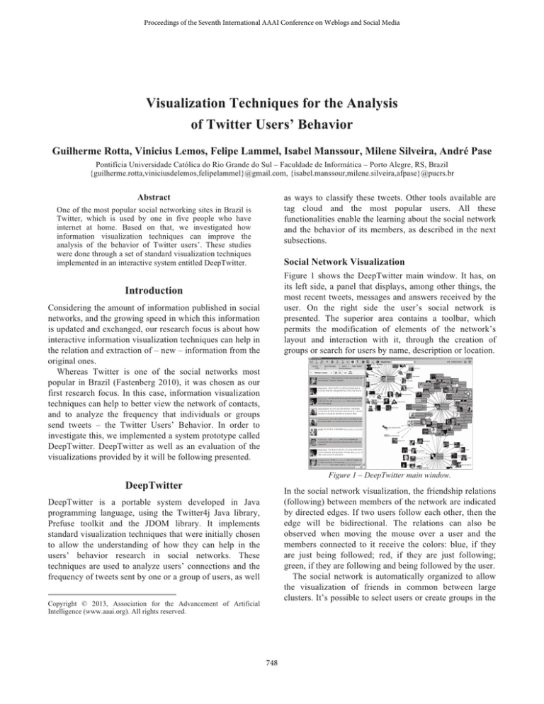
Figure 1 shows the DeepTwitter main window. It has, on
its left side, a panel that displays, among other things, the
most recent tweets, messages and answers received by the
user. On the right side the user’s social network is
presented. The superior area contains a toolbar, which
permits the modification of elements of the network’s
layout and interaction with it, through the creation of
groups or search for users by name, description or location.
Introduction
Considering the amount of information published in social
networks, and the growing speed in which this information
is updated and exchanged, our research focus is about how
interactive information visualization techniques can help in
the relation and extraction of – new – information from the
original ones.
Whereas Twitter is one of the social networks most
popular in Brazil (Fastenberg 2010), it was chosen as our
first research focus. In this case, information visualization
techniques can help to better view the network of contacts,
and to analyze the frequency that individuals or groups
send tweets – the Twitter Users’ Behavior. In order to
investigate this, we implemented a system prototype called
DeepTwitter. DeepTwitter as well as an evaluation of the
visualizations provided by it will be following presented.
Figure 1 – DeepTwitter main window.
DeepTwitter
In the social network visualization, the friendship relations
(following) between members of the network are indicated
by directed edges. If two users follow each other, then the
edge will be bidirectional. The relations can also be
observed when moving the mouse over a user and the
members connected to it receive the colors: blue, if they
are just being followed; red, if they are just following;
green, if they are following and being followed by the user.
The social network is automatically organized to allow
the visualization of friends in common between large
clusters. It’s possible to select users or create groups in the
DeepTwitter is a portable system developed in Java
programming language, using the Twitter4j Java library,
Prefuse toolkit and the JDOM library. It implements
standard visualization techniques that were initially chosen
to allow the understanding of how they can help in the
users’ behavior research in social networks. These
techniques are used to analyze users’ connections and the
frequency of tweets sent by one or a group of users, as well
Copyright © 2013, Association for the Advancement of Artificial
Intelligence (www.aaai.org). All rights reserved.
748
option, the most active user, e.g., appears with the biggest
picture, and the less one appears with the smallest picture.
Thus, with just a quick look the user can identify the most
active or important members from his network of contacts.
network to, among other things, read the tweets that they
posted, send them messages or follow them.
Tweets Classification
DeepTwitter allows the creation of categories, and, within
these, the addition of different tags that will track the
corresponding tweets in both timeline and tag cloud
visualization. The goal is to differentiate tweets by subject,
clustering all the tweets that contain a given set of tags
inside the same category that holds these tags.
Analysis of the Visualization Techniques
In order to verify users' impressions about the visualization
techniques implemented, two experiments were conducted:
the first one focusing on the general public, characterized
by people who use Twitter for personal use, and the second
focused on professionals who use Twitter as support for
their work or even as their main focus.
From the analyses carried out we can clearly see that
different profiles of users are interested in different
features (and in different visualization ways): for instance,
the general public preferred the social network
visualization, and professional users, the timelines.
Analyzing the Tweets in a Timeline
When visualizing tweets from individuals or groups it is
possible to open the respective timeline visualization. This
visualization organizes the tweets on a graphic, based on
the day (x axis) and time (y axis) in which they were sent.
Thus, it is possible to easily observe user behavior, i.e. the
frequency in which a user sends tweets and what times are
predominantly devoted to it.
Besides that, it is possible to classify tweets according to
the created categories. By doing this, the pictures are
outlined or ellipses are filled with different colors, in order
to facilitate the identification of which tweets belong to
each category. The tweet and the date it was posted are
highlighted when the mouse moves across the ellipses, as
shown in Figure 2.
Conclusion and Future Works
In this work we show possibilities to allow an integrated
manner to explore the interactions of one user or a group of
users in a social network, as well as to easily classify - or
even identify feelings from - tweets.
Comparing with some related works (Barata et al. 2012;
Marcus et al. 2011), the main contribution of this work is
to demonstrate how interesting from the user point of view
is to allow an integrated manner to explore the interactions
of one user or a group of users in a social network, as well
as to easily classify or even identify feelings from tweets.
The analysis carried out and the trend of users to
simultaneously use several small applications to monitor
the use of social networks led us to reflect. In this sense,
DeepTwitter is, at present, being redesigned, and instead of
a single tool, with different types of visualizations
available, distinct small tools have been created, focusing
on specific market niches.
Figure 2 - Example of a Timeline with tweets classification.
With timeline and classification, it is also possible to
analyze if users have the same habits, i.e. post tweets in the
same period of time or often with similar subjects.
Acknowledgments
This work was supported by project PRAIAS/PUCRS.
Tag Cloud and Most Popular Users
The tag cloud visualization shows the tags specified by the
user, as well as the tags that are currently the Popular
Topics at the Twitter homepage. The main goal is to
provide a quick way to detect the most talked-about
subjects by the DeepTwitter user.
The visualization of most popular users can be applied
to a group of users, to selected members or to all users of
the contact network. The classification can be made by the
number of friends, followers, favorite tweets, or tweets that
have already been written. According to the selected
References
Barata, G. et al. 2012. AppInsight: What have I been doing?
Proceedings of the International Working Conference on
Advanced Visual Interfaces, 465-472.
Fastenberg, D. 2010. Why is Twitter so popular in Brazil? Time
Magazine. Available at http://www.time.com/time/world/article/
0,8599,2026442,00.html (accessed in 2013).
Marcus, A et al. 2011. TwitInfo: aggregating and visualizing
microblogs for event exploration. Proceedings of the Conference
on Human Factors in Computing Systems, 227-236.
749
