Presentation Skills Key Points Plan the structure of your presentation
advertisement
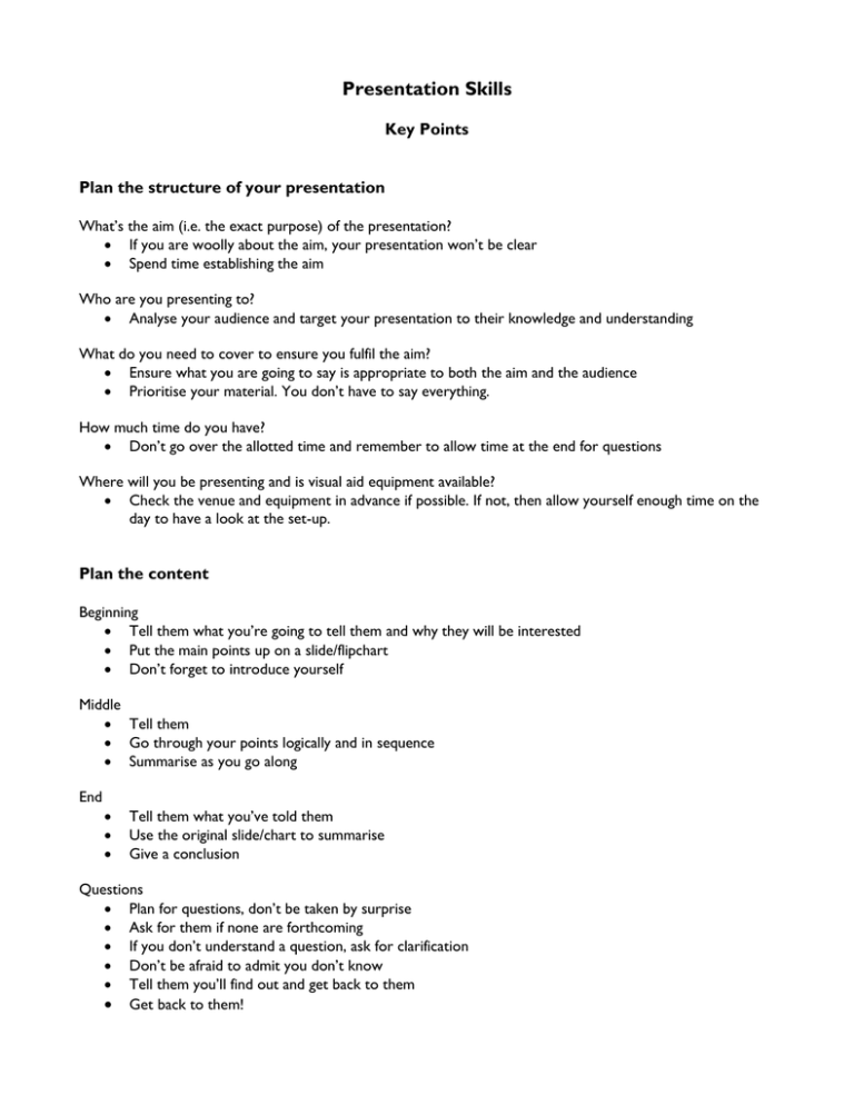
Presentation Skills Key Points Plan the structure of your presentation What’s the aim (i.e. the exact purpose) of the presentation? If you are woolly about the aim, your presentation won’t be clear Spend time establishing the aim Who are you presenting to? Analyse your audience and target your presentation to their knowledge and understanding What do you need to cover to ensure you fulfil the aim? Ensure what you are going to say is appropriate to both the aim and the audience Prioritise your material. You don’t have to say everything. How much time do you have? Don’t go over the allotted time and remember to allow time at the end for questions Where will you be presenting and is visual aid equipment available? Check the venue and equipment in advance if possible. If not, then allow yourself enough time on the day to have a look at the set-up. Plan the content Beginning Tell them what you’re going to tell them and why they will be interested Put the main points up on a slide/flipchart Don’t forget to introduce yourself Middle Tell them Go through your points logically and in sequence Summarise as you go along End Tell them what you’ve told them Use the original slide/chart to summarise Give a conclusion Questions Plan for questions, don’t be taken by surprise Ask for them if none are forthcoming If you don’t understand a question, ask for clarification Don’t be afraid to admit you don’t know Tell them you’ll find out and get back to them Get back to them! Visual Aids Whatever you use, whether it’s OHP, flipchart or computer presentation, keep it simple and clear. Visual aids should add to the impact of your presentation. Learn to use a software package like Powerpoint or Persuasion, which is specifically designed to produce presentation material. Bullet points are most effective – keep the point size large on slides. Use 18-24 point size, with up to 32 point for titles Use a sans serif font for clarity, even if you don’t like it for normal use Keep graphs large and simple. Use colour to differentiate elements Don’t use orange – no-one will be able to read it Label graphics, graphs and maps clearly Notes You may want to produce a full script. You may feel happier using notes and the prompts given by your slides. Make them easy to read Number the pages and clip them together. A hole punched in the corner, with a treasury tag keeping them together works well. Don’t play with them. Presenting If you have a quiet voice, ask for a microphone. There’s little point in being a brilliant speaker if no-one can hear you. Vary the tone of your voice and the pace you speak at, though better slower than too fast. Be careful of the ‘ums’, ‘you knows’ etc. What people often remember are the mental pictures. If you have suitable anecdotes, do use them. Make eye contact with your audience, not the floor, the ceiling or the OHP. Use pauses. It gives you thinking time and the audience time to reflect. Be natural up there. Gesture, but don’t emulate David Bellamy. Finally Check that you have everything you need sufficiently far in advance of the presentation to allow you time to deal with any unforeseen mishaps e.g. mislaid slides or notes. PRACTISE your presentation. Revise the bits that don’t work Practise it again… and again And ENJOY yourself! Good luck. Lesley Black, HERDU, UCL
