10.5 Abuses of Statistics
10.5
10.5 Abuses of Statistics
Common techniques to mislead people with graphs:
• 3-d graphs
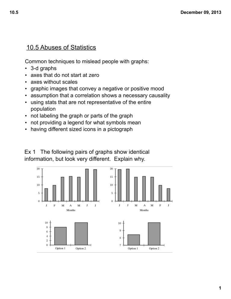
• axes that do not start at zero
• axes without scales
• graphic images that convey a negative or positive mood
• assumption that a correlation shows a necessary causality
• using stats that are not representative of the entire population
• not labeling the graph or parts of the graph
• not providing a legend for what symbols mean
• having different sized icons in a pictograph
Ex 1 The following pairs of graphs show identical information, but look very different. Explain why.
December 09, 2013
1
10.5
Ex 2 A company has tried to give a visual representation of the increase in their earnings from one year to the next. Does the graph below convince you? Why or why not?
December 09, 2013
Ex 3 List at least three ways this graph is misleading.
2
10.5
Ex 4 This graph is supposed to show how a company is losing business. Are you convinced?
What else could be true?
December 09, 2013
Ex 5 To test a theory, eight different offices were monitored for noise levels and productivity of the employees in the office. The results are depicted here.
Based on this data, is the following claim true? "If an office is noisy, then productivity is poor." Explain any flaws in this logic.
3
10.5
Ex 6 Explain the problems with this set of graphs.
December 09, 2013
4
10.5
December 09, 2013
5
