Scatter Plots Pre-Test: Data Analysis & Interpretation
advertisement
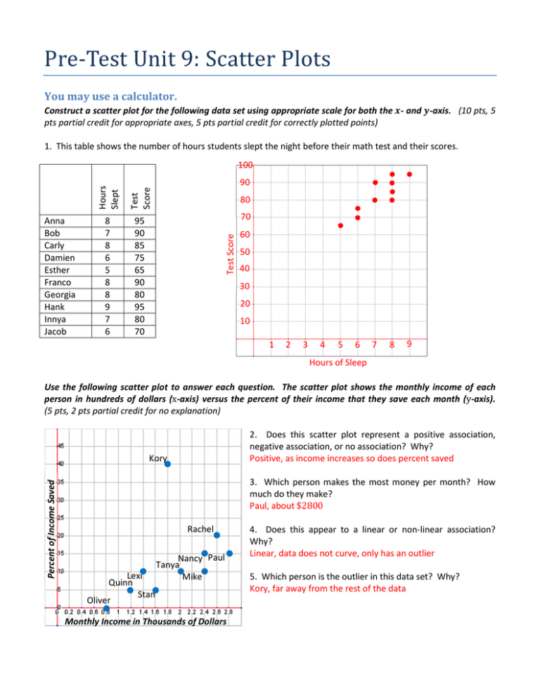
Pre-TestUnit9:ScatterPlots You may use a calculator. Construct a scatter plot for the following data set using appropriate scale for both the - and -axis. (10 pts, 5 pts partial credit for appropriate axes, 5 pts partial credit for correctly plotted points) 1. This table shows the number of hours students slept the night before their math test and their scores. 100 Hours Slept Test Score 8 7 8 6 5 8 8 9 7 6 95 90 85 75 65 90 80 95 80 70 80 70 Test Score Anna Bob Carly Damien Esther Franco Georgia Hank Innya Jacob 90 60 50 40 30 20 10 1 2 3 4 5 6 7 8 9 Hours of Sleep Use the following scatter plot to answer each question. The scatter plot shows the monthly income of each person in hundreds of dollars (x-axis) versus the percent of their income that they save each month (y-axis). (5 pts, 2 pts partial credit for no explanation) 2. Does this scatter plot represent a positive association, negative association, or no association? Why? Positive, as income increases so does percent saved Percent of Income Saved Kory 3. Which person makes the most money per month? How much do they make? Paul, about $2800 Rachel Lexi Quinn Stan Oliver Nancy Paul Tanya Mike Monthly Income in Thousands of Dollars 4. Does this appear to a linear or non-linear association? Why? Linear, data does not curve, only has an outlier 5. Which person is the outlier in this data set? Why? Kory, far away from the rest of the data Draw an informal line of best for the given scatter plots. (5 pts, partial credit at teacher discretion) 6. This scatter plot shows the amount copper in water in ppm versus plant growth in cm over three months. 7. This scatter plot shows the hours a cubic foot of ice was exposed to sunlight versus the amount of ice that melted in cubic inches. Plant Growth Ice Melted 9 9 8 8 7 7 6 6 5 5 4 4 3 3 2 2 1 1 Cu in Water 1 2 3 4 5 6 7 8 9 Hours Sunlight 10 1 −1 2 3 4 5 6 7 8 9 10 −1 Explain why the drawn line of best fit is accurate or why not. (5 pts, partial credit at teacher discretion) 8. This scatter plot shows the age in years versus the height in inches of a group of children. 9. This scatter plot shows the hours of TV watched per week versus the GPA on a 4.0 scale for a group of students. Height GPA 4.0 60 3.5 50 3.0 40 2.5 30 2.0 1.5 20 1.0 10 0.5 Age 2 4 6 8 10 12 Hours Weekly TV 14 −4 −0.5 −10 Not accurate because there are too many points below at the beginning of the line, and too many above at the end of the line. 4 8 12 16 20 24 28 Accurate because there is a balance of how far away the data points are from the line. 2 The scatter plot shows what people think the temperature “feels like” (y-axis) as the humidity (x-axis) varies when the room is actually at 68° F. The equation of the line of best fit is = + . (5 pts; 3 pts for equation answer, 2 pts for graph answer) 10. Predict what a person would say the temperature “feels like” when the humidity is at 80% using both the equation and graph. Feels Like Temp 70 Equation Work: 60 50 Graph Prediction: 69° 68°69° 40 30 20 10 % Humidity −10 −10 10 20 30 40 50 60 70 80 90 100 11. Predict what the humidity would be if someone said that it “feels like” 65° F in that room using both the equation and graph. Equation Work: Graph Prediction: 40% 40% Using the same scatter plot and equation of the line of best fit of = + , answer the following questions. (5 pts, partial credit at teacher discretion) 12. What does the slope of this equation mean in terms of the given situation? In other words, explain what the rise and run mean for this problem. The “feels like” temperature will go up one degree for every 10% increase in humidity. 13. What does the -intercept of this equation mean in terms of the given situation? In other words, explain what the -intercept means when considering the humidity and “feels like” temperature. The y-intercept of 61 degrees means that with 0% humidity it will “feel like” 61 degrees instead of 68 degrees. 3 Answer the following questions about two-way tables. (5 pts, partial credit at teacher discretion) 14. Construct a two-way table from the following data about whether people are democrats or republicans and whether or not they support stricter gun control laws. Democrat or Republican? Support Strict Gun Control? D R R R D D R D D D R D R R D R D D R R Y N N N N Y N Y Y Y N Y N Y N N Y Y Y N Support Gun Control Against Gun Control Republican 2 8 Democrat 8 2 15. Do you think there is a relationship between party affiliation and gun control laws? Based on the data, why or why not? (no credit without explanation of why, partial credit at teacher discretion for explanation) Yes. 80% of Republicans are against gun control while 80% of Democrats support gun control. Answer the following questions using the given two-way table. (5 pts, no partial credit) Students Teachers Support School Uniforms 278 82 Do Not Support School Uniforms 1726 23 16. How many students were surveyed? 2004 17. How many people support school uniforms? 360 18. How many students do not support school uniforms? 1726 19. As a percent to the nearest hundredth (two decimal places) what is the relative frequency of students who support school uniforms? 13.87% 4 Unit 9 Homework Lesson 9.1 Use the given data to answer the questions and construct the scatter plots. Pathfinder Character Level vs. Total Experience Points Level 2 3 6 9 10 XP 15 35 150 500 710 11 1050 14 2950 15 4250 17 8500 20 24000 24000 21600 19200 16800 XP 14400 12000 9600 7200 4800 2400 0 0 2 4 6 8 10 12 14 16 18 20 1. Which variable should be the independent variable ("-axis) and which should be the dependent variable (-axis)? Level should be x, XP should be y 2. Should you use a broken axis? Why or why not? No broken axis, uses all space in range 3. What scale and interval should you use for the "axis? 0 to 20 by ones 4. What scale and interval should you use for the axis? 0 to 24,000 by 1,200 5. Construct the scatter plot. Level Allowance Age vs. Weekly Allowance Age 12 12 Allowance 0 5 13 5 13 8 40 38 36 34 32 30 28 26 24 22 20 18 16 14 12 10 8 6 4 2 0 14 10 14 15 15 20 15 20 16 25 16 30 6. Which variable should be the independent variable ("-axis) and which should be the dependent variable (axis)? Age should be x, Allowance should be y 7. Should you use a broken axis? Why or why not? Broken axis for x since 0 to 11 not used 8. What scale and interval should you use for the "axis? 12 to 16 by 0.25 9. What scale and interval should you use for the axis? 0 to 30 by 1.5 or 0 to 40 by twos 10. Construct the scatter plot. 11 12 13 14 15 16 Age 5 Age vs. Number of Baby Teeth Age 5 6 7 Baby 20 19 17 Teeth 7 15 8 10 9 10 10 8 11 4 11 2 12 2 20 18 16 Baby Teeth 14 12 10 8 6 4 2 0 0 2 4 6 8 10 12 14 16 18 20 11. Which variable should be the independent variable ("-axis) and which should be the dependent variable (-axis)? Age should be x, Baby Teeth should be y 12. Should you use a broken axis? Why or why not? No broken axis, range greater than gap beforehand 13. What scale and interval should you use for the "axis? 0 to 20 by ones 14. What scale and interval should you use for the axis? 0 to 20 by ones 15. Construct the scatter plot. Age Mileage Car Speed (in mph) vs. Gas Mileage (in mpg) Speed 20 25 35 40 Mileage 25 27 28 30 32 31 30 29 28 27 26 25 24 23 22 21 0 10 20 30 40 50 60 70 80 90 100 45 31 55 32 65 30 80 29 90 25 100 22 16. Which variable should be the independent variable ("-axis) and which should be the dependent variable (-axis)? Speed should be x, Mileage should be y 17. Should you use a broken axis? Why or why not? Broken axis for since 0 to 22 not used 18. What scale and interval should you use for the "axis? 0 to 100 by fives 19. What scale and interval should you use for the axis? 22 to 32 by ones (or by halves) 20. Construct the scatter plot. Speed 6 Lesson 9.2 Use the given scatter plots to answer the questions. 1. Does this scatter plot show a positive association, negative association, or no association? Explain why. Positive, going up from left to right Daily Study Time Daily Study Time (minutes) 80 70 2. Is there an outlier in this data set? If so, approximately how old is the outlier and how about many minutes does he or she study per day? 12 years old and 75 minutes 60 50 40 30 3. Is this association linear or non-linear? Explain why. Linear, increases by about the same amount each year 20 10 0 0 5 10 15 20 4. What can you say about the relationship between your age and the amount that you study? The older you are, the more you study Age 5. Does this scatter plot show a positive association, negative association, or no association? Explain why. Negative, going down from left to right Daily Family Time 350 Daily Family Time 300 6. Is there an outlier in this data set? If so, approximately how old is the outlier and about how many minutes does he or she spend with family per day? No outlier in this data set 250 200 150 100 7. Is this association linear or non-linear? Explain why. Non-linear, it curves down 50 0 0 5 10 Age 15 20 8. What can you say about the relationship between your age and the amount of time that you spend with family? As you get older, you spend much less time with family each day 7 9. Does this scatter plot show a positive association, negative association, or no association? Explain why. Negative, going down from left to right Math Grade Math Grade 100% 90% 80% 70% 60% 50% 40% 30% 20% 10% 0% 10. Is there an outlier in this data set? If so, approximately how much does that person watch TV daily and what is his or her approximate math grade? About 5.5 hours of TV and 95% math grade 11. Is this association linear or non-linear? Explain why. Linear, grade goes down by the same amount for each hour of TV 0 2 4 6 12. What can you say about the relationship between the amount of time you watch TV and your math grade? Watching more TV correlates with lower math grades Daily TV Time (hours) 13. Does this scatter plot show a positive association, negative association, or no association? Explain why. Positive, math grade goes up from left to right Math Grade Math Grade 100% 90% 80% 70% 60% 50% 40% 30% 20% 10% 0% 14. Is there an outlier(s) in this data set? If so, approximately how much time does that person(s) spend with his or her family daily and what is his or her approximate math grade? 40 minutes with 92% and 100 minutes with 96% 15. Is this association linear or non-linear? Explain why. Questionable, could go either way 0 100 200 300 Daily Family Time (minutes) 400 16. What can you say about the relationship between the amount of time that you spend with your family and your math grade? More time with family correlates with higher math grades 17. Are there any other patterns that you notice in this data? Clumping around 280 minutes and also around 140 minutes 8 18. Does this scatter plot show a positive association, negative association, or no association? Explain why. Negative, going down from left to right Number of Pets 14 Number of Pets 12 19. Is there an outlier(s) in this data set? If so, approximately how many pets does that person(s) have? No outlier 10 8 6 20. Is this association linear or non-linear? Explain why. Linear, going down the same amount each time 4 2 0 0 10 20 30 First Letter of Last Name (A = 1 and Z = 26) 21. What can you say about the relationship between your last name and the number of pets you have? Earlier in the alphabet has more pets 22. Are there other patterns that you notice about people’s last names and how many pets they have? Clumping, early alphabet between 8 and 13 pets, middle alphabet between 4 and 6, later alphabet between 0 and 2 pets 23. Does this scatter plot show a positive association, negative association, or no association? Explain why. No association, no clear pattern Last Name First Letter of Last Name (A = 1 and Z = 26) 30 24. Is there an outlier(s) in this data set? If so, approximately how old is that person? No outlier 25 20 15 25. Is this association linear or non-linear? Explain why. Neither since there is no association 10 5 0 0 5 10 Age 15 20 26. What can you say about the relationship between your last name and your age? There is no relationship 9 27. Does this scatter plot show a positive association, negative association, or no association? Explain why. Positive, going up from left to right Weekly Allowance ($) Weekly Allowance ($) 30 28. Is there an outlier(s) in this data set? If so, approximately how tall is that person and how much does he or she make in allowance each week? 72 inches with $0 allowance 25 20 15 10 29. Is this association linear or non-linear? Explain why. Non-linear, it curves up 5 0 0 20 40 60 80 Height (inches) 30. What can you say about the relationship between your height and your allowance? As height increases, allowance increases 31. Do you think that being taller means that you will get more allowance? In other words, do you think this relationship is a causation or a correlation? This is a correlation, not a causation because being tall doesn’t cause more allowance 32. Does this scatter plot show a positive association, negative association, or no association? Explain why. Positive, going up from left to right Weekly Allowance ($) Weekly Allowance ($) 30 33. Is there an outlier(s) in this data set? If so, approximately how old is that person and how much does he or she make in allowance each week? 16 years old with $0 allowance 25 20 15 34. Is this association linear or non-linear? Explain why. Non-linear, it curves up 10 5 0 0 5 10 Age 15 20 35. What can you say about the relationship between your age and your allowance? As age increases, allowance increases 36. Do you think that being older means that you will get more allowance? In other words, do think this relationship is a causation or a correlation? This is probably a causation since being older means you generally spend more money and therefore need more allowance 10 Lesson 9.3 Draw an informal line of best fit on the given scatter plot and explain why you drew the line where you did. The real line of best fit is the thick line in red. 1. 2. Math Grade 80 100% 70 95% 60 90% Math Grade Daily Study Time (minutes) Daily Study Time 50 40 30 85% 80% 75% 20 70% 10 65% 0 60% 0 5 10 15 20 0 Age 2 4 6 Daily TV Time (hours) 3. 4. Math Grade Number of Pets 100% 14 95% 12 Number of Pets Math Grade 90% 85% 80% 75% 70% 10 8 6 4 2 65% 60% 0 0 100 200 300 400 -2 Daily Family Time (minutes) 11 0 10 20 30 First Letter of Last Name (A = 1 and Z = 26) 5. 6. Age vs. Sleep 80 75 70 65 60 55 50 45 40 35 30 14 12 Daily Sleep (hours) Height (inches) Age vs. Height 10 8 6 4 2 0 0 5 10 15 20 0 5 Age (years) 10 15 20 Age (years) 7. 8. Weight (pounds) Age vs. Weight Age vs. Languages Known 200 180 160 140 120 100 80 60 40 20 0 5 4 3 2 1 0 5 10 15 20 0 Age (years) 0 12 5 10 15 20 Determine whether the drawn line of best fit is accurate or not. Explain why you think your position is true. The real line of best fit is the thick line in red. 9. 10. 40 40 35 35 30 30 25 25 20 20 15 15 10 10 5 5 0 0 0 10 20 30 11. 0 10 20 30 0 10 20 30 12. 40 40 35 35 30 30 25 25 20 20 15 15 10 10 5 5 0 0 0 10 20 30 13 13. 14. 70 70 60 60 50 50 40 40 30 30 20 20 10 10 0 0 0 10 20 30 15. 0 10 20 30 0 10 20 30 16. 70 70 60 60 50 50 40 40 30 30 20 20 10 10 0 0 0 10 20 30 14 Use the given line of best fit or equation of the line of best fit to answer the following questions. 17. Using the graph only, about how much would you expect an 18 year old to weigh? 185 – 190 lbs Weight (pounds) Age vs. Weight 200 180 160 140 120 100 80 60 40 20 0 18. Using the graph only, about how much would you expect a 4 year old to weigh? 40 lbs 19. Using the graph only, if a person weighed 80 pounds, how old would you expect them to be? 8 years old 0 5 10 Age (years) 15 20 20. Using the graph only, if a person weighed 120 pounds, how old would you expect them to be? 12 years old The line of best fit for the scatter plot showing age (-value) compared to weight (-value) is approximately: # % = − # # 21. Using the line of best fit equation (show your work), about how much would you expect an 18 year old to weigh? How does this answer compare to the answer you gave to problem number 17? 185.5&'( 22. Using the line of best fit equation (show your work), about how much would you expect a 4 year old to weigh? How does this answer compare to the answer you gave to problem number 18? 38.5&'( 23. Using the line of best fit equation (show your work), about how old would you expect a person to be if they weighed 80 pounds? How does this answer compare to the answer you gave to problem number 19? ≈ 8)*(&+ 24. Using the line of best fit equation (show your work), about how old would you expect a person to be if they weighed 120 pounds? How does this answer compare to the answer you gave to problem number 20? ≈ 11.8)*(&+ 25. What is the rate of change (slope) of the line of best fit? What does the slope represent in this context and , does that make sense? )-)()./(ℎ12*.&'(-))*34*5. 26. What is the initial value (-intercept) of the line of best fit? What does it represent in this context and does that make sense? − )-)()./(1)54ℎ/*/'5/ℎ, +)(.7 /2*8)().()/ℎ*9).)4*/59)1)54ℎ/ 15 27. Using the graph only, about how much would you expect a 22 year old to sleep? 4 hours Daily Sleep (hours) Age vs. Sleep 20 18 16 14 12 10 8 6 4 2 0 28. Using the graph only, about how much would you expect a 4 year old to sleep? 12 hours 29. Using the graph only, if a person slept 6 hours, how old would you expect them to be? 17 years old 0 10 20 Age (years) 30 30. Using the graph only, if a person slept 13 hours, how old would you expect them to be? 2 years old The line of best fit for the scatter plot showing age (-value) compared to daily hours of sleep (-value) is approximately: = − + : # 31. Using the line of best fit equation (show your work), about how much would you expect a 22 year old to sleep? How does this answer compare to the answer you gave to problem number 27? 3ℎ3( 32. Using the line of best fit equation (show your work), about how much would you expect a 4 year old to sleep? How does this answer compare to the answer you gave to problem number 28? 12ℎ3( 33. Using the line of best fit equation (show your work), about how old would you expect a person to be if they slept 6 hours? How does this answer compare to the answer you gave to problem number 29? 16)*(&+ 34. Using the line of best fit equation (show your work), about how old would you expect a person to be if they slept 13 hours? How does this answer compare to the answer you gave to problem number 30? 2)*(&+ 35. What is the rate of change (slope) of the line of best fit? What does the slope represent in this context and , does that make sense? − )-)()./((&))-5.4*ℎ*&;ℎ3&)((-))* 36. What is the initial value (-intercept) of the line of best fit? What does it represent in this context and does that make sense? 14)-)()./(ℎ3(;(&))-*/'5/ℎ 16 Lesson 9.4 Use the data set to answer the following questions. For this data set a class of middle school students was asked what they thought was most important in school: good grades or popularity. Boy or Girl Grades or Popularity B B G G G B G B B G G B G B G B B G G B P G G P G P G G P G G P G P P P G G G P Boy or Girl Grades or Popularity B B G G G B G B B G G B G B G B B G G B P G P G G P G P P G G G G P P P G P G G 1. Construct a two-way table of the data. Boys Girls Grades 7 15 Popularity 13 5 2. What is the frequency of students who believe grades are more important? 22 3. What is the relative frequency of students who believe grades are more important? 22 = 55% 40 4. What is the frequency of students who believe popularity is more important? 18 5. What is the relative frequency of students who believe popularity is more important? 18 = 45% 40 6. What is the frequency of girls who believe grades are more important? 15 7. What is the relative frequency of girls who believe grades are more important? 15 = 75% 20 8. What is the frequency of boys who believe popularity is more important? 13 9. What is the relative frequency of boys who believe popularity is more important? 13 = 65% 20 10. Based on this data, do you feel there is relationship between a student’s gender and what they think is most important in school? What is that relationship and what evidence do you have that it exists? Based on the relative frequencies, girls typically believe that grades are more important, while boys believe popularity is more important. 17 Use the data set to answer the following questions. For this data set a class of middle school students was asked what hand was their dominant hand. Boy or Girl Right or Left B B G G G B G B B G G B G B G B B G G B L R R L R L R R R R L R R R R R L R L R Boy or Girl Right or Left B B G G G B G B B G G B G B G B B G G B R R L R R R L R L R R R L R R L R R L L 11. Construct a two-way table of the data. Boys Girls Right-handed 14 13 Left-handed 6 7 12. What is the frequency of students who are right-handed? 27 13. What is the relative frequency of students who are right-handed? 27 = 67.5% 40 14. What is the frequency of students who are left-handed? 13 15. What is the relative frequency of students who are left-handed? 13 = 32.5% 40 16. What is the frequency of girls who are right-handed? 13 17. What is the relative frequency of girls who are right-handed? 13 = 65% 20 18. What is the frequency of boys who are right-handed? 14 19. What is the relative frequency of boys who are right-handed? 14 = 70% 20 20. Based on this data, do you feel there is relationship between a student’s gender and whether or not they are right-handed? What is that relationship and what evidence do you have that it exists? Based on the relative frequencies it appears that boys and girls have the same chances of being left- or righthanded and that being right-handed is much more likely than being left-handed. 18 Use the two-way tables representing surveys middle school students took to answer the following questions. Survey 1: Boys Girls Prefer Spicy Salsa 255 68 Prefer Mild Salsa 45 132 Survey 2: Right-handed Left-handed Prefer Spicy Salsa 280 43 Prefer Mild Salsa 170 7 21. How many students were surveyed? 500 22. What is the relative frequency of students who prefer spicy salsa? Is it the same on both two-way tables? 323 = 64.6% 500 23. How many boys were surveyed? 300 24. How many girls were surveyed? 200 25. What is the relative frequency of boys who prefer spicy salsa? 255 = 85% 300 26. What is the relative frequency of girls who prefer spicy salsa? 68 = 34% 200 27. Do you think there is a relationship between gender and salsa preference? What is that relationship and what evidence do you have that it exists? Based on the relative frequencies, it appears that boys prefer spicy salsa more than girls. 28. How many right-handed students were surveyed? 450 29. How many left-handed students were surveyed? 50 30. What is the relative frequency of right-handed students who prefer mild salsa? 170 = 37. 7<% 450 31. What is the relative frequency of left-handed students who prefer mild salsa? 7 = 14% 50 32. Do you think there is a relationship between a student’s dominant hand and salsa preference? What is that relationship and what evidence do you have that it exits? Based on the relative frequencies, it appears that that right-handed students are between two and three times as likely to prefer mild salsa. 19 ReviewUnit9:BivariateDataKEY You may use a calculator. Unit 9 Goals • Construct and interpret scatter plots for bivariate measurement data to investigate patterns of association between two quantities. Describe patterns such as clustering, outliers, positive or negative association, linear association, and nonlinear association. (8.SP.1) • Know that straight lines are widely used to model relationships between to quantitative variables. For scatter plots that suggest a linear association, informally fit a straight line, and informally assess the model fit by judging the closeness of the data points to the line. (8.SP.2) • Use the equation of a linear model to solve problems in the context of bivariate measurement data, interpreting the slope and intercept. (8.SP.3) • Understand that patterns of association can also be seen in bivariate categorical data by displaying frequencies and relative frequencies in a two-way table. Construct and interpret a two-way table summarizing data on two categorical variables collected from the same subjects. Use relative frequencies calculated for rows or columns to describe possible association between the two variables. (8.SP.4) You may use a calculator. Construct a scatter plot for the following data set using appropriate scale for both the - and -axis. 1. This table shows the age of students slept and their scores on the MAP test. 8 10 11 12 9 15 13 14 13 14 180 200 215 220 195 235 230 235 225 225 230 220 MAP Score Anna Bob Carly Damien Esther Franco Georgia Hank Innya Jacob 240 MAP Score Age 250 210 200 190 180 170 160 150 0 2 4 6 8 10 12 14 16 18 20 Age 20 Use the following scatter plot to answer each question. The scatter plot shows the number of years each person invested ten thousand dollars (x-axis)versus the end value of that investment in thousands of dollars (y-axis). 2. Does this scatter plot represent a positive association, negative association, or no association? Why? Negative, going down over time. Remaining Student Loan Debt on a $30,000 Loan 35000 Mike Remaining Debt 30000 Jazmin Gonzo Eloise Amanda Fifi 25000 20000 3. Which person paid off their debt? About how long did it take? Brady, 30 years. Donna Katy Leonard 15000 Chuck Hannah Isildor 10000 5000 0 0 5 10 15 20 25 30 Brady 35 Years Since Graduating College 4. Does this appear to a linear or nonlinear association? Why? Non-linear, curves down. 5. Which person is the outlier in this data set? Why? Mike, has more debt after many years. Draw an informal line of best for the given scatter plots. 7. This scatter plot shows the hours of TV watched per week versus the GPA on a 4.0 scale for a group of students. 80 4 70 3.5 60 3 50 2.5 GPA Height in Inches 6. This scatter plot shows the age in years versus the height in inches of a group of children. 40 2 1.5 30 1 20 0.5 10 0 0 0 0 5 10 15 20 5 10 Hours of TV Watched per Week Age 21 15 Explain why the drawn line of best fit is accurate or why not. 8. This scatter plot shows the amount copper in water in ppm versus plant growth in cm over three months. Inaccurate, does not split data in half. 9. This scatter plot shows the hours a cubic foot of ice was exposed to sunlight versus the amount of ice that melted in cubic inches. Inaccurate, not the right slope. 10 9 9 Ice Melted in Cubic Inches 10 Plant Growth in cm 8 7 6 5 4 3 2 1 8 7 6 5 4 3 2 1 0 0 0 20 40 60 0 Cu in Water (ppm) 2 4 6 8 Hours of Sunlight The scatter plot shows the price of a gallon of milk (y-axis) from 2001 to 2012 (x-axis). The equation of the line # of best fit is approximately = #= + #. >. 10. Predict what price of a gallon of milk would have been in 2005 using both the equation and the graph. $4.50 $4.00 Equation Work: Avg Price of Milk $3.50 $3.00 = $2.50 Graph Prediction: 21 ?5@ + 2.68 = $3.10 250 $3.10 $2.00 $1.50 $1.00 $0.50 $0.00 0 5 10 Years since 2000 15 11. Predict what year it would have been when a gallon of milk cost approximately $3.00 using both the equation and the graph. Equation Work: 21 3= " + 2.68 250 21 0.32 = " 250 " ≈ 3.8 meaning about 2004 22 Graph Prediction: 2004 # Using the same scatter plot and equation of the line of best fit of = + #. >, answer the following #= questions. 12. What does the slope of this equation mean in terms of the given situation? In other words, explain what the rise and run mean for this problem. The price goes up $21 every 250 years. 13. What does the -intercept of this equation mean in terms of the given situation? In other words, explain what the -intercept means when considering the price of a gallon of milk and the year. In the year 2000, the price of a gallon of milk was $2.68. Answer the following questions about two-way tables. 14. Construct a two-way table from the following data about whether or not students own an iPhone and whether or not they own an iPad. Own an iPhone? Own a iPad? Y N Y Y N Y N N Y Y Y N N Y N N Y N Y N Y N Y N N Y Y N Y N Y Y N Y N N Y Y N N Owns iPhone Owns iPad Does Not Own iPad 7 3 Does Not iPhone 3 7 Own 15. Do you think there is a relationship between owning a iPhone and owning an iPad? Based on the data, why or why not? Yes, there is a relationship. Owners of iPhones are more likely to own iPads. 70% of iPhone owners also own an iPad and 70% of those who do not own an iPhone also do not own an iPad. 23 Answer the following questions using the given two-way table. Students Teachers Support Year-Round School 250 80 Do Not Support YearRound School 2150 70 16. How many teachers were surveyed? 150 17. How many students were surveyed? 2400 18. How many people support year-round school? 330 19. How many teachers do not support year-round school? 70 20. How many students do not support year-round school? 2150 21. As a decimal to the nearest hundredth (two decimal places) what is the relative frequency of the teachers compared to all those surveyed? 150 ≈ 5.88% 2550 22. As a decimal to the nearest hundredth (two decimal places) what is the relative frequency of the students who support year-round school compared to all students? 250 ≈ 10.42% 2400 23. As a decimal to the nearest hundredth (two decimal places) what is the relative frequency of the teachers who do not support year-round school compared to all teachers? 70 ≈ 46.67% 150 24
