Thing to Mind University ,.Indiana ~rrible
advertisement
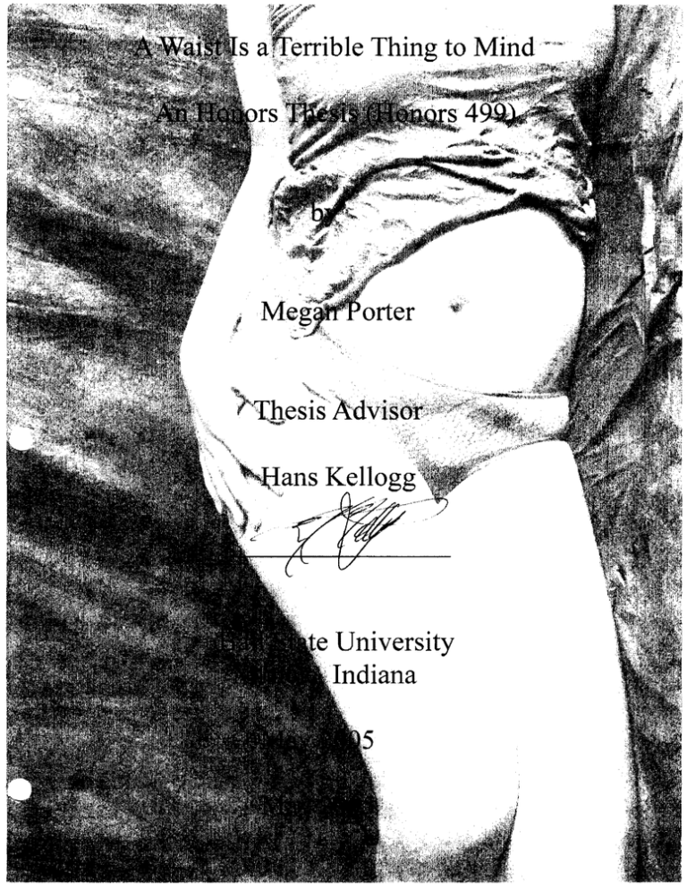
~rrible Thing to Mind University ,.Indiana Abstract "A Waist Is a Terrible Thing to Mind" is a collection often digitally edited photographs which depict a positive image of body fat. The goal of this project is for those who see it to walk away with a better self-image and a new definition of beauty. Acknowledgements -I would like to thank my models who bravely "bared it all." -I would like to thank my family and friends for their inspiration and support -I would also like to thank Hans Kellogg for his wonderful suggestions and advice and for going the extra mile to make this project a success. What is "beauty?" In our "the thinner the better" society, we are being constantly assaulted by images of what is considered beautiful by the standards of marketing professionals. We see young men and women with almost fictional-looking abs, butts, thighs, breasts, biceps, etc. parading around on television 24 hours a day. It is difficult to tum on the TV and not feel a little bit guilty about the bag of chips or the handful of chocolate that we may be munching on. But what's worse is that it's not just the sweet and salty snacks that drive us to these feelings ofinadequacy and remorse. It's our bodies themselves that just plain don't correspond with what we're seeing on TV. The way I see it, we have two options: 1. We can choose to make ourselves miserable, trying desperately through binge exercise and yo-yo dieting to force our bodies to emulate these svelte shapes we've corne to admire (no offense to the atypical few who are naturally shaped like Calista Flockhart or Brad Pitt.) OR 2. We can stop the "tyranny of the too thin" by accepting our body for exactly what it is: OURS, tummy, arm flab, cellulite and love-handles included! With this project, I'd like to convince you to choose option number two. My goal is to show you how beautiful our bodies, real bodies, with curves and contours and "huggable" parts truly are. I'd like you to see the art in the curve of a hip, the fold of a stomach, the ripple of a thigh and begin to think of your body not in terms of what it could be, but rather in terms of what it is: naturally beautiful. So relax, grab a snack, and enjoy! Your Thesis Is About What?! So I'm sure the question on your minds now is "Why?" Why would a student who majored in Spanish and spent a year studying abroad in Costa Rica photograph body fat for her senior thesis. It's a good question and there's a great answer, actually three of them. When I first came to Ball State University four years ago I was passionate about photography, but shied away from majoring in it for fear of not being able to find a lucrative job after college. A minor, the advisor told me, was just not an option due to the strict standards of the art department. So I fell into studying Spanish and adopted a digital publishing minor because of the two photo classes it offered me access to. The major advantage to this minor was that it had a focus in Photoshop. Through the ITGRA classes I have become familiar with this program and absolutely adore it. So even though I was not studying photography as actively as I would have liked to, or in the way I thought I would be, it remained a passion for me throughout my time here at Ball State. This passion is the first reason that I decided to focus my thesis on photography. The second reason is that my love for photography will have to take a backseat for a while to a financial and cultural reality. During my time studying abroad in Costa Rica I met a wonderful man and we began a relationship which we have been blessed enough to maintain through trust, love, emails, periodic visits and, of course, enormous phone bills. Now that I have finished my degree, I have made the decision to move to Costa Rica on a more permanent basis to be with him. Although there are a multitude of wonderful things about this "tropical paradise," the easy accessibility of the chemicals and technology required for professional photography is not one of them. For that reason I wanted one last chance to create some great photos before adopting a less technologybased lifestyle. So now we're all on the same page about the photography, but of all the subject matter in the world, why choose to glorify body fat? The answer is simple. Several years ago, I suffered from anorexia. It's not something that I like to talk about, and until recently I didn't even know that was what I had. While my case was fairly mild, I suffered from the same distorted body image that drives people (both female and male) to punish their bodies through extreme dieting. Although I have been healthy and enjoying food for many years, I still occasionally catch myself loathing the normal curves of my body and envying the flat stomachs and perfect "assets" I see on television. This project is my reaction to these images constantly thrown at us through the media. The Project. .. As you can see, I've made the photos a bit larger than the traditional eight by ten format. I feel that we are so bombarded by images of rail thin and perfectly toned people as the one true standard of beauty, that this message from the media has become "larger than life." So, in order to combat the media's promotion of self-hatred and make sure my photos would get the attention that their message of self-acceptance deserves, I created them on a larger scale. A few of the photos include words. The purpose of adding the words to the images is for the audience to associate the words (positive words like sexy, beautiful, curvaceous, intelligent, creative, etc.) which are not generally used in association with body fat, with the images and leave the exhibit feeling good about the similar parts of their own bodies. '" Although my models were all female, poor body image is an issue which affects both sexes and the aim of my project is for both women and men to have a more positive body image after viewing the photographs'" While nine of the ten images depict upbeat, optimistic themes, there is one image, the very small waistline, which does not seem to belong. This image is meant as the antithesis of the other photos. A reminder of the sickness we risk becoming a part of if we fall into the trap of believing what the media shows us. Finally, at the very insightful suggestion of my advisor, I have chosen to mount my artwork in a way which makes it stand out from the wall. We felt that this would help to draw attention to their unique, nontraditional focus. We originally hoped to utilize drywall or wood as frames for the photos, but since the honors college is very protective of its walls, that was no longer a practical idea. A word about the technical aspect of the project. .. All of the photos used in the exhibition were "born" in a small photography studio within the graphic arts lab. After developing the film, in the case of black and white, or having it developed, in the case of color, I scanned the negatives using the equipment in the basement of Bracken Library. From there, I saved the images at a high resolution (necessary for a quality print) to a CD and went to work. The first thing I had to do was sort through all of the images and decide which would be among the precious few that would advance to the next stage. Once I had narrowed down the field to the top ten it was time to move on to step two: Photoshop. As it turned out, my work was cut out for me since there was a significant presence of dust and scratches on the negatives. So that was the first order of business, eliminating the ugly white marks caused by these flaws that marred the quality of the images. In order to accomplish this, I first used a filter to reduce how conspicuous these imperfections seemed. Then I went a step further and zoomed in on the image and "cloned out" (a process using the cloning tool which copies image data from a selected nearby area to cover the blemish) each offending mark effectively eliminating it. The next stage for the photos was color balance, saturation, and contrast. In this step I decided how dark or light each photo would be and how bold its colors would turn out. At this stage I also utilized what are referred to as duotones in a few of the images. A duotone, just as the word implies, is an image composed of two tones, generally black and another color. This coloration gives the image an antique, classic look. "Para no aburrirte con el cuento," (To make a long story short) as they say in Costa Rica, I achieved the rest ofthe effects you see in the photos like the superimposed images, the freaky waistline, the cut out words, the checkerboard, etc. through a very time intense and not-all-that-interesting-to-read-about process of working with selections, opacity, layers, text masking, and paths among other Photoshop tools. I will not go into more detail because I would like my audience to focus on the photos themselves more than the process by which they were created. However, if you are genuinely interested in this process, I would be more than happy to talk with you about it. As you may have noticed after studying the photos, I have deviated from my original plan to utilize both the darkroom and Photoshop opting to produce the images solely through the Photos hop software. The reason for this change is that Photoshop provides me with a way to drastically manipulate my images and adjust fine details in a way that traditional darkroom printing never could. A Final Word ... When I told co-workers, friends, fellow students, and even my family about what I was doing for my senior thesis, the majority reacted with more or less the same phrase: "What would you want to do that?" (With the last word drawn out to emphasize their disgust) Their aversion is understandable given the scarcity of anything similar in magazines and on TV. Like a good friend of mine said "All we see photographed in the media is skinniness. Even in 'plus size' model pictures, it is airbrushed to look like that model is a bit bigger, but with no more cellulite or bulges than an anorexic supermodel." However, the more each person thought about the project, after getting over the initial feeling of "weirdness," the more they saw the utility and necessity of promoting an image of real, true, natural beauty. That is exactly what I hope to have done with this thesis. After completing this project, I feel better about myself and my body. I hope after seeing it you do, too.
