Severity Score 0-5: 0 = I don't agree that this is a usability problem at
advertisement
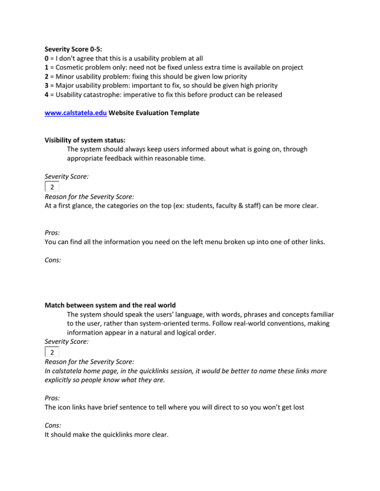
Severity Score 0-5: 0 = I don't agree that this is a usability problem at all 1 = Cosmetic problem only: need not be fixed unless extra time is available on project 2 = Minor usability problem: fixing this should be given low priority 3 = Major usability problem: important to fix, so should be given high priority 4 = Usability catastrophe: imperative to fix this before product can be released www.calstatela.edu Website Evaluation Template Visibility of system status: The system should always keep users informed about what is going on, through appropriate feedback within reasonable time. Severity Score: 2 Reason for the Severity Score: At a first glance, the categories on the top (ex: students, faculty & staff) can be more clear. Pros: You can find all the information you need on the left menu broken up into one of other links. Cons: Match between system and the real world The system should speak the users' language, with words, phrases and concepts familiar to the user, rather than system-oriented terms. Follow real-world conventions, making information appear in a natural and logical order. Severity Score: 2 Reason for the Severity Score: In calstatela home page, in the quicklinks session, it would be better to name these links more explicitly so people know what they are. Pros: The icon links have brief sentence to tell where you will direct to so you won’t get lost Cons: It should make the quicklinks more clear. User control and freedom Users often choose system functions by mistake and will need a clearly marked "emergency exit" to leave the unwanted state without having to go through an extended dialogue. Support undo and redo. Severity Score: 3 Reason for the Severity Score: When you go to Financial Aid page, you can't go back to home page by clicking the Cal State LA icon. Pros: At anytime if you want to go back to home page, you can always click on CalStateLA icon. Cons: Some pages can’t go back by clicking CalstateLA icon. Consistency and standards Users should not have to wonder whether different words, situations, or actions mean the same thing. Follow platform conventions. Severity Score: 1 Reason for the Severity Score: The website uses yellow color as the main color so it remains consistent. Pros: The website is pretty consistent oeverall. Cons: The layout changes a lot after you click on different links. Some pages don’t have CalstateLA icon so you don’t know it’s a CSULA page. Error prevention Even better than good error messages is a careful design which prevents a problem from occurring in the first place. Either eliminate error-prone conditions or check for them and present users with a confirmation option before they commit to the action. Severity Score: 3 Reason for the Severity Score: Campus Directory Services-> Department Offices->Associate VP Office, in division of academic affairs page, if you click Provost Newsletters, it will show not found page Pros: It gives you solution when you run into error, in commencement page, in order to watch live broadcasts; it shows the instruction how to install the software. Cons: No custom page for 404 error page. Recognition rather than recall Minimize the user's memory load by making objects, actions, and options visible. The user should not have to remember information from one part of the dialogue to another. Instructions for use of the system should be visible or easily retrievable whenever appropriate. Severity Score: 1 Reason for the Severity Score: The calstatela website does good recognition. When you click some links and refer to other pages, you will still know which link you clicked. Pros: On each page you visit, it will show which page you are in (ex: library, enrollment) Cons: None. Flexibility and efficiency of use Accelerators -- unseen by the novice user -- may often speed up the interaction for the expert user such that the system can cater to both inexperienced and experienced users. Allow users to tailor frequent actions. Severity Score: 3 Reason for the Severity Score: The calstatela website provides campus search bar so it's easy to find what you need. However, in Faculty Web Directory, some professor can't be found here. Pros: The website provides search function. Cons: The search bar doesn’t provide advanced search function Aesthetic and minimalist design Dialogues should not contain information which is irrelevant or rarely needed. Every extra unit of information in a dialogue competes with the relevant units of information and diminishes their relative visibility. Severity Score: 1 Reason for the Severity Score: It would be nice if the picture in Home page will change every few seconds to show the events. Pros: It doesn’t seem to have many problems. Cons: Spotlight and event would be better if it uses bigger icon. Help users recognize, diagnose, and recover from errors Error messages should be expressed in plain language (no codes), precisely indicate the problem, and constructively suggest a solution. Severity Score: 0 Reason for the Severity Score: If you type the wrong word in search bar, it will correct your spelling and give the suggestion. Pros: The website provides “report a problem with this page” link so anytime someone finds a problem, they can fix it right away. Cons: When typing the wrong password, it should have a link to retrieve the password. Help and documentation Even though it is better if the system can be used without documentation, it may be necessary to provide help and documentation. Any such information should be easy to search, focused on the user's task, list concrete steps to be carried out, and not be too large. Severity Score: 0 Reason for the Severity Score: There is a small search tips on the right of search bar and it helps you to search results more efficiency. Pros: The search tips helps a lot when you try to do an advanced search Cons: None.
