Create a chart in Excel
advertisement
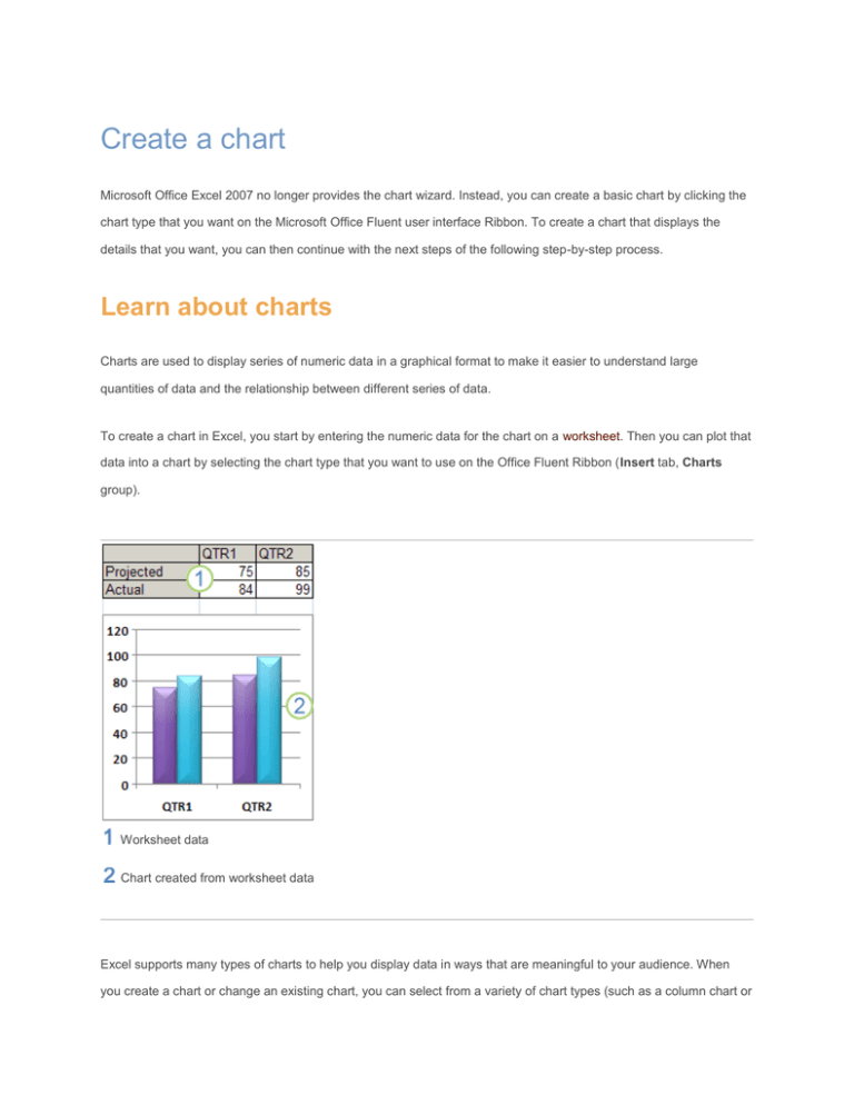
Create a chart Microsoft Office Excel 2007 no longer provides the chart wizard. Instead, you can create a basic chart by clicking the chart type that you want on the Microsoft Office Fluent user interface Ribbon. To create a chart that displays the details that you want, you can then continue with the next steps of the following step-by-step process. Learn about charts Charts are used to display series of numeric data in a graphical format to make it easier to understand large quantities of data and the relationship between different series of data. To create a chart in Excel, you start by entering the numeric data for the chart on a worksheet. Then you can plot that data into a chart by selecting the chart type that you want to use on the Office Fluent Ribbon (Insert tab, Charts group). Worksheet data Chart created from worksheet data Excel supports many types of charts to help you display data in ways that are meaningful to your audience. When you create a chart or change an existing chart, you can select from a variety of chart types (such as a column chart or a pie chart) and their subtypes (such as a stacked column chart or a pie in 3-D chart). You can also create a combination chart by using more than one chart type in your chart. Example of a combination chart that uses a column and line chart type. Getting to know the elements of a chart A chart has many elements. Some of these elements are displayed by default, others can be added as needed. You can change the display of the chart elements by moving them to other locations in the chart, resizing them, or by changing the format. You can also remove chart elements that you do not want to display. The chart area of the chart. The plot area of the chart. The data points of the data series that are plotted in the chart. The horizontal (category) and vertical (value) axis along which the data is plotted in the chart. The legend of the chart. A chart and axis title that you can use in the chart. A data label that you can use to identify the details of a data point in a data series. Modifying a basic chart to meet your needs After you create a chart, you can modify any one of its elements. For example, you might want to change the way that axes are displayed, add a chart title, move or hide the legend, or display additional chart elements. To modify a chart, you can: Change the display of chart axes. You can specify the scale of axes and adjust the interval between the values or categories that are displayed. To make your chart easier to read, you can also add tick marks to an axis, and specify the interval at which they will appear. Add titles and data labels to a chart. To help clarify the information that appears in your chart, you can add a chart title, axis titles, and data labels. Add a legend or data table. You can show or hide a legend, change its location, or modify the legend entries. In some charts, you can also show a data table that displays the legend keys and the values that are presented in the chart. Apply special options for each chart type. Special lines (such as high-low lines and trendlines), bars (such as up-down bars and error bars), data markers, and other options are available for different chart types. Applying a predefined chart layout and chart style for a professional look Instead of manually adding or changing chart elements or formatting the chart, you can quickly apply a predefined chart layout and chart style to your chart. Excel provides a variety of useful predefined layouts and styles that you can select, but you can fine-tune a layout or style if it is needed by making manual changes to the layout and format of individual chart elements, such as the chart area, plot area, data series, or legend of the chart. When you apply a predefined chart layout, a specific set of chart elements (such as titles, a legend, a data table, or data labels) are displayed in a specific arrangement in your chart. You can select from a variety of layouts that are provided for each chart type. When you apply a predefined chart style, the chart is formatted based on the document theme that you have applied, so that your chart matches your organization's or your own theme colors (a set of colors), theme fonts (a set of heading and body text fonts), and theme effects (a set of lines and fill effects). You cannot create your own chart layouts or styles, but you can create chart templates that include the chart layout and formatting that you want. Adding eye-catching formatting to a chart In addition to applying a predefined chart style, you can easily apply formatting to individual chart elements such as data markers, the chart area, the plot area, and the numbers and text in titles and labels to give your chart a custom, eye-catching look. You can apply specific shape styles and WordArt styles, and you can also format the shapes and text of chart elements manually. To add formatting, you can: Fill chart elements You can use colors, textures, pictures, and gradient fills to help draw attention to specific chart elements. Change the outline of chart elements You can use colors, line styles, and line weights to emphasize chart elements. Add special effects to chart elements You can apply special effects, such as shadow, reflection, glow, soft edges, bevel, and 3-D rotation to chart element shapes, which gives your chart a finished look. Format text and numbers You can format text and numbers in titles, labels, and text boxes on a chart as you would text and numbers on a worksheet. To make text and numbers stand out, you can even apply WordArt styles. Reusing charts by creating chart templates If you want to reuse a chart that you customized to meet your needs, you can save that chart as a chart template (*.crtx) in the chart templates folder. When you create a chart, you can then apply the chart template just as you would any other built-in chart type. In fact, chart templates are custom chart types — you can also use them to change the chart type of an existing chart. If you use a specific chart template frequently, you can save it as the default chart type. Step 1: Create a basic chart For most charts, such as column and bar charts, you can plot the data that you arrange in rows or columns on a worksheet into a chart. However, some chart types (such as pie and bubble charts) require a specific data arrangement. 1. On the worksheet, arrange the data that you want to plot in a chart. The data can be arranged in rows or columns — Excel automatically determines the best way to plot the data in the chart. Some chart types (such as pie and bubble charts) require a specific data arrangement as described in the following table. For this chart type Column, bar, line, area, surface, or radar chart Arrange the data In columns or rows, such as: Lorem Ipsum 1 2 3 4 Lorem 1 3 Ipsum 2 4 Or: Pie or doughnut chart For one data series, in one column or row of data and one column or row of data labels, such as: A 1 B 2 C 3 A B C 1 2 3 Or: For multiple data series, in multiple columns or rows of data and one column or row of data labels, such as: A 1 2 B 3 4 C 5 6 A B C 1 2 3 4 5 6 Or: XY (scatter) or bubble chart In columns, placing x values in the first column and corresponding y values and bubble size values in adjacent columns, like: X Y Bubble size 1 2 3 4 5 6 Stock chart In columns or rows in the following order, using names or dates as labels: high values, low values, and closing values Like: Date High Low Close 1/1/2002 46.125 42 44.063 Or: 2. Date 1/1/2002 High 46.125 Low 42 Close 44.063 Select the cells that contain the data that you want to use for the chart. TIP If you select only one cell, Excel automatically plots all cells that contain data that is adjacent to that cell into a chart. If the cells that you want to plot in a chart are not in a continuous range, you can select nonadjacent cells or ranges as long as the selection forms a rectangle. You can also hide the rows or columns that you do not want to plot in the chart. To select Do this A single cell Click the cell, or press the arrow keys to move to the cell. A range of cells Click the first cell in the range, and then drag to the last cell, or hold down SHIFT while you press the arrow keys to extend the selection. You can also select the first cell in the range, and then press F8 to extend the selection by using the arrow keys. To stop extending the selection, press F8 again. A large range of cells Click the first cell in the range, and then hold down SHIFT while you click the last cell in the range. You can scroll to make the last cell visible. All cells on a worksheet Click the Select All button. To select the entire worksheet, you can also press CTRL+A. NOTE If the worksheet contains data, CTRL+A selects the current region. Pressing CTRL+A a second time selects the entire worksheet. Nonadjacent cells or cell ranges Select the first cell or range of cells, and then hold down CTRL while you select the other cells or ranges. You can also select the first cell or range of cells, and then press SHIFT+F8 to add another nonadjacent cell or range to the selection. To stop adding cells or ranges to the selection, press SHIFT+F8 again. NOTE You cannot cancel the selection of a cell or range of cells in a nonadjacent selection without canceling the entire selection. An entire row or column Click the row or column heading. Row heading Column heading You can also select cells in a row or column by selecting the first cell and then pressing CTRL+SHIFT+ARROW key (RIGHT ARROW or LEFT ARROW for rows, UP ARROW or DOWN ARROW for columns). NOTE If the row or column contains data, CTRL+SHIFT+ARROW key selects the row or column to the last used cell. Pressing CTRL+SHIFT+ARROW key a second time selects the entire row or column. Adjacent rows or columns Drag across the row or column headings. Or select the first row or column; then hold down SHIFT while you select the last row or column. Nonadjacent rows or columns Click the column or row heading of the first row or column in your selection; then hold down CTRL while you click the column or row headings of other rows or columns that you want to add to the selection. The first or last cell in a row or column Select a cell in the row or column, and then press CTRL+ARROW key (RIGHT ARROW or LEFT ARROW for rows, UP ARROW or DOWN ARROW for columns). The first or last cell on a worksheet or in a Microsoft Press CTRL+HOME to select the first cell on the worksheet or in an Excel list. Office Excel table Press CTRL+END to select the last cell on the worksheet or in an Excel list that contains data or formatting. 3. Cells to the last used cell on the worksheet (lower-right corner) Select the first cell, and then press CTRL+SHIFT+END to extend the selection of cells to the last used cell on the worksheet (lower-right corner). Cells to the beginning of the worksheet Select the first cell, and then press CTRL+SHIFT+HOME to extend the selection of cells to the beginning of the worksheet. More or fewer cells than the active selection Hold down SHIFT while you click the last cell that you want to include in the new selection. The rectangular range between the active cell and the cell that you click becomes the new selection. On the Insert tab, in the Charts group, do one of the following: Click the chart type, and then click a chart subtype that you want to use. To see all available chart types, click a chart type, and then click All Chart Types to display the Insert Chart dialog box, click the arrows to scroll through all available chart types and chart subtypes, and then click the ones that you want to use. TIP A ScreenTip displays the chart type name when you rest the mouse pointer over any chart type or chart subtype. 4. By default, the chart is placed on the worksheet as an embedded chart. If you want to place the chart in a separate chart sheet, you can change its location by doing the following: 1. Click the embedded chart to select it. This displays the Chart Tools, adding the Design, Layout, and Format tabs. 2. On the Design tab, in the Location group, click Move Chart. 3. Under Choose where you want the chart to be placed, do one of the following: To display the chart in a chart sheet, click New sheet. TIP If you want to replace the suggested name for the chart, you can type a new name in the New sheet box. To display the chart as an embedded chart in a worksheet, click Object in, and then click a worksheet in the Object in box. Excel automatically assigns a name to the chart, such as Chart1 if it is the first chart that you create on a worksheet. To change the name of the chart, do the following: 0. Click the chart. 1. On the Layout tab, in the Properties group, click the Chart Name text box. TIP If necessary, click the Properties icon in the Properties group to expand the group. 2. Type a new name. 3. Press ENTER. NOTES To quickly create a chart that is based on the default chart type, select the data that you want to use for the chart, and then press ALT+F1 or F11. When you press ALT+F1, the chart is displayed as an embedded chart; when you press F11, the chart is displayed on a separate chart sheet. When you create a chart, Excel determines the orientation of the data series based on the number of worksheet rows and columns that are included in the chart. After you create a chart, you can change the way that worksheet rows and columns are plotted in the chart by switching rows to columns or vice versa. After you create a chart, you can quickly change the chart type of the whole chart to give the chart a different look, or you can select a different chart type for any single data series, which turns the chart into a combination chart. If you no longer need a chart, you can delete it. Click the chart to select it, and then press DELETE. Step 2: Change the layout or style of a chart After you create a chart, you can instantly change its look. Instead of manually adding or changing chart elements or formatting the chart, you can quickly apply a predefined layout and style to your chart. Excel provides a variety of useful predefined layouts and styles (or quick layouts and quick styles) that you can select from, but you can customize a layout or style as needed by manually changing the layout and format of individual chart elements. Apply a predefined chart layout 1. Click the chart that you want to format by using a predefined chart layout. TIP 2. This displays the Chart Tools, adding the Design, Layout, and Format tabs. On the Design tab, in the Chart Layouts group, click the chart layout that you want to use. NOTE When the size of the Excel window is reduced, chart layouts will be available in the Quick Layout gallery in the Chart Layouts group. TIP To see all available layouts, click More . Apply a predefined chart style 1. Click the chart that you want to format by using a predefined chart style. TIP 2. This displays the Chart Tools, adding the Design, Layout, and Format tabs. On the Design tab, in the Chart Styles group, click the chart style that you want to use. NOTE When the size of the Excel window is reduced, chart styles will be available in the Chart Quick Styles gallery in the Chart Styles group. TIP To see all predefined chart styles, click More . Change the layout of chart elements manually 1. Click the chart or the chart element for which you want to change the layout, or do the following to select a chart element from a list of chart elements. 1. Click anywhere in the chart to display the Chart Tools. 2. On the Format tab, in the Current Selection group, click the arrow next to the Chart Elements box, and then click the chart element that you want. 2. On the Layout tab, in the Labels, Axes, or Background group, click the chart element that you want to change, and then click the layout option that you want. The layout options that you select are applied to the chart element that you have selected. For example, if you NOTE have the entire chart selected, data labels will be applied to all data series. If you have a single data point selected, data labels will only be applied to the selected data series or data point. Change the format of chart elements manually 1. Click the chart or the chart element for which you want to change the style, or do the following to select a chart element from a list of chart elements. 1. Click a chart to display the Chart Tools. 2. On the Format tab, in the Current Selection group, click the arrow next to the Chart Elements box, and then click the chart element that you want. 2. TIP 3. This displays the Chart Tools, adding the Design, Layout, and Format tabs. On the Format tab, do any of the following: To format any selected chart element, in the Current Selection group, click Format Selection, and then select the formatting options that you want. To format the shape of a selected chart element, in the Shape Styles group, click the style that you want, or click Shape Fill, Shape Outline, or Shape Effects, and then select the formatting options that you want. To format the text in a selected chart element by using WordArt, in the WordArt Styles group, click the style that you want, or click Text Fill, Text Outline, or Text Effects, and then select the formatting options that you want. NOTE After you apply a WordArt style, you cannot remove the WordArt format. If you do not want the WordArt style that you applied, you can select another WordArt style, or you can click Undo on the Quick Access Toolbar to return to the previous text format. 4. TIP To use regular text formatting to format the text in chart elements, you can right-click or select the text, and then click the formatting options that you want on the Mini toolbar. You can also use the formatting buttons on the Ribbon (Home tab, Font group). Step 3: Add or remove titles or data labels To make a chart easier to understand, you can add titles, such as a chart title and axis titles. Axis titles are typically available for all axes that can be displayed in a chart, including depth (series) axes in 3-D charts. Some chart types (such as radar charts) have axes, but they cannot display axis titles. Chart types that do not have axes (such as pie and doughnut charts) cannot display axis titles either. You can also link chart and axis titles to corresponding text in worksheet cells by creating a reference to those cells. Linked titles are automatically updated in the chart when you change the corresponding text on the worksheet. To quickly identify a data series in a chart, you can add data labels to the data points of the chart. By default, the data labels are linked to values on the worksheet, and they update automatically when changes are made to these values. Add a chart title 1. Click the chart to which you want to add a title. This displays the Chart Tools, adding the Design, Layout, and Format tabs. 2. On the Layout tab, in the Labels group, click Chart Title. 3. Click Centered Overlay Title or Above Chart. 4. In the Chart Title text box that appears in the chart, type the text that you want. TIP 5. To insert a line break, click to place the pointer where you want to break the line, and then press ENTER. To format the text, select it, and then click the formatting options that you want on the Mini toolbar. TIP You can also use the formatting buttons on the Ribbon (Home tab, Font group). To format the whole title, you can right-click it, click Format Chart Title, and then select the formatting options that you want. Add axis titles 1. Click the chart to which you want to add axis titles. This displays the Chart Tools, adding the Design, Layout, and Format tabs. 2. On the Layout tab, in the Labels group, click Axis Titles. 3. Do any of the following: To add a title to a primary horizontal (category) axis, click Primary Horizontal Axis Title, and then click the option that you want. TIP If the chart has a secondary horizontal axis, you can also click Secondary Horizontal Axis Title. To add a title to primary vertical (value) axis, click Primary Vertical Axis Title, and then click the option that you want. TIP If the chart has a secondary vertical axis, you can also click Secondary Vertical Axis Title. To add a title to a depth (series) axis, click Depth Axis Title, and then click the option that you want. NOTE This option is only available when the selected chart is a true 3-D chart, such as a 3-D column chart. 4. In the Axis Title text box that appears in the chart, type the text that you want. TIP 5. To insert a line break, click to place the pointer where you want to break the line, and then press ENTER. To format the text, select it, and then click the formatting options that you want on the Mini toolbar. TIP You can also use the formatting buttons on the Ribbon (Home tab, Font group). To format the whole title, you can right-click it, click Format Axis Title , and then select the formatting options that you want. NOTES If you switch to another chart type that does not support axis titles (such as a pie chart), the axis titles will no longer be displayed. The titles will be displayed again when you switch back to a chart type that does support axis titles. Axis titles that are displayed for secondary axes will be lost when you switch to a chart type that does not display secondary axes. Link a title to a worksheet cell 1. On a chart, click the chart or axis title that you want to link to a worksheet cell. 2. On the worksheet, click in the formula bar, and then type an equal sign (=). 3. Select the worksheet cell that contains the data or text that you want to display in your chart. TIP You can also type the reference to the worksheet cell in the formula bar. Include an equal sign, the sheet name, followed by an exclamation point; for example, =Sheet1!F2 4. Press ENTER. Add data labels 1. On a chart, do one of the following: To add a data label to all data points of all data series, click the chart area. To add a data label to all data points of a data series, click anywhere in the data series that you want to label. To add a data label to a single data point in a data series, click the data series that contains the data point that you want to label, and then click the data point that you want to label. This displays the Chart Tools, adding the Design, Layout, and Format tabs. 2. On the Layout tab, in the Labels group, click Data Labels, and then click the display option that you want. NOTE Depending on the chart type that you used, different data label options will be available. Remove titles or data labels from a chart 1. Click the chart. This displays the Chart Tools, adding the Design, Layout, and Format tabs. 2. On the Layout tab, in the Labels group, do one of the following: To remove a chart title, click Chart Title, and then click None. To remove an axis title, click Axis Title, click the type of axis title that you want to remove, and then click None. TIP To remove data labels, click Data Labels, and then click None. To quickly remove a title or data label, click it, and then press DELETE. Step 4: Show or hide a legend When you create a chart, the legend appears, but you can hide the legend or change its location after you create the chart. 1. Click the chart in which you want to show or hide a legend. This displays the Chart Tools, adding the Design, Layout, and Format tabs. 2. On the Layout tab, in the Labels group, click Legend. 3. Do one of the following: To hide the legend, click None. TIP To quickly remove a legend or a legend entry from a chart, you can select it, and then press DELETE. You can also right-click the legend or a legend entry, and then click Delete. To display a legend, click the display option that you want. NOTE When you click one of the display options, the legend moves, and the plot area automatically adjusts to make room for it. If you move and size the legend by using the mouse, the plot area does not automatically adjust. For additional options, click More Legend Options, and then select the display option that you want. TIP By default, a legend does not overlap the chart. If you have space constraints, you might be able to reduce the size of the chart by clearing the Show the legend without overlapping the chart check box. TIP When a chart has a legend displayed, you can modify the individual legend entries. Step 5: Display or hide chart axes or gridlines When you create a chart, primary axes are displayed for most chart types. You can turn them on or off as needed. When you add axes, you can specify the level of detail that you want the axes to display. A depth axis is displayed when you create a 3-D chart. When the values in a chart vary widely from data series to data series, or when you have mixed types of data (for example, price and volume), you can plot one or more data series on a secondary vertical (value) axis. The scale of the secondary vertical axis reflects the values for the associated data series. After you add a secondary vertical axis to a chart, you can also add a secondary horizontal (category) axis, which might be useful in an xy (scatter) chart or bubble chart. To make a chart easier to read, you can display or hide the horizontal and vertical chart gridlines that extend from any horizontal and vertical axes across the plot area of the chart. Display or hide primary axes 1. Click the chart for which you want to display or hide axes. This displays the Chart Tools, adding the Design, Layout, and Format tabs. 2. On the Layout tab, in the Axes group, click Axes, and then do one of the following: To display an axis, click Primary Horizontal Axis, Primary Vertical Axis, or Depth Axis (on a 3-D chart), and then click the axis display option that you want. To hide an axis, click Primary Horizontal Axis, Primary Vertical Axis, or Depth Axis (on a 3-D chart), and then click None. To specify detailed axis display and scaling options, click Primary Horizontal Axis, Primary Vertical Axis, or Depth Axis (on a 3-D chart), and then click More Primary Horizontal Axis Options, More Primary Vertical Axis Options, or More Depth Axis Options. Display or hide secondary axes 1. In a chart, click the data series that you want to plot along a secondary vertical axis, or do the following to select the data series from a list of chart elements: 1. Click the chart. This displays the Chart Tools, adding the Design, Layout, and Format tabs. 2. On the Format tab, in the Current Selection group, click the arrow next to the Chart Elements box, and then click the data series that you want to plot along a secondary vertical axis. 2. On the Format tab, in the Current Selection group, click Format Selection. 3. Click Series Options if it is not selected, and then under Plot Series On, click Secondary Axis and then click Close. 4. On the Layout tab, in the Axes group, click Axes. 5. Do one of the following: To display a secondary vertical axis, click Secondary Vertical Axis, and then click the display option that you want. TIP To help distinguish the secondary vertical axis, you can change the chart type for just one data series. For example, you can change one data series to a line chart. To display a secondary horizontal axis, click Secondary Horizontal Axis, and then click the display option that you want. NOTE This option is available only after you display a secondary vertical axis. To hide a secondary axis, click Secondary Vertical Axis or Secondary Horizontal Axis, and then click None. TIP You can also click the secondary axis that you want to delete, and then press DELETE. Display or hide gridlines 1. Click the chart to which you want to add chart gridlines. This displays the Chart Tools, adding the Design, Layout, and Format tabs. 2. On the Layout tab, in the Axes group, click Gridlines. 3. Do the following: To add horizontal gridlines to the chart, point to Primary Horizontal Gridlines, and then click the option that you want. If the chart has a secondary horizontal axis, you can also click Secondary Horizontal Gridlines. To add vertical gridlines to the chart, point to Primary Vertical Gridlines, and then click the option that you want. If the chart has a secondary vertical axis, you can also click Secondary Vertical Gridlines. To add depth gridlines to a 3-D chart, point to Depth Gridlines, and then click the option that you want. This option is only available when the selected chart is a true 3-D chart, such as a 3-D column chart. To hide chart gridlines, point to Primary Horizontal Gridlines, Primary Vertical Gridlines, or Depth Gridlines (on a 3-D chart), and then click None. If the chart has a secondary axes, you can also click Secondary Horizontal Gridlines or Secondary Vertical Gridlines, and then click None. To quickly remove chart gridlines, select them, and then press DELETE. Step 6: Move or resize a chart You can move a chart to any location on a worksheet or to a new or existing worksheet. You can also change the size of the chart for a better fit. Move a chart To move a chart, drag it to the location that you want. Resize a chart To resize a chart, do one of the following: Click the chart, and then drag the sizing handles to the size that you want. On the Format tab, in the Size group, enter the size in the Shape Height and Shape Width box. TIP For more sizing options, on the Format tab, in the Size group, click the Dialog Box Launcher . In the Size and Properties dialog box, on the Size tab, you can select options to size, rotate, or scale the chart. On the Properties tab, you can specify how you want the chart to move or size with the cells on the worksheet. Step 7: Save a chart as a template If you want to create another chart like the one that you just created, you can save the chart as a template that you can use as the basis for other similar charts. 1. Click the chart that you want to save as a template. 2. On the Design tab, in the Type group, click Save as Template. 3. In the File name box, type a name for the template. TIP Unless you specify a different folder, the template file (.crtx) will be saved in the Charts folder, and the template becomes available under Templates in both the Insert Chart dialog box (Insert tab, Charts group, Dialog Box Launcher ) and the Change Chart Type dialog box (Design tab, Type group, Change Chart Type). NOTE A chart template contains chart formatting and stores the colors that are in use when you save the chart as a template. When you use a chart template to create a chart in another workbook, the new chart uses the colors of the chart template — not the colors of the document theme that is currently applied to the workbook. To use the document theme colors instead of the chart template colors, right-click the chart area, and then click Reset to Match Style on the shortcut menu.
