Design Vocabulary Agate: Small type (usually 5.5 point) used for
advertisement
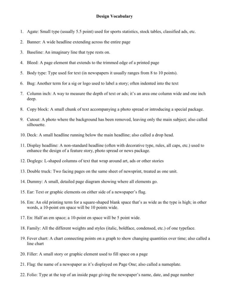
Design Vocabulary 1. Agate: Small type (usually 5.5 point) used for sports statistics, stock tables, classified ads, etc. 2. Banner: A wide headline extending across the entire page 3. Baseline: An imaginary line that type rests on. 4. Bleed: A page element that extends to the trimmed edge of a printed page 5. Body type: Type used for text (in newspapers it usually ranges from 8 to 10 points). 6. Bug: Another term for a sig or logo used to label a story; often indented into the text 7. Column inch: A way to measure the depth of text or ads; it’s an area one column wide and one inch deep. 8. Copy block: A small chunk of text accompanying a photo spread or introducing a special package. 9. Cutout: A photo where the background has been removed, leaving only the main subject; also called silhouette. 10. Deck: A small headline running below the main headline; also called a drop head. 11. Display headline: A non-standard headline (often with decorative type, rules, all caps, etc.) used to enhance the design of a feature story, photo spread or news package. 12. Doglegs: L-shaped columns of text that wrap around art, ads or other stories 13. Double truck: Two facing pages on the same sheet of newsprint, treated as one unit. 14. Dummy: A small, detailed page diagram showing where all elements go. 15. Ear: Text or graphic elements on either side of a newspaper’s flag. 16. Em: An old printing term for a square-shaped blank space that’s as wide as the type is high; in other words, a 10-point em space will be 10 points wide. 17. En: Half an em space; a 10-point en space will be 5 point wide. 18. Family: All the different weights and styles (italic, boldface, condensed, etc.) of one typeface. 19. Fever chart: A chart connecting points on a graph to show changing quantities over time; also called a line chart 20. Filler: A small story or graphic element used to fill space on a page 21. Flag: the name of a newspaper as it’s displayed on Page One; also called a nameplate. 22. Folio: Type at the top of an inside page giving the newspaper’s name, date, and page number 23. Graf: Newsroom slang for “paragraph.” 24. Grid: The underlying pattern of lines forming the framework of a page; also to align elements on a page. 25. Gutter: The space running vertically between columns. 26. Hairline: The thinnest rule used in newspapers. 27. Hammer head: A headline that uses a big, bold word or phrase for impact and runs a small, wide deck below. 28. Header: A special label for any regularly appearing section, page or story; also called a standing head. 29. Infographic: Newsroom slang for “information graphic”; any map, chart or diagram used to analyze an event, object or place. 30. Initial cap: A large capital letter set at the beginning of a paragraph. 31. Inset: Art or text set inside other art or text. 32. Kerning: Tightening the spacing between letters. 33. Kicker: A small, short, one-line headline, often underscored, placed above a larger headline. 34. Leading: Vertical spacing between lines of type, measured in points. 35. Leg: A column of text. 36. Masthead: A block of information, including staff names and publication data, often printed on the editorial page. 37. Modular layout: A design system that views a page as a stack of rectangles. 38. Orphan: A short word or phrase that’s carried over to a new column or page; also called a widow. 39. Pica: A standard unit of measure in newspapers. There are 6 picas in one inch, 12 points in one pica. 40. Refer (or reefer): A line or paragraph, often given graphic treatment, referring to a related story elsewhere in the paper. 41. Sidebar: A small story accompanying a bigger story on the same topic. 42. Sig: A small standing head that labels a regularly appearing column or feature. 43. Skyboxes: Teasers that run above the flag on Page One. If they’re boxed (with art), they’re called skyboxes or boxcars; if they use only a line of type, they’re called skylines. 44. Stand-alone photo: A photo that doesn’t accompany a story, usually boxed to show it stands alone; also called wild art. 45. Style: A newspaper’s standardized set of rules and guidelines. Newspapers have styles for grammar, punctuation, headline codes, design principles, etc. 46. Tombstoning: Stacking two headlines side by side so that they collide with each other; also called bumping or butting heads. 47. Trapped white space: An empty area, inside a story design or photo spread, that looks awkwardly or clumsy. 48. Well: Ads stacked along both edges of the page, forming a deep trough for stories in the middle. 49. Widow: A word or phrase that makes up the last line of text in a paragraph. (See orphan) 50. X-height: the height of a typical lower-case letter.
![[Type text] Fill in a fictional “headline from the future” above](http://s3.studylib.net/store/data/008674091_1-c12eeba0d4bd6938777e08ea064ad30a-300x300.png)
