Drawing Terminology
advertisement
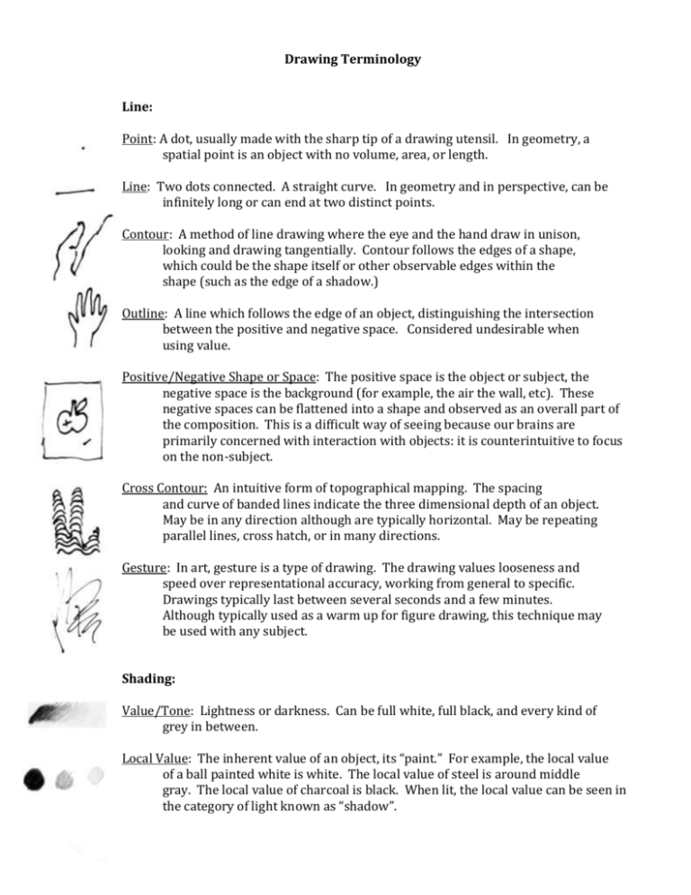
Drawing Terminology Line: Point: A dot, usually made with the sharp tip of a drawing utensil. In geometry, a spatial point is an object with no volume, area, or length. Line: Two dots connected. A straight curve. In geometry and in perspective, can be infinitely long or can end at two distinct points. Contour: A method of line drawing where the eye and the hand draw in unison, looking and drawing tangentially. Contour follows the edges of a shape, which could be the shape itself or other observable edges within the shape (such as the edge of a shadow.) Outline: A line which follows the edge of an object, distinguishing the intersection between the positive and negative space. Considered undesirable when using value. Positive/Negative Shape or Space: The positive space is the object or subject, the negative space is the background (for example, the air the wall, etc). These negative spaces can be flattened into a shape and observed as an overall part of the composition. This is a difficult way of seeing because our brains are primarily concerned with interaction with objects: it is counterintuitive to focus on the non-subject. Cross Contour: An intuitive form of topographical mapping. The spacing and curve of banded lines indicate the three dimensional depth of an object. May be in any direction although are typically horizontal. May be repeating parallel lines, cross hatch, or in many directions. Gesture: In art, gesture is a type of drawing. The drawing values looseness and speed over representational accuracy, working from general to specific. Drawings typically last between several seconds and a few minutes. Although typically used as a warm up for figure drawing, this technique may be used with any subject. Shading: Value/Tone: Lightness or darkness. Can be full white, full black, and every kind of grey in between. Local Value: The inherent value of an object, its “paint.” For example, the local value of a ball painted white is white. The local value of steel is around middle gray. The local value of charcoal is black. When lit, the local value can be seen in the category of light known as “shadow”. Illusionistic Value: The value of an object when under different lighting conditions. For example, the illusionistic value of a white ball in a room with no light is black. Highlights and shadows on an object fall under the category of illusionistic value. Categories of light: Highlight, light, shadow, core of the shadow, reflected light, cast shadow. The highlight is the part of the form which is opposite from the light source. The cast shadow is the space where the light is blocked by the object. Penumbra: Where multiple light sources cause multiple layering cast shadows. Sfumato: Gradual value transitions with soft edges. “Like smoke.” Famously used by Leonardo Da Vinci to create Mona Lisa’s mysterious smile. Chiaroscuro: An artwork employing a full range of value with full white, full black, and all the range of values in between. Related to the art movement known as Tenebrism which uses dramatic illumination. The artist Caravaggio used this technique. Key: An artwork which stays within a particular range of value, described as High Key, Middle Key, or Low Key. High key is primarily in the top third of the value scale, lacking dark shadows. Middle key is primarily in the middle, lacking light highlights and dark shadows. Low key is primarily on the bottom third, having lots of darks but lacking bright lights. Often used to create a mood, for example high key lighting is often employed in comedy sitcoms. Hatching: A means of creating value through the use of repetitive lines. Lines may be parallel hatch, cross hatch, cross contour cross hatch, or scribbled lines. Lines which are farther apart with lots of light space behind them appear as lighter values, lines that are closer together with little space between them appear as darker values. Typically used with pencil or ink drawings, and frequently employed in printmaking, for example, on paper money. Stippling: A means of creating value through the use of repetitive dots. Related to pointillism. Used to great effect by the artist Georges Seurat. Optical Grey: When using hatching or stippling or other similar methods, this is our perception of the resulting value. The small movements of our eyes mix the white and black lines into the perception of a particular value or tone. Edge Quality: The hardness or softness with which one edge meets another. Often spoken of as sharp or soft. Blending an edge makes it soft. Texture: In art, this refers to literal or perceived texture. The pattern on a blanket, a polka dot dress, a woven basket, and the hair on someone’s head all have texture. The texture passes through the overall range of value on an object while also having its own value (or hue) variations within. Texture is the most apparent in the category of light known as shadow, where the light is parallel to the object. Silhouette: Where an outline and its interior are represented as a flat shape. Often used in profile portraiture. Can be created with a strong backlight with no front lights, or as the shadow on a vertical screen. Perspective: Overlap: The most basic form of perspective, where one object blocks the view of another object, indicating position in space. Vertical/Diagonal Perspective: A form of perspective in which the objects closer to the bottom of the page are perceived as being closer than those at the top or middle of that page. Frequently employed in the middle ages and in historical Asian landscape prints and is used by the artist Hokusai in his woodblock prints. Atmospheric Perspective: The tendency for objects which are farther away to appear blurrier, more blue, and having lower contrast, and typically being lighter in value than those which are close to the viewer. The makeup of the air obscures our view like fog over a great distance. Horizon line: The eye level. Where the earth turns out of view (the perceived edge of the world.) The axis around which linear perspective drawing is structured. Vanishing Point(s): The point or points to which orthagonals recede. In one and two point perspective, the vanishing point or points are located on the horizon line. In three point, vanishing points may be above or below the horizon. Ortrhogonals: Receding diagonals. All lines which are geometrically parallel appear to recede to a common point when represented in two dimensional space. Cone of Vision: The viewing plane a person sees without turning their head. Extending out sixty degrees in all directions from the eyes. You can notice this by looking straight ahead and moving your hands in and out of your cone of vision. In two point linear perspective, this is a circle which includes the two vanishing points outside of which the illusion of depth falls apart. One Point Perspective: Typically occurs when facing a wall. Where the horizontals and verticals are at straight 90 degree angles and are parallel to the picture plane (paper). Only the depth appears to recede to a single vanishing point. Two Point Perspective: Typically occurs when facing a corner. Where the Verticals are at straight 90 degree angles. The lines of width vanish to one point and the lines of depth vanish to a second point, usually with one on the right and one on the left sides of the horizon line, with these points occurring off of the edges of the paper. Three Point Perspective: Typically occurs when looking up at a skyscraper or down from a helicopter. Where, in combination with one or two point, the verticals are no longer parallel to the picture plane and recede to their own separate point above or below the horizon line. Foreshortening: The illusion created when the part of an object which is close appears larger than the part of an object which is far away. Typically used to describe the figure in perspective. Color: Pigment and Dye: The raw form of subtractive color. Pigment is powdered, dye is wet. All colored media contain these in combination with some kind of binder. These come from a wide variety of sources, from the toxic (mercury, cadmium) to the natural (cow dung, beetle wings) to those made in a lab (the beautiful Quinacridones). They come in different strengths and are often chemically manipulated to change their effects. Many have undertones and do not perfectly correspond to pure theoretical color – there are no true primaries with subtractive color. There are a limited number of source pigments and dyes. When purchasing colored media, items with strange names tend to be made with pure pigments or dyes, and those with romantic sounding titles tend to be mixtures of pigments or dyes. For example, “Alizarin Crimson and Dioxazine Violet” are pure. “Cotton candy pink” is a mixture. Color Wheel: Although many historical color systems exist, the one we use today is derived from the studies of Albert Munsell. The color wheel is arranged practically for use in mixing subtractive color such as paint (additive color is light, which works differently.) Note: I find it useful to remember ROY G. BIV from Biology and then eliminate the I because we don’t use Indigo on the color wheel. Local Color: The inherent color of an object, its “paint.” For example, the local color of a ball painted orange is orange. The local color of a granny smith apple is yellow-green. When lit, the local color can be seen in the category of light known as “shadow”. Value: In color, the value of an object is the same as it would be in a black and white drawing, except while remaining in color. Imagine taking a black and white photograph of a colored vase. The vase has a range of value, even though it is red. This is referred to in terms of the lightness or darkness of an area of color. Some colors have an inherently lighter value than others. For example, yellow is lighter in value than violet. Hue: The name of the area of color you are perceiving. The hue of an orange is orange. The hue of a granny smith apple is yellow-green. You may have specific variations of hue within the same object, for example a red hued glass vase may have a blue hued reflection in it. Chroma: Sometimes referred to as the intensity or brightness of a color, measured in terms of high or low. A neon sign has a very high chroma, whereas a gray feather has a low chroma. Some colors have inherently higher chromas than others. For example, cadmium red has a higher chroma than burnt sienna. Mixing colors together lowers their chroma. Monochromatic Color: Use of color that remains in the same hue with a variety of values. Ex: Dark red, red, pink, white. Analogous Color: A color scheme which uses colors that are neighbors on the color wheel. For example, yellow/orange/red, and yellow-green/green/blue. Complementary Color: Colors that are opposite from each other on the color wheel. For example, some opposites are: red and green, yellow and violet, orange and blue, yellow-green and red-violet. When placed next to each other they can cause optical strain and the illusion of shimmering (this can be seen in the artist Bridget Riley’s work.) When mixed together, complementary colors lower each others chroma. Chromatic Grey: A grey that is the result of mixing colors together without the use of a true black or true grey pigment. Can be achieved by mixing across the color wheel, such as with complementary colors. The colors Alizarin crimson and Viridian green are often mixed to make a chromatic grey. Triadic Color Scheme: Colors which are equidistantly spaced on the color wheel, in the shape of a triangle. For example: red/yellow/ blue, orange/green/violet, Yellow-orange /blue-green /red-violet. Simultaneous Contrast: The way that two different colors affect each other. For example, the same violet appears slightly different when placed next to green than when placed next to red. Josef Albers has artwork about this. Broken Color: Varying a color’s hue, value, and/or chroma to give it a more complex shimmering appearance, not flat color. This technique was frequently employed by artists in the impressionist movement. For example, to use broken color with the color blue, you might weave in blue-green and blue-violet. Tint: Adding color to white. Note: I remember my grandma getting her white hair tinted with blue. Shade: Adding black to a color. © Mariko Frost 2010
