Word
advertisement
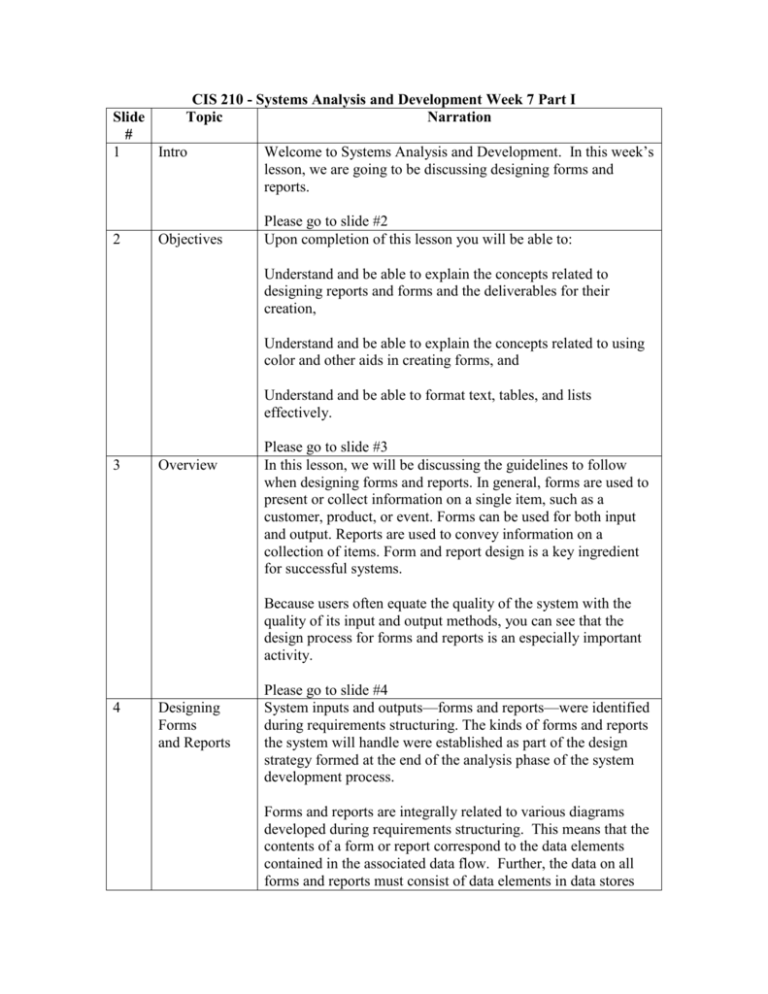
CIS 210 - Systems Analysis and Development Week 7 Part I Topic Narration Slide # 1 Intro 2 Objectives Welcome to Systems Analysis and Development. In this week’s lesson, we are going to be discussing designing forms and reports. Please go to slide #2 Upon completion of this lesson you will be able to: Understand and be able to explain the concepts related to designing reports and forms and the deliverables for their creation, Understand and be able to explain the concepts related to using color and other aids in creating forms, and Understand and be able to format text, tables, and lists effectively. 3 Overview Please go to slide #3 In this lesson, we will be discussing the guidelines to follow when designing forms and reports. In general, forms are used to present or collect information on a single item, such as a customer, product, or event. Forms can be used for both input and output. Reports are used to convey information on a collection of items. Form and report design is a key ingredient for successful systems. Because users often equate the quality of the system with the quality of its input and output methods, you can see that the design process for forms and reports is an especially important activity. 4 Designing Forms and Reports Please go to slide #4 System inputs and outputs—forms and reports—were identified during requirements structuring. The kinds of forms and reports the system will handle were established as part of the design strategy formed at the end of the analysis phase of the system development process. Forms and reports are integrally related to various diagrams developed during requirements structuring. This means that the contents of a form or report correspond to the data elements contained in the associated data flow. Further, the data on all forms and reports must consist of data elements in data stores and on the E-R data model for the application, or must be computed from these data elements. If you are unfamiliar with computer-based information systems, it will be helpful to clarify exactly what we mean by a form or report. A form is a business document that contains some predefined data and often includes some areas where additional data are to be filled in. Most forms have a stylized format and are usually not in a simple row and column format. A report is a business document that contains only predefined data; it is a passive document used solely for reading or viewing. A report is only for reading and often contains data about multiple related records in a computer file. The processes for the design of forms and reports are very similar. Designing forms and reports is a user-focused activity that typically follows a prototyping approach. First, you must gain an understanding of the intended user and task objectives by collecting initial requirements during requirements determination. During this process, the “who, what, when, where, and how” questions must be answered. After collecting the initial requirements, you structure and refine this information into an initial prototype. Structuring and refining requirements is typically completed independently of the users, although you may need to occasionally contact users in order to clarify some issue that was overlooked during analysis. Finally, you ask users to review and evaluate the prototype. After reviewing the prototype, users may accept the design or request that changes be made. The initial prototype may be constructed in numerous environments, including Windows, Linux, Macintosh, or HTML. The obvious choice is to employ standard mock development tools used within your organization. In the case of designing forms and reports, design specifications are the major deliverables and are inputs to the system implementation phase. Design specifications have the following sections: Narrative overview, Sample design, and Testing and usability assessment. The narrative overview section contains a general overview of the characteristics of the target users, tasks, system, and environmental factors in which the form or report will be used. The purpose is to explain to those who will actually develop the final form why this form exists and how it will be used. In the second section of the specification. Using actual development tools allows the design to be more thoroughly tested and assessed. The final section provides all testing and usability assessment information. 5 Formatting Please go to slide #5 A large body of human-computer interaction research has provided numerous general guidelines for formatting information. The mainstay of designing usable forms and reports requires your active interaction with users. If this single and fundamental activity occurs, it is likely that you will create effective designs. The following is a list of general guidelines for the design of forms and reports: Use clear and specific titles; In the title, include a revision date or code to distinguish prior versions, a current date, and a valid date that indicates when the data were accurate; Only needed information should be displayed; Information should be provided in a manner that is usable without modification; Information should be balanced on the screen; All data and entry fields should be labeled; and Navigation should be intuitive. As display technologies continue to improve, a greater variety of methods will be available to you for highlighting information. There are several situations when highlighting can be a valuable technique for conveying special information: Notifying users of errors in data entry or processing, Providing warnings to users, and Drawing attention to keywords. Color is a powerful tool for the designer in influencing the usability of a system. If information is most effectively displayed, color can be used to enhance or supplement the display. If information is displayed in an inappropriate format, color has little or no effect on improving understanding or task performance. In business-related systems, textual output is becoming increasingly important as text-based applications are more widely used. You should display text using common writing conventions such as mixed uppercase and lowercase letters and appropriate punctuation. When displaying textual information, you should also be careful not to hyphenate words between lines or use obscure abbreviations and acronyms. Unlike textual information, the context and meaning of tables and lists are derived from the format of the information. The following are some guidelines for displaying tables and lists: Use meaningful labels; Sort columns, rows, and text in a meaningful order; Place a blank line in between every five rows in long columns; Allow white space for notes; Use a single typeface; Avoid fancy fonts; Right justify numeric data; and Left justify textual data. 6 Usability Please go to slide #6 There are many factors to consider when you design forms and reports. The objective for designing forms and reports is usability. Usability typically refers to the following three characteristics: Speed, Accuracy, and Satisfaction. Usability refers to an overall evaluation of how a system performs in supporting a particular user for a particular task. Research and practical experience have found that design consistency is the key ingredient in designing usable systems. Other important factors found to be important include efficiency, ease, format, and flexibility. User friendliness is a term often used, and misused, to describe system usability. This term is too vague from a design standpoint to provide adequate information because it means different things to different people. Consequently, most development groups use several methods for assessing usability, including the following considerations: Time to learn, Speed of performance, Rate of errors, Retention over time, and Subjective satisfaction. In assessing usability, you can collect information by observation, interviews, keystroke capturing, and questionnaires. 7 Summary Please go to slide #7 We have now reached the end of this lesson. Let’s take a look at the material we have just covered: The process of designing forms and reports, Formatting forms and reports, and Assessing usability. This marks the end of the audio lecture.
