bulletin board basics
advertisement
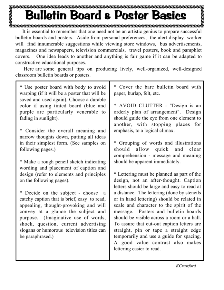
Bulletin Board & Poster Basics It is essential to remember that one need not be an artistic genius to prepare successful bulletin boards and posters. Aside from personal preferences, the alert display worker will find innumerable suggestions while viewing store windows, bus advertisements, magazines and newspapers, television commercials, travel posters, book and pamphlet covers. One idea leads to another and anything is fair game if it can be adapted to constructive educational purposes. Here are some general tips on producing lively, well-organized, well-designed classroom bulletin boards or posters. * Use poster board with body to avoid warping (if it will be a poster that will be saved and used again). Choose a durable color if using tinted board (blue and purple are particularly venerable to fading in sunlight). * Consider the overall meaning and narrow thoughts down, putting all ideas in their simplest form. (See samples on following pages.) * Make a rough pencil sketch indicating wording and placement of caption and design (refer to elements and principles on the following pages). * Decide on the subject - choose a catchy caption that is brief, easy to read, appealing, thought-provoking and will convey at a glance the subject and purpose. (Imaginative use of words, shock, question, current advertising slogans or humorous television titles can be paraphrased.) * Cover the bare bulletin board with paper, burlap, felt, etc. * AVOID CLUTTER - "Design is an orderly plan of arrangement". Design should guide the eye from one element to another, with stopping places for emphasis, to a logical climax. * Grouping of words and illustrations should allow quick and clear comprehension - message and meaning should be apparent immediately. * Lettering must be planned as part of the design, not an after-thought. Caption letters should be large and easy to read at a distance. The lettering (done by stencils or in hand lettering) should be related in scale and character to the spirit of the message. Posters and bulletin boards should be visible across a room or a hall. To assure that cut-out caption letters are straight, pin or tape a straight edge temporarily and use a guide for spacing. A good value contrast also makes lettering easier to read. KCrawford TEXTURE: ...visual shock by contrast of surfaces attracts attention; texture holds interest because the feel of things gives us pleasure; texture makes a good background (such as burlap or corrugated cardboard). SPACE: Background areas must receive careful attention and must, in themselves, constitute good shapes; all material shows to best advantage if surrounded by ample empty space; space is created by advancing and receding colors and by lights and darks. SIMPLICITY: Simplify shapes, lines, spaces and colors in order to present a readable display; "When in doubt, leave it out"; only a few selected colors should be used; do not decorate without reason; place informational captions in limited areas or units inside the area, not at the edges. UNITY: A dominance of similar shapes, lines and space will help to maintain unity; emphasize a basic line direction throughout the design. EMPHASIS: To focus attention on any important item, set is apart with isolating space, value contrast, color contrast, texture contrast...point out or encircle an important areas with a directional devise such as an arrow, line or string; project the illustration into space with a three-dimensional device like a box on which the material is mounted. KCrawford Elements And Principles To Guide You SKETCH A PLAN: LINE: Several quick sketches of the layout including background material, illustrations and lettering will save time. ...pulls the eye to specific areas; it suggests action, direction, and movement; it holds posters/bulletin boards together. SHAPE: Emphasis on large, bold, interesting shape; serves as a background for illustration and lettering; repeating a similar shape creates harmony; beware of too many strange shapes. COLOR: ...commands attention; no color works alone, it changes when placed next to other colors; some colors are traditionally symbolic, but try to invent new color schemes......... KCrawford ...light and dark color values carry to every seat in the room; patterns of color lead the eye from area to area creating movement; intense colors have visual impact. BALANCE: Informal balance creates more interest than does formal balance... BALANCE: Formal balance represents an equal distribution of visual weights which invites quick and final inspection and stresses dignity in the design; the diagonal plan should be avoided because it creates two awkward areas on either side of the diagonal axis and urges the eye to move quickly out of the display. Evaluate The Poster And Bulletin Board * Does it attract attention? How? * Have you applied the principle of simplicity, unity, balance and emphasis? * Is the message clear and communicative? * Do the illustrations, lettering and background harmonize? * Does it pass the test of good taste and attractiveness? * How can it be improved? RESOURCES: Randall and Haines, Bulletin boards and Display Coplan Poster Ideas and Bulletin Board Techniques for Libraries and Schools Coplan and Rosenthal Guide to Better Bulletin Boards. KCrawford
