Graphic highlighting
advertisement
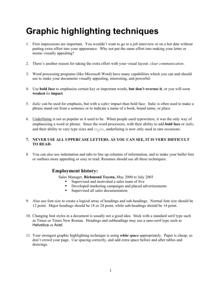
Graphic highlighting techniques 1. First impressions are important. You wouldn’t want to go to a job interview or on a hot date without putting extra effort into your appearance. Why not put the same effort into making your letter or memo visually appealing? 2. There’s another reason for taking the extra effort with your visual layout: clear communication. 3. Word processing programs (like Microsoft Word) have many capabilities which you can and should use to make your documents visually appealing, interesting, and powerful: 4. Use bold face to emphasize certain key or important words, but don’t overuse it, or you will soon weaken its impact. 5. Italic can be used for emphasis, but with a softer impact than bold face. Italic is often used to make a phrase stand out from a sentence or to indicate a name of a book, brand name, or place. 6. Underlining is not as popular as it used to be. When people used typewriters, it was the only way of emphasizing a word or phrase. Since the word processors, with their ability to add bold face or italic, and their ability to vary type sizes and styles, underlining is now only used in rare occasions. 7. NEVER USE ALL UPPERCASE LETTERS. AS YOU CAN SEE, IT IS VERY DIFFICULT TO READ. 8. You can also use indentation and tabs to line up columns of information, and to make your bullet lists or outlines more appealing or easy to read. Resumes should use all these techniques: Employment history: Sales Manager, Richmond Toyota, May 2000 to July 2003 Supervised and motivated a sales team of five Developed marketing campaigns and placed advertisements Supervised all sales documentation 9. Also use font size to create a logical array of headings and sub-headings. Normal font size should be 12 point. Major headings should be 18 or 24 point, while sub-headings should be 14 point. 10. Changing font styles in a document is usually not a good idea. Stick with a standard serif type such as Times or Times New Roman. Headings and subheadings may use a sans-serif type such as Helvetica or Ariel. 11. Your strongest graphic highlighting technique is using white space appropriately. Paper is cheap, so don’t crowd your page. Use spacing correctly, and add extra space before and after tables and drawings. 1 Bullet lists and paragraphs (Adapted from Mary Munter (2000). Guide to Managerial Communication, Fifth Edition. Upper Saddle River, NJ: Prentice Hall.) Busy readers don't like long paragraphs. They prefer to get their information in "bite sized" bits. An ideal paragraph in a business document should be no more than four or five lines long -- that means lines, not sentences. If your printed copy contains paragraphs longer than five lines, your readers may me tempted to skim over the text too quickly and miss your idea. Normally a paragraph should be like a "mini-essay" with a central idea (thesis), followed by an explanation and support -- in the form of examples or evidence. Normally you should have only one idea per paragraph. But what if your idea is complex, and demands a lot of explanation? A solution is to use some kind of bullet list or numbered list to organize the information. Bad example: Remember we discussed the upcoming training seminar and you agreed to take care of the arrangements. Please be sure to reserve the room for the training seminar at least two weeks in advance. The seminar is on December 1, so that means the room must be reserved by November 15. I'm worried about getting the facilitator confirmed by then. We also need to print up posters announcing the session. Will you take care of these arrangements? Don't forget that the poster should include the room number, too. Good example: Please make the three arrangements you agreed to handle for the upcoming training seminar: 1. Line up the facilitator and set the seminar date. 2. Reserve the room by November 15. 3. Print up the posters (including the room number) by December 1. When do you use numbers, and when do you use bullets? Lists can begin with numbers or bullet points (dots, asterisks, or hyphens). Use bullet points if the list is not in order of importance or in time sequence. Use numbers if the list implies a time sequence, if the list is in order of importance, or if you will need to refer to items by number. 2 Parallelism All headings and subheadings at the same hierarchical level should be parallel. What does this mean? One kind of parallelism is grammatical. Use the same grammatical construction for ideas of equal importance. For example, the first word in each heading could be an active verb -- an -ing verb, a pronoun, or whatever -- but it must be consistent with the other words in the series. Bad example: Steps to organize internally: 1. Establishing formal sales organization. 2. Production department: responsibilities defined. 3. Improve cost-accounting system. Good example: Steps to organize internally: 1. Establish formal sales organization. 2. Define responsibilities within the production department. 3. Improve cost-accounting system. Headings must be not only grammatically parallel, but also conceptually parallel -- that is, each heading should be the same kind of item. Bad example: Cost-effective optimization: - What are the options? - What are the problems with testing? - What is Finite Element Analysis (FEA)? - What are the benefits of FEA? Good example: Cost-effective optimization: - Option 1: Testing - Option 2: Finite Element Analysis (FEA)? Just like anything else, bullet lists can be overused. Sometimes an idea is better expressed in a paragraph -- even if it is a very long paragraph. The challenge of business writing is to decide on the best possible way to express your idea and to present your information to a busy reader. 3
