Open House 2 Summary
advertisement
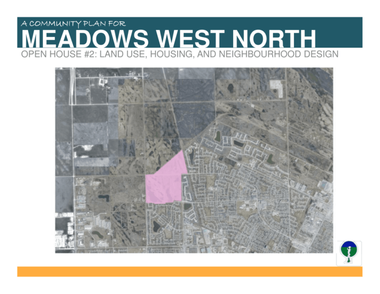
A COMMUNITY PLAN FOR MEADOWS WEST NORTH OPEN HOUSE #2: LAND USE, HOUSING, AND NEIGHBOURHOOD DESIGN WELCOME PRESENTATION OUTLINE 1. Review of Community Preferences 2. Proposed Land Use 3. Neighbourhood Design 4. Next Steps 1 - REVIEW OF COMMUNITY PREFERENCES The quality of our neighbourhoods are defined by our open spaces, our streets, our housing types and mix of land uses. We showed you 30 slides for the following categories: 1. Single family Character 2. Town House/Multi-family Character 3. Neighbourhood Commercial Character 4. Neighbourhood Street Character 5. Recreation and Open Space -2 -1 0 DIDN’T LIKE +1 +2 LIKED 1 - REVIEW OF COMMUNITY PREFERENCES SINGLE FAMILY CHARACTER – WHAT YOU LIKED • Housing with unique architectural features +55 +41 • Housing which incorporates a mix of styles • Housing served by both front driveways and rear lanes +31 +21 +17 1 - REVIEW OF COMMUNITY PREFERENCES SINGLE FAMILY CHARACTER – WHAT YOU DIDN’T LIKE • Monotonous and repetitive house design • Garages that dominate the landscape • Un-imaginative landscaping design -13 1 - REVIEW OF COMMUNITY PREFERENCES TOWN HOUSE/MULTI-FAMILY CHARACTER – WHAT YOU LIKED • Unique architectural features (differing roof lines and projections) +64 +47 • Multi-family that is pedestrian focused and walkable • Variety of ‘look’ and ‘feel’ +20 • Multi-family that fits with neighbourhood singlefamily residential character 1 - REVIEW OF COMMUNITY PREFERENCES TOWN HOUSE/MULTI-FAMILY CHARACTER – WHAT YOU DIDN’T LIKE • Uniformity -73 • Design dominated by surface parking lots • Repetitive visual character • Large box scale -45 • Green spaces that are not functional -38 1 - REVIEW OF COMMUNITY PREFERENCES NEIGHBOURHOOD COMMERCIAL CHARACTER – WHAT YOU LIKED • Strong pedestrian focused environment +89 +36 • Incorporate aesthetics into streetscape including planting, lighting and architectural details • Signage designed for the pedestrian scale +21 • Building setback designed to create an intimate relationship with sidewalk and the street 1 - REVIEW OF COMMUNITY PREFERENCES NEIGHBOURHOOD COMMERCIAL CHARACTER – WHAT YOU DIDN’T LIKE • Poor pedestrian environment (cars and parking lots rule) • Buildings set back from the street with no pedestrian connections -50 • Poor visual character (‘strip mall’ commercial buildings) • Little or no green space -4 • Signage is car orientated 1 - REVIEW OF COMMUNITY PREFERENCES NEIGHBOURHOOD STREET CHARACTER – WHAT YOU LIKED • Focused on landscape and pedestrian amenities +51 +14 • Walkable environment +24 +8 • Building setbacks designed to create an aesthetically pleasing relationship between buildings, sidewalks and the streets • High quality fencing +7 1 - REVIEW OF COMMUNITY PREFERENCES NEIGHBOURHOOD STREET CHARACTER – WHAT YOU DIDN’T LIKE • Poor visual character • Spaces that are not designed for people -49 • Inconsistent design standards for streetscape fencing 1 - REVIEW OF COMMUNITY PREFERENCES RECREATION & OPEN SPACE – WHAT YOU LIKED • Green spaces that incorporate trail systems +86 +108 • High quality functional landscape with contemplative spaces • Retention ponds that incorporate naturalized shoreline plantings +60 +50 • Places that provide a variety of recreation opportunities • Play spaces for children +45 1 - REVIEW OF COMMUNITY PREFERENCES RECREATION & OPEN SPACE – WHAT YOU DIDN’T LIKE • Green spaces that do not provide for recreation activities beyond walkways • Green spaces that are not pedestrian in scale -64 1 - REVIEW OF COMMUNITY PREFERENCES REVIEW OF POSTER BOARDS – NORTH BOUNDARY Include multi-family condominiums on north side of Jefferson Avenue. • Provide for seniors housing . Jefferson Ave. Dr. Jose Rizal Way • 1 - REVIEW OF COMMUNITY PREFERENCES REVIEW OF POSTER BOARDS – EAST BOUNDARY Concern about traffic on Keewatin (its only 2 lanes) • Keewatin should be a four lane divided median roadway • Keewatin should be extended to meet with Jefferson Avenue and Chief Peguis Trail • Traffic lights should be placed at major intersections along Keewatin • Keewatin frontage would be a good location for smaller houses and townhouses Jefferson Ave. Dr. Jose Rizal Way • 1 - REVIEW OF COMMUNITY PREFERENCES REVIEW OF POSTER BOARDS – SOUTH BOUNDARY Residential traffic from new development are should be discouraged from infiltrating into Meadows West neighbourhood streets. Connections to Stillmeadow Cove, Meadowland Dr. and Garton Ave need to consider neighbourhood traffic impacts. • Incorporate recreational spaces behind Marianne Rd. and preserve the trees planted by local residents. • Inter-connect the neighbourhoods through sidewalks to encourage walking and biking instead of car use. • Do not connect Adsum Dr. west through the new development to the Industrial Area because it might invite truck traffic from the industrial area onto King Edward and into our residential streets. Jefferson Ave. Dr. Jose Rizal Way • * ** Marianne Rd 1 - REVIEW OF COMMUNITY PREFERENCES REVIEW OF POSTER BOARDS – WEST BOUNDARY • Place commercial land uses on western side of King Edward Street as well as schools, community centre, fire and police services to buffer industrial uses • Transform King Edward into a four lane roadway and do not allow truck traffic • Incorporate a bike path along King Edward Street north to Jefferson Avenue to connect to the future Chief Peguis Trail bikeways • Keep King Edward Street residential in character. No truck traffic. Dr. Jose Rizal Way Jefferson Ave. 2 - PROPOSED LAND USES NEIGHBOURHOOD CONCEPT PLAN Single family homes Townhouses Multi-family Neighbourhood Commercial Dr. Jose Rizal Way Jefferson Ave. 2 - PROPOSED LAND USES PARKS, GREEN SPACES AND RECREATION Retention pond is naturalized and incorporates a pathway system to interconnect the neighbourhoods Jefferson Ave. Dr. Jose Rizal Way Green Space to provide a variety of different options for passive and active recreation play spaces 2 - PROPOSED LAND USES CIRCULATION & CONNECTIVITY Safe and efficient road network The planned internal “loop” street system makes it easy to get around and provides connectivity within the neighbourhood and to collector streets connecting to the city at large Jefferson Ave. A roundabout at Jefferson Avenue and Dr. Jose Rizal Way proposed as a safe and efficient traffic control and community “entry” feature that creates a sense of place and arrival Arterial Street Collector Street Dr. Jose Rizal Way Roundabout 2 - PROPOSED LAND USES NEIGHBOURHOOD COMMERCIAL CENTRE Pedestrian focused environment • • • Sidewalks Human scale lighting and signage Patios and seating areas View Corridor/Neighbourhood Connectivity Greenspace “view corridor” from the intersection of Adsum and Keewatin through the village commercial centre to the “Street Promenade” park entrance and lake Types of uses • • • • Restaurants/coffee shops Health services Grocery/ Retail shops Personal services Dr. Jose Rizal Way • Adsum Dr. 2 - PROPOSED LAND USES PROPOSED MEADOWS WEST NORTH CONCEPT PLAN Housing Provides a variety of housing options that meets life cycle housing needs and responds to demographic trends in the community (i.e. young families and seniors) Neighbourhood Commercial Provides a neighbourhood commercial centre that is easily accessible by foot, meets local commercial needs, and creates a community gathering space Green Space Network Meets the passive and active recreational needs of residents in a linked pathway network that creates a unique sense of place and defines the quality character of the community to residents and visitors Connectivity and Circulation Creates an efficient roadway network that takes into account choice of mobility accessibility to bus routes and that provides quality spaces for pedestrians 3 - NEIGHBOURHOOD DESIGN PUBLIC REALM THAT PLACES PEOPLE FIRST 1 - Public Realm that Places People First: THIS Designing for people means communities and neighbourhoods need to consideration how people experience space. This will include, but not be limited to the following: 1. Having sidewalks on collector streets to provide a comfortable and safe pedestrian environment and improve connectivity; 2. Having green spaces that connect people within the neighbourhood and to the broader community; 3. Having public realm elements (e.g. lighting, street furniture, public art, and plantings) that are pedestrian in scale, contribute to an inviting environment and add visual quality of the streetscape . NOT THIS 3 - NEIGHBOURHOOD DESIGN ACTIVE FRONTAGES THIS 2 - Active Frontages: Commercial buildings have the ability to enliven and positively contribute to the public realm. By facing the street they create pedestrian sensitive environment. To promote active frontages, buildings, should where possible, include the following: 1. Main entrances and extensive window treatment fronting the streetscape/walkways; 2. Eliminate blank walls or tall non-transparent fencing and buildings that ‘back onto the street’; 3. Provide facades that articulate (e.g. bays, porches, etc.); and 4. Provide plazas, patios and other public seating areas. NOT THIS 3 - NEIGHBOURHOOD DESIGN GATEWAYS AND VIEW CORRIDORS THIS 3 - Gateways and View Corridors: • incorporate gateways and view corridors where possible • celebrate the unique character of the neighbourhood, • foster a sense of place, and • create a sense of ‘arrival’ when entering the community at a major gateway (i.e. Adsum at Dr. Jose Rizal Way and Jefferson Avenue at Dr. Jose Rizal Way). NOT THIS 3 - NEIGHBOURHOOD DESIGN PEDESTRIAN & CYCLIST CONNECTIONS THIS 4 - Pedestrian and cyclist connections: • Bus stops will be located at natural pedestrian “hot spots” or nodes. • Pedestrian crossings will be located at strategic locations which connect to public spaces and key thoroughfares. • Cyclists will be separated from vehicle traffic where possible to create a safe environment. NOT THIS 3 - NEIGHBOURHOOD DESIGN SUSTAINABLE LANDSCAPES THIS 5- Sustainable Landscapes: The green space network designed to: • promote a sustainable relationship between human activity and the landscape; • biodiversity ; and • incorporate the use native plant species to reduce maintenance costs. NOT THIS 3 - NEIGHBOURHOOD DESIGN QUALITY ARTERIAL STREETS THIS 6 - Quality Arterial Streets: Keewatin/Dr. Jose Rizal Way to be designed as four lane arterials to move traffic efficiently while also providing comfortable spaces for people and bikes. Create “people streets” where residents are encouraged to walk, bike and take the bus in a comfortable environment. NOT THIS 3 - NEIGHBOURHOOD DESIGN DR. JOSE RIZAL WAY BIKE/PEDESTRIAN PATHWAY 3 - NEIGHBOURHOOD DESIGN QUALITY ARTERIAL STREETS Wider back lanes to allow off-lane parking within private driveways Walking/Biking lane 4 lane roadway with divided median Keewatin/Dr. Jose Rizal Way 3 - NEIGHBOURHOOD DESIGN WIDER BACK LANE Keewatin/Dr. Jose Rizal Way 3 - NEIGHBOURHOOD DESIGN LANE LOTS ATTACHED GARAGE DETACHED GARAGE House width Lot width 30ft 40ft House width Lot width 30ft 40ft Front yard 15ft Front yard 15ft House depth 40ft House depth with garage 53ft Backyard 14.5ft Garage depth 20ft Driveway 10ft Driveway 32ft Lane ROW Lane ROW 40ft 40ft NEXT STEPS • Complete Precinct policy plan for Community Committee approval (March 2012) • Based upon community input refine the plan of subdivision and rezoning proposal • Review refined plan at public open house #3 – Final Plan (March 2012) • Projected subdivision and rezoning hearing (April 10th, 2012) – LSWK Community Committee • Start of Construction – Fall 2012 • First home construction – Summer 2013 NEXT STEPS QUESTIONS OR COMMENTS? CONTACT INFORMATION DAVE PALUBESKI, PROJECT PLANNER MEADOWS WEST NORTH C/o Lombard North Group Ltd Planners and Landscape Architects 505-93 Lombard Avenue Winnipeg MB R3B 3B1 Email – dave@lombardnorth.com Phone – (204) 943-3896 DOWNLOAD PRESENTATION, POST & VIEW COMMENTS ON FACEBOOK: SEARCH MEADOWS WEST NORTH
