Landmark This! - Chicago Reader
advertisement
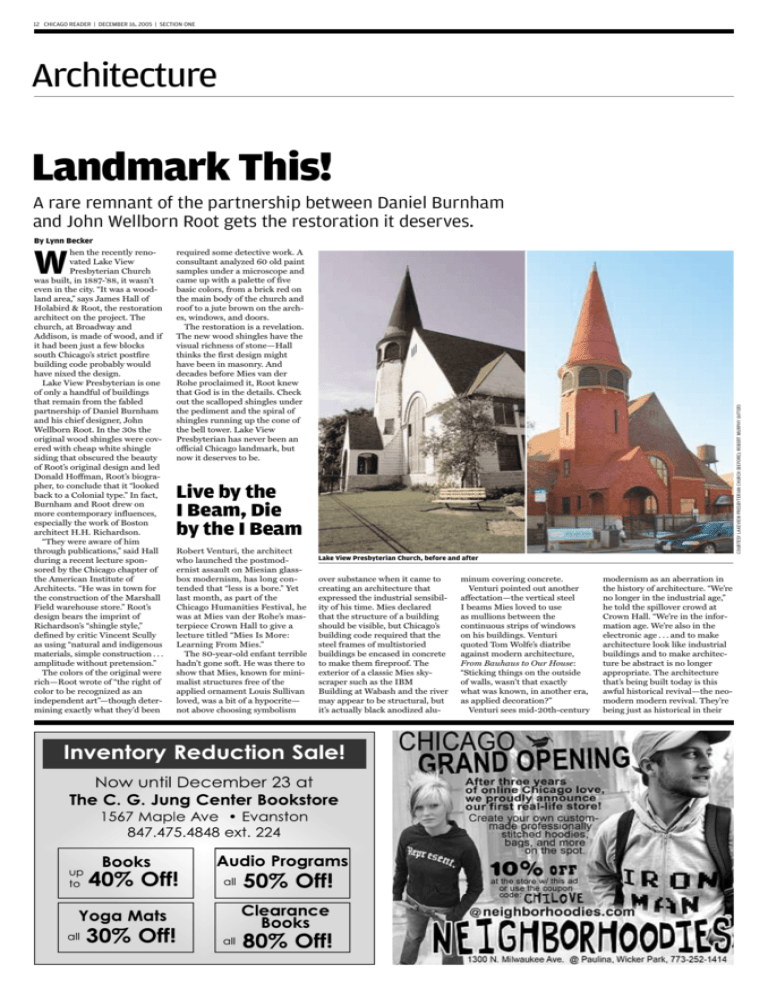
12 CHICAGO READER | DECEMBER 16, 2005 | SECTION ONE Architecture Landmark This! A rare remnant of the partnership between Daniel Burnham and John Wellborn Root gets the restoration it deserves. By Lynn Becker required some detective work. A consultant analyzed 60 old paint samples under a microscope and came up with a palette of five basic colors, from a brick red on the main body of the church and roof to a jute brown on the arches, windows, and doors. The restoration is a revelation. The new wood shingles have the visual richness of stone—Hall thinks the first design might have been in masonry. And decades before Mies van der Rohe proclaimed it, Root knew that God is in the details. Check out the scalloped shingles under the pediment and the spiral of shingles running up the cone of the bell tower. Lake View Presbyterian has never been an official Chicago landmark, but now it deserves to be. COURTESY LAKEVIEW PRESBYTERIAN CHURCH (BEFORE); ROBERT MURPHY (AFTER) W hen the recently renovated Lake View Presbyterian Church was built, in 1887-’88, it wasn’t even in the city. “It was a woodland area,” says James Hall of Holabird & Root, the restoration architect on the project. The church, at Broadway and Addison, is made of wood, and if it had been just a few blocks south Chicago’s strict postfire building code probably would have nixed the design. Lake View Presbyterian is one of only a handful of buildings that remain from the fabled partnership of Daniel Burnham and his chief designer, John Wellborn Root. In the 30s the original wood shingles were covered with cheap white shingle siding that obscured the beauty of Root’s original design and led Donald Hoffman, Root’s biographer, to conclude that it “looked back to a Colonial type.” In fact, Burnham and Root drew on more contemporary influences, especially the work of Boston architect H.H. Richardson. “They were aware of him through publications,” said Hall during a recent lecture sponsored by the Chicago chapter of the American Institute of Architects. “He was in town for the construction of the Marshall Field warehouse store.” Root’s design bears the imprint of Richardson’s “shingle style,” defined by critic Vincent Scully as using “natural and indigenous materials, simple construction . . . amplitude without pretension.” The colors of the original were rich—Root wrote of “the right of color to be recognized as an independent art”—though determining exactly what they’d been Live by the I Beam, Die by the I Beam Robert Venturi, the architect who launched the postmodernist assault on Miesian glassbox modernism, has long contended that “less is a bore.” Yet last month, as part of the Chicago Humanities Festival, he was at Mies van der Rohe’s masterpiece Crown Hall to give a lecture titled “Mies Is More: Learning From Mies.” The 80-year-old enfant terrible hadn’t gone soft. He was there to show that Mies, known for minimalist structures free of the applied ornament Louis Sullivan loved, was a bit of a hypocrite— not above choosing symbolism Lake View Presbyterian Church, before and after over substance when it came to creating an architecture that expressed the industrial sensibility of his time. Mies declared that the structure of a building should be visible, but Chicago’s building code required that the steel frames of multistoried buildings be encased in concrete to make them fireproof. The exterior of a classic Mies skyscraper such as the IBM Building at Wabash and the river may appear to be structural, but it’s actually black anodized alu- minum covering concrete. Venturi pointed out another affectation—the vertical steel I beams Mies loved to use as mullions between the continuous strips of windows on his buildings. Venturi quoted Tom Wolfe’s diatribe against modern architecture, From Bauhaus to Our House: “Sticking things on the outside of walls, wasn’t that exactly what was known, in another era, as applied decoration?” Venturi sees mid-20th-century modernism as an aberration in the history of architecture. “We’re no longer in the industrial age,” he told the spillover crowd at Crown Hall. “We’re in the information age. We’re also in the electronic age . . . and to make architecture look like industrial buildings and to make architecture be abstract is no longer appropriate. The architecture that’s being built today is this awful historical revival—the neomodern modern revival. They’re being just as historical in their CHICAGO READER | DECEMBER 16, 2005 | SECTION ONE 13 Draw Me a Picture “We have a wonderful history of dreaming in the field of architecture,” said Chicago Architecture Foundation curator Ned Cramer at the Graham Foundation last month. “In Chicago specifically I don’t know a single person who hasn’t been emotionally captivat- RICH HARKIN/IIT revival as they would be if they were reviving Renaissance architecture or Gothic architecture.” Venturi, who’s championed the idea of buildings as “decorated sheds,” said Frank Gehry’s Pritzker Pavilion in Millennium Park was carrying on “the idea of the great American loft tradition. His buildings . . . are essentially a loft with applied ornament, which are these potato chips”—a reference to the billowing metallic forms around the stage. “So I feel at home when you acknowledge that his architecture is not only the potato chips, but the potato chips applied to a loft. And Frank was more than happy when I said that.” Robert Venturi at IIT ed by the visionary schemes of a Piranesi or the incredible Jules Guerin renderings for the Burnham plan.” Cramer is onto something. When we recall Burnham’s 1909 plan for Chicago we’re most likely to remember not its precepts but the stunning image of a massive new city hall soaring above a conflux of broad boulevards lined with neoclassical buildings. Yet in today’s technocratic age we set process over place. The 1909 plan’s latest heir, Metropolis 2020—produced by the Commercial Club of Chicago, the same outfit that commissioned Burnham’s plan— doesn’t have a single illustration in its 120-page report. Cramer was speaking as part of a panel convened to mark the opening of a new exhibit at the Graham Foundation, “Visionary Chicago Architecture,” which can be seen as an effort to rescue the future from the academics and the bureaucrats. Chicago’s architectural godfather Stanley Tigerman put together a team of 14 local architects to create a pair of proposals for each of seven urban gateways, seven team members representing the older generation, seven the younger. Without exception, the proposals are intriguing, often stunning, and they’re spectacularly rendered. They include John Ronan’s striking proposal (which I described in the June 10 Reader) to transform the old post office that straddles the Eisenhower into a municipal mausoleum; Carol Ross Barney’s idea to dematerialize the Loop el tracks by moving stations out of intersections so they don’t block the long view down the cross streets, making the platforms translucent, and putting gardens above the tracks; Helmut Jahn’s 500-foot “sail tower” on Northerly Island, which would house a restaurant, cafe, and museum and would rotate in the wind; and Dirk Lohan’s boat basin and 100-story parkinggarage tower in Chinatown. This past summer the designs were exhibited on a sun-blasted terrace behind the Harris Theater with no signs pointing to them, and few people knew they were there. They can now be seen at Midway Airport— though you’ll have to leave town because they’re past the security checkpoint—and in a cleanly designed, generously illustrated book also titled Visionary Chicago Architecture ($31.50 at Prairie Avenue Bookshop, 418 S. Wabash, and $35 at the Chicago Architecture Foundation, 224 S. Michigan). The exhibit at the Graham is in some ways the most interesting, because it shows how each concept evolved through its working drawings. “None of this stuff is in the book,” says Tigerman. Also on display are transcripts of the lively sessions in which the architects presented their work and had it critiqued by their colleagues. v
