CM
Color Methodologies | UCLA Extension | online
Alvalyn Lundgren, instructor | alvalynlundgren@gmail.com
Project 3: Value & Tonality
Differentiate between value and intensity modulations; recognize character qualities of tints, shades and tones.
The Problem
Create achromatic and chromatic value scales and a tonality scale.
The Process
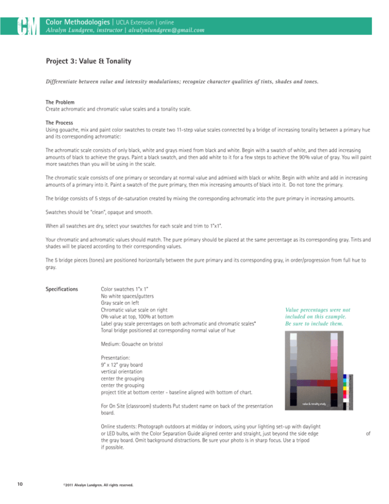
Using gouache, mix and paint color swatches to create two 11-step value scales connected by a bridge of increasing tonality between a primary hue
and its corresponding achromatic:
The achromatic scale consists of only black, white and grays mixed from black and white. Begin with a swatch of white, and then add increasing
amounts of black to achieve the grays. Paint a black swatch, and then add white to it for a few steps to achieve the 90% value of gray. You will paint
more swatches than you will be using in the scale.
The chromatic scale consists of one primary or secondary at normal value and admixed with black or white. Begin with white and add in increasing
amounts of a primary into it. Paint a swatch of the pure primary, then mix increasing amounts of black into it. Do not tone the primary.
The bridge consists of 5 steps of de-saturation created by mixing the corresponding achromatic into the pure primary in increasing amounts.
Swatches should be “clean”, opaque and smooth.
When all swatches are dry, select your swatches for each scale and trim to 1”x1”.
Your chromatic and achromatic values should match. The pure primary should be placed at the same percentage as its corresponding gray. Tints and
shades will be placed according to their corresponding values.
The 5 bridge pieces (tones) are positioned horizontally between the pure primary and its corresponding gray, in order/progression from full hue to
gray.
10
Specifications
Color swatches 1”x 1”
No white spaces/gutters
Gray scale on left
Chromatic value scale on right
0% value at top, 100% at bottom
Label gray scale percentages on both achromatic and chromatic scales*
Tonal bridge positioned at corresponding normal value of hue
Medium: Gouache on bristol
Presentation:
9” x 12” gray board
vertical orientation
center the grouping
center the grouping
project title at bottom center - baseline aligned with bottom of chart.
For On Site (classroom) students Put student name on back of the presentation
board.
Online students: Photograph outdoors at midday or indoors, using your lighting set-up with daylight or LED bulbs, with the Color Separation Guide aligned center and straight, just beyond the side edge the gray board. Omit background distractions. Be sure your photo is in sharp focus. Use a tripod
if possible.
©2011 Alvalyn Lundgren. All rights reserved.
Value percentages were not
included on this example.
Be sure to include them.
value & tonality study
of
