Good Graph Characteristics: Guidelines for Data Visualization
advertisement
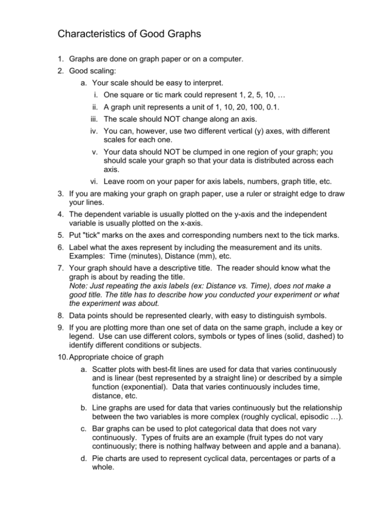
Characteristics of Good Graphs 1. Graphs are done on graph paper or on a computer. 2. Good scaling: a. Your scale should be easy to interpret. i. One square or tic mark could represent 1, 2, 5, 10, … ii. A graph unit represents a unit of 1, 10, 20, 100, 0.1. iii. The scale should NOT change along an axis. iv. You can, however, use two different vertical (y) axes, with different scales for each one. v. Your data should NOT be clumped in one region of your graph; you should scale your graph so that your data is distributed across each axis. vi. Leave room on your paper for axis labels, numbers, graph title, etc. 3. If you are making your graph on graph paper, use a ruler or straight edge to draw your lines. 4. The dependent variable is usually plotted on the y-axis and the independent variable is usually plotted on the x-axis. 5. Put "tick" marks on the axes and corresponding numbers next to the tick marks. 6. Label what the axes represent by including the measurement and its units. Examples: Time (minutes), Distance (mm), etc. 7. Your graph should have a descriptive title. The reader should know what the graph is about by reading the title. Note: Just repeating the axis labels (ex: Distance vs. Time), does not make a good title. The title has to describe how you conducted your experiment or what the experiment was about. 8. Data points should be represented clearly, with easy to distinguish symbols. 9. If you are plotting more than one set of data on the same graph, include a key or legend. Use can use different colors, symbols or types of lines (solid, dashed) to identify different conditions or subjects. 10. Appropriate choice of graph a. Scatter plots with best-fit lines are used for data that varies continuously and is linear (best represented by a straight line) or described by a simple function (exponential). Data that varies continuously includes time, distance, etc. b. Line graphs are used for data that varies continuously but the relationship between the two variables is more complex (roughly cyclical, episodic …). c. Bar graphs can be used to plot categorical data that does not vary continuously. Types of fruits are an example (fruit types do not vary continuously; there is nothing halfway between and apple and a banana). d. Pie charts are used to represent cyclical data, percentages or parts of a whole.
