Graphing WS
50
40
30
20
10
0
120
110
100
90
80
70
60
Environmental Science Graphing Activity
The ability to effectively communicate experimental results with others is critical to scientists. The public must be able to understand and follow the logic that leads to the conclusions of an experimenter, while fellow scientists must be able to replicate their experiments. Presenting data graphically allows the reader to view a considerable amount of data quickly and requires little mathematical expertise. The graphs included with experimental results are especially important when communicating with the public, as members of the general public may be less mathematically literate as members of the scientific community. This activity reviews the ingredients of a well-constructed scientific graph.
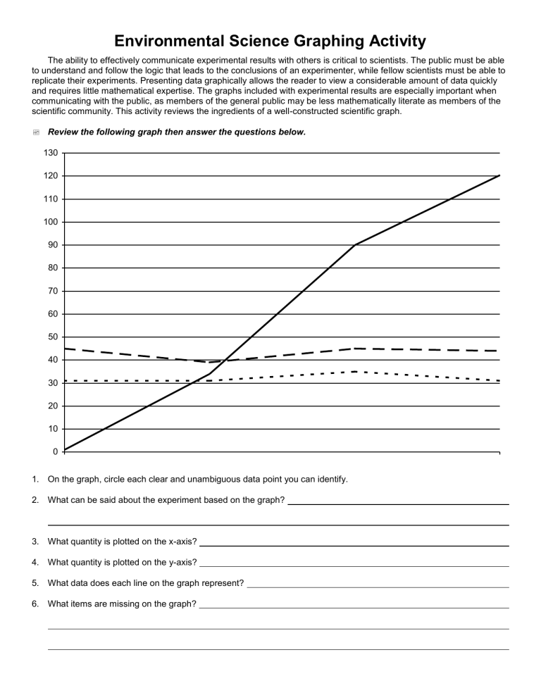
Review the following graph then answer the questions below.
130
1. On the graph, circle each clear and unambiguous data point you can identify.
2. What can be said about the experiment based on the graph?
3. What quantity is plotted on the x-axis?
4. What quantity is plotted on the y-axis?
5. What data does each line on the graph represent?
6. What items are missing on the graph?
Review the following graph then answer the questions below.
Figure 4: The Relationship between Distance (meters) and Time (seconds) for Three Cars
50
35
30
25
20
15
10
45
40
5
0
0 0.5
1 1.5
2
Ti me (s )
2.5
1. On the graph, circle each clear and unambiguous data point you can identify.
2. What can be said about the experiment based on the graph?
3. What quantity is plotted on the x-axis?
4. What quantity is plotted on the y-axis?
5. What data does each line on the graph represent?
6. What items are missing on the graph?
3 3.5
4 blue car green car red car blue car green car red car
4.5
