Tropicana-Line’s-Sales-Plunge-20
advertisement
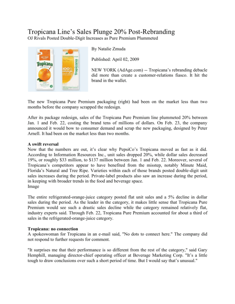
Tropicana Line’s Sales Plunge 20% Post-Rebranding OJ Rivals Posted Double-Digit Increases as Pure Premium Plummeted By Natalie Zmuda Published: April 02, 2009 NEW YORK (AdAge.com) -- Tropicana’s rebranding debacle did more than create a customer-relations fiasco. It hit the brand in the wallet. The new Tropicana Pure Premium packaging (right) had been on the market less than two months before the company scrapped the redesign. After its package redesign, sales of the Tropicana Pure Premium line plummeted 20% between Jan. 1 and Feb. 22, costing the brand tens of millions of dollars. On Feb. 23, the company announced it would bow to consumer demand and scrap the new packaging, designed by Peter Arnell. It had been on the market less than two months. A swift reversal Now that the numbers are out, it’s clear why PepsiCo’s Tropicana moved as fast as it did. According to Information Resources Inc., unit sales dropped 20%, while dollar sales decreased 19%, or roughly $33 million, to $137 million between Jan. 1 and Feb. 22. Moreover, several of Tropicana’s competitors appear to have benefited from the misstep, notably Minute Maid, Florida’s Natural and Tree Ripe. Varieties within each of those brands posted double-digit unit sales increases during the period. Private-label products also saw an increase during the period, in keeping with broader trends in the food and beverage space. Image The entire refrigerated-orange-juice category posted flat unit sales and a 5% decline in dollar sales during the period. As the leader in the category, it makes little sense that Tropicana Pure Premium would see such a drastic sales decline while the category remained relatively flat, industry experts said. Through Feb. 22, Tropicana Pure Premium accounted for about a third of sales in the refrigerated-orange-juice category. Tropicana: no connection A spokeswoman for Tropicana in an e-mail said, "No dots to connect here." The company did not respond to further requests for comment. "It surprises me that their performance is so different from the rest of the category," said Gary Hemphill, managing director-chief operating officer at Beverage Marketing Corp. "It’s a little tough to draw conclusions over such a short period of time. But I would say that’s unusual." Mr. Hemphill said typically when a beverage brand undergoes a rebranding it signals increased marketing expenditures and leads to improved performance, at least in the short term. "It gets people to look at the brand again and brings some kind of news and excitement around the brand," he added. Tropicana had certainly sought to create excitement around the Pure Premium rebrand, announcing Jan. 8 a "historic integrated-marketing and advertising campaign ... designed to reinforce the brand and product attributes, rejuvenate the category and help consumers rediscover the health benefits they get from drinking America’s iconic orange-juice brand." ‘Black eye’ Beverage experts were hard pressed to think of another major brand that had pulled the plug on such a sweeping redesign as swiftly as Tropicana. "It’s a black eye when you have to backtrack that quickly," said Bob Goldin, exec VP at Technomic. "There must be [another example] but nothing comes to mind. [Tropicana] is a big brand, and it was a big restage. This is something that I’m sure they were not happy about." While it’s impossible to say whether Tropicana has permanently lost share, as a result of the blunder, competitors are likely taking note. "We think the Minute Maid brand has opportunity for growth, and we’re working hard to make that happen," said Ray Crockett, a Coca-Cola spokesman. 5 Comments Subscribe to comments on: Tropicana Line’s Sales Plunge 20% Post-Rebranding By davebarnes | Denver, CO April 2, 2009 07:17:27 pm: I could tell that sales of Tropicana were tanking. My local King Soopers (Kroger) has Tropicana for $2.39 a 1/2 gallon. That is below Minute Maid’s price. The new design was a total cock-up. As someone who always appreciated the fact that Tropicana always tasted better than its competition and that it created this entire category of juices, I just expect Tropicana to be higher priced. This low price is shocking to me. But, Pepsico deserves it. By nathalieNY | New York, NY April 2, 2009 06:33:14 pm: I had a feeling that was the case. Here is a piece I wrote on March 15th for http://jathatsart.blogspot.com that I think delves into actually why the package design failed so miserably: "Tropicana had their agency do a re-design of the Tropicana packaging visual identity last year. Should we get excited about this new design? No, no we should not. Just because a design is new doesn’t necessarily make it good. That is the case for Tropicana’s new look. And this is why: • The biggest problem is that the Tropicana brand name on the front of the carton is reduced in size and becomes an equal or subordinate element in the design. The "100% orange" becomes the focal point due to its heavy weight, large scale, and centered location. • Ease of use was thrown out the window. Tropicana makes many types of OJ... pulp, no pulp, some pulp, calcium, heart healthy, etc. Therefore, they need to make sure the consumer can scan across the shelf and easily pick out their choice. "Pulp Free" is nearly hidden by being placed over a background of a similar colour orange. And moreover, why is that the only element that is capitalized in title case?? Everything else is lowercase. • Typeface. Yes, we know sans serif typefaces are all the rage -- they’re modern, clean and liked. Choosing a sans serif typeface just for the sake of having a sans serif is, however, not liked. There is no balance here; the various weights do not complement one another and, quite frankly, the bottom details look really cheap. • Also reinforcing this meretricious look is the way the layout resembles a generic store-brand juice. The carefree way the type is thrown together underscores this problem. • The glass of orange juice is all wrong. I do concede, the idea of using a close-up in an almost abstract way is okay. It could work. Just not here. The Tropicana brand is recognized for the iconic straw-in-orange icon. That image tells me quickly and easily that yes, this juice is damn fresh. An unimpressive glass of orange something (Tang?) is too direct and doesn’t even look very quenching. • The GOOD: the only salvageable element in this re-design is the nice touch of the leaves adjacent to the cap so as to resemble an orange. Cute." By Karlotto Winroth | Gothenburg April 2, 2009 05:42:14 pm: Tropicana in Sweden is currently running a campain featuring a really nice advergame done by the game company Muskedunder Interactive. http://www.tropicana.nu/smash/ Have fun! By William | East Rockaway, NY April 2, 2009 03:15:14 pm: When you’re the clear category leader, why would you mess with success? Pepsi’s tweaking of its cola logo was one thing; dumping its "straw-in-orange" brand icon, however, was truly another. Kind of like removing Tony The Tiger from Frosted Flakes packaging so you could feature a bowl of corn flakes in milk. I don’t get! I watched the Peter Arnell video where he defended and rationalized his agency’s approach to Tropicana and simply scratched my head. How could anyone at Pepsi buy into his logic with so much brand equity at stake? I’ll bet anyone a dollar that if you had an orange juice carton with nothing but the "straw-in-orange" graphic on it (no brand name), consumers would know it’s Tropicana. Talk about brand identity! Meanwhile, I wish the Ad Age editors and their reporting sources would stop throwing around branding words like rebrand and restage and like they were frisbies. THey are not the same. At best, and if it worked, this was a revitalization. There was no change in the brand name (a key core values issue), no intrinsic change to the product formulation (same juice and benefits), and no fundamental alteration or improvement to the delivery system (same carton, but now with pour spout offering consumers dubious marginal utility and added-value). Contemporizing an old establised brand for today’s changing times makes sense to me. Throwing the baby out with the bath doesn’t. bcranndallnyc@aol.com
