Lab 3, 1-14-09
advertisement
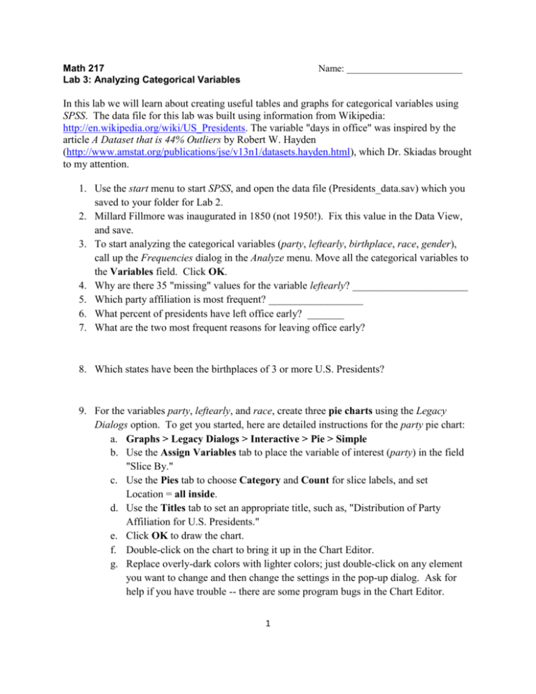
Math 217 Lab 3: Analyzing Categorical Variables Name: ________________________ In this lab we will learn about creating useful tables and graphs for categorical variables using SPSS. The data file for this lab was built using information from Wikipedia: http://en.wikipedia.org/wiki/US_Presidents. The variable "days in office" was inspired by the article A Dataset that is 44% Outliers by Robert W. Hayden (http://www.amstat.org/publications/jse/v13n1/datasets.hayden.html), which Dr. Skiadas brought to my attention. 1. Use the start menu to start SPSS, and open the data file (Presidents_data.sav) which you saved to your folder for Lab 2. 2. Millard Fillmore was inaugurated in 1850 (not 1950!). Fix this value in the Data View, and save. 3. To start analyzing the categorical variables (party, leftearly, birthplace, race, gender), call up the Frequencies dialog in the Analyze menu. Move all the categorical variables to the Variables field. Click OK. 4. Why are there 35 "missing" values for the variable leftearly? ______________________ 5. Which party affiliation is most frequent? __________________ 6. What percent of presidents have left office early? _______ 7. What are the two most frequent reasons for leaving office early? 8. Which states have been the birthplaces of 3 or more U.S. Presidents? 9. For the variables party, leftearly, and race, create three pie charts using the Legacy Dialogs option. To get you started, here are detailed instructions for the party pie chart: a. Graphs > Legacy Dialogs > Interactive > Pie > Simple b. Use the Assign Variables tab to place the variable of interest (party) in the field "Slice By." c. Use the Pies tab to choose Category and Count for slice labels, and set Location = all inside. d. Use the Titles tab to set an appropriate title, such as, "Distribution of Party Affiliation for U.S. Presidents." e. Click OK to draw the chart. f. Double-click on the chart to bring it up in the Chart Editor. g. Replace overly-dark colors with lighter colors; just double-click on any element you want to change and then change the settings in the pop-up dialog. Ask for help if you have trouble -- there are some program bugs in the Chart Editor. 1 h. Double-click on a slice label, and in the pop-up dialog, set minimum text size = 9, preferred text size = 9. i. To move slice labels (to make them easier to read), first double-click on a slice label, then try dragging the desired label to a new position. j. Remember to close the Chart Editor window after you've finished with it. k. Repeat the pie chart procedure for leftearly and race. (The birthplace variable has too many categories to make a reasonable pie chart, and the gender variable takes only one value so it looks very strange in a pie chart.) 10. For the variables party, birthplace, and gender, create three bar graphs using the Legacy Dialogs. To get you started, here are detailed instruction for the party bar graph: a. Graphs > Legacy Dialogs > Interactive > Bar b. Use the Assign Variables dialog, drag party to the horizontal axis. c. Use the Options tab to unselect "Exclude empty categories." Also choose "Order by counts" and "descending" (to make a Pareto chart). This puts the categories in descending order of frequency from left to right in the graph. DO THIS FOR EACH BAR GRAPH if SPSS doesn't save these settings. d. Use the Titles tab to create a title. e. Click OK to draw the graph. f. If any elements need improvement, double-click on the chart to bring it up in the Chart Editor. You may find some of the colors too drab -- change them! Don't use patterns, they just make the graph harder to look at. g. Repeat for birthplace and gender. 11. Draw a boxplot for days in office vs. race, using Chart Builder. a. Graphs > Chart Builder b. Click the Gallery tab and choose "Boxplot". Drag the icon for "Simple Boxplot" to the preview area. c. Drag the race variable to the horizontal axis, and the days in office variable to the vertical axis. d. Click the Titles/Footnotes tab and give your boxplot the title, "Days in Office vs. Race." Click OK to create the boxplot. e. Use the Chart Editor, as needed, to make an attractive graph. 12. SPSS shows boxplot outliers with an asterisk. a. How many outliers does SPSS identify for the days in office variable (minus Obama)? ________ b. How many outliers did you identify in the days in office variable in Lab 2, after drawing a histogram with narrow rectangles? ________ c. What is the better way to find outliers -- by using an automated procedure like 1.5*IQR, or by carefully examining the data and applying human judgment? 2 13. Use Chart Builder to draw a boxplot for year of inauguration vs. party affiliation. a. Be sure to give your boxplot an appropriate title. b. Notice that the default boxplot parameters make a stupid scale on the vertical axis. There is no reason to start the vertical axis from 0 in this case (year 0 is not a reasonable value for the year of inauguration variable). c. Call back the Chart Builder window and edit the properties of the vertical axis to create a reasonable vertical scale. Click OK to redraw the boxplot. d. Describe two important facts about the U.S. political parties which are made evident in this boxplot: i. ii. --------------------------------------------------------------------------------------------------------------------Save a copy of your SPSS output file to a folder with your name on it in My Documents. The output file should contain all the tables and graphs you generated in this lab. Name the file "Lab 3". Write the number of your computer here _________ . Turn in this handout, with written answers, by Monday 1/19/09 at the beginning of class. (Turn in now if you are finished.) 3
