MS Word - Environmental Science & Policy
advertisement
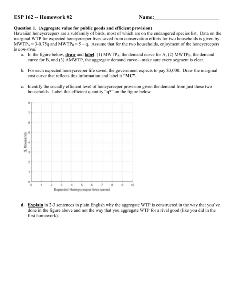
ESP 162 -- Homework #2 Name:________________________ Question 1. (Aggregate value for public goods and efficient provision) Hawaiian honeycreepers are a subfamily of birds, most of which are on the endangered species list. Data on the marginal WTP for expected honeycreeper lives saved from conservation efforts for two households is given by MWTPA = 3-0.75q and MWTPB = 5 – q. Assume that for the two households, enjoyment of the honeycreepers is non-rival. a. In the figure below, draw and label: (1) MWTPA, the demand curve for A, (2) MWTPB, the demand curve for B, and (3) AMWTP, the aggregate demand curve—make sure every segment is clear. b. For each expected honeycreeper life saved, the government expects to pay $3,000. Draw the marginal cost curve that reflects this information and label it “MC”. c. Identify the socially efficient level of honeycreeper provision given the demand from just these two households. Label this efficient quantity “q*” on the figure below. d. Explain in 2-3 sentences in plain English why the aggregate WTP is constructed in the way that you’ve done in the figure above and not the way that you aggregate WTP for a rival good (like you did in the first homework). Question 2. (Negative externality) In the figure below, the horizontal axis reflects the level of use of an open access resource. In the figure, draw the following elements: i. A demand curve that reflects a constant marginal benefit for each unit of use—label it “MB”. ii. A curve depicting marginal private costs of using the resource that are increasing as more units are used—label it “MPC”. iii. Suppose each additional unit of use imposes an equal (constant) additional amount of external cost. Draw a marginal social cost curve consistent with this assumption—label it “MSC”. iv. Identify and label in the figure: a. The socially efficient rate of output—label it “Q*”. i. The total external cost under the socially efficient rate of output—label it “A”. (Note: in class we characterized total external cost in a second separate figure—here the task is to figure out how to represent it in just one figure.) b. The predicted market rate of output—label it “Qp”. i. The additional total external cost under the market rate of output—label it “B”. [**Assume that the MB and MSC curves intersect at some point in your figure.] $ Quantity Question 3. (Discounting) Suppose that for an environmental pollution control program we expect the benefits will be $40/yr, for years 1 through an infinite horizon, the costs will be $500/year for year 1 and then $30/yr for years 2 through an infinite horizon. Using a discount rate of r = 5%: Showing your written work, demonstrate: o that the present value of the benefits is $800. o that the present value of the costs received in year 1 is $476.2. o that the present value of the costs received in years 2-infinity is $571.4 What is the present value of net benefits (PVNB)? [Practice only, do not turn in: Now, repeat the calculations using a discount rate of 2%. Before doing so, in what direction would you expect the PVNB to shift? Why?] Question 4. (Game Theory and Tragedy of the Commons). Two countries are considering their strategic choices with respect to managing a resource that affects both countries. The matrices below show their payoffs under two different scenarios. a. Identify the Nash Equilibrium (if it exists) in each payoff matrix—CIRCLE the payoffs in each quadrant that represents a Nash Equilibrium or write “NONE” next to the matrix if it doesn’t exist. b. Which matrix above depicts a set of payoffs for which the Nash Equilibrium would be consistent with the “Tragedy of the Commons” as discussed in class? Scenario: _________ c. Based on the payoff matrix you selected in part (b), explain why the outcome you circled is the predicted outcome (Nash Equilibrium) (3 sentences or less) Additional practice problems only, do not turn in: Question A. (Negative externality) In the figure below, the horizontal axis reflects the level of use of an open access resource. In the figure, draw the following elements: i. A demand curve that reflects a declining marginal benefit as use increases—label it “MB”. ii. A curve depicting a marginal private cost of using the resource that is constant as more units are used— label it “MPC”. Assume that the MB and MPC curves intersect at some quantity above zero. iii. Suppose each unit of use generates an external cost felt by other users. At first this externality is essentially zero but as use of the resource increases, the level of the externality generated by each additional unit of use increases. Draw a marginal social cost curve consistent with this description— label it “MSC”. iv. Identify and label in the figure: a. The socially efficient rate of output—label it “Q*”. i. The area representing the total external cost given the socially efficient rate of output— label it “TEC”. Draw any additional lines you need to specify the area. b. The predicted market rate of output—label it “Qp”. $ Quantity Question B. (Aggregate value for public goods and efficient provision) Below are portions of the demand curves of three households for the water quality in a nearby lake (a non-rival good). The water quality is expressed in terms of the parts per million (ppm) of dissolved oxygen (DO). Water quality improves at higher DO levels. [Adapted from Field and Field (2006) 4.3] [Note on interpreting table: if A’s MWTP at 1 ppm is $5/ppm that means A is willing to pay (at most) $5 to increase the DO level from 0 ppm to 1 ppm.] a. Show that the aggregate MWTP for these three households at DO = 1 is 21. Find the aggregate marginal WTP for these three people for the other levels of DO. You may either plot an aggregate MWTP curve (make sure the values and quantities are clear) or just write down the aggregated demand in table form. b. Suppose that the marginal cost of achieving better DO levels is $4 per unit (where a “unit” is 1 ppm) regardless of what the level of DO is. What is the level of DO in the lake that maximizes net benefits (i.e. the socially efficient level) assuming these three individuals are the only ones affected? Marginal WTP for levels of DO ($/ppm) 11 9 7 5 3 1 0 DO Level A B C 1 2 3 4 1 2 3 4 5 1 2 3 4 5 6 Question C. (Benefit-cost) Below are some illustrative numbers for benefits and costs arising from a program to restrict emissions of a pollutant. (Current emissions are 10 tons/month.) Create and fill in two new columns: “net benefits” and “benefit-cost ratio”. Identify the emission level at which net benefits would be maximized. Is this the same emission level that gives the highest benefit-cost ratio? If not, explain the discrepancy; specifically, if efficiency is our goal, why might focusing on the choice with the greatest benefit-cost ratio let us down? [Adapted from Field and Field (2006) 6.3] Emissions 10 9 8 7 6 5 4 3 2 1 0 Total Benefits ($ mil) Total Costs ($ mil) 0 4 8 18 32 44 54 62 68 72 74 0 2 4 6 9 14 21 36 48 64 86 Question D. (Uncertainty) Suppose that you must decide whether to invest in research to develop a new fertilizer that will decrease the amount nitrogen pollution in water runoff. The cost of research is known with certainty: it will cost $8 million to conduct the research. However, there is uncertainty concerning the potential benefits of the research. The benefits and probability of the three possible outcomes are given in the table below. Outcome Unsuccessful Somewhat Successful Very Successful Benefit ($ millions) 0 5 10 Probability 0.4 0.2 0.4 Calculate the expected net benefits (show your work) and state whether the policy is an efficient alternative to the status quo:
