Reflection Memo - Personal Web Pages
advertisement
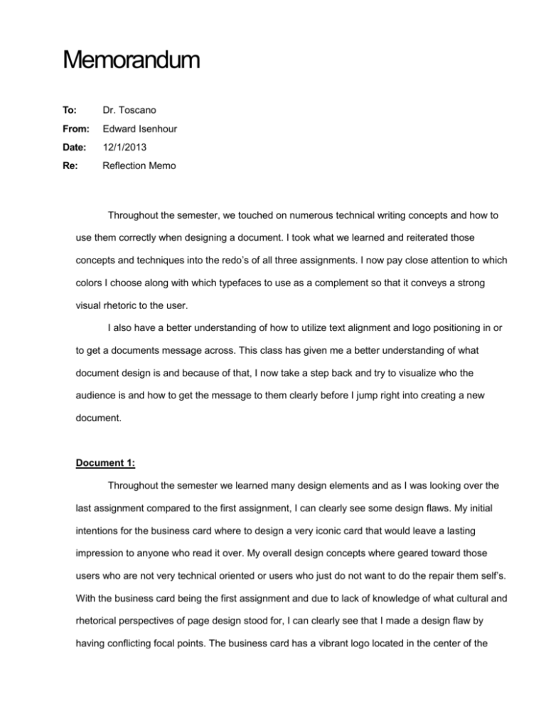
Memorandum To: Dr. Toscano From: Edward Isenhour Date: 12/1/2013 Re: Reflection Memo Throughout the semester, we touched on numerous technical writing concepts and how to use them correctly when designing a document. I took what we learned and reiterated those concepts and techniques into the redo’s of all three assignments. I now pay close attention to which colors I choose along with which typefaces to use as a complement so that it conveys a strong visual rhetoric to the user. I also have a better understanding of how to utilize text alignment and logo positioning in or to get a documents message across. This class has given me a better understanding of what document design is and because of that, I now take a step back and try to visualize who the audience is and how to get the message to them clearly before I jump right into creating a new document. Document 1: Throughout the semester we learned many design elements and as I was looking over the last assignment compared to the first assignment, I can clearly see some design flaws. My initial intentions for the business card where to design a very iconic card that would leave a lasting impression to anyone who read it over. My overall design concepts where geared toward those users who are not very technical oriented or users who just do not want to do the repair them self’s. With the business card being the first assignment and due to lack of knowledge of what cultural and rhetorical perspectives of page design stood for, I can clearly see that I made a design flaw by having conflicting focal points. The business card has a vibrant logo located in the center of the March 7, 2016 card and it also has a thick shaped computer monitor that surrounds the card, very similar to a border. The overall look and feel shows signs of an inexperienced designer who made questionable design choices. I was assuming that if I surrounded the logo and all the descriptive information using a computer monitor, it would give an ethos of creditability that would reflect highly on the type services the business card was offering. With the redesign of the business card, I focused more on the rhetorical perception of page design while still providing an ethos of creditability. To further establish the ethos, I added a backside to the business card that listed multiple technology services provided by such company. As I’m looking back at my original business card design, I noticed the color choices I choose as my focal point leave a lot of room for improvement. I didn’t have a clear understanding that the choices I make could either help or hurt the way the business card is perceived by the users. I didn’t take into account the rhetorical purpose of certain colors when designing the business card; I just chose two colors that I thought looked good. Now after weeks of visual rhetoric discussions, I now have a clear understanding of it as it pertains to choosing colors as a way to emphasis a product or service. As part of my redesigned, I looked at switching the main color of my logo from a deep red color to a calmer more trustworthy color such as blue. By initially having red as the main color, the business card could potentially giving off an overall an ethos of fright or danger which then would keep people away . If someone gets a vibe of danger there’s a high probability that they will stay away from it and that’s why I had to update the main logo color to blue. By changing the main logo color to blue, it helps present a deeper rhetorical feel of confidence and intelligence. By keeping the 2 March 7, 2016 ascent color orange, it provides that burst of bright color that is still needed to catch the reader’s eye. That little bit of eye catching color helps point the reader’s eye to the center of the card so they can see what the cards message is all about. Document 2: Ethos is represented greatly in this project by the various logos that are placed at the bottom of the flyer. The Microsoft certified and the CompTia logos give the organization creditability because of the extensive knowledge one must obtain in order to receive such certification. By having the “BBB” (Better Business Bureau) logo on the flyer, it further illustrates the creditability of services provided because individuals can go out to the BBB website and retrieve user reviews for services performed. By presenting that you’re a BBB Accredited Business, you live up to a set of business standards based on trust which prides itself on treating the public fairly and honestly in all circumstances. Not many people are part of the BBB and in order to maintain that creditability, you must continue to maintain the altitude that you will not deceive the user in any way. BBB accreditation is an honor and not every company is eligible so if in any way you try and deceive an individual, you could be excluded from the prestige’s club as well as receive negative reviews for your services provided. The overall design of this flyer is to inform the reader that I’m a Microsoft certified professional who owns a computer repair business. The initial concept of the logo was a way for me to establish a since of pathos with the reader. I designed a logo of a sick computer as way to appeal to the reader’s emotional side with the intent on leaving a lasting impression on them knowing that I fix these types of problems. Initially I thought my first logo design was great, but after taking a step back to visualize the audience, I figured I needed to upgrade the logo to a more modern day image. While searching the web, I found a more 20th century computer image that 3 March 7, 2016 gives of the same pathos appeal as the original image while still illustrating the message I’m trying to portray. As far as the two red textual statements that are above and below the logo, my intent was to visually emphasize that the services provided by this flyer are flexible as well as guaranteed. The initial design was to use a specific type face that stood out on the page and in this case I used chiller. During the reevaluation process, I noticed that the chiller type face originally used does not represent a clear ethos persuasion. In order for me to show credibility, I had to redo the text to a more persuasive typeface such as Sans Serif. The overall design of the flyer works well for the human vision, it’s designed in a way that it’s easy for the user to read and understand exactly what is being offered. The flyer displays a logo that conceptual fits with the services provided as well as the meaning behind the designing of the flyer. The supportive text is proportionally placed so that it’s also easy to read and redirects the user to the credibility trademarks of the flyer, the multiple computer certifications located at the bottom. In general, the flyer is designed in a way so that a user with any sort of computer related issues knows that our business handle such issues. Document #3 Ethos is represented in this project by the various logos that are placed on the back page of the brochure. These logos give the company creditability because of the extensive knowledge one must obtain in order to receive such certification. By having the “BBB” (better business Bureau) logo on the brochure, it further illustrates the creditability of services provided because individuals can go out to the BBB website and retrieve user reviews for services performed. By presenting that 4 March 7, 2016 you’re a BBB Accredited Business, you live up to a set of business standards based on trust which prides itself on treating the public fairly and honestly in all circumstances. The creation of the main logo on the front flap illustrates a since of pathos because by having a computer with a stethoscope draped over, it represent a sick computer in need of help. My intentions during the design of the logo was to draw in the reader by appealing to their emotions of feeling sorry for someone or something that is feel ill. I also used blue as the border throughout the document because the color blue emits a since of peace, trustworthy and stability. In the computer industry, you need your customer base to have complete trust in the service you provide in order to gain continuous business for them. In some data retrieval cases, you are trying to retrieve the individual’s confidential information and that trust needs to be established that you will not use the information found against them in any way. Not too many changes were done to the brochure to enhance the over appeal outside of finding and replacing the Microsoft Certified logos and altering the border. All the logos that I have used to establish creditability needed to be freshened up a little bit because during the formatting process they came out blurry. As for the border, the black accent line looked a little wavy so I just omitted it from the final copy and touched up the blue base in order to keep a much cleaner look and feel. This brochure was designed in a way that it conveys a visual message to the user that this is a brochure for a computer repair company. The brochure is designed for a company called ComputerMD and as way to add visual appeal, I added a computer with a stethoscope logo to the front panel. This particular logo design gives an pathos appeal because it symbolizes a sick computer, which appeals to an emotional response that the brochure is all about helping individuals in need. Throughout out the document, there are specifically placed logos that add a since of ethos 5 March 7, 2016 because they reiterate that the brochure is for a computer repair company that is certified and guarantees it works. As far as the perceptual elements goes, I represented each in a way that express the overall concept of the brochure. I established various instances of ethos by having credible logos placed throughout the brochure; each logo represents a specific service or a specific guarantee. I have all my supporting text in a list format and arranged it directly below the specific category it represents. Since this is a computer repair brochure I thought I would use a specific font called “Fixed sys” which means fixed system, because its glyphs are monospace or fixed-width. It is the oldest font in Windows, and was the system font in Windows 1.0 and 2.0, where it was simply named "System". This particular font gives off an ethos of creditability because it’s the very first instance of computer text used during the first computers. Conclusion: Honestly, I don’t think I contributed to my full potential and it showed according to the participation grade I received for half the semester. You gave me a 1 out of 8 and I clearly think I at least should have gotten a 4 out of 8, I talked a few times but not enough to warrant full credit. I participated on all the quizzes even though I didn’t do well on the first few; I stuck it out and continued to get better. I never missed a class, I always came prepared and ready to turn in assignments on time and completed. In my opium, I don’t deserve an A and a B might be pushing it a little bit but I definitely think I contributed and did well enough on all the assignments and exams to warrant a letter grade of C. 6
