Age structure Diagram
advertisement
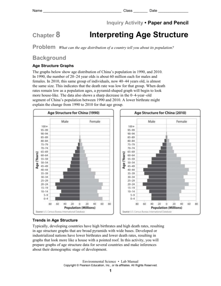
Name _______________________________________ Class _______ Date _______________ Inquiry Activity • Paper and Pencil Chapter 8 Problem Interpreting Age Structure What can the age distribution of a country tell you about its population? Background Age Structure Graphs The graphs below show age distribution of China’s population in 1990, and 2010. In 1990, the number of 20–24 year olds is about 60 million each for males and females. In 2010, this same group of individuals, now 40–44 years old, is almost the same size. This indicates that the death rate was low for that group. When death rates remain low as a population ages, a pyramid-shaped graph will begin to look more house-like. The data also shows a sharp decrease in the 0–4-year–old segment of China’s population between 1990 and 2010. A lower birthrate might explain the change from 1990 to 2010 for that age group. Trends in Age Structure Typically, developing countries have high birthrates and high death rates, resulting in age structure graphs that are broad pyramids with wide bases. Developed or industrialized nations have lower birthrates and lower death rates, resulting in graphs that look more like a house with a pointed roof. In this activity, you will prepare graphs of age structure data for several countries and make inferences about their demographic stage of development. Environmental Science • Lab Manual 1 Name _______________________________________ Class _______ Date _______________ Procedure Materials Computer with spreadsheet software, or blank graph paper Step 1 Prepare two graphs from the data below using spreadsheet software. (OPTION: If you are graphing by hand, use graph paper to create age structure diagrams from the data above. Use a calculator if necessary to help you round the numbers.) Population by Age and Sex for Japan in 2010 Population by Age and Sex for Haiti in 2010 Age Male Female Age Male Female 0–4 2,597,406 2,460,936 0–4 610,054 600,176 5–9 2,970,683 2,815,396 5–9 569,297 559,808 10–14 3,097,351 2,936,348 10–14 563,003 551,371 15–19 3,126,374 2,966,198 15–19 534,625 524,089 20–24 3,345,718 3,189,946 20–24 468,739 461,655 25–29 3,817,825 3,654,724 25–29 384,993 381,705 30–34 4,370,891 4,183,603 30–34 308,676 307,926 35–39 5,057,805 4,859,729 35–39 263,251 257,567 40–44 4,401,791 4,292,902 40–44 234,341 226,302 45–49 3,967,790 3,925,996 45–49 201,029 200,361 50–54 3,794,685 3,805,951 50–54 149,468 162,395 55–59 4,311,023 4,408,454 55–59 95,346 122,662 60–64 4,775,927 5,004,145 60–64 59,438 92,334 65–69 3,852,938 4,262,873 65–69 44,552 74,654 70–74 3,116,404 3,679,326 70–74 34,339 58,024 75–79 2,496,588 3,296,923 75–79 23,339 35,758 80–84 1,648,086 2,572,727 80–84 13,065 17,421 85–89 731,034 1,630,895 85–89 3,993 5,538 90–94 249,446 757,661 90–94 636 959 95–99 61,507 256,876 95–99 65 117 Step 2 If you are using spreadsheet software, enter the data above into a spreadsheet, or copy and paste the data from the base file provided by your teacher. Then follow steps 3–7. Environmental Science • Lab Manual 2 Name _______________________________________ Class _______ Date _______________ Step 3 Format the population values so they are in millions of people; for example, 1,500,000 becomes 1.5 million. An easy way to do this is to: • Type an “=” (equals) sign before each value on the spreadsheet. • Type “/1000000” (without quotation marks) after the value. For example, the 0–4 category for Japan would be converted from 2,597,406 people to 2.597406 million people. • Do this for all of the male and female age brackets. Step 4 Next, add a “–“ sign to each male data entry. Clearly, you can’t have a negative population, so why add the negative sign? It will cause the spreadsheet software to display all of the male values to the left of the y–axis. All of the female values, will be graphed as positive numbers, and will be displayed to the right of the y-axis. Step 5 Select all of the data for Japan and open your menu of chart types. Select “Bar Graph” from the menu and click “Next.” Title the graph Population by Age and Sex for [Name of Country] in 2010, and label the x- and y- axes. You may remove gridlines by unclicking under the “Gridlines” tab. Then, click “Finish.” And finally, to add Male and Female labels to the legend, choose “Format Data Series” under the “Options” tab, and re-label Series 1 “Males” and Series 2 “Females.” Step 6 Now format your graph so that it looks like the example age structure diagrams of China. To do this, move the y-axis labels to the far left of the diagram by right-clicking on the y-axis and selecting “Format Axis.” Then, under the “Colors and Lines” tab, choose “Low” for the “Tick Mark Labels” position. Next, right-click on one of the data series and choose “Format Data Series.” Then, under the “Options” tab, set the “Overlap” and “Gap Width” to 100, and click “OK.” Check with your teacher and make sure that your graph is properly formatted. When your graph has been approved, print it out. Step 7 Repeat Steps 2–6 for the Haiti dataset, but this time set the values to be in the thousands rather than the millions. Analyze and Conclude 1. Graph Attach your graph of Population by Age and Sex for Japan in 2010 to your lab report. 2. Graph Attach your graph of Population by Age and Sex for Haiti in 2010 to your lab report. Environmental Science • Lab Manual 3 Name _______________________________________ Class _______ Date _______________ 3. Infer Based on your graphs, describe the stage of development for both Japan and Haiti. Justify your conclusions. __________________________________________________________________________ __________________________________________________________________________ __________________________________________________________________________ __________________________________________________________________________ __________________________________________________________________________ __________________________________________________________________________ 4. Calculate Determine the percentage of Haitians and the percentage of Japanese below the age of 20 as follows: • Find the total number of individuals in a country below twenty by adding together all the males and females in the age categories 0–4, 5–9, 10–14, and 15–19. • Find the total number of individuals in a country by adding together all the males and females in all age categories. • Find the percentage below twenty by dividing the total number of individuals below twenty by the total number of individuals and multiplying by 100. Percentage below twenty total number of individual s below twenty 100 total number of individual s __________________________________________________________________________ 5. Calculate Determine the percentage of Haitians and the percentage of Japanese between the ages of 40–59 as above, using data from those age categories. __________________________________________________________________________ Environmental Science • Lab Manual 4 Name _______________________________________ Class _______ Date _______________ 6. Interpret Graphs Explain what might cause the trends in percentages observed in Questions 5 and 6 above. What might cause a big change in oercentages or a small change __________________________________________________________________________ __________________________________________________________________________ __________________________________________________________________________ __________________________________________________________________________ __________________________________________________________________________ __________________________________________________________________________ 7. Interpret Graphs Why do the age structure graphs for Haiti and Japan look the way they do? __________________________________________________________________________ __________________________________________________________________________ __________________________________________________________________________ __________________________________________________________________________ 8. Extension Determine the percentage of individuals below the age of 20 in both Haiti and Japan that are male. Determine the percentage of individuals between the ages of 40 and 59 in both Haiti and Japan that are male. Explain the data. What happens to the initial difference between the percentages as the population ages? __________________________________________________________________________ __________________________________________________________________________ __________________________________________________________________________ __________________________________________________________________________ __________________________________________________________________________ __________________________________________________________________________ __________________________________________________________________________ Environmental Science • Lab Manual 5
