Using Your TI-NSpire Calculator: Descriptive Statistics
Dr. Laura Schultz
Statistics I
This handout is intended to get you started using your TI-Nspire graphing calculator for statistical
applications. Let’s begin by considering the foot length measurements (in cm) for a random sample
of 20 Rowan University statistics students:
26.2
28
23.5
25
23.2
26.2
20.3
26.5
27.9
24.1
28.5
28.7
24.9
25
29.2
21.6
26.1
25.5
23.1
25
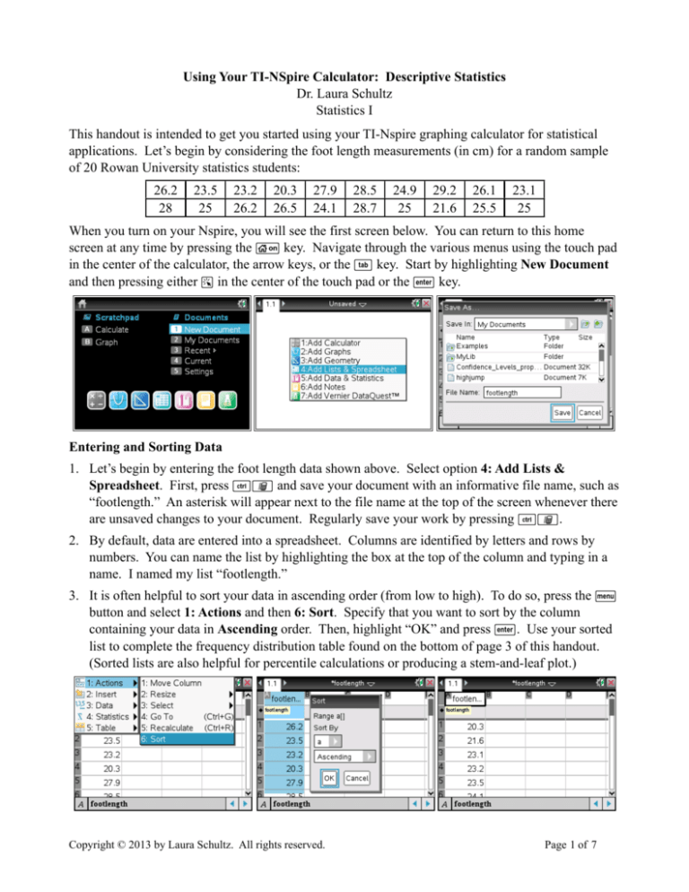
When you turn on your Nspire, you will see the first screen below. You can return to this home
screen at any time by pressing the c key. Navigate through the various menus using the touch pad
in the center of the calculator, the arrow keys, or the e key. Start by highlighting New Document
and then pressing either a in the center of the touch pad or the · key.
Entering and Sorting Data
1. Let’s begin by entering the foot length data shown above. Select option 4: Add Lists &
Spreadsheet. First, press /» and save your document with an informative file name, such as
“footlength.” An asterisk will appear next to the file name at the top of the screen whenever there
are unsaved changes to your document. Regularly save your work by pressing /».
2. By default, data are entered into a spreadsheet. Columns are identified by letters and rows by
numbers. You can name the list by highlighting the box at the top of the column and typing in a
name. I named my list “footlength.”
3. It is often helpful to sort your data in ascending order (from low to high). To do so, press the b
button and select 1: Actions and then 6: Sort. Specify that you want to sort by the column
containing your data in Ascending order. Then, highlight “OK” and press ·. Use your sorted
list to complete the frequency distribution table found on the bottom of page 3 of this handout.
(Sorted lists are also helpful for percentile calculations or producing a stem-and-leaf plot.)
Copyright © 2013 by Laura Schultz. All rights reserved.
Page 1 of 7
Descriptive Statistics: The One-Variable Statistics Command
The one-variable statistics command provides “one-stop shopping” for finding the mean, median,
standard deviation, and five-number summary of a data set. We’ll spend the first few weeks of the
semester working with the various descriptive statistics generated by this calculator command.
1. Press the ~ key and select 4: Insert to add a new document to your file. Select 3: Calculator.
You can scroll between your various documents by using the touchpad to move to the top of the
screen and then clicking on the document number with the a key. At this point, “1.1” is your
data list, and “1.2”will be your calculator screen.
2. Once you have added a calculator display to your document, press the b key. Select 6:
Statistics and then 1: Stat Calculations. Choose 1: One-Variable Statistics and indicate that
you will be using one list.
3. Specify that you want statistics for the “footlength” list and select “OK.” Use the up and down
arrow keys to scroll through all of the output.
Statistical Displays: Generating a Dot Plot
1. Press the ~ key and select 4: Insert to add another new document to your file. Select 7: Data
& Statistics. This will be screen 1.3 in your file. If you haven’t saved lately, now is probably a
good time to press /».
2. Use the touch pad to move the cursor to the bottom center of the screen and select the name of the
variable you want to plot along the x-axis.
3. The dots will dynamically reposition themselves to form the dot-plot display shown on the next
page of this handout.
Copyright © 2013 by Laura Schultz. All rights reserved.
Page 2 of 7
Statistical Displays: Generating a Histogram
1. Press the ~ key and select 4: Insert to add another new document to your file. Select 7: Data
& Statistics again. This will be screen 1.4 in your saved file.
2. Repeat steps 2 and 3 on the previous page to produce another dot plot, the default graphical
display. Then, press b and choose 1: Plot Type followed by 3: Histogram.
3. The dot plot will dynamically change into an equivalent histogram.
4. The resulting histogram is undoubtedly not what you would like to see. We can change the
appearance of the histogram by pressing b and navigating to 2: Plot Properties then
2:Histogram Properties. Select 2: Bin Settings and then 1: Equal Bin Width.
5. If you haven’t already completed the frequency distribution table below, navigate back to your
sorted data list (screen 1.1) and do so now. Adjust the bin settings until the histogram matches
your completed frequency distribution table. Note that we want the first lower class limit to be
20.0 and the class width to be 2. (The correct settings and the desired histogram are shown on the
next page.)
Footlength (cm) Frequency
20.0 – 21.9
22.0 – 23.9
24.0 – 25.9
26.0 – 27.9
28.0 – 29.9
Copyright © 2013 by Laura Schultz. All rights reserved.
Page 3 of 7
6. Once you change the bin settings, the histogram will not be displayed correctly until you
complete one more step. Press b and then 5: Window/Zoom followed by 2: Zoom - Data.
7. Using the touch pad, move the cursor across your histogram. The class limits for a given bar will
be shown along with a count of how many data points fall within that class. The bar I pointed to
above includes foot lengths between 24.0 and 25.9 cm (i.e., up to but not including 26). Six
students in the sample had foot lengths within this interval. The notation [24.000, 26.000)
indicates that the interval is closed on the left (i.e., includes 24.000) and open on the right (i.e.,
does not include 26.000).
8. We can easily produce a relative frequency histogram by first repeating steps 1-6 above. Then,
press b and navigate to 2: Plot Properties and then 2: Histogram Properties. This time,
select 1: Histogram Scale followed by 2: Percent.
9. If you have a TI-Nspire cx, you have the ability to use color in your graphical displays. Let’s end
by changing the color of the histogram bars. Click on one of the bars to highlight it. Then,
press /b and select 7:Color followed by 2:Fill Color. Select whichever color you prefer
and then press ·.
Copyright © 2013 by Laura Schultz. All rights reserved.
Page 4 of 7
Statistical Displays: Generating a Box Plot
A box plot is a graphical display of the five-number summary (Min, Q1, Q2, Q3, Max). Any outliers
will be displayed as dots beyond the whiskers. Recall from lecture that mild low outliers are those
data values that fall between Q1 - (1.5 × IQR) and Q1 - (3 × IQR), extreme low outliers are those
values that are less than Q1 - (3 × IQR), mild high outliers fall between Q3 + (1.5 × IQR) and Q3 + (3
× IQR), and extreme high outliers are those values greater than Q3 + (3 × IQR). The interquartile
range (IQR) is equal to Q3 - Q1.
1. Press the ~ key and select 4: Insert to add another new document to your file. Select 7: Data
& Statistics again.
2. Follow the directions on page 2 of this handout to produce another dot plot, the default graphical
display. Then, press b and choose 1: Plot Type followed by 2: Box Plot.
3. The dot plot will dynamically change into a boxplot.
4. Move the cursor across the box plot using the touch pad, and you will see the values for the
various components of the box plot. Note that there are no outliers present in this data set.
Statistical Displays: Generating a Bar Chart
Let’s shift gears and work with some categorical data. The table below shows the cell phone
providers used by a sample of 34 Rowan University statistics students.
Cell Phone Provider
AT&T
Sprint
T-Mobile
Verizon
Frequency
10
4
3
17
1. Save your “footlength” file one last time by pressing /». Then, press c to return to the
home screen. Indicate that you want to start a New Document and choose 4: Add Lists &
Spreadsheet. Don’t forget to press /» and save your document with an informative file
name, such as “cellphone.”
2. Label column A “provider.” Press the º key (located with the letters at the bottom of your
calculator) and choose the quotation mark (”) before you type the name of each cell phone
provider. You need to use the quotation marks so that your calculator knows that you are entering
categorical data.
Copyright © 2013 by Laura Schultz. All rights reserved.
Page 5 of 7
3. Name column B something like “tally” and enter in the frequency values from the previous page.
(Note that you cannot use “frequency” or “count” as a column name.)
4. Press b and then 3: Data followed by 8: Summary Plot.
5. Specify that the x list is “provider” (the categorical variable), the summary list is “tally” (the list
containing the frequency values), and that you want the display on a New Page.
6. Use the touch pad to move the cursor across the bars. Note that 17 students out of the sample of
34 (50.0%) use Verizon as their cell phone provider.
7. You can order the bars in descending order by pressing b and then 3: Actions followed by 7:
Sort and then 2: Value Order. This special type of bar chart is called a Pareto chart.
Statistical Displays: Generating a Pie Chart
Pie charts are my least favorite type of statistical display, but I include them here because they are
commonly used in the business world. Let’s finish off this exercise by adding a pie chart display to
our file.
1. Use the touch pad to navigate back to your spreadsheet (1.1). Then, repeat steps 4 and 5 given
above for a bar chart.
Copyright © 2013 by Laura Schultz. All rights reserved.
Page 6 of 7
2. After you have produced another bar chart, press b and then 1: Plot Type followed by 9: Pie
Chart.
3. Use the touch pad to move across the various wedges of the pie chart. Doing so, we find that 3
out of the 34 students in the sample (8.8%) use T-Mobile as their cell phone provider.
4. To label all of the wedges of the bar chart, press /b and select 2: Show All Labels. Without
labels, a pie chart is pretty useless.
Copyright © 2013 by Laura Schultz. All rights reserved.
Page 7 of 7
