Using Excel for Statistical Analysis
advertisement
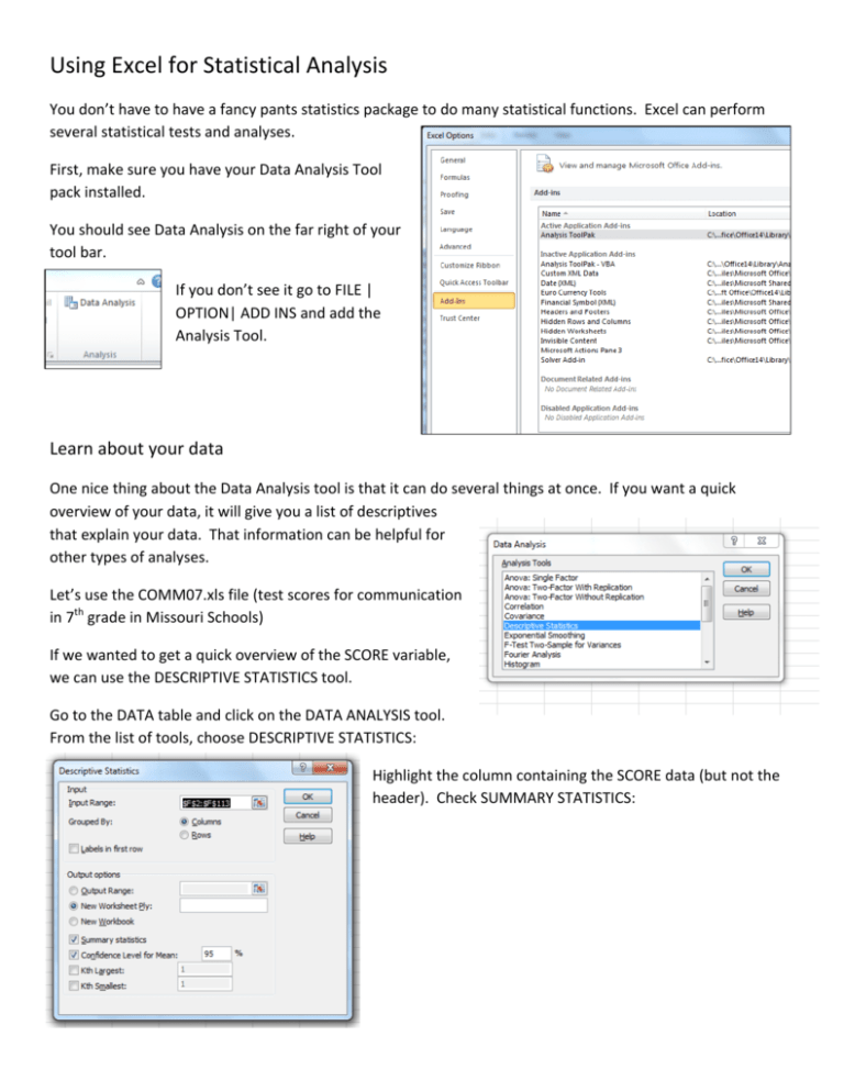
Using Excel for Statistical Analysis You don’t have to have a fancy pants statistics package to do many statistical functions. Excel can perform several statistical tests and analyses. First, make sure you have your Data Analysis Tool pack installed. You should see Data Analysis on the far right of your tool bar. If you don’t see it go to FILE | OPTION| ADD INS and add the Analysis Tool. Learn about your data One nice thing about the Data Analysis tool is that it can do several things at once. If you want a quick overview of your data, it will give you a list of descriptives that explain your data. That information can be helpful for other types of analyses. Let’s use the COMM07.xls file (test scores for communication in 7th grade in Missouri Schools) If we wanted to get a quick overview of the SCORE variable, we can use the DESCRIPTIVE STATISTICS tool. Go to the DATA table and click on the DATA ANALYSIS tool. From the list of tools, choose DESCRIPTIVE STATISTICS: Highlight the column containing the SCORE data (but not the header). Check SUMMARY STATISTICS: This looks like a lot. But some of these variables can be helpful. For example, when you do a regression, you want the Mean (average) and Median (middle value) to be fairly close together. You want your Standard Deviation to be less than the Mean. So in the above table, our Mean and Median are close together. The standard deviation is about 29 – which means that about 70 percent of the schools scored between 155 and 213. Correlation Another good overview of your data is a correlation Matrix, which gives you an overview of what variables tend to go up and down together and in what direction. It’s a good first past at relationships in your data before delving into regression. The correlation is measured by a variable called Pearson’s R, which ranges between -­‐1 (indirect relationship) and 1 (perfect relationship). Go to the DATA table and the DATA ANALYSIS tool and choose CORRELATIONS. Choose the range of all the columns (less headers) that you want to compare: You get a table that matches each variable to all other variables. Because the relationship between two columns is the same, no matter which direction you compare, Excel gives you the value just once. Below you see that the correlation between Column 3 and Column 1 is -­‐.43348. It would be the same between Column 1 and Column 3. This shows me that the variables with the strongest relationship are Column 3 (PCT_POOR) and Column 4 (SCORE). Correlation provides a general indicator of the linear relationship between two variables, but it doesn’t allow you to let you predict one variable based on another. To do that, you need linear regression, also known as ordinary least squares regression. Some characteristics help predict others. For example, people growing up in a lower-­‐income family are more likely to score lower on standardized tests than those from higher-­‐income families. Regression helps us see that connection and even say about how much characteristics affect another. A note about Excel: It is picky 1. Your data should be numeric. 2. You should not have any empty cells. To start, you need to determine which characteristics are what we call independent variables. These are the predictors. Next, the characteristics they help predict are the dependent variables. When you run a regression, you get a result called an R-­‐square. That will help you see how much the independent variable predicts the dependent variable. Let’s Regress Go to the DATA tab and click on the DATA ANALYSIS tool: Choose Regression from the list of statistics. Next, Excel will ask you to highlight the range of cells for the X and Y ranges. The Y is your DEPENDENT variable and X is your INDEPENDENT variable. Check Confidence Level and leave at 95 percent – the common level used for social science research. Check New Worksheet Ply so the output goes into a new worksheet. Leave everything else blank for now. There’s a lot in the output. But for now, let’s pay attention to a couple of variables: Adjusted R Square and Significance: R Square tells you how much of the change in your DEPENDENT variable can be explained by your INDEPENDENT variable. In this case, only about 16 percent of the change in SCORE can be explained by PCT TESTED. An R Square is between 0 and 1 – the closer to 1, the stronger the relationship. The SIGNIFICANCE variable is 0.000 -­‐-­‐-­‐ if this is less than .05 it means your results are significant – or that they didn’t just occur by chance. Let’s check another variable. Run a regression with PCTPOOR as you INDEPENDENT variable and SCORE as your DEPENDENT variable. So there is a much stronger relationship with PCTPOOR. It explains 80 percent of the variation. The R Square doesn’t tell you everything. Another important variable is what is labeled above as X VARIABLE 1, which is -­‐0.84291 This is the SLOPE of the line. What this tells you is that for every 10 point increase in PCTPOOR, SCORE goes down about 8 points. Using this information, Excel can tell us whether a school is doing better or worse than it should given the percent of poor students. Under RESIDUALS, check RESIDUALS, STANDARDIZED RESIDUALS AND LINE FIT PLOTS The residuals tell you how well a school did: The first school had a score of 210.5, which is 6.77 points better than it should given it’s poverty level. The STANDARDIZED RESIDUAL tells you the same information in terms of standard deviation. The plot gives you a graphic image of your model: Practice Use the file strong_mayor.xlsx to see if there is any relationship between population and election results A note of caution: This class is a quick overview of some statistics that can be tricky sometimes. Be sure to invoke expert opinions before running with the results of a regression.
