Fancy fonts with TeX and LaTeX
advertisement
The Poetica Family: Fancy Fonts with TEX and LATEX
Alan Hoenig
17 Bay Avenue
Huntington NY 11743
USA
Email: ajhjj@cunyvm.cuny.edu
Abstract
The Adobe Poetica family comprises fonts which have widely varying degrees of
ornamentation, but which are designed to be used together. A document that
employs them must change fonts regularly to provide appropriate ornamentation
in different parts of words. Techniques for using Poetica fonts in (LA)TEX are
presented, using a macro package written by the author, and metrics for the
fonts derived using the fontinst package.
In the beginning of the ‘desktop publishing era’,
digital foundries concentrated on making all old favorite fonts available in digital form. When that
task was well along, they then began to turn their
attention to enhancements to these fonts, the first
group of which were expert fonts which contained
things like small capitals and all double-f ligatures.
Now that an impressive array of expert fonts has become available, a third wave may be under way —
the development of beautiful fonts which break out
of common font schemes altogether. A prime example is the Poetica family of fonts from Adobe.
(Another is the Mantinia faces from the Carter and
Cone foundry.) The purpose of this presentation is
to suggest ways of typesetting with these beautiful
fonts without walking around with numerous font
tables in hand.
The Poetica Package
As delivered from Adobe Systems, the Poetica fonts
comprise 21 fonts in two families. The main font
is plainly modeled after the Chancery scripts of the
Renaissance:
Sonata Number 29 in B Xat major,
opus 106,
Hammerklavier
Why so many fonts? There is a wide variety of plain
and fancy variants for many glyphs, odd ligatures,
and special forms word endings or beginnings. One
font contains ornaments, and another contains nothing but different ampersands. Using some of these
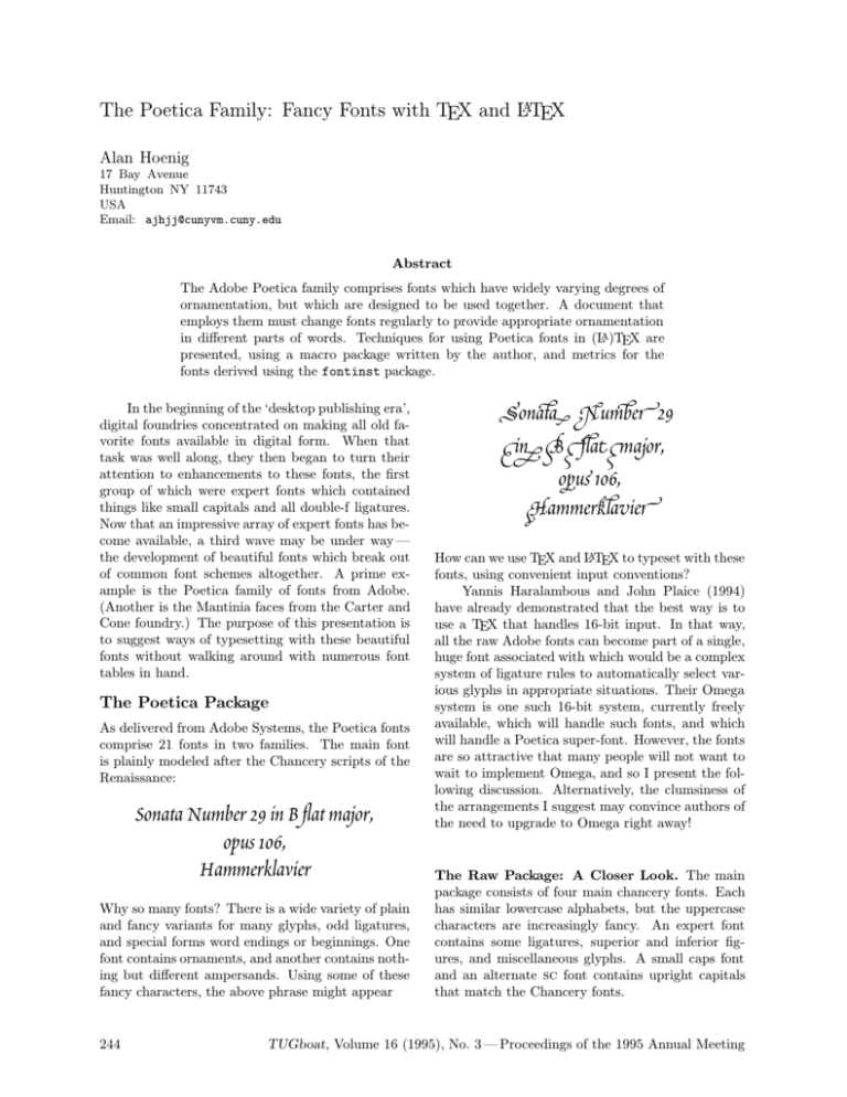
fancy characters, the above phrase might appear
244
SonatA NumBeR 29
IN B FLaT Major,
oPus 106,
HammerKLaVieR
How can we use TEX and LATEX to typeset with these
fonts, using convenient input conventions?
Yannis Haralambous and John Plaice (1994)
have already demonstrated that the best way is to
use a TEX that handles 16-bit input. In that way,
all the raw Adobe fonts can become part of a single,
huge font associated with which would be a complex
system of ligature rules to automatically select various glyphs in appropriate situations. Their Omega
system is one such 16-bit system, currently freely
available, which will handle such fonts, and which
will handle a Poetica super-font. However, the fonts
are so attractive that many people will not want to
wait to implement Omega, and so I present the following discussion. Alternatively, the clumsiness of
the arrangements I suggest may convince authors of
the need to upgrade to Omega right away!
The Raw Package: A Closer Look. The main
package consists of four main chancery fonts. Each
has similar lowercase alphabets, but the uppercase
characters are increasingly fancy. An expert font
contains some ligatures, superior and inferior figures, and miscellaneous glyphs. A small caps font
and an alternate sc font contains upright capitals
that match the Chancery fonts.
TUGboat, Volume 16 (1995), No. 3 — Proceedings of the 1995 Annual Meeting
The Poetica Family: Fancy Fonts with TEX and LATEX
Chancery I
Chancery II
Chancery III
Chancery IV
Expert
Smap Caps
SC Alternates
Abc Def GHI Jklmn
Abc Def GHI Jklmn
Abc Def GHI Jklmn
Abc Def GHI Jklmn
VYZWX
abcdefghijklmn
ABCDEFGHIJKLN
The second Poetica family is more interesting.
There are four swash caps fonts, each of which contains two increasingly fancy uppercase alphabets.
abcdeABCDE
abcdeABCDE
abcdeABCDE
abcdeABCDE
An initial swash font contains one very fancy uppercase font, appropriate only for word beginnings.
ABCDEFGHIJ
There are two lowercase alternate fonts, and each of
these contains several groups of alternate forms for
many lowercase characters.
gkpyz
gkpyz
GKPYZ
gkpyz
GKPYZ
There are two each of lowercase beginnings and endings fonts. Each of these fonts contains at least two
forms (of certain letters only) appropriate for word
boundaries.
baa end hah ip ton
BaA EnD HaH Ip ToN
baa end hah iQ ton
BaA EnD HaH Iq ToN
A special ligature font contains fancy forms of the
familiar f-ligatures, as well as many more ligatures
not normally used.
GHhiJLkm
cEnpQq
sV wWx
Finally, separate fonts contain batches of ornaments
and bunches of ampersands.
ABCDEabcde
ABCDEabcde
It’s clear that there are many ways to represent a single character, depending on its location in
a word, whether it’s upper- or lowercase, and the
degree of swash that an author desires. The first
example also makes clear that a little swash goes
a long way, and a convenient font selection scheme
would make it convenient to typeset in some single
‘background’ font from which it would be easy to
ascend or descend to fancier or plainer fonts for isolated characters. We’d also like to be able to do this
without having to lug around sheaves of font tables
with us.
The next section details the font scheme that I
propose for these fonts. I will then show how to use
TEX’s virtual font mechanism to create these fonts.
Fonts, Fonts, Fonts
Poetica contains a total of sixteen — 16! — uppercase alphabets. These include:
• four alphabets which match the four original
chancery fonts;
• eight increasingly fancy swash alphabets (these
appear in four fonts so that each font contains
a pair of uppercase alphabets, one of which is
in the lowercase position);
• a super-fancy swash alphabet suitable only for
initial letters (if then);
• two small caps alphabets; and
• a small caps alternate alphabet (although this
is a sparse set — only 15 letters are represented.
I felt able to organize these in twelve fonts:
• four Chancery fonts;
• four swash fonts, each incorporating two uppercase alphabets;
• one super-swash font;
• two small caps fonts; and
• two titling fonts.
This is still a formidable array of fonts, and I’ll
say more later on about ways of dealing with them
all. But at this point, I’ll indicate that I shoehorned
TUGboat, Volume 16 (1995), No. 3 — Proceedings of the 1995 Annual Meeting
245
Alan Hoenig
two swash uppercase alphabets into each font by
virtue of TEX’s ligature mechanism. Most of the
time, uppercase glyphs appear only at the beginning
of a word, so I created the fonts so that * followed
by a capital letter generates the alternate capital.
For example, if I type
A B C D E
I might get
abcde
but if I type
*A *B *C *D *E
in the same font, I get
ABCDE
instead.
The uppercase alphabets dictate the nature of
their fonts. They quite clearly become increasingly
fancy, so it makes sense to apportion some of the
other special characters to these fonts in order of
increasing fanciness. It’s straightforward via Alan
Jeffrey’s fontinst package to add these characters
to the fonts.
Word Boundaries. Many of the characters provided by Adobe belong specially to the beginnings
or endings of words, and the boundarychar mechanism of TEX3 makes this easy to implement, but
not as easy as I expected for the following interesting reason.
Human readers are quite specific in what constitutes a word boundary. Most often it would be
a space or punctuation, but TEX3 is more restrictive: essentially any consecutive string of characters
is a word. This means that te\it st is two words
from TEX’s point of view — that is, a font change
in the middle of a word creates two word boundaries. Typesetting with fonts containing fancy word
boundary glyphs requires dealing with this fact.
Here is an example of automatic boundary glyph
selection. Notice here how the forms of the ‘m’
and ‘t’ change depending on their positions within
a word. With the proper fonts selected, I simply
typed mat tom-tom to get
MaT Tom-toM
Supporting Macros. These fonts are beautiful,
but I needed some input conventions that would allow me to increase or decrease the amount of fanciness in some easy way.
I began by appropriating from mathematics the
characters ^, _, +, and -; this is no loss, as I felt it
246
unlikely that I’d be doing math in conjunction with
Poetica. (However, some of the Chancery capitals
do make a good candidate as a math calligraphic
alphabet. That is a different and easier problem.)
Typesetting is done within the Poetica environment:
\begin{Poetica}
...
\end{Poetica}
(I am assuming the conventions of LATEX 2ε , so I
have access to the New Font Selection Scheme) which
automatically switches to the Poetica family. All
the fonts are in the medium series m, selected automatically, and the fonts themselves are divided into
three groups of shapes. (Adobe provides no bold
face fonts in this family.) ‘Normal’ fonts comprise
four fonts, with font shapes of n0, n1, n2, and n3.
Two groups of five swash fonts apiece, with shape
designations f0 through f4 and F0 through F4 (f or
F=fancy) encompass the ornate fonts I set up. The
F-shapes incorporate word boundary glyphs, while
f-shapes do not. The higher the number, the fancier
the font. There is also a small caps font (shapes
c and c1) and two titling fonts (shapes t and t1).
The default font has the shape n3 at an eighteenon-twenty-two point size:
Alpha-Betic ConVants
Demand Emphasis.
12345 67890
Although these fonts can be accessed by the
usual NFSS commands, the usual \fontshape and
\selectfont commands are discouraged in favor
of a single \Fontshape command which combines
\fontshape and \selectfont together with some
bookkeeping, the reason for which will shortly become clear. It will be necessary to do any font sizing with \fontsize (in the usual way) before calling
\Fontshape.
But even \Fontshape is too verbose. Most of
the time, we are content to typeset virtually everything in a piece of text in the same font, except
from time to time we may want to make one or two
characters more or less fancy than the default. Although the usual font changing could be invoked, it’s
a bit messy to do that for a single character here
and there. I implemented a scheme which seemed
to me ideal from the point of view of making these
spot changes, and for that reason different meanings
were assigned to ^, _, |, \+, and \-. The control sequences \+ and \- take the next character (or group)
and raise the level of fanciness up or down by one
TUGboat, Volume 16 (1995), No. 3 — Proceedings of the 1995 Annual Meeting
The Poetica Family: Fancy Fonts with TEX and LATEX
font. If that is not sufficient, simply add additional
+s and -s. The symbols ^ and _ now mean go up to
the fanciest and plainest fonts respectively (that is,
shapes n0 and f4),
but the + and - convention also holds here. The
vertical bar is now equivalent to the \noboundary
command. There are also two additional commands:
\wordbounds and \nowordbounds, which select the
F-shape or f-shape fonts respectively.
Thus, if we type
\begin{Poetica}
For every action there is a reaction
\end{Poetica}
we get
For every AEion there is a ReaEion
But if we type
\begin{Poetica}
^For every \+A^{ct}{\i}on\ \
^there i^s a
^--{*R}ea^--{ct}{\i}o^n
\end{Poetica}
we get instead
For every aFıon there is a Reafıon
Actually, the markup here is almost as intrusive as
normal TEX markup would be, but normal Poetica
markup would not be this excessive. I had great fun
generating this sample, adding and subtracting +s
and -s until there was sufficient demonstration of
these conventions as well as a demonstration of several different glyphs. Note the several ct ligatures,
and other alternate letterforms.
Let’s see why special treatment of word bounds
is necessary. If we re-typeset this example with
\wordbounds in effect, we get
For every aFıon There iS a ReafıoN
Notice the unfortunate appearance of certain boundary glyphs in the middle of real words due to the
word boundaries formed every time there is a font
shift.
Incidentally, to get an idea of the possibilities
of swash I first typed
\begin{Poetica}
^{For every action
there is a Reaction}
\end{Poetica}
to get
For eVerY aFion yere is a ReaFion
Let me include two more examples. If we type
\newsavebox{\mybox}
\newlength{\mywd}\newlength{\myht}
\newlength{\mydp}
\setlength{\fboxrule}{1.2pt}
\savebox{\mybox}
{\fbox{\begin{minipage}{.5\textwidth}
\begin{center}\begin{Poetica}
\fontsize{26}{34}\selectfont
^--{*A}nd if \+{y}ou wi^{ll} con-\\
sider a\++{ll} t\++h{\i}ngs,
{\wordbounds\++y}ou\\
will find that ^{th}ose\\
whi^{ch} are ^goo^--d an^d\\
use\++ful a\++lways ^have\\
^{th}e grace of beaut^y\\
in ^{th}em as we^--{ll}.\\
{\renewcommand\.{\hspace{1.8pt}}%
\fontshape{t1}\fontsize{16}{24}
\selectfont
c\.a\.s\.t\.i\.g\.l\.i%
\.o\.n\.e}\\[1pc]
\fontsize{30}{38}\orn{78}
\end{Poetica}\end{center}
\end{minipage}}}
\settowidth{\mywd}{\usebox{\mybox}}
\settoheight{\myht}{\usebox{\mybox}}
\settodepth{\mydp}{\usebox{\mybox}}
\noindent\rlap{\vrule width1.1\mywd
height1.1\myht depth1.1\mydp}%
\hskip.05\mywd%
{\White{\usebox{\mybox}}}
we get figure 1. Notice that the titling fonts have to
be accessed explicitly (ditto for the small caps fonts);
they are not part of the bump up scheme elsewhere
in use. We selected a special ornament via the \orn
command; there is a corresponding \amp command
to select ampersands for the special ampersand font.
I guess you will need to have access to the ornament
and ampersand font tables to know which characters
to choose. Since I am using Tom Rokicki’s dvips
post-processor, I use the colordvi package. I get
the fancy effect here by setting a big, black rule box,
and overprinting the text in \White ink. Actually,
only the indented material sets type; the remaining
lines set things up to print white on black.
And a final example. To get figure 2, I typed
\newdimen\W
\newcommand{\dropcap}[1]{\setbox0=
\hbox{\fontsize{44}{48}
\selectfont#1\ }%
TUGboat, Volume 16 (1995), No. 3 — Proceedings of the 1995 Annual Meeting
247
Alan Hoenig
And if you wiq consider ap tHıngs, You
wip Wnd that yose
whia are Good anD
useful aLways Have
ye grace of beautY
in yem as weQ.
ca s t igL i o O e
N
Figure 1: One example.
248
TUGboat, Volume 16 (1995), No. 3 — Proceedings of the 1995 Annual Meeting
The Poetica Family: Fancy Fonts with TEX and LATEX
\setbox0=\hbox to.5\wd0{\hss\box0}%
\W=\wd0 \gdef\.{\noindent\hskip\W}
\noindent\vbox to10pt{\box0 \vss}}
\begin{center}
\begin{Poetica}\fontsize{23}{31}
\selectfont
\fontsize{30}{32}\selectfont
_{A Sonne}{\wordbounds^--{|t}}
\\[3pt]
{\fontsize{14}{21}\fontshape{c}
\selectfont
William Shakespeare}
\end{Poetica}\end{center}
\begin{verse}\begin{Poetica}
\dropcap{^W}hen, in disgrace with
\+{*F}ortune and men’s eye^{s},\\
\.I a^--{ll} alone beweep my
outca\++{st} \ ^{st}ate,\\
And trouble deaf heaven with my
bootle^--{ss} cries,\\
\+And look upon myself, and
curse my fate,\\
Wishing me like to one more
ri^{ch} in ^-{h}ope,\\
Featured like him, like him
with ^{f}riends posse^--{st},\\
Desiring this man’s ar^---{t}
and that man’s sco^---{p}e,\\
\+With what I most enjoy
contented least;\\
Yet in these thoughts myself
almost de^--{sp}{\i}sing---\\
Haply I think on ^{th}ee:
and then my \+++{st}ate,\\
Like to the \+Lark at break
of day arisin{\wordbounds^g}\\
\+From su^-{ll}en earth,
sings hymns at \++Heaven’s
gate;\\[6pt]
\quad ^For ^{th}y sweet \ \ \
{\wordbounds^--l}ove rememb’red
suc^-{h} weal^{th} brings\\
\quad ^{Th}at t^-{h}en \++++{*I}
scorn to ^{ch}ange my ^-{st}ate
with ^-{*K}ings.\\
\end{Poetica}
\end{verse}
The Poetica macro file, very short, appears in Appendix A.
Creating Poetica Virtual Fonts. The tool of
choice for creating virtual fonts is the Alan Jeffrey’s
fontinst package. In the presence of ASCII files
containing font information, running the installation
file through TEX creates the .vpl files from which
the actual .vf virtual fonts are rendered. The font
information should be in three types of files.
1. Metric files — files giving information about the
sizes and kernings of each glyph. typically, these
are files with extensions .pl (TEX fonts) or .afm
(type 1 outline fonts). The fontinst package
reads these files and creates its own metric .mtx
files. Other metric information needs to be supplied in additional .mtx files using commands
following the standard fontinst syntax.
2. Encoding files, which say how the glyphs should
be arranged in the font. In addition to this encoding information, ligature information is also
found here.
3. Miscellaneous additional files, usually metric in
nature.
The fontinst installation file has the following
structure.
\input fontinst.sty
\installfonts
\installfamily{OT1}{poet}{}
\installfont{pof3}{posl0,unposl3,
poslaii0,poslai0,
unlai1,
possciv0,unsc,
setfont1,
pociii0,latinpoe}
{OT1swa}%
{OT1}{poet}{m}{f3}{}
...
...
\endinstallfonts
\bye
The lines of ellipses represent the (many) additional
\installfont commands not shown here. These
instructions provide for a font family called poet
which uses OT1 (original TEX) encoding. One font
in that family is called pof3 and corresponds to
medium series m and font shape f3 within this family.
Of the parameters of the \installfont command, the second and third present a list of metric
and encoding files that fontinst will need to construct the virtual fonts. The cryptic nature of these
file names is imposed, as is so often the case, by the
8 + 3 file name structure of MS-DOS. Here’s a brief
description of these files.
• All file names po* are of .afm files containing metric information about one of the 21 Poetica raw fonts. The names posl0, poslai0,
poslaii0, poslbii0, posleii0, poslei0,
possciv0, and pociii0 belong to the ligature,
TUGboat, Volume 16 (1995), No. 3 — Proceedings of the 1995 Annual Meeting
249
Alan Hoenig
the second lowercase alternates, the first lowercase alternates, the second lowercase beginning letters, the second lowercase endings, the
first lowercase endings, the fourth supplementary swash caps, and Chancery font number 3.
• Because the order in which the information is
read by fontinst, we need some mechanism
for removing superfluous information from its
memory. The un*.mtx files perform this function. See below for an extensive description
of this process. Remember that the fontinst
macros have been crafted so that information
once read is not over-written by later information.
Crafting a Font
Let’s consider in greater detail the construction of
the font we called pof3. The first thing fontinst
does is read the glyph information pertaining to the
ligatures (posl0), whose glyphs have been named
according to the standard Adobe encoding vector.
For example, position 65 — A — of the ligature raw
font posl0 is occupied by the ligature ‘Ch’ and is
called ‘A’ in the .afm file.
This is bad, and a violation of Adobe’s own
standards! Such a glyph should, by rights, be named
‘Ch’ since that’s what the letterform looks like and
not ‘A’. If something is not done, the real ‘A’ (in
possciv0) will never be typeset and every ‘A’ in the
source document will appear as ‘Ch’ in the typeset
output. (Do you see why? fontinst pays attention
only to the first definition of a letterform. Since the
default nomenclature creates an ‘A’ out of a C-h ligature, this becomes the definition of ‘A’ and a proper
definition of A later on will be ignored.) Therefore,
we must read a file unposl3.mtx which saves the
ligature information under a more meaningful name
and frees up the ‘A’ slot for the real glyph. Two
lines of this file might read
\resetligglyph Ch A
\unsetglyph A
where we have previously entered the definition
\setcommand\resetligglyph#1#2#3{
\setleftkerning{#1#2}{#1}{1000}
\setrightkerning{#1#2}{#2}{1000}
\resetglyph{#1#2}
\glyph{#3}{1000}
\endresetglyph
}
In this case, a new glyph called ‘Ch’ is defined to
be equivalent to ‘A’. This new glyph is also given
some appropriate kerning information. Once that
250
definition has been fixed, the ‘A’ glyph has been
made free for later use.
This is the philosophy behind the next several
files. Special alternate forms, beginning forms, and
ending forms are carefully ingested, and various un*
files save glyphs under more appropriate names and
free up poorly named slots. Finally, the uppercase
letters are taken from a swash font, some of the alternate characters are declared to be equivalent to
letter glyphs (in file setfont1.mtx), the remaining
lowercase and other characters are taken from the
Chancery 3 font pociii0, and latinpoe.mtx lists
the characters in the font. This concludes the metric portion.
Anything not involving measurement is by definition the province of an encoding file. The file lays
out the order of glyphs in a font — the encoding vector — and arranges for ligature formation. For example,
\setslot{c}
\Ligature{h}{ch}
\Ligature{k}{ck}
\Ligature{l}{cl}
\Ligature{t}{ct}
\atendofword{cend}
\endsetslot
arranges things with TEX so that ‘c’ followed by ‘h’
are replaced by the special ‘ch’ ligature if the ‘ch’
glyph exists. If a ‘c’ appears at the end of a word,
it is replaced by a special final c glyph, here called
‘cend’. Special forms for the beginning of a word are
set up by
\setslot{boundarychar}
\atstartofword{b}{bbeg}
\atstartofword{e}{ebeg}
...
\atstartofword{w}{wbeg}
\atstartofword{y}{ybeg}
\endsetslot
We use the fontinst definitions
\setcommand\Ligature#1#2{% cond’l lig
\ifisglyph{#2}\then
\ligature{LIG}{#1}{#2}\fi}
\setcommand\atendofword#1{%
\Ligature{boundarychar}{#1}}
\setcommand\atstartofword#1#2{%
\Ligature{#1}{#2}}
to control these special ligatures.
The fontinst files are to be posted on CTAN
for anonymous file transfer.
TUGboat, Volume 16 (1995), No. 3 — Proceedings of the 1995 Annual Meeting
The Poetica Family: Fancy Fonts with TEX and LATEX
A Sonnet
William Shakespeare
W
hen, in disgrace with Fortune and men’s eyes,
I aQ alone beweep my outcaw xate,
And trouble deaf heaven with my bootleT cries,
and look upon myself, and curse my fate,
Wishing me like to one more ria in Hope,
Featured like him, like him with friends posseW,
Desiring this man’s art and that man’s scoPe,
with what I moV enjoy contented leaV;
Yet in these thoughts myself almoV deSısing—
Haply I think on yee: and then my Wate,
Like to the lark at break of day arising
from suqen earth, sings hymns at heaven’s gate;
For yy sweet love rememb’red sucH wealy brings
zat tHen I scorn to aange my xate with Kings.
Figure 2: A second example.
TUGboat, Volume 16 (1995), No. 3 — Proceedings of the 1995 Annual Meeting
251
Alan Hoenig
The Poetica Macros
%%% Package File poetica.sty
\newcount\poetic
\newcount\poetbound \poetbound=4
\newcount\poetceiling \poetceiling=8
\newcount\poetfloor \poetfloor=0
\def\wordbounds{\def\fancyshape{F}}
\def\nowordbounds{\def\fancyshape{f}}
\nowordbounds % default
\def\parsefontshape#1#2{\poetic=-1
\if f#1\poetic=\poetbound
\advance\poetic by#2 \fi
\if n#1\poetic=\poetfloor
\advance\poetic by#2 \fi
}
\def\setshape{% input is \poetic
\ifnum\poetic<0 \else
\ifnum\poetic<\poetbound
\edef\fshape{n\the\poetic}%
\else\advance\poetic by
-\poetbound
\edef\fshape{\fancyshape
\the\poetic}%
\fi
\fi
}
\newcommand{\Fontshape}[1]{%
\parsefontshape#1%
\fontshape{#1}\selectfont}
\newenvironment{Poetica}{%
\begingroup\fontencoding{OT1}
\fontfamily{poet}\fontsize{18}{22}
\fontseries{m}\Fontshape{n3}
\poetic=3 \setshape}{\endgroup}
\let\dhyph=\- \let\mytabs=\+
\let\oldhat=^ \let\oldsub=_
\let\oldvert=|
\catcode‘\^\active \catcode‘\_\active
\catcode‘\|\active \def\|{\oldvert}
\let|=\noboundary
\newcount\INC \INC 1
\def^{\bgroup \let\compare=\let\bump=\bumpdown \INC-1
\poetic=\poetceiling
\afterassignment\getnextchar
\global\let\nexttok= }
\def_{\bgroup \let\compare=+
\let\bump=\bumpup \INC 1
\poetic=\poetfloor
\afterassignment\getnextchar
\global\let\nexttok= }
252
\def\-{\bgroup \let\compare=\let\bump=\bumpdown \INC-1 \bump
\afterassignment\getnextchar
\global\let\nexttok= }
\def\+{\bgroup \let\compare=+
\let\bump=\bumpup \INC 1 \bump
\afterassignment\getnextchar
\global\let\nexttok= }
\def\getnextchar{%
\if\compare\nexttok
\bump \let\nextact\grabchar
\else
\edef\nextact{%
\noexpand\typeset
\noexpand\nexttok}%
\fi \nextact
}
\def\grabchar{\afterassignment
\getnextchar \let\nexttok}
\def\bumpdown{\advance\poetic \INC
\ifnum\poetic<\poetfloor
\poetic\poetfloor \fi}
\def\bumpup{\advance\poetic \INC
\ifnum\poetic>\poetceiling
\poetic\poetceiling \fi}
\def\typeset#1{\setshape\fontshape
{\fshape}
\selectfont #1\egroup}
%% ornaments and ampersands
\newcommand{\orn}[1]{%
{\fontshape{orn}\selectfont
\symbol{#1}}}
\newcommand{\amp}[1]{%
{\fontshape{amp}\selectfont
\symbol{#1}}}
\endinput
References
Y. Haralambous and Plaice, John. “First applications of Ω: Adobe Poetica, Arabic, Greek,
Khmer”. TUGboat 15(3), 344–352, 1994.
TUGboat, Volume 16 (1995), No. 3 — Proceedings of the 1995 Annual Meeting
