The Heartbeat of the Factory
The Heartbeat of the Factory:
Understanding the Dynamics of Agile Manufacturing Enterprises1
Van Parunak (vparunak@erim.org)
ERIM
Abstract
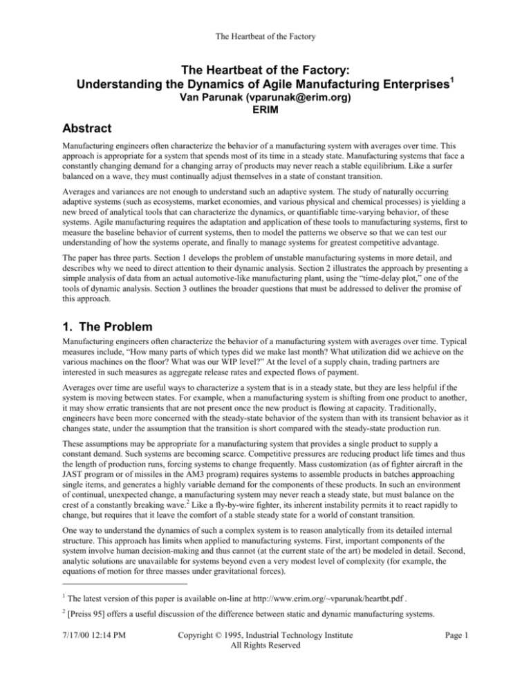
Manufacturing engineers often characterize the behavior of a manufacturing system with averages over time. This
approach is appropriate for a system that spends most of its time in a steady state. Manufacturing systems that face a
constantly changing demand for a changing array of products may never reach a stable equilibrium. Like a surfer
balanced on a wave, they must continually adjust themselves in a state of constant transition.
Averages and variances are not enough to understand such an adaptive system. The study of naturally occurring
adaptive systems (such as ecosystems, market economies, and various physical and chemical processes) is yielding a
new breed of analytical tools that can characterize the dynamics, or quantifiable time-varying behavior, of these
systems. Agile manufacturing requires the adaptation and application of these tools to manufacturing systems, first to
measure the baseline behavior of current systems, then to model the patterns we observe so that we can test our
understanding of how the systems operate, and finally to manage systems for greatest competitive advantage.
The paper has three parts. Section 1 develops the problem of unstable manufacturing systems in more detail, and
describes why we need to direct attention to their dynamic analysis. Section 2 illustrates the approach by presenting a
simple analysis of data from an actual automotive-like manufacturing plant, using the “time-delay plot,” one of the
tools of dynamic analysis. Section 3 outlines the broader questions that must be addressed to deliver the promise of
this approach.
1. The Problem
Manufacturing engineers often characterize the behavior of a manufacturing system with averages over time. Typical
measures include, “How many parts of which types did we make last month? What utilization did we achieve on the
various machines on the floor? What was our WIP level?” At the level of a supply chain, trading partners are
interested in such measures as aggregate release rates and expected flows of payment.
Averages over time are useful ways to characterize a system that is in a steady state, but they are less helpful if the
system is moving between states. For example, when a manufacturing system is shifting from one product to another,
it may show erratic transients that are not present once the new product is flowing at capacity. Traditionally,
engineers have been more concerned with the steady-state behavior of the system than with its transient behavior as it
changes state, under the assumption that the transition is short compared with the steady-state production run.
These assumptions may be appropriate for a manufacturing system that provides a single product to supply a
constant demand. Such systems are becoming scarce. Competitive pressures are reducing product life times and thus
the length of production runs, forcing systems to change frequently. Mass customization (as of fighter aircraft in the
JAST program or of missiles in the AM3 program) requires systems to assemble products in batches approaching
single items, and generates a highly variable demand for the components of these products. In such an environment
of continual, unexpected change, a manufacturing system may never reach a steady state, but must balance on the
crest of a constantly breaking wave.2 Like a fly-by-wire fighter, its inherent instability permits it to react rapidly to
change, but requires that it leave the comfort of a stable steady state for a world of constant transition.
One way to understand the dynamics of such a complex system is to reason analytically from its detailed internal
structure. This approach has limits when applied to manufacturing systems. First, important components of the
system involve human decision-making and thus cannot (at the current state of the art) be modeled in detail. Second,
analytic solutions are unavailable for systems beyond even a very modest level of complexity (for example, the
equations of motion for three masses under gravitational forces).
1
The latest version of this paper is available on-line at http://www.erim.org/~vparunak/heartbt.pdf .
2
[Preiss 95] offers a useful discussion of the difference between static and dynamic manufacturing systems.
7/17/00 12:14 PM
Copyright © 1995, Industrial Technology Institute
All Rights Reserved
Page 1
The Heartbeat of the Factory
Level of
Understanding
New Perspective
Data Collection
Generalizations and
Patterns
Predictive Rules that
enable Control
Mechanisms
Table 1: Levels of Understanding
Example from Physics
Manufacturing Systems Parallel
Copernicus: Shift focus from earth-ascenter to sun-as-center
Brahe: Detailed measurements
Kepler: Solar “radius” sweeps out equal
areas in equal time
Newton: F = Gm1m2/r2
Shift focus from steady-state to dynamics
Existing shop-floor and supply-chain data; other
data to be gathered
Results of applying dynamic systems techniques to
manufacturing data
???
Einstein: mass warps the space-time
???
continuum
An alternative approach is to begin by studying actual operating systems and attempting to generalize from their
behavior. As an example of this approach, consider the development of Newtonian physics (Table 1). Starting with
the Copernican model of planets orbiting the sun, Brahe gathered detailed observational data on the motion of
planets from which Kepler was able to develop important generalizations. These generalizations in turn led to
Newton’s laws. As manufacturing engineers, we need the manufacturing equivalent of Newton’s laws. The vision of
manufacturing systems that can thrive on change plays the role of the Copernican model. This new perspective tells
us, like Brahe, what kind of data we need to gather (in our case, data that has not had the time variation averaged out
of it). In turn, we may form generalizations at the level of Kepler’s laws that ultimately will permit us to understand
the physics of manufacturing in a manner comparable with Newton’s achievement.
Even before we reach the ultimate abstractions, this approach can yield important commercial benefit. In medicine,
physicians learn to recognize particular patterns of EKG’s or brain wave recordings and the underlying conditions
that they reflect without understanding in detail the mechanisms by which these signals are generated. [Kempf &
Beaumariage 94] have derived some tantalizing patterns from a simplified simulation of a semiconductor fab. Our
vision here is to build a body of understanding that will permit us to use easily gathered data for diagnostic and
descriptive purposes. We can reasonably expect in less than five years to develop a crude tool that can give us the
EKG of a factory or a set of trading partners. Such a tool in turn will refine our understanding of manufacturing
systems.
2. A Real-World Example
This section illustrates the vision by applying a simple tool for analysis of dynamic systems (the time-delay plot) to
actual data from an operating manufacturing plant. It defines the manufacturing context, introduces the analytical
methodology, applies it to the data, and discusses the implications of the results. This exercise does not by any means
exhibit the breadth of the dynamical systems toolbox. We use a shop-floor example because we have that data
available, but the techniques should be applicable to interactions between firms as well. Our objective is to get a feel
for the kind of information that a dynamical perspective on manufacturing can yield. In particular, we will see how
fairly conventional data can distinguish between two different obstacles to the throughput of a plant: various degrees
of equipment shutdown, and dynamic congestion due to the real-time flow of material.
2.1 The Manufacturing Context
The data in this study come from an operating American factory that produces several different models of specialty
vehicles, and from a portion of that factory that is similar in its processes and structures to an automotive body and
paint shop. Parts are mounted on carriers, which in turn travel on a power-and-free conveyor system. Sensors placed
at critical points in the process record the time and identity of passing carriers.
Carriers pass sensors 12 and 17 in that order, and traffic jams sometimes form in the intervening segment of the
conveyor. We will examine the transit times for carriers moving between these sensors. That is, we calculate from
the raw data how long it takes each successive carrier to move from sensor 12 to sensor 17, and record these transit
times in the order in which the successive carriers reach sensor 17. Transit times are recorded in days. That is, a
7/17/00 12:14 PM
Copyright © 1995, Industrial Technology Institute
All Rights Reserved
Page 2
The Heartbeat of the Factory
transit time of 1.5 is one and a half days, or 36 hours. For convenient reference,
Table 2 gives the translation among fractional days, hours, and minutes.
Table 2: Translating Time
Units
Days
Hours Minutes
1.0000 24.000 1440.00
0.1000
2.400 144.00
1.000
0.0417
60.00
0.0100
0.240
14.40
0.0010
0.024
1.44
1.00
0.0007
0.017
0.0001
0.002
0.14
Figure 1 shows the overall series of 1685 successive transit times over a two-week
period. The vertical (logarithmic) axis indicates the transit time for a single carrier in
days, and the horizontal axis counts the successive transits included in the data.
Transit Time (Days
Summary statistics are not enough to understand this scenario, but they are a useful
starting point. Most of the transits are well below 0.1 days (about 2.5 hours), with
prominent peaks about every 200 readings. The largest peak, at index 1200, is
Thanksgiving weekend, and the second largest peak is the previous weekend. The
population on the segment between the two sensors ranges from 0 to 17, with an
average of 4; the average transit time is .066
10
(about an hour and a half); the median transit
time is .013 (about 20 minutes), and the
shortest .0065 (about ten minutes). These
1
numbers capture some basic information
about the shop, but the complex structure of
0.1
the plot shows that there is much more that
they do not capture. In the following sections,
we explore how one simple tool of dynamical
0.01
systems analysis can uncover some of this
information.
1601
1401
1201
1001
801
601
2.2 Analysis Method: Timedelay plots
401
1
201
0.001
Time Series Index
Figure 1: Basic Transit Time Data (Two-Week Period)
We want to learn how successive transit times
depend on one another. A useful tool for this
purpose is the time-delay plot, which plots each value of a time series (on the Y axis) against the
Table 3: Timeprevious value (on the X axis). The justification for this procedure lies in Takens’ theorem
Shifting a
[Takens 81], which shows that such plots capture the topology of the system’s underlying state
Time Series
space, to which we do not have direct access. For our purposes, the proof of the value of the
x=t(i-1) y=t(i)
technique will lie in the results we gain from it.
1
1
For example, consider the time series <1, 3, 5, 4, 3, 2>. Table 3 shows how this series is converted 1
3
into a set of (x,y) pairs by shifting it relative to itself. The y column consists of the time series
3
5
shifted up one position with respect to the x column, and the missing values at the top of the x
5
4
column and bottom of the y column are then made up by duplicating the first or last value,
4
3
respectively, of the series (shown as italicized numbers in the Table). More sophisticated use of
3
2
time delay plots includes different amounts of shift, and constructing triplets or higher-order data
2
2
points by a similar mechanism, but the single shift is sufficient to illustrate the approach.
t(i)
t(i)
Figure 2 shows the results of plotting these artificial pairs. The trajectory begins at the lower left corner of the plot
with (1,1), and proceeds clockwise.
1
5
What would less-structured data
look like? Figure 3 shows such a
0.8
4
time-delay plot generated from 100
0.6
3
points randomly generated from a
uniform distribution on the interval
0.4
2
[0,1].
0.2
1
0
0
0
0
1
2
3
4
5
t(i-1)
Figure 2: Time Delay Plot of Table 3
7/17/00 12:14 PM
Copyright © 1995, Industrial Technology Institute
All Rights Reserved
0.2
0.4
0.6
0.8
1
t(i-1)
Figure 3: Plot of a Random
Series
Page 3
The Heartbeat of the Factory
5
2.3 Plotting the Transit
Data
0.3
4
3
0.2
0.1
0
0
0.05
0.1
0.15
0.2
0.25
0.3
t(i-1)
Figure 5: Transits < 1 Day
0.07
0.06
0.05
0.04
t(i)
Figure 5 shows several large squares reminiscent of the two in Figure
4. It also contains some “imperfect” squares, and a distinctive diagonal
clump at the lower left corner. We can focus in on this latter feature by
restricting ourselves to transits less than .07 day, or about an hour and
a half(1610 points), in Figure 6.
t(i)
t(i)
Contrast the disorder generated by
2
only 100 points in Figure 3 with
Figure 4, the time delay plot for all
1
1685 points of the transit data. The
0
two weekend shutdowns produce
0
1
2
3
4
5
large square trajectories that
t(i-1)
dominate the display, but there
Figure 4: Full Data Set
appears to be some orderly structure
in the mass of points at the lower
left. To explore this region further, we eliminate from the data all
transit times greater than one day. The remaining 1660 points produce
Figure 5.
0.03
# of High Values
Figure 6 is still much simpler than the random plot in Figure 3, even
0.02
though it contains more than sixteen times as many points. In addition
0.01
to the familiar squares, the plot shows a strong, clearly defined
diagonal band. Points within the diagonal band result from successive
0
transits that are close to the same duration, while points off the
0
0.01 0.02 0.03 0.04 0.05 0.06 0.07
diagonal result from successive transits that differ widely from one
t(i-1)
another in duration. This observation suggests that we compute the
Figure 6: Transits < .07 Day
difference in transit between each successive pair of points, and
observe how the resulting differences are distributed.
900
Figure 7 plots the number of pairs of successive
800
700
points differing by more than a threshold value, as a
600
function of that threshold. For example, the point at
500
(x,y) = (.001, 900) means that 900 pairs of successive
400
points have transits differing by at least .001. The
300
resulting curve has a sharp elbow at about .005. The
200
right-hand leg of the curve (with pairs differing by
100
more than .005 in transit time) produces the squares
0
0
0.001 0.002 0.003 0.004 0.005 0.006 0.007 0.008 0.009 0.01
on Figure 6, while the left-hand leg of the curve
Threshold
produces the diagonal. The values on the left-hand
Figure
7:
Number
of
Transit
Differences > Threshold
leg are higher than those on the right-hand leg,
corresponding to the higher density of points along the
900
diagonal of Figure 6.
800
The empirical differences between the squares and the
diagonal on Figure 6 (shape, density of points, fit to
7/17/00 12:14 PM
700
# of High Values
Figure 8 shows the result of fitting straight lines by
least squares to the two legs of Figure 7. The fit to the
left-hand portion is y = -233828x + 1117, and the fit to
the right-hand portion is y = -12703x + 159. The
straightness of the individual legs and their sharp elbow
emphasize the distinctness of the two regions in Figure
6, and the location of the elbow shows where the edge
of the diagonal band lies.
600
500
400
300
200
100
0
0
0.001 0.002 0.003 0.004 0.005 0.006 0.007 0.008 0.009
0.01
Thre shold
Figure 8: Straight-Line Fits
Copyright © 1995, Industrial Technology Institute
All Rights Reserved
Page 4
The Heartbeat of the Factory
different underlying straight lines) suggest that they result from different underlying causes.
These simple examples show the ability of the time-delay plot to call our attention to patterns in shop data that would
escape our notice if we averaged out the time component or worked only with trend charts. In the next section, we
will learn what these various patterns mean.
2.4 Interpreting Patterns
The simple device of a time-delay plot graphically reveals two qualitatively different kinds of time-varying behavior
in our data. One manifests itself as squares of varying degrees of symmetry. The other generates a strong diagonal
band of points. By examining more carefully the data behind these plots, we can understand these behaviors in ways
that can help us manage a factory more efficiently.
2.4.1 Squares: Line Stoppages
It is helpful to walk through the events that generate the smaller square on Figure 4, corresponding to the weekend of
Nov. 18-19, 1989. Just before the line stops for the weekend, the transit times are small (about .01 day) compared
with the length of the weekend. When the last carrier clears sensor 17 before the weekend, its transit time, t(i = 580),
is close to that of the one before it, t(i-1 = 579), generating a point in the lower left corner of the plot. When the line
stops, fourteen carriers have passed sensor 12 but not yet reached sensor 17, so their transit time (about 2.25 days
each) includes the shutdown. For the first carrier to arrive at sensor 17 after the line restarts, t(i = 581) is large, but
t(i-1 = 580) is small (being the transit time of the last carrier to clear before the weekend), generating the upper left
corner of the plot. The other thirteen carriers that passed sensor 12 but not sensor 17 before the weekend all have
similar transit times to the first one, since the length of the weekend swamps any variation in their actual travel time.
Thus t(582) through t(594) are large and about the same as t(581), generating the upper right corner of the plot. At
the lower right corner, t(i-1 = 594) still records the transit time of the last weekend carrier, but t(i = 595) now records
the much lower transit time of the first carrier to pass sensor 12 after the shutdown. Since subsequent carriers also
have transit times much shorter than two days, subsequent points return to the lower left corner of the plot.
This analysis leads us to recognize other squares in the plots as resulting from similar conditions. A trajectory forms
a symmetrical square when all carriers have been in the segment for periods of time that are much larger than their
usual transit times, and when the differences between those periods are small (on the order of usual transits). This
condition could result from a downstream stoppage alone if the segment were full when the stoppage began, thus
keeping upstream processes from adding carriers. A square can also result if the segment is not full, as long as
upstream processes shut down before or concurrently with downstream ones, and stay down until the downstream
starts up again.
Four of the squares in Figure 5 have the same structure as the large squares in Figure 4: a one-step rise from a low
value to a high one (0.26 for t(789) through t(793), .2 for t(986) - t(990), .16 for t(167) and t(168), .12 for t(407) and
t(408)), followed by a one-step drop back to a low value. These squares suggest shutdown of the line for periods of
time comparable to their magnitudes, and in fact all occur between midnight and 8 AM, probably representing
maintenance shutdowns.
2.4.2 Imperfect Squares: Interacting Stoppages
0.5
0.4
0.3
t(i)
Figure 9 and Figure 10 show two imperfect squares that result from timing
interactions between stoppages upstream and downstream of the 12-17
segment. To understand these patterns, we need to distinguish the relative
timing of upstream and downstream stoppages, and whether or not the
segment is full when the downstream process stops. The upstream process
might not stop at all, or its stoppage might overlap the downstream stoppage
in four different ways, illustrated in Figure 11. Thus we have a total of ten
possible conditions to consider, which together generate four different
patterns, as illustrated in Figure 12.
0.2
0.1
0
0
0.1
0.2
0.3
0.4
0.5
t(i-1)
Figure 9: t(1206) - t(1226)
7/17/00 12:14 PM
Copyright © 1995, Industrial Technology Institute
All Rights Reserved
Page 5
The Heartbeat of the Factory
0.15
0.1
t(i)
As noted in the previous section, a perfect square (Figure 12a) results any time
the segment is full to capacity when the downstream stoppage begins, whether or
not upstream processes stop. This is a fairly uncommon circumstance, and the
more likely cause of a perfect square is a stoppage of the upstream processes that
includes the complete downstream stoppage.
0.05
When the segment still has room and the upstream stoppage overlaps the
downstream one (that is, ends before the downstream stoppage ends), additional
carriers that enter the segment do not need to wait as long as the carriers that
0
were there when the downstream stoppage began. As before, the carriers in the
0
0.05
0.1
0.15
t(i-1)
segment for the full stoppage generate the upper right corner of the square, but
the right side drops only to the age of the first carrier to enter the segment when
Figure 10: t(411) - t(436)
the upstream stoppage ended (Figure 12b). The length of the vertical drop
corresponds to the overlap between the upstream
Downstream Stoppage
and downstream stoppages. Because the first
Upstream Stoppage
carrier from the restarted upstream process still
Overlaps
has to wait for part of the downstream stoppage,
Overlapped
its transit is longer than normal, but not as long as
During
the complete downstream stoppage. Successive
Includes
carriers are delayed even less by the downstream
stoppage, until the stoppage ends completely and
Time
normal transits resume. This situation gives rise to
Figure 11: Timing Relations between Downstream and
Figure 9.
Upstream Stoppages
When an upstream stoppage begins partway through a
Relation of
downstream stoppage, all of the carriers it supplied to the
Upstream to
segment between the start of the downstream stoppage and the
Downstream
start of its own stoppage must wait in the segment for a length
Stoppage:
of time equal to the overlap between the two stoppages. Again,
Includes
the right-hand corner of the square represents carriers in the
a
segment when the downstream process stopped. Since the
upstream process was still active at that point, the next several
carriers have transit times only incrementally shorter, but all at
b
Overlaps
least as long as the overlap. The final drop of the right-hand
side corresponds to the size of this overlap (Figure 12c). This
situation gives rise to Figure 10.
Overlapped
c
While we have not identified an example in the data, an
upstream stoppage contained completely within a downstream
stoppage would be expected to yield a combination of the
previous two figures, with the large half-box on the right-hand
side corresponding to the upstream stoppage (or perhaps
starting earlier if the segment fills) (Figure 12d).
During
d
(None)
The explanation we have just developed requires further
refinement. The stairsteps on Figure 9 and Figure 10 are much
Full
Not Full
larger than would be generated by the differences in arrival
Segment when Downstream Stops
rates of carriers under normal conditions. The size of these
Figure 12: Varieties of Perfect and Imperfect
normal rates can be seen in the fine detail at the lower-left and
Squares
upper-right corners of Figure 10. The larger steps in fact
reflect repeated intermittent stoppages of the upstream process (“upstream stuttering”) that group the late-arriving
carriers into batches. All the carriers in a batch arrive at about the same time, and generate a single step. In Figure 9,
these stoppages occur as the upstream processes restart, and reflect difficulty in bringing the system up after a
prolonged shutdown. In Figure 10, the steps occur at the beginning of a system-wide shutdown rather than its end,
and reflect a pattern of cascading system breakdown.
7/17/00 12:14 PM
Copyright © 1995, Industrial Technology Institute
All Rights Reserved
Page 6
The Heartbeat of the Factory
0.2
0.15
t(i)
Figure 13 exhibits a new phenomenon: stairsteps up as well as
down. The upward stairsteps result when one downstream
stoppage is followed by another before the backlog from the first
has cleared the segment. Just before the first stoppage, the
segment fills with sixteen carriers. When the line restarts, only
two are able to escape before the line stops again, generating the
first step at about 0.1. Another carrier arrives during this time,
leaving the segment with a population of fifteen carriers. Of these
fifteen, fourteen are resident during both stoppages, while one is
resident only for the second stoppage. When the line again
restarts after the second stoppage, the first fourteen carriers to
exit have transit times equal to the total time between the first
stoppage and the second resumption, leading to the second
upward step. The next carrier to exit has been in the segment
through the second stoppage, so the plot drops down only part
way. The remaining steps down are due to upstream stutter, as
observed in Figure 9.
0.1
0.05
0
0
0.05
0.1
0.15
0.2
t(i-1)
Figure 13: t(1421) - t(1445)
Thus the large squares that pervade the data tell a detailed story of the patterns of equipment shutdown that
characterize a facility. We have extracted considerable information from the patterns in only a single segment of the
conveyor system. These patterns could easily be detected by automatic systems to isolate repeated correlations
between the failure of different processes, and thus could help focus maintenance activity more efficiently.
2.4.3 The Diagonal: Dynamic Congestion
7/17/00 12:14 PM
81
81
91
71
71
41
41
61
31
31
61
21
21
51
11
11
51
1
6
5
4
3
2
1
0
91
Population
What is the origin of this periodicity? Figure 15
shows essentially the same pattern in the
population of the 12-17 segment over the same
set of transits. As the population of the segment
builds up, newly-arrived carriers must wait for
the earlier ones to be processed, and their transit
time becomes greater than the transit time for a
carrier that arrives when the segment is relatively
empty. The oscillation of period 60 that generates
the diagonal band in Figure 6 appears to be due
to “traffic-jam dynamics,” the effect of crowding
1
Transit
Our data shows not only squares of varying degrees of symmetry, but also a distinct diagonal band, in which transit
times vary in small steps (less than .005 day, which is about 7 minutes). The elbow in Figure 7 suggests that these
small steps may have a different origin
3.00E-02
than the big ones that generate squares. To
explore further, we select a series of 96
2.50E-02
points (t(1096) through t(1191)) within
2.00E-02
which there are no transitions greater than
.005 day. Even without large shifts, the
1.50E-02
transit times vary by a factor of more than
1.00E-02
four, from a maximum of .029 to a
minimum of .0068. Figure 14 shows how
5.00E-03
the lengths of these transits vary from one
0.00E+00
to the next. The first 30 or so transits
successively shrink in length. The next 30
Index
or so increase successively, and then there
Figure 14: Variation in t(1096) - t(1191)
appears to be another period of reduction,
though not as sharp as the first. The
8
difference in clock time covered by the first sixty
transits is about four hours.
7
Index
Figure 15: Segment Population in t(1096) - t(1191)
Copyright © 1995, Industrial Technology Institute
All Rights Reserved
Page 7
The Heartbeat of the Factory
within the segment. Further study is needed to determine the cause of this oscillation. It might be driven by the
timing of neighboring processes. It might also result from the combination of a random impulse (such as a
momentary line stoppage due to a machine failure) and the finite capacity of the 12-17 segment. Any physical
segment has an upper limit to its population, which imposes a nonlinear term in the recurrence relation governing its
population, and such a nonlinearity can lead to oscillation under the right circumstances.
2.5 Discussion
Using only a single simple tool of dynamical systems analysis, and concentrating on only a single segment of a
complex material transport system, we can peel away layers of behavior from shop floor data and distinguish
different sorts of dynamic behavior, including
•
system-wide shutdowns;
•
timing relations between upstream and downstream stoppages;
•
intermittent “stuttering” of selected processes, either when the line is started up or as a precursor to a shutdown;
•
periodic fluctuations in traffic density at selected locations in the line (“traffic-jam dynamics”).
These phenomena can easily be tracked and monitored automatically, enabling factory managers to distinguish
between two important kinds of obstacles to throughput: those that result from machine failure, and those that result
from dynamic congestion. The remedies to these problems are quite different. Once we can measure the relative
impact of these two problems inexpensively, we can make responsible decisions about allocating resources to
improve throughput. For example, if unplanned machine shutdowns dominate the dynamics of a particular shop,
increased preventive maintenance may be in order. If slowdowns are due to dynamic congestion, machine
maintenance is of little help, and the shop needs to devote attention to improving methods of shop-floor scheduling
and control. Techniques such as these can support decisions about the relative budgets needed by the maintenance
and industrial engineering departments.
As interesting as these observations are, they are only examples of a single technique in a single context. The larger
point is that dynamical systems analysis is a tool with great potential for understanding and managing the operation
of complex manufacturing facilities, particularly those that must handle changing mixes of different products. The
lessons of this exercise can be generalized in two directions: techniques and application domains. There are many
more techniques whose applicability should be explored, and the domains to which they are relevant include not only
shop floor, but also supply chains and other closely-coupled networks of trading partners.
3. What Needs to be Done?
Analysis techniques for nonlinear systems hold considerable promise for manufacturing systems engineering, but to
date the research community has not devoted much attention to this application area. In this section we survey some
of the problems that need to be addressed, and suggest some next steps to advance our abilities in this domain.
3.1 Problems to be Solved3
Figure 16 proposes an overall roadmap of the techniques we need to develop to apply dynamical systems analysis to
manufacturing enterprises. First, we need ways to measure the state of the enterprise. Then we need to interpret the
resulting information to yield insights about what is right or wrong. Finally, we need to implement these insights by
taking action in the enterprise itself.
3
The insights in this section were developed by a discussion panel at the workshop on Enhanced Manufacturing
Technologies, sponsored by Sandia National Laboratories, JAST, ARPA, and the Department of Energy in
Albuquerque, NM, Oct 1995.
7/17/00 12:14 PM
Copyright © 1995, Industrial Technology Institute
All Rights Reserved
Page 8
The Heartbeat of the Factory
3.1.1 Measurement: Gathering Data from the
Enterprise
Enterprise
Initially, the challenge in understanding manufacturing
dynamics may not be lack of information, but how to select
Implementation
Measurement
from the abundance of information that is available. The
example analyzed in this paper illustrates the kind of
information that can be routinely collected, and is often
gathered now in order to compute time-averaged performance
Insight
Information
statistics. To select from this jungle of information, we need
some idea of what different kinds of measurements can tell us
Interpretation
about the system. For example, the series of transit times
between sensors 12 and 17 yield useful patterns that do not
Figure 16: A Roadmap for Manufacturing
emerge as readily from the interarrival times at a single
System Dynamics
sensor. In some cases, theoretical approaches may suggest
that some measurements will be more “information-rich” than others, but in general, researchers need to conduct the
equivalent of a biologist’s collecting trip in the jungle of factory data to learn what sorts of information will be most
valuable.
The value of data will depend heavily on how it is organized, which in turn depends on the organizational structure
from which the numbers are gathered. [Packer 95] reports that useful management of the F16 JAST case study
depends on partitioning the enterprise in such a way that the behavior of organizational units directly impacts the
metrics by which they are evaluated, a process dubbed “getting the beans in the box.” Different measurements will
be appropriate for different organizational functions (e.g., production vs. field service). It is an open question which
measurements useful at one level of a given function will be appropriate for other levels. Patterns of transit times are
likely to be informative both between stations on the factory floor and between successive partners in a supply chain,
but each of these domains probably has important metrics that are less relevant to the other.
While much useful data may be available essentially for free, important insights may depend on information that is
not currently being gathered, for which new collection mechanisms need to be established. Thus in addition to
learning to assess the value that can be derived from information of a given kind, we need to quantify the cost
associated with collecting each class of measurement.
3.1.2 Interpretation: Making Management Decisions
Like raw data, some analysis procedures for dynamical systems are available off-the-shelf, having been developed
for applications other than manufacturing. For example, delay plots, power spectra, BDS and the related Savit delta
statistic, phase space and Poincaré plots, and computation of Lyapunov exponents and various measures of fractal
dimension, have been applied to many different kinds of data and can readily be adapted to manufacturing
information. Just as some data are more useful for our purposes than others, we need to learn which techniques are
most appropriate to the complex noisy information available in manufacturing. In some cases, the unique challenges
of manufacturing may suggest the development of new methods.
It is not enough to characterize a manufacturing system in terms of its formal dynamics. Simply knowing that a
process has an attractor of a particular shape or dimensionality does not lead to business decisions. As we learn to
characterize the dynamics of manufacturing systems, we must correlate particular dynamical patterns with business
performance, thus forming the basis for dynamically-based decisions support tools. The problem is inherently multidimensional. We cannot usefully optimize any single dimension, but need to learn how to combine different
characterizations to reach useful recommendations. In general, observation of real-world operations will provide data
for only some of the conditions of interest, and we will rely on simulation to explore the effects of changing various
operating parameters.
The initial impetus for a dynamical approach to manufacturing measurements is the growing demand for enterprises
to offer a wide scope of products and the observation that such an enterprise may never reach a steady state. To be
useful in such a context, our metrics must be correlated with the scope of products that an enterprise can offer. We
want to be able to reason in two directions. First, what can a given set of observed dynamics tell us about the scope
7/17/00 12:14 PM
Copyright © 1995, Industrial Technology Institute
All Rights Reserved
Page 9
The Heartbeat of the Factory
that a given enterprise can support? Second, given a proposed scope, can we estimate the resulting dynamics and
thus determine whether we can meet the proposal?
3.1.3 Closing the Loop
Neither information nor abstract insights are sufficient to meet the demands of modern commercial life. We must
move from insight to actual changes in the enterprise as a result of our measurement activity. Making changes
requires identifying the drivers of complex dynamics, learning which levers to pull to move a system’s dynamics
toward a more desirable configuration. These levers are often counter-intuitive. For example, in some cases of
contention for constrained resources, providing decision information too rapidly may lead to instability [Kephart et
al. 89].
The human side of manufacturing presents a particularly challenging implementation issue. Unlike custom
manufacturing equipment, unique skills cannot be reliably replaced on the open market. The ability of multi-skilled
workers to integrate different processes in an enterprise is only one example of a characteristic of human capital that
can be critical to success but difficult to anticipate in advance. The general US practice of “at will” employment
makes a company’s workforce especially liable to unexpected change and complicates our ability to project the
results of certain management decisions.
We need a new generation of management models that take account of the dynamics of changing organizations.
Developing these models will require extensive collection and analysis of data, development of theories, and
modeling and experimentation to validate these theories.
3.2 Next Steps
There is currently no formal program to support research and development in the application of dynamical systems
theory to manufacturing. ERIM has sketched out a research agenda in this domain,4 and is informally cultivating a
network of academic researchers and manufacturing professionals with interest in the area, but real progress depends
on support. A useful first step would be to convene a workshop of interested parties around a common data set such
as the one analyzed here, to illustrate what can be done with current techniques and to set priorities for ongoing
research. Such research will require an infrastructure that includes an archive of operating data from actual shops and
supply chains that researchers can explore for useful dynamical patterns, and validated simulation models of some of
those environments to test theories generated from data analysis.
3.3 Postscript (July 2000)
Since this paper was written, we have applied these techniques beyond the factory floor to the supply network in the
DASCh (Dynamical Analysis of Supply Chains) and SNAP (Supply Network Agility and Performance) projects.
Papers on the DASCh project are available at http://www.erim.org/cec/projects/dasch.htm.
References
[Kempf & Beaumariage 94]
Unpublished working paper.
K.Kempf and T.Beaumariage, "Chaotic Behavior in Manufacturing Systems."
[Kephart et al. 89]
J.O.Kephart, T.Hogg and B.A.Huberman, "Dynamics of Computational Ecosystems."
Physics Review 40A, 404-21.
[Packer 95]
M.Packer, Lockheed/Martin, “Cost Reductions Achieved on the F-16.” Presentation at Workshop
on Emerging Manufacturing Technologies, Albuquerque, 18 October 1995.
[Preiss 95]
K.Preiss, “Mass, Lean, and Agile as Static and Dynamic Systems.” Perspectives on Agility Series,
Vol. PA95-04. Agility Forum.
4
A white paper on “Complexity Theory in Manufacturing Engineering: Conceptual Roles and Research
Opportunities” is available at http://www.erim.org/~vparunak/3roles.pdf .
7/17/00 12:14 PM
Copyright © 1995, Industrial Technology Institute
All Rights Reserved
Page 10
The Heartbeat of the Factory
[Takens 81]
F.Takens, “Detecting strange attractors in turbulence.” Dynamical Systems and Turbulence,
Warwick 1980, Lecture Notes in Mathematics 898, Springer-Verlag, 366-81.
7/17/00 12:14 PM
Copyright © 1995, Industrial Technology Institute
All Rights Reserved
Page 11
