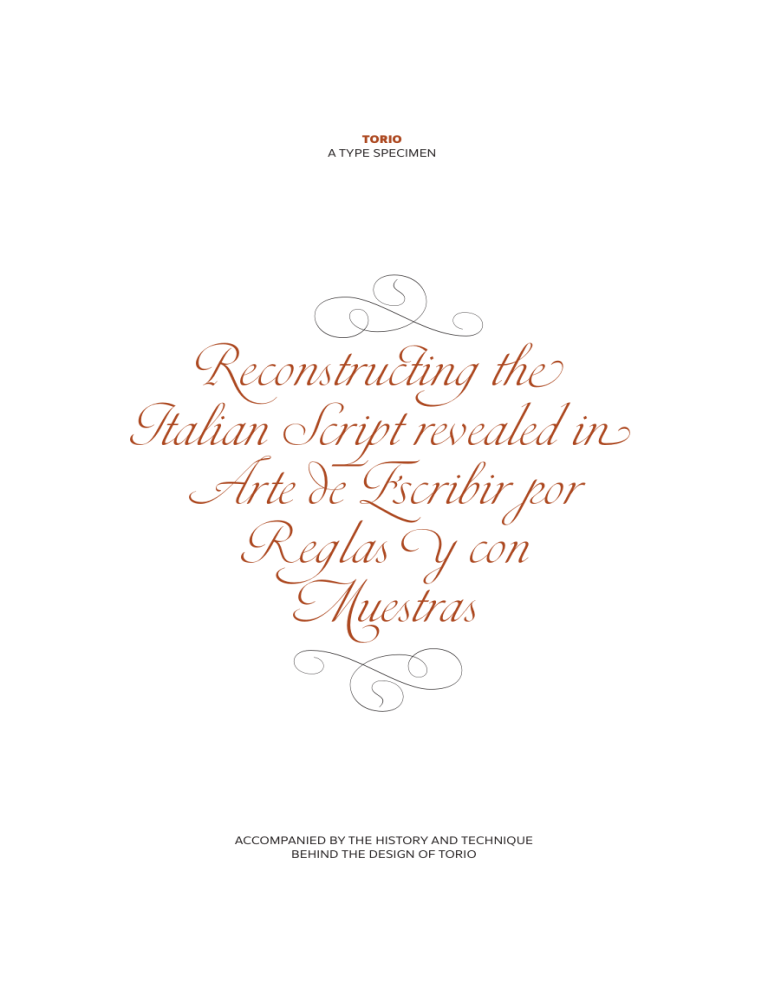
TORIO
A TYPE SPECIMEN
D
Reconstructing the
Italian Script revealed in
Arte de Escribir por
Reglas y con
Muestras
D
ACCOMPANIED BY THE HISTORY AND TECHNIQUE
BEHIND THE DESIGN OF TORIO
DSTYPE FOUNDRY
the historical part of this specimen was written by dino dos santos
and the technical part was written by pedro leal
our research was based on the writings of don rufino blanco y sanchez in his
“arte de la escritura y de la caligrafia”, printed in madrid in 1924 and the work of
don emilio cotarelo y mori “diccionario biografico y bibliografico de caligrafos
españoles, tomo ii”, printed in madrid in 1913.
we would like to thank catherine dixon for reviewing and editing the text.
the typeface used in this type specimen is ines
designed by dino dos santos
for dstype
S
T
the history
T
orio de la riva was born D. Torquato Torio y Herrero on the 1 April 1759. He completed his elementary schooling and a Latin course in Carrión de los
Condes, after which the cost to his parents of such
an education was too great and he left to become
a farmer for almost a year. ¶ His uncle, Pedro de la Riva, a citizen
of Valladolid, then became his tutor, taking him into his home and
paying for his studies in Philosophy, Theology and Law. Following
his uncle’s death, however, Torio left university and started working for Rafael Floranes, who was to offer him guidance in the disciplines of History and Diplomacy. An interest in calligraphy was
also to emerge during an internship with the Escolapios monks in
Madrid. ¶ In his later life Torio would go on to publish more than a
dozen books on many subjects, also translating several classics into
Spanish, such as The Thought of Cicero (a selection of philosophic
writings), Simon de Nantua's Le Marchand Forain not to mention
writing books on calligraphy. ¶ The first of his calligraphy books
entitled Nueva Arte de Escribir was actually very badly received becoming the focus for numerous discussions and criticisms concerning his merit as a calligrapher, owing to some imperfections in the
plates he showed. ¶ In spite of this, almost fourteen years later,
Torio went on to publish what is now considered his most important
work: Arte de Escribir por Reglas y con Muestras. Our studies are
based on the 1802 edition of this book, it’s full title being: Arte de escribir por reglas y con muestras, según la doctrina de los mejores autores
antiguos y modernos, estrangeros y nacionales, acompañado de unos
principios de Aritmética, Gramática y Ortografía Castellana, Urbanidad y varios sistemas para la formación y enseñanza de los principales
caractéres que se usan en Europa, Madrid, en la imprenta de la viuda de
don Joaquín Ibarra. ¶ The engravings for the book were undertaken
in part by Josef Asencio, and Torio apologizes for any incongruities
in the plates explaining that,“Engravers are like painters in that they
always find a way to input their own style into the works they realize.
Don Josef Asencio was indeed the most capable and talented engraver
in our country and he reproduced my originals in the best possible way,
but the amount of work he had at the time did not allow him the peace or
attention necessary for such labour.” ¶ This also helps to explain the
unusually high number of other engravers mentioned in the book
including Ascencio, Gangoiti, J. Castro and B. Ametller. Yet, despite
such circumstances, Arte de Escribir is one of most amazing books
on calligraphy to have been published in the late eighteenth century.
Undoubtedly, it is the most relevant work on the subject in Spain
since the earlier contributions of Juan de Yciar and Pedro Diaz Morante, although Torio’s offering is beyond comparison to those of
any of his predecessors. ¶ Put simply Torio was a reflexive artist
with a great talent for writing beautiful letters. He doesn’t claim to
have been the inventor of any of the scripts engraved on the plates
he published. He was also not the creator of any particular style to
be followed by modish students, yet his Arte de Escribir remains as
probably the most complete compendium on the art of writing from
the whole of the Iberian Peninsula in the period since the Renaissance until now. ¶ In Arte de Escribir Torio draws together a perfect and comprehensive dissertation on the history of writing and
calligraphy, with the faithful reproduction of what he considers to
have been the best calligraphic models used in Europe, from the sixteenth century to the final quarter of the eighteenth century. ¶ With
amazing cultural insight, he was able to capture the spirit of many
well-known calligraphers, correcting those things he found inappropriate and useless, while simultaneously interpreting such models to
suit the stylistic tastes of his own era. ¶ Torio was, in fact, an excep-
tionally talented man and highly cultured too, an unusual quality at
that time especially among Spanish calligraphers. He spoke several
languages, enjoyed a deep knowledge of mathematics and science,
and perfectly understood the very best of writing practice from the
early calligraphers onwards. ¶ Arte de Escribir is divided into three
main sections: history of writing; on theory (followed by an
incredibly rich discourse concerning the proper methods for the execution of the writing hands used since the Renaissance) and on
practice. The work ends with a foray into arithmetic, grammar and
orthography. ¶ Torio’s work also brought together the richly contended but widely divergent opinions of the so-called Palomaristas
and the Anduagistas, two sides in a long contested discussion in the
calligraphic landscape of eighteenth century Spain. ¶ Santiago Palomares argued that the establishment of rules in order to understand
the perfect path for written forms was completely absurd, because
the plates showing the visual examples should be enough to explain
the process. In opposition, Don José de Anduaga y Garimberti, argued that it was the rules informing the writing that were most important, more important even than any calligraphic samples. Arte de
Escribir por Reglas y con Muestras, uses both educational systems,
with all the plates reflecting, in a very precise way, the subjects of
the text. ¶ In fact Arte de Escribir por Reglas y con Muestras was to
be declared the official book for teaching calligraphy. On 31 January
1801 King D. Carlos iv demanded by royal appointment that copies
of Torio’s book should be distributed to schools, universities and
academies throughout Spain. ¶ Our main aim in developing this
typeface was to reconstruct, as accurately as possible, the first twelve
plates from Arte de Escribir. These are taken from the chapter Enseñanza de la letra italiana, y sus principales variaciones, autores, sistemas, &c., which is dedicated to an analysis of the Italian Script.
No hables á
las orejas de los
necios; porque
despreciarán la
doctrina de tus
palabras.
100/70 Points
We chose these few plates as they are the ones that do not refer
either directly, or indirectly, to any one particular author. As such
it is our belief that these plates truly reflect the freedom of Torio’s
own calligraphy. They are also closely related to the calligraphic style
that was such a success among Spanish calligraphers of the time: the
Spanish Bastarda. In the words of Torio: “The Italians deserve distinction over everyone, because as has been told in the fourth and final
chapter, we owe to them the invention of the Bastard script, which is so
easy, beautiful and fast to learn and adapt, and which was used for more
than three centuries across Europe.” ¶ We began our own reconstruction process with a careful selection of characters from the many
variations as shown in the plates and then decided to start drawing
a few glyphs. ¶ Our main intention was to stay close to the original
forms, nevertheless introducing some minor changes, especially in
glyphs less common in Spanish, such as the lower and uppercase ‘k’.
KkKkK�
We believe that this is also an important part in the reconstruction
process. In bringing these calligraphic models forwards to the twenty-first century, we need to ensure they will work with many more
languages than the calligraphers of their time were used to. ¶ Cotarelo y Mori, in his Diccionario Biografico de Caligrafos Españoles,
Tomo ii, wrote a highly critical note about Arte de Escribir, especially as it concerns the drawing of certain letters: “Notwithstanding
the unbeatable beauty of the plates, some critics soon warned about
the bearing of the author’s personal taste and a certain attachment to
the calligraphic rules of old. While Torio respected some mannerisms
of these older calligraphic methods he exaggerated others. The main issues regarded the use of the wide ‘long s’ which resembles an ‘f’ and
effectively makes reading difficult; the unnecessary swashes in the ‘t’
and sometimes in the ‘p’; the old style ‘shoes’ in the letters ‘y, p, q’; the
double shape of the letter ‘d’ and the strange letter ‘E’, so similar to an
‘F’; and the exaggerated size of the letter ‘v’ when used at the start of
words. These were the main defects of his cursive script, because when
Torio strictly followed the work of Palomares, no errors were visible.”
Understanding that these are actually the key elements
that make Torio’s work unique and exquisite
we decided to leave all of these
features completely
untouched.
‡
verdant fields
Hastineſs
Endogenously
Quien con afectacion
importuna é
intepestiva alaba
a otro, es como si
dixera mal de él.
Los aduladores
hacen el mal á las
claras, los detractores
ocultamente.
76/48 Points
Quando el hombre llegando al colmo
de su felicidad, cree que
v iverá quieto
y sosegado en el empleo á que le
elevaron sus próprios méritos, echa
de ver que solo ha sido para que
se le aumenten las penas y los
disgustos, y para que con su autoridad
y crédito crezcan sus émulos y
enemigos, que no pierden momento de
asestar los tiros de su mortal envidia
para derrivarle. Entonces descubre
y conoce la
v anidad de sus
pensamientos, y quan falsa es la
felicidad que goza en esta
v ida.
38/30 Points
A
J
El justo trabaja para �ivir,
Y
S
y para emplear bien lo que gana,
7
J
y de este modo merecer la
v ida eterna; pero.
C
V
A
el impio no tiene otro fin que satisfacer suſ
f
w
apetitos con los que ofende á Dios y se
D
9
Z
precipita asimiſmo á la muerte eterna.
ytn
S
T
the technique
F
rom our research we were able to arrive at a
typeface with at least four versions of each letter, all
designed to ensure perfect flow in connecting strokes
and the rich calligraphic variety representative of Torio’s original plates. ¶ These letter variations are all
contextually programmed, so as to be determined by the letters that
succeed them. At dstype we joked that it was a dictatorial script!
The letter you’re going to type next is always going to determine the
shape of the letter you’re typing now, and all without any intervention from you. ¶ In that sense the first variation of each letter will
always appear before every letter with a short stem on the left side,
such as the i, j, m, n, p, r, t, or u as well as heart-shaped letters such
as the v, w and y. The second version precedes letters with round
shapes on the left side such as the a, c, d, e, g, o and q. The third version was specially designed to connect with the letters s, x and z, and
the fourth to precede letters with left ascenders such as the b, f, h, k
or l. These versions are available for every single letter, both in upper
and lowercase, and vary not only in the form of the end stroke, to ensure perfect connections, but also in style. It’s this pseudo-random
variation in style that gives the typeface its calligraphic flair. ¶ This
four-version rotation system constitutes the basic inner workings of
our typeface. However, we then went on to develop further systems
on top of that. ¶ A fifth version was developed for select letters
that shouldn’t always connect, and a few others that required more
containment so as to avoid collisions with other more expressive
characters. ¶ A sixth and seventh version were then introduced to
our system allowing for glyphs specifically designed to appear at the
beginning and ending of words. ¶ Finally an eighth version adds a
final swash to select letters whenever they're succeeded by a period,
a question mark or an exclamation point. ¶ All of these versions are
Amazing
Aesthetics
Axiomatic
Alchemists
(1)
(2)
(3)
(4)
Cryptology
dramatized
weltschmerz
Damaged.
(5)
(6)
(7)
(8)
programmed under the OpenType feature of Contextual Alternates,
which is on by default. A set of ligatures, including ligatures for
letters separated by a space present in Torio's original plates, were
designed and programmed under an OpenType feature (Ligatures)
that is also on by default. ¶ This means that everything just works
right from the start. We feel so strongly that all of these features
are essential to this typeface and so it makes sense they should be
turned on all the time. ¶ A feature titled Swashes provides the user
with the option to swap all upper ascenders with swash versions.
This feature is off by default, requiring the user to turn it on when
necessary. We felt that this was best since those swashes are an exception in the original plates. ¶ We have tried hard to maintain the
key characteristics of those original Torio plates, propelling them
forwards from the eighteen century into our digital world,
all the while keeping the fluid spirit of their
construction and an essential sense of
the composition of their
Spanish calligraphy.
‡
Maſ vale la
repreension manisfiesta,
que el amor eſcondido.
Maſ valen las
heridaſ del que ama que
los ósculos engañosoſ del
que aborrece.
Prov. xxv11.
70/50 Points
En el sagrado y canónico libro de los Proverbios
al capítulo X. Vs.8 se nos dice: que los labios
metirosos ocultan odio; y que es necio el que
profiere la contumelia. Así es, que el que tiene el
corazon lleno de odio, y lo disimula y esconde
con palabras dulces, suaves y alagüeñas, es
hombre falso y traidor; y el que se desahoga
cargando de injurias á su próximo, es un necio
é imprudente; porque se dexa arrebatar de
una passion violenta, descubre su corazon, y
dá ocasion al otro de que se guarde de él, ó
tome satisfaccion. Por lo tanto nos aconseja el
sabio, que para evitar estos dos extremos debemos
despojarnos de todo odio y mala
v oluntad. La
lengua del justo , como dice el mismo capítulo diez
de los Proverbios, es plata escogida: mas el corazon
de los impíos nada
v ale.
34/24 Points
E
u
ed
un
en
Aa Bb Cc Dd
Ee Ff Gg Hh Ii
Jj Kk Ll Mm
Nn Oo Pp QqRr
Ss Tt Uu Vv
Ww Xx Yy Zz
!?�@&
11223344556677889900
§¶�
El f ruto de
una buena
ducacion de
n padre bo
n la sabido
S
T
fin
all rights reserved
no part of this publication may be reproduced or transmitted in any form by any means,
electronic, mechanical, photocopying, recording, or otherwise,
without the prior written permission of the publisher.
for more information on getting permission
for reprints and excerpts, contact: info@dstype.com
dstype unipessoal lda
rua óscar da silva 1234, 4esq
4450-754 leça da palmeira - matosinhos
portugal
email: info@dstype.com
www.dstype.com
