How to Use Microsoft Maps
advertisement
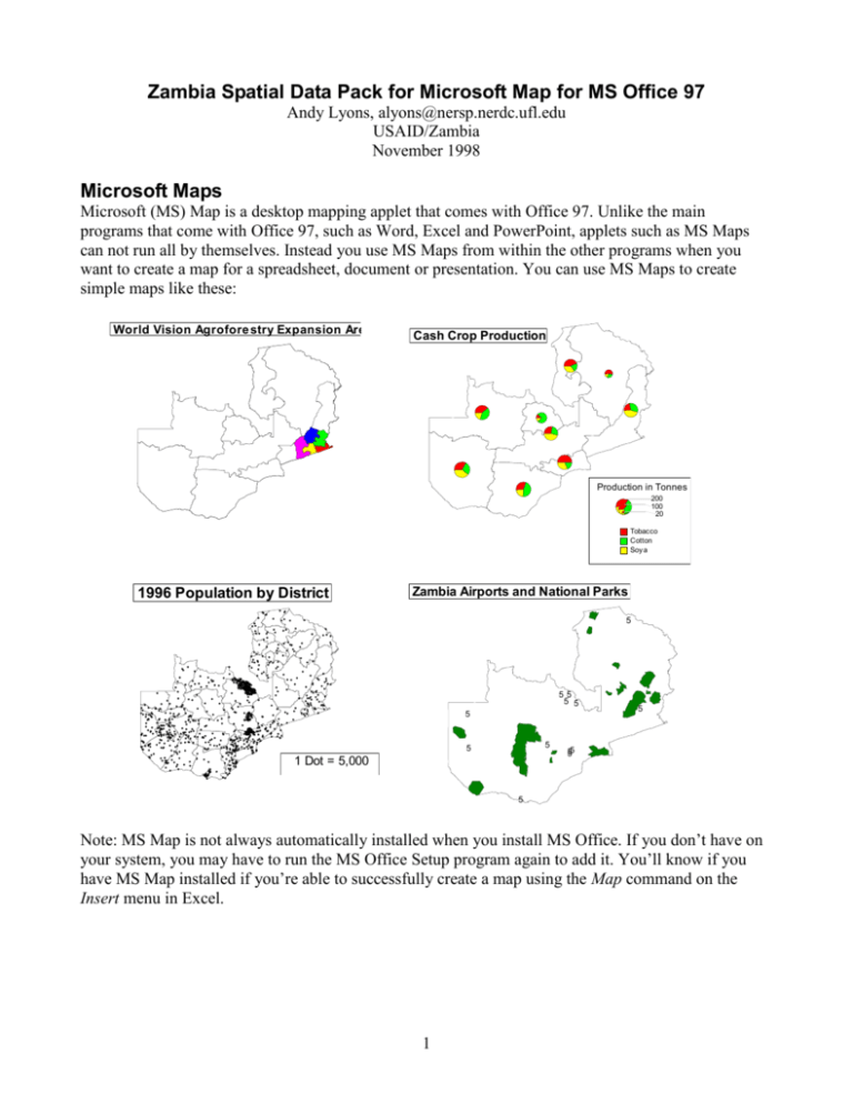
Zambia Spatial Data Pack for Microsoft Map for MS Office 97 Andy Lyons, alyons@nersp.nerdc.ufl.edu USAID/Zambia November 1998 Microsoft Maps Microsoft (MS) Map is a desktop mapping applet that comes with Office 97. Unlike the main programs that come with Office 97, such as Word, Excel and PowerPoint, applets such as MS Maps can not run all by themselves. Instead you use MS Maps from within the other programs when you want to create a map for a spreadsheet, document or presentation. You can use MS Maps to create simple maps like these: World Vision Agrofore stry Expansion Are as Cash Crop Production Production in Tonnes 200 100 20 Tobacco Cotton Soy a 1996 Population by District Zambia Airports and National Parks 5 55 5 5 5 5 5 1 Dot = 5,000 5 55 5 5 Note: MS Map is not always automatically installed when you install MS Office. If you don’t have on your system, you may have to run the MS Office Setup program again to add it. You’ll know if you have MS Map installed if you’re able to successfully create a map using the Map command on the Insert menu in Excel. 1 Map Data To use MS Map, you of course need to have the appropriate map data. In the world of computerized mapping, map data comes in layers. Each layer represents a certain type of geographic feature, For example one layer may store district borders, another layer towns, and another layer rivers. A single map may have several layers of data on it, all overlaid on top of each other. Office 97 comes with a few sample layers of data, such as countries of the world and major airports. However if you want to make customized maps of other places, such as the rural health centers in the Western Province of Zambia, then you need to track down the appropriate map data. The following map layers are available for Zambia in the Zambia Spatial Data Pack: airports districts (57 divisions) districts (72 divisions) game management areas national parks pipelines powerlines provinces provincial capitals rail lines regions rivers roads wetlands To install the Zambia data for MS Maps, go to Explorer and double-click on the ZamMapData.exe file. This will extract the spatial data in ZamMapData and put it in the appropriate folder for use with MS Map. Note: if you have already installed additional spatial data on your computer for MS Map from other sources, do not install the Zambia Map Data with the self-extracting archive, because it will overwrite the geodict.dct file. Instead open the self-extracting archive in WinZip, unzip it manually and put the files in the MS Map data folder. Then run the datainst.exe file to create a new Map Template for Zambia. Also, if your map data is in a directory other than C:\Program Files\Common Files\Microsoft Shared\Datamap\Data, then you will have to install the Zambia Map Data files manually. Options for Running MS Maps No matter what program you ultimately use to display your map (e.g., a PowerPoint presentation), most of the time you will want to create your map using Excel. The reason for this is that if you make your map in Excel, then you can link your map to numbers on a spreadsheet. (You can’t do that in Word or PowerPoint.) For example, you might have a column of numbers which represent the per capita caloric availability of each district. Or those numbers could just be 0’s and 1’s, representing whether a project is active in an area. Once your spreadsheet is linked to your map, you can use these numbers to automatically color your map, create little pie charts or bar charts, etc. Example 1: Making a map in Excel Let’s suppose, for example, that you want to make a map of Zambia that shows the per capita income by district, along with the provincial capitals for reference purposes. Let’s go through the steps involved in making this kind of map: 2 1. The first step is to prepare your spreadsheet. The spreadsheet that you use to create your map should have the name of the districts in one column, and the population density figures in a second column. But the tricky part is that the names of the districts must be spelled exactly the same as the map data file, which you can’t see directly. To make certain that you are using the correct spellings, open the ZamMSMapData_Names.xls file, which has all the correct spellings. From this file, you can copy and paste the column of district names into your spreadsheet. Figure 1 – The first step is to prepare your spreadsheet. The district names in column A must match the names in ZamMSMapData_Names.xls exactly. 2. Creating a map in Excel is similar to creating a chart. When you make a chart in Excel, you first highlight the range of cells that contain the data, then click on the chart wizard button and drag a box for the chart. Creating a map is basically the same. First highlight the cells which contain the names of the districts and the numeric data. Then from the Insert menu choose Map, and finally drag a box on the spreadsheet where you want your map. Of course you can always move the map or change its size later. Figure 2 – Next highlight the group of cells containing the data and select Map from the Insert menu 3. If you used the correct spellings of the districts and your computer is set up properly, then Excel should automatically detect that you are trying to create a map of Zambia, and create the appropriate kind of map. If you didn’t highlight a range of cells before you created your map, or don’t have the correct spellings of the geographic features, then you can always link the map to the spreadsheet later. 3 Zambia Zm Districts-57 by 1996 Population 90 to 1,190 (22) 70 to 90 (5) 50 to 70 (3) 40 to 50 (4) 0 to 40 (23) Figure 3 – The default map created. You can change it now with the MS Map tools 4. When Excel first creates the default map, it uses a Value Shading color scheme with the first highlighted column of numeric data (which in this case was district population - not what we want). So to complete our map we need to do three things. First we want to tell it to color the map using the Per Capita Salary column instead of the 1996 Population column. Then we want to set the number of intervals it uses. Finally we want to display the provincial capitals. The first two of these changes can be made using the MS Map Control window: Figure 4 – The MS Map Control window is used to control how your map looks The MS Map Control window basically has three sections. At the top of the window are the column(s) of data from the spreadsheet which are currently linked to the map. On the lower left are icons for the different types of shading formats. And the big box on the lower right of the window is an area where you match the columns of data with the shading format options. In general, to use the Control window you first drag a format icon from the left into the box, and then you drag down columns of data. If you make a mistake or want to get rid of a shading option, just drag the formatting icon back to where it came from. You can also double-click on format icons in the box to change color and grouping options. In our example, the Value Shading icon is ok, but we should drag the Per Capita Salary column icon on top of 1996 Population icon so it will be replaced: 4 Double-click here to set options for the Value Shading formatting Figure 5 – Changing the column of data Excel uses to color the map Next, we should double-click the Value Shading icon so we can set it’s options: Figure 6 – Format Properties dialog for Value Shading In this dialog, you can specify the number of intervals you’d like, as well as the color ramp and whether you want to use equal interval or quantile intervals. In this case we’ll accept the default. If we were going to use this map for a PowerPoint presentation making instead of a black and white printout, we could change the color for the shading. 5. Finally, to add the provincial capitals, go to the Map menu and select Features. Then put a check in the box for provincial capitals to make them visible. Note if you don’t see the Map menu on the Excel toolbar, then your map is not activated for editing. Double-click on the map to activate it. 5 Figure 7 – Choose Features from the Map menu to make other layers visible 1997 Per Capita Salary $ $ $ $ $ $ USD per year $ $ s ourc e: 1997 VAM 810to 2,690 (13) 620to 810 (9) 480to 620 (12) 380to 480 (9) 50 to 380 (14) $ Figure 8 – The Finished Map 6. To customize your map further, for example by adding labels, changing the titles, altering the legend, zooming in or out, moving the map around, etc., use the menu items which appear when your map is in edit mode. The best way to learn how to use these features is to play with them. Don’t be afraid to double-click or use the right mouse button to change features on your map. Exampe 2: Hiding features If you want to hide an entire layer, for example all the rivers or all of the provinces, then simply turn that layer off (see previous example). However if you want to hide certain features on the same layer, for example all of the districts in the eastern part of the country, then when you create the map originally, before you go to the Insert menu and choose Map , highlight only the data for those features which you want visible on the map. In other words, before you create the map, delete or don’t select those rows which you don’t want to see. However if you have already created the map and then decide you want to hide some of the areas, then you can just delete those cells on the spreadsheet and refresh the map. See Figure 9. Figure 9 – By highlighting just a portion of the list of districts before you create you map, you can get it to hide all the other area. 6 Note however that this trick only works for polygon regions. You can’t hide point or line data this way because you can’t link point or line data to the spreadsheet (at least not with the current Zambia map data files). However you might be able to work around this problem by making a custom pin map. Example 3: Adding Pie Charts to A Map To put pie charts on your map, first you need to make sure that when you initially create your map, that you highlight at least two columns of numeric data in addition to the column which contains the names of the geographic features. That’s because to make pie charts you need at least two columns of data. Figure 10 – When you’re going to add pie charts or bar charts to your map, be sure to highlight as least two columns of numeric data when you first create your map After you have highlighted your data and dragged a box for your map, the MS Map Control window will probably first look something like this: Figure 11 – MS Map Control window Because we want to add pie charts, the first thing to do is get rid of the default Value Shading color scheme, which you do by dragging the Value Shading icon off to the side, like this: 7 Figure 12 – To get rid of the default color scheme, drag the Value Shading icon out of the box Your Microsoft Map Control Panel should now look empty: Figure 13 – The MS Map Control window with no shading formats Now that we have cleared the default color scheme, the next thing to do is to add a format icon for pie charts. First drag the pie chart icon on to the box: Figure 14 – To add pie charts to your map, first drag the Pie Chart icon into the box Next drag down the columns of data that contain the numeric data for the pie charts. In this case, columns B, C, and D contain the numeric data that we want to use for our pie charts: 8 Figure 15 – Next drag down the columns which contain data for your pie charts Your map should now have little pie charts on it. If you don’t like the colors Excel selects for the pie slices, or you want to adjust how Excel sizes the pie charts or formats the legend, then you can doubleclick on the pie-chart icon in the MS Map Control window. You create bar charts in much the same way. Bre akdown of Ce re al Crops Problem Solving FAQ (Frequently Asked Questions) When I was making my map, I accidentally clicked the mouse on the spreadsheet outside of the map, and now I can’t do anything to my map. What do I do? If at anytime you are not in edit mode (i.e., you can make changes to your map), then double-click on your map to activate it. When a map is activated you can edit it. You can tell whether you are in edit mode because the Excel menu bar will have a Map item. How do I make the rivers visible on my map? Once your map is in edit mode (i.e., you double-click on it), go to the Map menu, and then select Features. From this dialog, you can see a list of all of the available features and select which layers you’d like visible. See Figure 16. 9 Figure 16 – Hiding or showing different layers I don’t like these gray colors it uses. I want to color my map differently. How do I do that? You control the way your map is colored or classified by using the MS Maps Control window. When you first create a map, the default color scheme is often gray-scale Value Shading (e.g., each region is assigned a shade of gray based on its numeric value). To change the colors, double-click on the Value Shading format icon in the box. Note that Value Shading can only use shades of a single color (where the intensity of the color reflects the value of the number). If you want to use a non-monochromatic color ramp, for example the colors of the rainbow, then try Category Shading. To change colors, double-click the formatting icon Figure 17 – To change shading options, double-click on the formatting icon My map has little pie charts, but now I don’t see the borders. If you create a map with pie charts, bar charts, graduated symbols, or a dot density classification scheme, but don’t see the borders of the areas, then go to the Map menu and select Features. Then make visible those layers you’d like to see. 10 Figure 18 - To make borders visible, go to the Map menu and select Features I’ve updated the numbers on my spreadsheet, but the map hasn’t changed. What’s wrong? You need to tell Excel to update the map. Select the map by clicking on it once (not double-clicking it – which will put it in edit mode). Once your map is selected, from the Edit menu choose Microsoft Map Object, then Refresh Data. I have made a really nifty map in Excel, now how do I get it into my word processor or presentation program? If you have made a map in Excel, you can put it into a Word document, a PowerPoint slide, or any other Windows program that can paste objects from the clipboard (which is pretty much all of them!). To do this, first select the map in Excel by clicking on it just once (not double-clicking) so you see the little hollow black squares. Then select Copy. Then switch to your other program, such as PowerPoint or Word, and choose Paste. Strengths and weaknesses of MS Maps One of the big advantages of MS Maps is that it comes with every copy of MS Office 97, which means there are a lot of people who have access to it. It is also fairly flexible in how you can classify (e.g., color) regions. Also, by being an applet which you can embed in pretty much any Windows program, you have a lot of options in how you combine your maps with other information, such as graphs and text. One of the weaknesses of MS Maps is that it is not well documented. The help file is not very helpful, except to tell you how you can buy more map data from Microsoft. Linking your map to data on the spreadsheet is also not very straightforward. The labeler feature works well if you only have a few labels to make. If you want to label a large number of features, for example all 72 districts, it will become tedious to do this manually. Many of these weaknesses will probably get better in future versions of MS Maps. Perhaps a bigger concern with MS Maps is data availability. MS Maps can only use data which is in MapInfo format (Microsoft’s GIS program), which is not that common in the world of GIS users. Which means it might be difficult for you to find someone to convert the map data you need. MS Maps: A True GIS? MS Maps has a number of presentation features that you would find in a Geographic Information System (GIS) to design maps, but it lacks a number of abilities that you would find in a more powerful 11 GIS program, such as ArcInfo, ArcView or MapInfo. True GIS programs can manipulate spatial data in a wide variety of ways, such as creating buffers around areas, querying data based on its proximity to other features, selecting features based on values in an attribute table, calculating the distances of features from the nearest road, etc. Without these abilities, MS Maps is probably more accurately characterized as a desktop mapping program. For System Administrators System administrators may want to note the following points about MS Maps: MS Maps is not one of the normal components installed when you do a standard installation of Office 97. You may have to do a custom installation and then make certain that the MS Maps component is checked. Of course if you have already installed Office 97 and want to add MS Maps, run Setup again and add the component. To install the Zambia data for MS Maps, extract ZmMapData.exe to the MS Map data folder, which is usually C:\Program Files\Common Files\Microsoft Shared\Datamap\Data. Note however that if you have already used the Data Installer to add other layers that didn’t come with Office 97, then you don’t want to overwrite existing file names. Instead just extract the Zambia files to the MS Maps data folder, and install them manually using DATAINST.EXE. MS Maps uses data in MapInfo format only. In order to make new data available to MS Maps, you must convert whatever GIS coverages you have into MapInfo format. Here are tips about preparing GIS layers in Map Info for use with MS Maps: The layers you prepare for use in MS Maps must all be in the same projection system in order for them to align properly. If you want your layers to be linkable to a column of numbers on a spreadsheet, take note that: In order for a layer to be linkable, the TAB file (which store the attribute information), must contain one field which has a unique value for each record. Usually this will be the name of the feature (e.g., Eastern Province, Western Province). However sometimes more than one features will have the same name, for example Eastern Province might be composed of two separate non-contiguous regions, both of which should have the name ‘Northwestern Region’. In these cases you just have to change the name to make them unique but still understandable, for example ‘Northwestern Region Upper’, and ‘Northwestern Region Lower’. The field in the table that contains the name of the geographic features must be indexed If you index point data, then you can’t make that layer visible in MS Maps. However you make point features visible by linking the point coverage to data on the spreadsheet. Indexing point layers allows you to represent points using graduated symbols. However because of the problem with visibility, none of the Zambia point layers are indexed. MS Maps only can read TAB files that follow the 8-dot-3 naming standard Order of the fields in the TAB file is also significant. When using the labeler, MS Maps will get a label from the first unique field in the table. You really don’t need to maintain any attribute data in the TAB file, because none of this is accessible to the person using MS Maps. A better way to make attribute data accessible to delete these fields from the TAB file and put them in a spreadsheet. 12


