Species Area Curve
advertisement
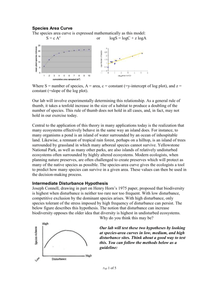
Species Area Curve The species area curve is expressed mathematically as this model: S = c Az or logS = logC + z logA Where S = number of species, A = area, c = constant (=y-intercept of log plot), and z = constant (=slope of the log plot). Our lab will involve experimentally determining this relationship. As a general rule of thumb, it takes a tenfold increase in the size of a habitat to produce a doubling of the number of species. This rule of thumb does not hold in all cases, and, in fact, may not hold in our exercise today. Central to the application of this theory in many applications today is the realization that many ecosystems effectively behave in the same way an island does. For instance, to many organisms a pond is an island of water surrounded by an ocean of inhospitable land. Likewise, a remnant of tropical rain forest, perhaps on a hilltop, is an island of trees surrounded by grassland in which many arboreal species cannot survive. Yellowstone National Park, as well as many other parks, are also islands of relatively undisturbed ecosystems often surrounded by highly altered ecosystems. Modern ecologists, when planning nature preserves, are often challenged to create preserves which will protect as many of the native species as possible. The species-area curve gives the ecologists a tool to predict how many species can survive in a given area. These values can then be used in the decision-making process. Intermediate Disturbance Hypothesis Joseph Connell, drawing in part on Henry Horn’s 1975 paper, proposed that biodiversity is highest when disturbance is neither too rare nor too frequent. With low disturbance, competitive exclusion by the dominant species arises. With high disturbance, only species tolerant of the stress imposed by high frequency of disturbance can persist. The below figure describes this hypothesis. The notion that disturbance can increase biodiversity opposes the older idea that diversity is highest in undisturbed ecosystems. Why do you think this may be? Our lab will test these two hypotheses by looking at species-area curves in low, medium, and high disturbance sites. Think about a good way to test this. You can follow the methods below as a guideline: Page 1 of 5 Materials & Methods Measuring tape Compass Plot design: Data table Field guides 8m 1 2 3 4 Flagging tape 5 8 1 6 1 7 1 10 9 Procedure 1. Each lab group will measure an 8 m2 sampling area according to the diagram above. Group members should number the ten plots within their sampling area. 2. Record your observations of the sampling site (Habitat heterogeneity including dead trees, rocks, understory plants; slope of hill; dominant tree types; sizes of trees). 3. Set up a data table in your notebook, following the model on the next page. 4. Identify the vegetation in your plots. Record each new species in your notebook. If we cannot identify the species, you may collect a sample and describe it using appropriate vocabulary. 5. When all groups have finished collecting their data, we will compile the data from all of the group plots. Groups should confer to be sure that everyone has correctly identified the species. Data Table example: Plot Area 1 1mx1m 2 2mx2m species name Bursera microphyla … Page 2 of 5 Total # individuals 1 … Results Graph the total plot area as the independent variable and the total number of new species as the dependent variable. Connect the data points by drawing in a curve of best fit. Conclusions & Discussion Include your qualitative and quantitative observations of the field site. In addition to including your data table and graph with an appropriate title, you should describe your graph in paragraph form (What is the shape of the curve? What is the correlation?). Use your data and the following discussion points to answer the following questions. How many species total were found If you wanted to preserve 90% of these species, how many square meters would it take? If you wanted to preserve twice as many species, how many square meters would it take? If you wanted to preserve 10% of the species, how many square meters would it take? Do your data fit the generalization that it takes a tenfold increase in area to double the number of species? Explain. How many species would you expect to find in a hectare? What can you conclude about the biodiversity of the area based on your data? Do your results support or reject your hypothesis? Explain. How does the species-area curve show us how much of a habitat we need to sample in order to find the maximum number of species living there? Source of error: What errors or potential errors in this investigation might have affected your results? Describe any difficulties or limitations of your investigation. How would you expect the graph to look if we sampled a 1000 m2 plot? What would be some characteristics of additional new tree species that you might encounter in a larger area? What does the species-area curve tell us about the problem of habitat fragmentation? What does it not tell us? How would you use the species-area curve to inform Tucson about the effect of potential development plans (construction of new buildings, houses, etc)? Page 3 of 5 Page 4 of 5 Lab handout compiled from the following sources: Connell, J.H. (1978) Diversity in tropical rain forests and coral reefs. Science 199 (4335) 1302-1310 Wilkinson, D.M. (1999) The disturbing history of intermediate disturbance. Oikos 84: 145-147. www.marietta.edu/~biol/introlab/speciesarea.pdf Cathy Hulshof October 2007 ECOL 406/506 Page 5 of 5
