Step 5 - Students trade graphs and questions. Have the students
advertisement
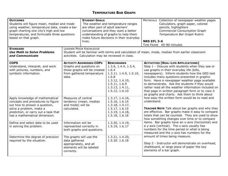
TEMPERATURE BAR GRAPH OUTCOMES Students will figure mean, median and mode using weather, temperature data, create a bar graph charting one city’s high and low temperatures, and formulate three questions based on that graph. STUDENT GOALS The weather and temperature ranges are often part of adult learners’ conversations and they want a better understanding of graphs to help them make future decisions in their everyday lives. MATERIALS Collection of newspaper weather pages Calculators, graph paper, colored pencils, highlighters Commercial Consumption Graph Temperature Bar Graph Rubric NRS EFL 3-6 TIME FRAME 45-90 minutes STANDARD Use Math to Solve Problems and Communicate LEARNER PRIOR KNOWLEDGE Student will be familiar with terms and calculation of mean, mode, median from earlier classroom activities. Calculation may be reviewed in class. COPS Understand, interpret, and work with pictures, numbers, and symbolic information. ACTIVITY ADDRESSES COPS Graphs and questions on those graphs will be created from gathered temperature data. BENCHMARKS 1.3.6, 1.4.4, 1.5.4, 1.6.4 1.3.11. 1.4.9, 1.5.10, 1.6.8 1.3.12, 1.4.10, 1.5.11, 1.6.9 1.3.13, 1.4.11, 1.5.12, 1.6.10 Apply knowledge of mathematical concepts and procedures to figure out how to answer a question, solve a problem, make a prediction, or carry out a task that has a mathematical dimension. Measures of central tendency (mean, median and mode) will be calculated. 1.3.17, 1.5.16, 1.3.18, 1.5.17, 1.3.19, 1.5.18, Define and select data to be used in solving the problem. Information will be represented correctly in both graphs and questions. 1.3.20, 1.4.19, 1.5.19, 1.6.17 Determine the degree of precision required by the situation. The graphs will use the data gathered appropriately, and all elements will be labeled correctly. 1.3.21, 1.4.20, 1.5.20. 1.6.18 1.4.16, 1.6.14 1.4.17, 1.6.15 1.4.18, 1.6.16 ACTIVITIES [REAL-LIFE APPLICATIONS] Step 1 – Discuss with students when they see or use graphs in their everyday life (bills, newspapers). Inform students how the GED test includes many questions presented in graphic form. Have a newspaper weather page available to demonstrate. Ask the students if they would rather read all the weather information included on that page in written paragraph form or to view it as graphs and charts. Ask them to think about how easy the written form would be to read and understand. TEACHER NOTE Talk about bar graphs and why they are effective. Bar graphs make it easy to compare totals that can be counted. They are used to show how something changes over time or to compare items. Bar graphs have an x-axis (horizontal) and a y-axis (vertical). The x-axis usually has numbers for the time period or what is being measured and the y-axis has numbers for the amount of times being measure. Step 2 - Instructor will demonstrate on overhead, chalkboard, or large piece of paper the key elements of a bar graph. Solve problem using appropriate quantitative procedures and verify that the results are reasonable. Problems will be calculated accurately in order for others to answer formulated questions. 1.3.22, 1.5.21, 1.3.23, 1.5.22, 1.4.21, 1.6.19 1.4.22, 1.6.20 Communicate results using a variety of mathematical representations, including graphs, chart, tables, and algebraic models. The activity’s main focus is to gather data and accurately represent it in a graph. 1.3.24, 1.4.23, 1.5.23, 1.6.21 Pass out the bar graph example titled Commercial Consumption from the National Restaurant Association. Talk about the different parts of this graph including: Title, x-axis/y-axis and what each represents, scale, data, source of the graph including the year Additional vocabulary will include perpendicular and parallel. Ask the class what conclusions they can reach regarding income and eating out. Step 3 - Students choose a United States or world city from the newspaper and note the high and low temperatures for each day in one week. They will calculate the mean, median, and mode using both the high and low figures and calculators to verify their answers. Step 4 - Using the data, graph paper, and colored pencils, they will create a graph representing that data. Make students aware of the criteria that will be used to assess their work. Distribute the Temperature Bar Graph rubric and explain each component. WRITING EXTENSION Each student will create three questions based on his or her bar graph for other students to answer. The questions may be content related, mathematical or a combination. Step 5 - Students trade graphs and questions. Have the students interpret the data and draw implications that allow them to correctly answer the questions. A class discussion will be the final step. Students will reflect on their success and complete the rubric evaluating his or her work. ASSESSMENT/EVIDENCE Instructor will monitor activity, noting accuracy, independence and fluency. Graphs and questions will be collected and included in the student portfolio along with the rubric. REFLECTION/EVALUATION Students enjoyed the activity and took more time than I anticipated drawing the graphs. Some wanted to take the graphs home to spend more time on making them look better. The questions were varied. Higher-levels students wrote more complex question. NEXT STEPS PURPOSEFUL & TRANSPARENT The GED test includes more graphs and charts then ever before. This activity will help the student prepare for material and questions in this format. The teacher models the creation of the key elements of a graph. CONTEXTUAL Everyday material comes to our students in the form of graphs and tables. This activity will build confidence in understanding this information. BUILDING EXPERTISE Students are more likely to remember and understand something they have created themselves. This activity will increase their ability to find average, median, and mode in other situations. Graphs may be a new concept for students or this activity may act as a review for the group. Evaluating student’s prior knowledge will be an important part for teachers to do before presenting this information. SOURCE: NATIONAL RESTAURANT ASSOCIATION, MEAL CONSUMPTION BEHAVIOR, 2000 This graph shows that income is an important indicator of families eating commercially prepared meals. What is the title of this graph? What number does the x-axis represent? The y-axis? Who is more likely to dine out – Consumers with a household income of $75,000 or more or consumers with a household income of $35-$44,000? What generalization can you make regarding eating out and household income? Why? Temperature Bar Graph Rubric Student Name ________________________________________ Date ________________________ CATEGORY Labeling of X axis 4 The X axis has a clear, neat label that describes the units used for the independent variable (e.g, days, months, The Y axis has a clear, neat label that describes the units and the dependent variable (e.g, % of dogfood eaten; Data in the table are well organized, accurate, and easy to read. 3 2 The X axis has a clear The X axis has a label that describes label. the units used for the independent variable. 1 The X axis is not labeled. The Y axis has a clear label that describes the units and the dependent variable (e.g, % of dogfood eaten; Data in the table are organized, accurate, and easy to read. The Y axis has a label. The Y axis is not labeled. Units All units are described (in a key or with labels) and are appropriately sized for the data set. Most units are described (in a key or with labels) and are appropriately sized for the data set. All units are described (in a key or with labels) but are not appropriately sized for the data set. Neatness and Attractiveness Exceptionally well designed, neat, and attractive. Colors that go well together are used to make the graph more readable. A ruler and graph paper (or graphing computer program) are used. Neat and relatively Lines are neatly attractive. A ruler and drawn but the graph graph paper (or appears quite plain. graphing computer program) are used to make the graph more readable. Labeling of Y axis Data Table Data in the table are Data in the table are accurate and easy to not accurate and/or read. cannot be read. Units are neither described NOR appropriately sized for the data set. Appears messy and "thrown together" in a hurry. Lines are visibly crooked.
