Mapping from the Census Bureau Website
advertisement
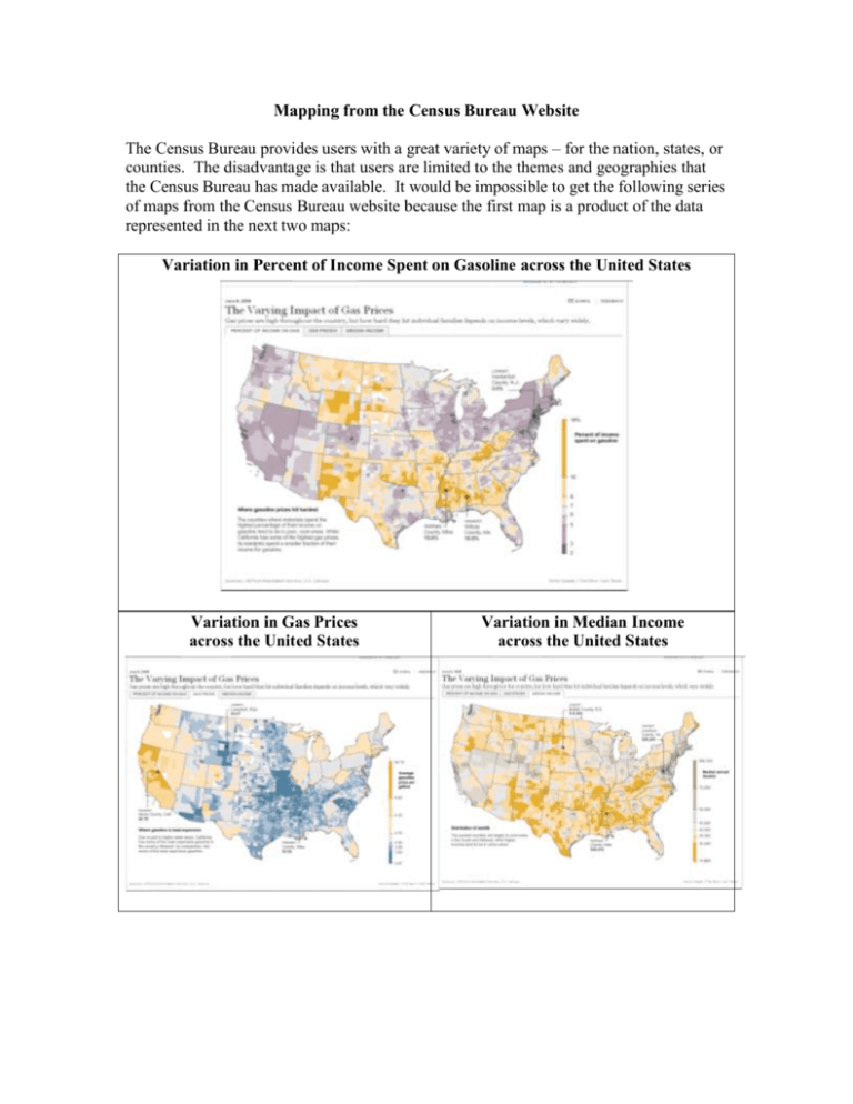
Mapping from the Census Bureau Website The Census Bureau provides users with a great variety of maps – for the nation, states, or counties. The disadvantage is that users are limited to the themes and geographies that the Census Bureau has made available. It would be impossible to get the following series of maps from the Census Bureau website because the first map is a product of the data represented in the next two maps: Variation in Percent of Income Spent on Gasoline across the United States Variation in Gas Prices across the United States Variation in Median Income across the United States The advantage of the Census Bureau site is that the maps are easy to produce. They are quite useful for those who do not have mapping capabilities. Because the ACS does not have all counties available yet, we will use data from Census 2000 for the first illustration. Go to the Census 2000 portal of American Factfinder. Click on ‘Census 2000 Summary File (SF3) – Sample Data’ Click on ‘Thematic Maps’ among the choices listed to the right. In the first example, stay with the default choice of ‘Nation’ Click ‘Next’ Select a theme. In this example, I have highlighted: ‘TM-H016. Percent of Occupied Housing Units with No Vehicles Available: 2000’ Click ‘Show Result’ The first display is by state. To get more detail, change the ‘Display map by choice’ from state to county. You can change the color and data classes of the map by going to the upper left panel the interface. The color schemes are Orange, Green, Blue, Magenta, Violet, and Gray. The class choices are Natural Breaks (default), Equal interval, Quantiles, and User Defined. I have modified my color scheme to orange. Once you are finished making changes to the map, Right Click on the map image and save to the desktop. Give it a meaningful name like ‘NoCar.gif.’ If you want to get rid of Alaska, Hawaii, and Puerto Rico, Open ‘Paint’ Click on the ‘Select feature’ Draw a box around the boundary box that includes Alaska; Right click/Cut Repeat for the other areas you would like to cut Save As NoCarx.gif Here is an example of this map: TM-H016. Percent of Occupied Housing Units with No Vehicles Available: 2000 Universe: Occupied housing units Data Set: Census 2000 Summary File 3 (SF 3) - Sample Data The next figure, is the other side of the coin. TM-H017. Percent of Occupied Housing Units With Three or More Vehicles Available: 2000 Universe: Occupied housing units Data Set: Census 2000 Summary File 3 (SF 3) - Sample Data Maps are available for the ACS, but data do not exist for all counties so one should probably not use county as a unit of analysis. To get to the ACS, click on ‘Data Sets with Thematic Maps’ Highlight ‘2006 American Community Survey’ Click ‘Themes’ For this example, I have selected: M1704. Percent of Children under 18 Years Below Poverty Level in the Past 12 Months: 2006 The data look reasonable for States, but the county map is too sparse: A more informative geography is Public Use Microdata Areas (PUMAs). The gray areas are PUMAs that do not have enough cases. Recall that the universe is the population < 18. The black areas on the maps are metropolitan areas where many counties have multiple PUMAS within the county. Here are the results for Michigan. The close-up view allows one to see the multiple PUMAs within a county more clearly.
