Micro-array preprocessing
advertisement
Microarray data analysis
Pre-processing of Affymetrix data using R Bioconductor
1 Introduction
Producing gene expression data using Affymetrix Gene Chip probe arrays is, although
to a large extent automated and standardized, an elaborate procedure and is hence
susceptible to various factors influencing the quality of such data. A number of steps
and measures are described in the Expression Analysis Technical Manual, available
from the Affymetrix web site at http://www.affymetrix.com, to ensure satisfactory
quality throughout the process of sample preparation. To monitor the quality of
sample hybridisation to the arrays and their subsequent scanning and generation of
signal intensities, Affymetrix further provides a number of metrics describing the
quality of external and internal controls, as well as a variety of parameters related to
the performance of the experiment instrumentation. This exercise will make you
familiar with the use of various Bioconductor packages that can be used to analyse
and compare these parameters across the samples included in an experiment, detailing
how to identify sample, array and hybridisation anomalies and outlier samples. The
latter part of the exercise will familiarize you with the most commonly used
techniques to remove systematic bias from arrays, allowing for bias-free comparisons
across arrays.
1.1 Example data
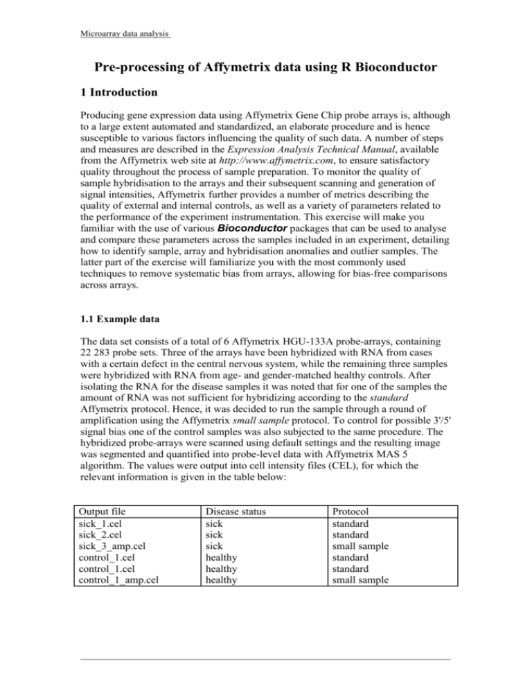
The data set consists of a total of 6 Affymetrix HGU-133A probe-arrays, containing
22 283 probe sets. Three of the arrays have been hybridized with RNA from cases
with a certain defect in the central nervous system, while the remaining three samples
were hybridized with RNA from age- and gender-matched healthy controls. After
isolating the RNA for the disease samples it was noted that for one of the samples the
amount of RNA was not sufficient for hybridizing according to the standard
Affymetrix protocol. Hence, it was decided to run the sample through a round of
amplification using the Affymetrix small sample protocol. To control for possible 3'/5'
signal bias one of the control samples was also subjected to the same procedure. The
hybridized probe-arrays were scanned using default settings and the resulting image
was segmented and quantified into probe-level data with Affymetrix MAS 5
algorithm. The values were output into cell intensity files (CEL), for which the
relevant information is given in the table below:
Output file
sick_1.cel
sick_2.cel
sick_3_amp.cel
control_1.cel
control_1.cel
control_1_amp.cel
Disease status
sick
sick
sick
healthy
healthy
healthy
Protocol
standard
standard
small sample
standard
standard
small sample
___________________________________________________________________________________
Microarray data analysis
1.2 Bioconductor packages
There are numerous packages collected in the Bioconductor project that allows
manipulation and analysis of data collected using Affymetrix probe-arrays (have a
look at www.bioconductor.org for an extensive list). For pre-processing purposes the
most intuitive and commonly used ones are the affy, affyQCReport and
simpleaffy packages (note that R is case sensitive so double-check your
spelling!).
___________________________________________________________________________________
Microarray data analysis
2 Exercise - importing and handling data
2.1 Loading data
In order to load the data contained in the CEL files into the working memory of R one
first need to load the affyQCReport, simpleaffy and affy packages into
memory using the library() command or by using the [Load package(s)...] pulldown menu under the [PACKAGES] menu.. If the packages are not stored locally
(on the hard drive of the computer where the R software is installed) they first need to
be installed from one of the remote servers that host the Bioconductor repositories.
This is done following these steps:
1. Open the [Packages->Set CRAN mirror...] menu and select a download site
located close to Finland.
2. Open the [Packages->Select repositories...] menu and select Bioconductor.
3. Open the [Packages->Install package(s)...] menu and select the affyQCReport
package from the pull-down menu.
You will notice how the affy, simpleaffay, as well as a number of other
packages, will be automatically loaded since some of their functions are used by the
functions of the affyQCReport package.
Now that the packages are loaded into memory it's time to create a variable called
dataset that will collect data from all the CEL files and add sample annotation
information using the ReadAffy() function. The dataset variable will be of tthe
class AffyBatch for which many functions have special features, as we will see
later. ReadAffy() without parameters reads all CEL files in the working directory.
The experimental design can be put in a csv file, and loaded with
read.AnnotatedDataFrame(). Use the phenoData function to add it to dataset.
2.2 Obtaining summary information about a data set
Once a data set has been created a summary of the data set itself and the associated
sample information can conveniently be extracted by simply writing their names. To
get an output similar to the summary table given in the introduction above one can
apply the pData() function to the data set.
2.3 Modifying sample names
The names of the samples can be accessed, or changed, using the sampleNames()
function. For easier display in plots it can be convenient to remove the .CEL from the
names:
As you might have guessed the nchar() function finds out the length of a character
string, whereas substr() extracts a substring from it.
Check that the names were changed correctly:
___________________________________________________________________________________
Microarray data analysis
3 Exercise - quality control
3.1 Assessing hybridisation artefacts by visual inspection
The first and perhaps most obvious, but quite often overlooked, thing to check when
assessing the quality of the acquired data is to look at the images of the scanned
arrays. With simple visual inspection it is easy to pick up hybridisation artefacts
arising from scratches, air bubbles, straws of hair or problems with staining, mixing or
washing. However, doing this can of course be problematic if the actual image files,
or .DAT files as Affymetrix calls them, are not available. Luckily, the affy package
provides functionality allowing the reconstruction of the image of the scanned array
from the CEL files. Using the image()function on an AffyBatch object will
display a pseudo-image of the intensity from all features on each array arranged
according to how they are actually physically arranged on the array. Since the
distribution of intensities is usually highly skewed with a very long right tail the
pseudo-images tend to become rather dim, making them harder to assess for artefacts.
To alleviate the problem it is possible to give the function an argument setting up the
intensity scale in logarithmic mode. Displaying pseudo-images of all arrays in one
single image (figure 3):
Figure 3: Pseudo-images of the 6 arrays of the example data.
Can you spot any significant anomalies for any of the samples?
Can you spot any systematic differences between sample types?
3.2 Assessing the quality of arrays using Affymetrix quality controls
___________________________________________________________________________________
Microarray data analysis
When pre-processing the data using Affymetrix MAS 5.0 or GCOS software packages
a number of quantities that can be used for assessment of quality of arrays are
calculated and reported. In the publication GeneChip Expression Arrays: Data
Analysis Fundamentals, available from http://www.affymetrix.com, Affymetrix gives
guidelines on how to interpret these quantities and what cut-off values to use when
determining whether an array is of acceptable quality or not. When importing raw
data from CEL files into R no control quantities are calculated, but they can be
obtained using functions implemented in the simpleaffy package. Specifically, the
functions will calculate average background, scale factor, percent present, 3'/5' ratios
of housekeeping controls and also report the expression values for the spike-in control
probes and cross-species control probes. The quantities can be calculated and stored
in a QCStats object using the qc function. You can find the functions to calculate
the statistics in the examples in the help of qc.
average background
According to Affymetrix, and assuming that the arrays were scanned with PMT
setting at 10%, the average background values should normally fall between 20 and
100. So, no apparent problems for any of the samples, not even the amplified ones.
Scale factors
Since the scaling factors do not only depend on sample quality but also on what target
intensity is selected for scaling (note that the qc() function applies a target intensity
of 100 by default), Affymetrix do not recommend any absolute threshold for
determining if an array is of poor quality or not. Rather, they suggest that the factors
should be similar among samples and not vary more than about 2 to 3-fold from each
other. According to this criterion the samples handled with the amplification protocol
would not pass the criteria. In practice, what this means is that it would not be a good
idea to include the samples handled with the standard protocol and the ones with the
amplification protocol in the same analysis due to the apparent systematic bias
introduced during the amplification process.
percent present
This bias often shows up also in the percent present values. In this case it appears
that the overall lower signal intensities observed for the arrays with amplified samples
have not resulted in a noticeably lower proportion of probes scored as present. Note
that the percent present scores vary considerably with tissue type and type of
experiment condition under study and consequently no absolute quality cut-offs can
be recommended.
As mentioned before, prior to loading samples onto the arrays a number of control
oligonucleotides are added. Four of these are spiked into the sample mixture at
different concentrations, thus allowing for later monitoring of the hybridisation
performance. The concentrations range from low down at the detection limit of
approximately 3 copies (1.25pM) of mRNA per cell for bioB to roughly 200 copies
(100 pM) per cell for cre. With the exception of the earliest generation of Affymetrix
arrays, even the spike-in with the lowest concentration should always be called
present by the MAS 5.0 algorithm. The bioBCalls slot of a QCStats object,
containing information regarding bioB detection calls, can be viewed by:
___________________________________________________________________________________
Microarray data analysis
qc_data@bioBCalls
Evidently, all arrays were hybridised and scanned without any mishaps.
Would you have expected the amplified samples to perform lesser in this regard?
It is also useful to closely examine the actual expression values for the spike-in
controls, something that can be done using the spikeInProbes() function:
Notice that in addition to being scaled to achieve a target intensity of 100 the values
have also been transformed using the base 2 logarithm. What is important to examine
about the values is that, for each array, they increase roughly linearly with the
logarithm of the concentration. As neither the affy, affyQCReport or
simpleaffy packages include functions for checking this some longer code is
required to do this. The following lines of code will create a scatterplot (figure 4) of
the values and superimpose a line of best fit for each array:
# setup and calculate x and y-values
concentration <- log(c(1.5, 5, 25, 100))
x_values <- array(concentration, c(4, length(dataset)))
x_values <- t(x_values)
y_values <- spikeInProbes(qc_data)
# plot the values in a scatterplot of y as function of x
plot(x_values, y_values, col=1:6, main="Spike-in
performance", xlab="log ( concentration in pM)", ylab="log2
(expression)")
# add legend box with sample names
legend(legend=sampleNames(dataset), x=3.7, y=7, lty=1,
col=1:6, cex=0.75)
# add lines of best fit
for (loop_count in 1:length(dataset))
{
y_values <- spikeInProbes(qc_data) [loop_count,]
lm_spike <- lm(y_values~concentration)
slope <- coef(lm_spike) [2]
intercept <- coef(lm_spike) [1]
abline(intercept, slope, col=loop_count)
}
Interpret the results.
Do the results show what you expected?
___________________________________________________________________________________
Microarray data analysis
Figure 4: Plot of the expression levels observed for the spike-in control probes
as a function of the spike-in concentration. Lines of best fit are superimposed.
3.3 Assessing 3' to 5' bias using data for control probes or whole array
The final quality control metric to examine monitors possible problems with RNA
degradation or inefficient in vitro transcription steps during sample preparation and is
calculated by taking the ratio between the 3' and the 5' located probe sets targeting the
housekeeping genes GAPDH and -Actin. Since the values stored in the QCStats
object have been transformed using the base 2 logarithm ,they have to be transferred
back to linear scale before calculation of the ratio. The 3'/5' ratios for the GAPDH
gene can be displayed with the following code:
(2^qc_data@qc.probes[,4]) / (2^qc_data@qc.probes[,6])
The corresponding values for the -Actin gene:
(2^qc_data@qc.probes[,1]) / (2^qc_data@qc.probes[,3])
Affymetrix suggests different cut-off thresholds to be used for GAPDH and -Actin,
since the latter is considerably longer than the former and hence with greater distance
between probes located at the 3' and 5' ends. Ratios for GAPDH are usually very close
to 1 and even such a small deviation as 1.25 should be considered suspect. The
corresponding value for -Actin is 3.
What do the results show and what could be the reason for this?
___________________________________________________________________________________
Microarray data analysis
How would you proceed in the downstream analysis?
Assessing RNA quality based on the performance of only a couple of probe sets may
seem precarious, especially considering what a small proportion of the total RNA
isolated that is monitored through this somewhat blunt tool. A more robust way to
evaluate RNA degradation problems is offered through a couple of functions in the
affy package. The idea is to order the probes within each probe set according to the
physical position in which they recognize its target gene and then average the values
for each position across all probe sets. Averaging over this many probe sets will
efficiently cancel out any probe-specific effects and should bring out even slight
trends with decreasing intensities towards the more 5' located probes. Use
AffyRNAdeg and summaryAffyRNAdeg to evaluate the extent of such trends
mathematically through linear regression.
Are these results consistent with the previous findings?
It is also possible to display the data graphically using plotAffyRNAdeg, giving a
more intuitive way of interpreting the results (figure 5):
Figure 5: Averaged and log2-transformed probe intensities as a function of the 5' to 3' probe
position. Note that the individual plots are slightly shifted by vertical staggering for a clearer view.
It is interesting to note that the slope values (and graph) indicate some degree of 3' to
5' bias also for the arrays hybridised non-amplified samples prepared with the
standard Affymetrix protocol. This is not unique to this specific dataset, indeed even
arrays of the highest quality will display this behaviour. Depending on what array
type has been used the 3'/5' trend will be more or less pronounced due to differences
in physical spacing between the individual probes in a probe-set. Early Affymetrix
designs with 20 or 16 probe-pairs per probe-set have shorter inter-probe distance and
___________________________________________________________________________________
Microarray data analysis
hence less 3'/5' bias while later designs with 11 probe-pairs per probe-set and larger
inter-probe spacing are associated with increased bias levels. As stated before, the
absolute values do not per se constitute a meaningful threshold for accepting or
discarding arrays from further analysis. Rather, what is important is to have
agreement between arrays.
___________________________________________________________________________________
Microarray data analysis
4 Exercise - Identifying and removing systematic bias (normalization)
4.1 Checking the distribution of data
Systematic bias, as well as other anomalies in the distribution of expression values,
are most easily identified by plotting the data in histograms or boxplots. In the Basic
statistics using R exercise the hist() and boxplot() functions were used to
accomplish this for simple data sets. The same commands can also be applied to more
complex data sets, containing data for many different samples, without modification.
There is hence no need to extract the data for the individual samples before applying
the function. Try the following, which should yield the plot in figure 6:
Figure 6: The distribution of the log2-transformed intensities
viewed as boxplots and smoothed histograms.
What conclusions can you make from the resulting plots?
Non-linear bias is most effectively identified in an MA-plot, which depicts the logtransformed ratio between two samples as a function of the log-transformed average
of the samples. This generates a scatter plot where genes with equal expression levels
in the compared samples will fall along a horizontal line with a y-intercept at 0.
Systematic deviations are easily picked up as vertical shifts in the whole distribution
of data points, while non-linear or intensity-dependent effects are clearly spotted as
curvatures in the data cloud. The affy package implementation of the MA-plot uses
the base 2 for log-transformation and compares all samples to an artificial reference
sample, which is created from the average of all samples. The function is called
___________________________________________________________________________________
Microarray data analysis
MAplot(), and creates as may scatter plots as there are arrays by default. Try the
following code (and be patient because it is very computing intensive and may take a
while), which should result in the plots shown in figure 7:
Figure 7: MA-plots for each of the six arrays compared to the calculated median of
all arrays. Lines of perfect correlation (blue) and LOESS (red) are overlaid.
Can you see any systematic and/or non-linear effects for any of the samples?
-4.2 Normalizing data from Affymetrix arrays
The most common ways to normalize Affymetrix is through simple linear scaling,
like is implemented in Affymetrix own MAS 5 algorithm, or through the more
complex RMA or GC-RMA methods developed by Terrence Speed et al. The affy
package offers an extensive array (no joke intended) of methods to perform the
different steps (background correction, quantification and summarisation) that make
up these normalization procedures. There are also wrapper functions that combine a
specific sequence of normalization steps into one single, and often more
computationally efficient, step. For a more detailed description of what these steps are
and what alternatives are associated to each of them have a look at the Affy and
BuiltinMethods vignettes. Let's first have a look at the options provided for the
individual normalization steps, which should be stated as arguments to the
expresso() function. To list the available options simply type the following:
bgcorrect.methods()
[1] "mas" "none" "rma"
"rma2"
___________________________________________________________________________________
Microarray data analysis
pmcorrect.methods()
[1] "mas"
"pmonly"
"subtractmm"
normalize.methods(dataset)
[1] "constant"
"contrasts"
[5] "qspline"
"quantiles"
express.summary.stat.methods()
[1] "avgdiff"
"liwong"
"mas"
"invariantset"
"loess"
"quantiles.robust"
"medianpolish" "playerout"
Note that not all combinations of background correction, pm-probe correction,
normalization and summary methods are possible. More specifically, rma
background correction can only be used in conjunction with pmonly pm-probe
correction. Moreover, since mas and medianpolish summarization will apply
base 2 logarithm transformation to the data a pm-probe correction method like
subtractum, which may result in negative values, is not advised.
Calling
rma_data <- expresso(dataset, bgcorrect.method="rma",
normalize.method="quantiles", pmcorrect.method="pmonly",
summary.method="medianpolish")
is in fact equivalent to running the wrapper function rma() like this:
rma_data <- rma(dataset)
The latter version is preferable because it runs considerably faster, as it is
implemented in C language rather than R code. Similarly, normalization according to
Affymetrix MAS5 algorithm can either be specified as:
mas5_data <- expresso(dataset, bgcorrect.method="mas",
normalize.method="constant", pmcorrect.method="mas",
summary.method="mas")
or using the quicker wrapper function mas() like this:
mas5_data <- mas5(dataset)
Let's have a closer look at the normalization steps of MAS5 and RMA to see if we can
notice any differences in how they treat the data and how efficient they are, Type the
following to do the normalization, and make the plots shown in figures 8-9:
mas5_norm <- normalize(dataset, method="constant")
rma_norm <- normalize(dataset, method="quantiles")
___________________________________________________________________________________
Microarray data analysis
Figure 8: Boxplots of data normalized using the constant and quantile
normalizations employed in the MAS5 and RMA algorithms, respectively.
Recently, a more sophisticated method to correct the pm-probes to account for nonspecific binding, but in a sequence-specific manner, was introduced in the GC-RMA
procedure. This is supposed to result in decreased signal variance on a par with RMA,
but with accuracy close to what MAS5 gives. The normalization and summarization
steps are identical to the ones implemented in RMA, so there is no point making a
comparison of those. Instead, let's apply all steps of the normalization procedures
employed in MAS5, RMA and GC-RMA to the whole dataset and compare the MAplots for the worst of the samples, i.e. the array with amplified RNA from one of the
sick individuals to one of the other sick samples. Of course, first we need to install
and load the gcrma package, but you should know how to do that by now. Make
data.frames from the expression data (function exprs) for the differently normalised
data sets, and us mva.pairs to draw MA graphs for sick2 vs sick3 (figure 10)
So, which normalization procedure would you choose for the data and why?
What would you do with the data from the arrays with amplified RNA?
___________________________________________________________________________________
Microarray data analysis
Figure 10: MA-plots for data normalized with MAS5, RMA and GC-RMA.
___________________________________________________________________________________
