Access to Higher Education Diploma
advertisement
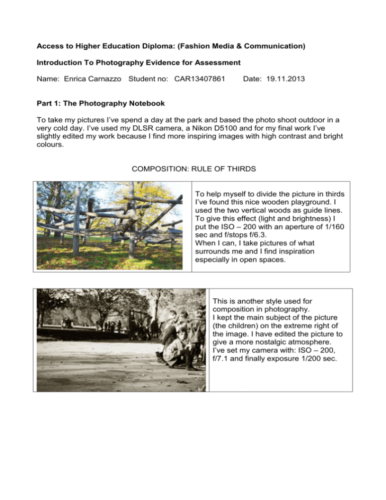
Access to Higher Education Diploma: (Fashion Media & Communication) Introduction To Photography Evidence for Assessment Name: Enrica Carnazzo Student no: CAR13407861 Date: 19.11.2013 Part 1: The Photography Notebook To take my pictures I’ve spend a day at the park and based the photo shoot outdoor in a very cold day. I’ve used my DLSR camera, a Nikon D5100 and for my final work I’ve slightly edited my work because I find more inspiring images with high contrast and bright colours. COMPOSITION: RULE OF THIRDS To help myself to divide the picture in thirds I’ve found this nice wooden playground. I used the two vertical woods as guide lines. To give this effect (light and brightness) I put the ISO – 200 with an aperture of 1/160 sec and f/stops f/6.3. When I can, I take pictures of what surrounds me and I find inspiration especially in open spaces. This is another style used for composition in photography. I kept the main subject of the picture (the children) on the extreme right of the image. I have edited the picture to give a more nostalgic atmosphere. I’ve set my camera with: ISO – 200, f/7.1 and finally exposure 1/200 sec. SELECTIVE FOCUS For this picture I portrayed the model behind the tree leafs and I’ve focused the camera at the end of the yellow leaf. The result is a very blurred background with a very sharp object at the front. I’ve edited brightness, contrast and colour balance to give this contrasting tones effect. To have this result my camera settings were: ISO – 100, f/5.6 and aperture 1/200 sec. DEPTH OF FIELD In this picture I tried to experiment with the depth of field. I focused on the thin branches in front of the subject. This is a photo with a short depth of field; the focus is set to the branches in the middle of the picture. To achieve this result I set my camera with ISO – 6400, an aperture of 1/4000 sec, use of natural light so no flash and finally f/5.6. I edited the picture slightly changing the contrast, the brightness and colour balance to confer a darker atmosphere. In this picture I tried to achieve a short depth of field (but longer that the previous one). The focus is again, in the centre on the image. To achieve that, I set the camera with ISO – 100, an aperture of 1/200 sec, and finally f/5.6, always using natural light. MOVEMENT In this picture, instead of let the subject move, I moved the camera. The result is a very blurred and light picture (due to my ISO setting). To achieve this effect I set my camera with: ISO – 320, f/5.6 and exposure 1/80 sec. For this picture I tried to capture movement with a slow stutter speed to give a “ghost” effect. The room was completely dark; the only light source was a candle that I put on the floor whilst the subject was sitting. For this picture the settings were: ISO – 3200 (the room was completely in the dark), aperture 1 sec, f/4.2. I’ve slightly edited this image (the original colour was with a red light) but for a darker mood I changed the colour into a shade of green. In this picture I tried to capture the movement of two candles that the model was moving in front of him. The result is a warm and intense picture. To achieve this I set the camera with ISO – 3200, aperture 2.5 sec, and f/4.2. I’ve just edited brightness and contrast for this image to give a warmer feeling. In this picture I’ve tried to capture a frozen movement weaving my hand in front of the camera. The only light source was behind my hand. It was quite difficult to portray this type of movement due to the fact there wasn’t enough light in the environment. I set my camera to: f/22 and shutter speed 1/4000 sec. Like the previous one, in this picture the only light source was this light. This time instead of using a moving subject I was moving the camera from right to left. This is the final result. Even if the camera is moving, the light is in focus. I set my camera to: f/22 and shutter speed 1/4000 sec. Part 2: Photography Research Notebook After my personal studies in photographic techniques and fashion photographers, I've selected 10 images of 10 fashion photographers to better represent the photographic techniques I've learned. PORTRAIT Portrait photography is a way to take pictures of a person or more people that displays the personality, and mood of the subject. This is a portrait of Elizabeth Tailor taken by Richard Avedon. The photographer was specialized in minimalist portraits. He was a predominant cultural force in that era. In this portrait the beauty of the actress has been captured in an indoor environment. I like the way she keeps her arms behind her body and the way she bands slightly forward closer to the camera. It look like her beauty is endless, frozen in that specific moment. Yet coloured pictures did not exist at that time yet the black and white tone gives to the picture a deeper atmosphere and texture. COMPOSITION: RULE OF THIRDS The rule of thirds is a technique used in composition to make photos more interesting and dynamic and it is also the most used. The rule of thirds gives a picture a more pleasant feeling because the subject is not centered in the middle of the image but located along imaginary lines which divide the image into thirds. To better explain the rule of thirds I used a black and white photography by Andrea Klarin in which the model stands in the right side of the picture. Andrea Klarin was born in Belgrade in 1972. He describes his work as the need to move and evolve. He worked for major fashion houses such as Valentino, Lanvin, and Guerlain. His work has appeared in Vogue and Harper’s Bazaar. I find this image very eye catching. I love the way black and white are almost blending together on the left side of the image and almost clashing at the same time in the right side. The Lines are almost hypnotic moving your focus towards the model's face. It is possible to see how the photographer used the rule of third to compose this picture, using the model's hood. SELECTIVE FOCUS The selective focus is a technique that can be used to make an object or model stand out in a photograph. There are different ways to achieve the selective focus. Find an object to put on focus in the picture and a wide aperture size (f stop) can help achieve this technique. A large aperture and fast shutter speed will ensure a lot of light going into the camera. So the selective focus is how the depth of field and brightness is used. To give an example of selective focus I used a photograph by Ruven Afanador. Ruven Afanador is a Columbian fashion photographer full of imagination. In his work there is a perfect mix between endless elegance and erotic undertone. He created a completely personal language in his work characterized by the balance of bold emotions and delicate nuance In this picture the tones are almost molding together. The model (Ashley Olsen) is looking at the camera and she's completely in focus while the background is not. With this technique the eyes of the viewer are concentrated just on the object that the photographer wants to show. When, instead of having just an object or model on focus all the parts in the picture are in focus the aperture should be around f22 and being far away from the subject helps too because the depth of field increases. In this picture it is clear that every part of the picture is sharp in focus. What I like about this shot is the contrast of pastel and light colours at the back (like the building, the sky and the light green grass) with the dark colour of the model’s outfit and the bird of prey. There is a contrast of direction between the vertical windows of the building and the short green poles with the horizontal posture of the model. DEPTH OF FIELD The depth of field refers to the range of distance that appears sharp in a picture. This technique deeply influences the mood and the atmosphere in an image. This is a portrait taken by Alexi Lubomirski an English photographer which work as been published in fashion magazines such as Harpers Bazaar US, Harpers Bazaar UK, Vogue, GQ USA, Vogue Nippon and Wonderland. I love the colour tones in this picture. It is clear that just the left side of her face is sharply in focus, the rest of the image is blurred. This is to let the viewer focus just on a specific part of the picture. The depth of field goes from her nose to half of her cheek (on focus). The model’s gaze might symbolize that she looks sure of her elegance and her beauty. Another fashion photographer that I find very interesting and influential is Steven Klein. His photography work is very controversial, with a very strong sexual undertone. I find his art very catching, maybe because his art is very dark and with very strong messages. In this image, which he shot for D&G, he uses a short depth of field. It is possible to notice that for the short distance from the first object in focus (the edge of the table) to the last subject in focus (model in the centre of the image). It is clear that the image has been retouched but still, it’s a good example of how to use the depth of field. MOVEMENT There are different ways to capture movement in photography. The resulting image will depend from the shutter speed and the aperture. The aperture is the opening that allows more or less light going into the camera and are called f/stops. The shutter speed determines the speed the aperture will open and close. In this picture James Nader portrayed movement using a slow shutter speed (that’s why the moving objects have this “blurred” look) whilst the model is steady (in focus). This technique gives the picture a different feeling. It looks like all around the model is chaos and noise and the viewer can focus just on her. Tim Walker is another photographer that caught my attention. His style is famous for its extravagance, romantic atmosphere and humor. In this picture he uses a slow shutter speed to give the picture the effect of movement. The colours are very dark and the model looks like puppet. On the contrary, a fast shutter speed will “freeze” the movements, giving them a “super real” feeling because it’s not something we see with “human eyes”. This is one of the beautiful photographic works by Iain Crawford. He was born in Africa and then moved to London to pursue his photographic career. He loves to create images with a strong graphic quality. In his work symmetry and chaos are on the same level. Regarding the paint shoot, the photographer says: “I love the fusion between paint and model. The resulting shapes are as opulent as any piece of bespoke couture.” His pictures have a very powerful feeling. In this one the contrast between the pastel colour of the dust, the model’s make up and hair with the black background gives a sense of distance between what is going on in the picture and the surrounding. The moment he took the picture the dust is almost going around her face, contouring it. Another photographer that likes to use movement in his pictures is Paul Weaver. For this picture he uses a fast shutter speed to freeze the movement of the floating red dress and give a “super real” feeling. I find this picture very eye catching, maybe because the way the red fabric covers the model just showing the shape of her figure. And the way her shadow reflects on the floor completely break the symmetry of the picture. Another interesting photographer is Kristian Schuller, born in Romania, he studied fashion with Vivienne Westwood. I love the warm colours in this picture. It makes me feel in another place, like a warm desert. I like the elegance and the femininity in his art. Another thing that completely hypnotizes me is the scale he uses in his picture; everything looks very big and unreal. Part 3: 400 word illustrated evaluation of two photographers In this essay I will be focusing on two fashion photographers whose work I find inspiring and how they influenced fashion photography. Richard Avedon, an American based photographer, which portraits defined the 20th Century. The Second World War was a hard period for the fashion industry. But after the war, a new generation of photographers led by Richard Avedon, helped to restore the fashion houses and popularize the ready to wear in the US. 1. One of the most famous Avedon’s pictures is Dovima with elephants, 1955. This was a unique picture because of the posture of the model. Instead of adopting a hunched posture, she pulls her shoulder back and keeps her chin upwards. Like in all his picture, the subject of ageing is present and this is clearly visible in the contrast of skin between the model’s hand and the elephant’s rough and furrowed skin. 2. Avedon’s most important project called In the American West was in 1979, when he decided to spend six years photographing member of the working class. 3. 4. 5. For this project the photographer chose to portray men and women who work hard and are ignored from the society. This series of portrait are the greater work in the period of postwar photography. In 1970 the photographer wrote: “My photographs don’t go below the surface. They don’t go below anything. They’re readings of what’s on the surface. I have great faith in surfaces. A good one is full of clues.” (Avedon 1970). In contrast to the “classic” black and white Avedon’s photography I will illustrate Miles Aldridge’s style which its characterized by acid and vivid colours. Miles Aldridge is well known for his characteristic recreation of dream-like worlds in his pictures moulding elegant, glamorous women with the darkest side of the society. The subjects on all his work are women portrayed like plastic dolls with blank facial expressions. His work is strongly influenced by film noir and film directors like Alfred Hitchcock. “Miles Aldridge is a director at heart. Each photograph has a very sacred pathology to every angle and obsession to detail. There is genius in the very deliberate blankness on the face of the models that enables transference of identity. He always draws you into an arrested fetish that seems as forbidden as a little girl’s diary.” (Marilyn Manson) In his photography he illustrates daily activities and he criticizes the women’s place in the society. He moulds unreal and real together creating his highly artistic work. At first his pictures look static and silent but they ooze chaos and tragedy. 2. 4. 1. 3. Sources: Part 2: Alexi Lubomirski: http://www.alexilubomirski.com/ Andrea Klarin: http://www.andreaklarin.com/ Iain Crawford: http://iaincrawford.com/ http://iaincrawford.com/ABOUT/1/ James Nader: http://www.jamesnaderphoto.com/#!/portfolio/C0000jUUp5iBaN8w/G000047rosylAVuQ/31 Kristian Schuller: http://www.kristianschuller.com/portfolio.php?pid=45 Paul Weaver: http://www.paulweaverphoto.com/ Richard Avedon: http://awhitecarousel.com/2011/elizabeth-taylor-by-richard-avedon-1964/ Ruven Afanador: http://www.ruvenafanador.com/ Steven Klain: http://www.shockblast.net/steven-klein-photography/ http://www.vogue.com/voguepedia/Steven_Klein http://nymag.com/nymetro/shopping/fashion/features/n_10371/ Tim Walker: http://timwalkerphotography.com/recent_work.php Part 3: Bibliography: Juliet Hacking, Photography the whole story, 2012. Thames & Hudson. pp. 342-347 Images: 1. Richard Avedon: http://sunnystyles.wordpress.com/2012/07/24/richard-avedon/richardavedon-self-portrait/ 2. Dovima with elephants: https://www.google.co.uk/search?hl=en&site=imghp&tbm=isch&source=hp&biw=1365&bih =620&q=Dovima+with+elephants&oq=Dovima+with+elephants&gs_l=img.3..0l5j0i24.646.6 043.0.6355.21.7.0.10.10.0.201.821.3j3j1.7.0....0...1ac.1.31.img..7.14.634._vaC6bHgOjo#h l=en&q=Dovima+with+elephants&tbm=isch&tbs=isz:m&facrc=_&imgdii=_&imgrc=Ih0Gf4m dD1mjpM%3A%3Bdw5xQB6SCawQcM%3Bhttp%253A%252F%252Fwww.amateurphotog rapher.co.uk%252FimageBank%252Fd%252FDovima%252520with%252520elephants.jp g%3Bhttp%253A%252F%252Fwww.amateurphotographer.co.uk%252Fhowto%252Ficons-of-photography%252F535317%252Fdovima-with-elephants-richardavedon-iconic-photograph%3B450%3B582 3. In the American West: https://www.google.co.uk/search?hl=en&site=imghp&tbm=isch&source=hp&biw=1365&bih =620&q=Dovima+with+elephants&oq=Dovima+with+elephants&gs_l=img.3..0l5j0i24.646.6 043.0.6355.21.7.0.10.10.0.201.821.3j3j1.7.0....0...1ac.1.31.img..7.14.634._vaC6bHgOjo#h l=en&q=avedon+american+west&tbm=isch&tbs=isz:m&facrc=_&imgdii=_&imgrc=UrhiVjZp hKDKM%3A%3BbnOAKAfS4VkJ0M%3Bhttp%253A%252F%252Fthephotoexchange.files.wo rdpress.com%252F2010%252F05%252Favedon_johnford.jpg%3Bhttp%253A%252F%252Fthephotoexchange.wordpress.com%252F2010%252 F05%252F%3B700%3B705 Miles Aldridge images: 1: http://content.animalnewyork.com/wp-content/uploads/2009/05/miles-aldridge-1.jpg 2: http://cdn.trendhunterstatic.com/thumbs/minuit-miles-aldridge.jpeg 3: http://livingproofmag.com/mag/wp-content/uploads/Miles-Aldridge10.jpg 4: http://www.paranaiv.no/files/images/miles_aldridge_bang_04.jpg Sources: Avedon’s quote: http://www.portrait.gov.au/site/exhibition_subsite_avedon_essay1.php Marilyn Manson quote: http://www.stevenkasher.com/artist/Miles_Aldridge/biography/ Miles Aldridge: http://www.stevenkasher.com/artist/Miles_Aldridge/biography/ http://iconiclook.com/fashion/carmen-kass-by-miles-aldridge-for-vogue-italia http://www.growpin.com/en/miles-aldridge-color-plastic-fashion/ http://www.interviewmagazine.com/art/miles-aldridge-i-only-want-you-to-love-me/ https://www.artexperiencenyc.com/miles-aldridge-at-stephen-kasher/ http://disegnodaily.com/interview/miles-aldridge-on-fashion-photography

