Endangered Mammal Bar Graph Activity
advertisement
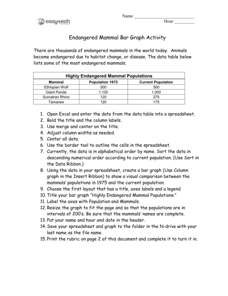
Name ___________________________ Hour _________ Endangered Mammal Bar Graph Activity There are thousands of endangered mammals in the world today. Animals become endangered due to habitat change, or disease. The data table below lists some of the most endangered mammals. Highly Endangered Mammal Populations Mammal Ethiopian Wolf Giant Panda Sumatran Rhino Tamaraw 1. 2. 3. 4. 5. 6. 7. Population 1975 500 1,100 120 120 Current Population 500 1,000 275 175 Open Excel and enter the data from the data table into a spreadsheet. Bold the title and the column labels. Use merge and center on the title. Adjust column widths as needed. Center all data. Use the border tool to outline the cells in the spreadsheet. Currently, the data is in alphabetical order by name. Sort the data in descending numerical order according to current population. (Use Sort in the Data Ribbon.) 8. Using the data in your spreadsheet, create a bar graph (Use Column graph in the Insert Ribbon) to show a visual comparison between the mammals’ populations in 1975 and the current population. 9. Choose the first layout that has a title, axes labels and a legend 10. Title your bar graph “Highly Endangered Mammal Populations.” 11. Label the axes with Population and Mammals. 12. Resize the graph to fit the page and so that the populations are in intervals of 200’s. Be sure that the mammals’ names are complete. 13. Put your name and hour and date in the header. 14. Save your spreadsheet and graph to the folder in the N-drive with your last name as the file name. 15. Print the rubric on page 2 of this document and complete it to turn it in. Name ___________________________ Hour _________ Student Evaluation Spreadsheet: _____ All data from the data table is entered into the spreadsheet. _____ The Title is Merge and Centered and is bold. _____ The column labels are bold and centered. _____ All data is centered. _____ Column width is adjusted as needed. _____ All cells are outlined using the border tool. _____ Data is sorted in descending order according to the current population. Bar Graph: _____ Graph is a column graph. _____ Title is included and correct. _____ Each axis is included and correctly labeled. _____ Graph reflects spreadsheet data. _____ Numerical Scale is in intervals of 200s _____ Graph includes a legend. _____ Excel Document is saved to the N-drive _____ Rubric is completed and turned in. Teacher Evaluation Spreadsheet: _____ All data from the data table is entered into the spreadsheet. _____ The Title is Merge and Centered and is bold. _____ The column labels are bold and centered. _____ All data is centered. _____ Column width is adjusted as needed. _____ All cells are outlined using the border tool. _____ Data is sorted in descending order according to the current population. Bar Graph: _____ Graph is a column graph. _____ Title is included and correct. _____ Each axis is included and correctly labeled. _____ Graph reflects spreadsheet data. _____ Numerical Scale is in intervals of 200s _____ Graph includes a legend. _____ Excel Document is saved to the N-drive _____ Rubric is completed and turned in.
