Fri, Jan 20 2012 11:36 AM ET
Previous Market MessageNext Market Message
AIRLINE INDEX CHALLENGES OCTOBER HIGHS -- UNITEDCONTINENTAL, DELTA AND SOUTHWEST TAKEOFF IN 2012 -- 3-MONTH
T-BILL YIELD HITS 4-MONTH HIGH -- LONG-TERM RATES ALSO SURGED
THIS WEEK -- GOLD NEARS FALLING WEDGE RESISTANCE -- BROKEN
RESISTANCE MARKS FIRST SUPPORT FOR DOLLAR INDEX
By Arthur Hill
AIRLINE INDEX CHALLENGES OCTOBER HIGHS... Link for today’s video. Led by railroad, trucking and air-freight
stocks, the Dow Transports exceeded its October high with a surge in early January. Airlines have been lagging, but may be
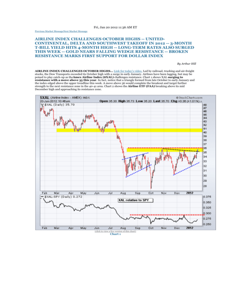
poised to play catch-up as theAmex Airline Index ($XAL) challenges resistance. Chart 1 shows XAL surging to
resistance with a move above 35 this year. In fact, notice that a triangle formed from late October to early January and
the index edged above the upper trendline this week. A move above 36 would complete the breakout and target further
strength to the next resistance zone in the 40-41 area. Chart 2 shows the Airline ETF (FAA) breaking above its mid
December high and approaching its resistance zone.
(click to view a live version of this chart)
Chart 1
(click to view a live version of this chart)
Chart 2
UNITED-CONTINENTAL, DELTA AND SOUTHWEST TAKEOFF IN 2012... Chart 3 shows United-Continental
(UAL) forming a higher low in early January and breaking the wedge trendline with a surge over the last two weeks. Notice
that this low is equal to the early October low and the November low is lower. This means a possible inverse head-andshoulders pattern is taking shape. Neckline resistance resides in the 21.50 area. Chart 4 shows Delta Air Lines
(DAL) breaking above its October-December highs with a big surge the last three weeks. Chart 5 shows Southwest
Airlines (LUV) breaking double bottom resistance with a move above 9.25 this week.
(click to view a live version of this chart)
Chart 3
(click to view a live version of this chart)
Chart 4
(click to view a live version of this chart)
Chart 5
3-MONTH T-BILL YIELD HITS 4-MONTH HIGH... Chart 6 shows the 3-month T-Bill Yield ($IRX) surging to its
highest level since early August, which is a four month high. This is an important development for the risk-on trade. The 3month T-Bill Yield plunged along with the stock market in early August and remained at excessively low levels. Buyers were
simply interested in a return of their investment and not a return on there investment. With the real interest rate negative on
this investment, it was the ultimate flight to safety. This week’s surge above .30 (.03%) indicates selling in 3-month TBills. Money from these proceeds could find its way into the stock market.
(click to view a live version of this chart)
Chart 6
LONG-TERM RATES ALSO SURGED THIS WEEK... Chart 7 shows the 10-year Treasury Yield ($TNX) surging
back above 20 this week (2.00%). The 2% level is nothing special, but chartists should note that $TNX could be forming
a higher low and preparing for a breakout. $TNX bottomed around 1.7% in September and held above this low in
December-January. Notice that the decline since late October formed a falling wedge and the yield broke the upper trendline
this week. Further strength above the early January high would be bullish for yields (bearish for bonds). Resistance in the
2.3-2.4% area would be the first target. A breakout in yields or breakdown in treasuries would be bullish for stocks. The
indicator window shows the Correlation Coefficient ($TNX, $SPX) in positive territory for most of the last 12 months. Chart 8
shows the 30-year Treasury Yield ($TYX) with similar characteristics.
(click to view a live version of this chart)
Chart 7
(click to view a live version of this chart)
Chart 8
GOLD NEARS FALLING WEDGE RESISTANCE... Chart 9 shows Gold Spot ($GOLD)bouncing off a support zone
with a surge above 1600 this year. On this weekly chart, gold peaked around 1900 and then declined below 1600 twice in
2011. Despite such a sharp move, this decline looks corrective because of the pattern and the retracement amount.
First, the yellow area marks a support zone from the May-June consolidation, August low and December low. Second, the
decline formed a falling wedge. Third, the decline retraced around 61.80% of the 2011 advance. The pattern and the
retracement are typical for corrections within bigger uptrends. Finally, notice that RSI is also in a support zone (4050) that held during the entire uptrend (over three years).
(click to view a live version of this chart)
Chart 9
Chart 10 shows daily prices with gold entering an important resistance zone that will make or break this falling wedge. With
this year’s surge, gold has now retraced around 50% of the November-December decline. In addition to the retracement zone,
resistance in the 1675-1700 area stems from broken support and the wedge trendline. A mere oversold bounce would fail in
this zone. A break above 1700 would suggest otherwise and could signal a continuation of the long-term uptrend
in gold. Chartists may have to take their cues from the stock market. For whatever reason, gold and the stock market have
been positively correlated since mid September. Even this year’s slide in the Euro did not derail gold. Therefore, a continued
uptrend in stocks should be bullish for bullion.
(click to view a live version of this chart)
Chart 10
Chart 11 shows Spot Silver ($SILVER) with a large falling channel over the last nine months. Even though silver has been
in a nine month downtrend, support is at hand in the 26 area. Notice that the 2011 lows and the 50-61.80% retracement zone
mark support here. Along with gold and the S&P 500, silver has been moving higher in 2012 with a break above 29 last week.
(click to view a live version of this chart)
Chart 11
(click to view a live version of this chart)
Chart 12
BROKEN RESISTANCE MARKS FIRST SUPPORT FOR DOLLAR INDEX... The US Dollar Index
($USD) declined this week, but remains in an uptrend overall. Success with French, Italian and Spanish bond auctions
boosted confidence in the Euro. As John Murphy pointed out on Thursday, the Euro accounts for around 57% of the US
Dollar Index ETF (UUP). Chart 13 shows the US Dollar Index breaking resistance with a surge above 80 late last year
andbroken resistance turning into support. This is a classic tenet of technical analysis. Support in the 79.5 area is
confirmed by the late December and early January lows.
(click to view a live version of this chart)
Chart 13
Chart 14 shows weekly prices over the last four years. The Dollar index has ranged from 89 to 71 during this timeframe. With
the move above 80 early this year, the index crossed the midpoint of this four year range. Also notice that there have
been five major price swings the last four years. The current swing is up, but hitting some resistance near the January 2011
high and the 50-61.80% retracement zone.
(click to view a live version of this chart)
Chart 14
Any Comments On This Article?
Your Name:
Send Comments
Copyright © StockCharts.com, Inc. All rights reserved.
You may not republish or redistribute this article in any manner without our prior written permission. Use of this article for any purpose
other than your own personal, non-commercial use is a violation of our copyright


