Collecting and Displaying Data - Baltimore City Public School System
advertisement
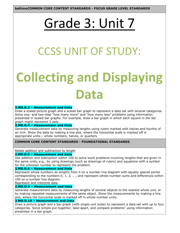
baltimoCOMMON CORE CONTENT STANDARDS - FOCUS GRADE LEVEL STANDARDS Grade 3: Unit 7 CCSS UNIT OF STUDY: Collecting and Displaying Data 3.MD.B.3 – Measurement and Data Draw a scaled picture graph and a scaled bar graph to represent a data set with several categories. Solve one- and two-step “how many more” and “how many less” problems using information presented in scaled bar graphs. For example, draw a bar graph in which each square in the bar graph might represent 5 pets. 3.MD.B.4 – Measurement and Data Generate measurement data by measuring lengths using rulers marked with halves and fourths of an inch. Show the data by making a line plot, where the horizontal scale is marked off in appropriate units— whole numbers, halves, or quarters. COMMON CORE CONTENT STANDARDS - FOUNDATIONAL STANDARDS Relate addition and subtraction to length 2.MD.B.5 – Measurement and Data Use addition and subtraction within 100 to solve word problems involving lengths that are given in the same units, e.g., by using drawings (such as drawings of rulers) and equations with a symbol for the unknown number to represent the problem. 2.MD.B.6 – Measurement and Data Represent whole numbers as lengths from 0 on a number line diagram with equally spaced points corresponding to the numbers 0, 1, 2, ..., and represent whole-number sums and differences within 100 on a number line diagram. Represent and interpret data 2.MD.D.9 – Measurement and Data Generate measurement data by measuring lengths of several objects to the nearest whole unit, or by making repeated measurements of the same object. Show the measurements by making a line plot, where the horizontal scale is marked off in whole-number units. 2.MD.D.10 – Measurement and Data Draw a picture graph and a bar graph (with single-unit scale) to represent a data set with up to four categories. Solve simple put-together, take-apart, and compare problems1 using information presented in a bar graph. FOCUS STANDARDS FOR MATHEMATICAL PRACTICE MP.2 Reason abstractly or quantitatively. Students work with data in the context of science and other content areas and interpret measurement data using line plots. Students decontextualize data to create graphs, then contextualize as they analyze their representations to solve problems. MP.5 Use appropriate tools strategically. Students create and use rulers marked in inches, half inches, and quarter inches. Students plot measurement data on a line plot. They reason about the appropriateness of a line plot as a tool to display fractional measurements. MP.6 Attend to precision. Students generate rulers using precise measurements, then measure lengths to the nearest quarter inch to collect and record data. Students label axes on graphs to clarify the relationship between quantities and units. They attend to the scale on the graph to precisely interpret the quantities involved. MP.7 Look for and make use of structure. Students use an auxiliary line to create equally spaced increments on a six-inch strip, which is familiar from the previous unit. Students look for trends in the data to help them solve problems and draw conclusions about the data. ENDURING UNDERSTANDINGS ESSENTIAL QUESTIONS Data can be collected, organized, and represented in a variety of ways. Conducting surveys is one way to collect data. Picture graphs and bar graphs are used to represent categorical data. Each unit can have a value of 1 or a value of greater than 1. Graphs can be analyzed and the data used to solve problems, including comparison problems. Using scaled intervals helps to organize data in an organized way. A number line can be used as a measurement tool. The smaller the increments used to measure, the more accurate the data. Line plots are tools used to display measurement data. Line plots are counts of things along a numerical scale. Line plots lend themselves easily to analyze the distribution and frequency of data, and can be used to solve problems, including comparison problems. Different types of data are best represented as a bar graph or a line plot. VOCABULARY New Terminology Axis (vertical or horizontal scale in a graph) What are different ways to collect, organize, and represent data? What is categorical data and how can it be represented in an organized way? How can I analyze data on a picture or bar graph to understand and solve problems about the data? How can I make a picture or bar graph in an organized way? How do I know which intervals to use when graphing data? How can I collect measurement data? How do I make measurement data more accurate and when would I need to do this? What are line plots and what are they best used for? How do I decide which type of graphical representation to use for specific types of data? Frequent (most common measurement on a line plot) Measurement data (e.g., length measurements of a collection of pencils) Scaled graphs (bar or picture graph in which the scale uses units with a value greater than 1) Survey (collecting data by asking a question and recording responses) Familiar Terminology Bar graph (graph generated from categorical data with bars to represent a quantity) Data (information) Fraction (numerical quantity that is not a whole number, e.g., ) Line plot (display of measurement data on a horizontal line) Picture graph (graph generated from categorical data with graphics to represent a quantity) 1 3
