Hydrographs and Flood Analysis Worksheet
Name: ___________________________________________ Date: _________________ Class: _______________
Hydrographs and Flood Analysis Worksheet
Open the Runoff Data Excel file. Notice three tabs: event data, annual streamflow, peak streamflow.
Part 1: Creating an Event Hydrograph
1.
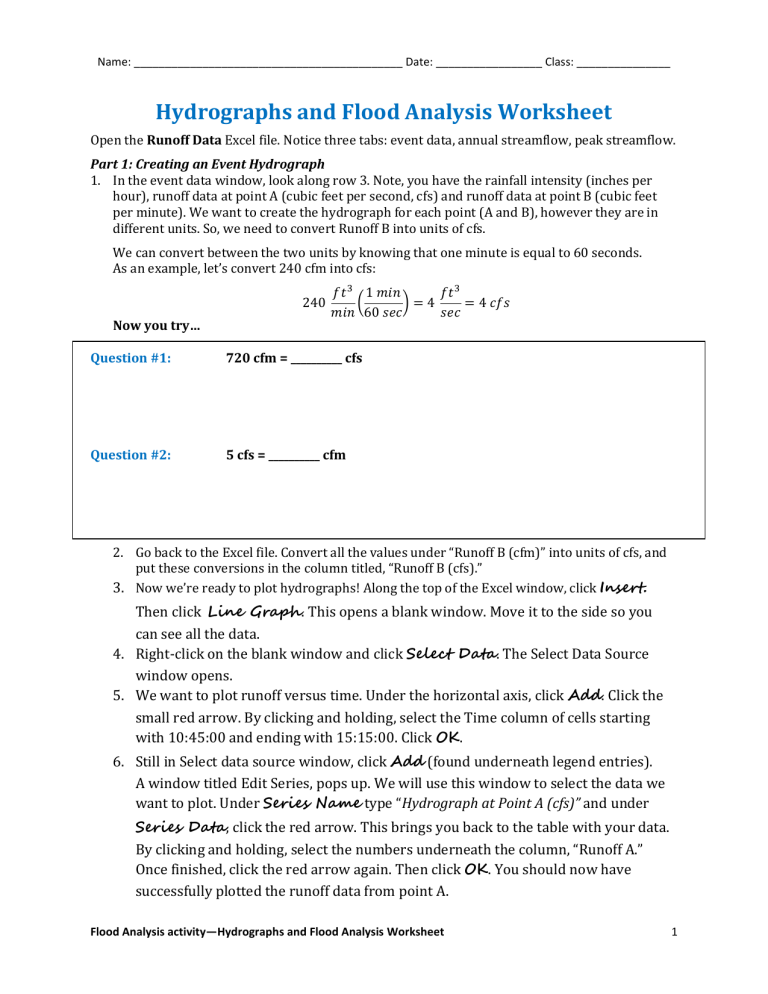
In the event data window, look along row 3. Note, you have the rainfall intensity (inches per hour), runoff data at point A (cubic feet per second, cfs) and runoff data at point B (cubic feet per minute). We want to create the hydrograph for each point (A and B), however they are in different units. So, we need to convert Runoff B into units of cfs.
We can convert between the two units by knowing that one minute is equal to 60 seconds.
As an example, let’s convert 240 cfm into cfs:
240 𝑓𝑡 3 𝑚𝑖𝑛
1 𝑚𝑖𝑛
(
60 𝑠𝑒𝑐
) = 4
720 cfm = __________ cfs 𝑓𝑡 3 𝑠𝑒𝑐
= 4 𝑐𝑓𝑠
Now you try…
Question #1:
Question #2: 5 cfs = __________ cfm
2.
Go back to the Excel file. Convert all the values under “Runoff B (cfm)” into units of cfs, and put these conversions in the column titled, “Runoff B (cfs).”
3.
Now we’re ready to plot hydrographs! Along the top of the Excel window, click Insert.
Then click Line Graph . This opens a blank window. Move it to the side so you can see all the data.
4.
Right-click on the blank window and click Select Data . The Select Data Source window opens.
5.
We want to plot runoff versus time. Under the horizontal axis, click Add . Click the small red arrow. By clicking and holding, select the Time column of cells starting with 10:45:00 and ending with 15:15:00. Click OK .
6.
Still in Select data source window, click Add (found underneath legend entries).
A window titled Edit Series, pops up. We will use this window to select the data we want to plot. Under Series Name type “Hydrograph at Point A (cfs)” and under
Series Data , click the red arrow. This brings you back to the table with your data.
By clicking and holding, select the numbers underneath the column, “Runoff A.”
Once finished, click the red arrow again. Then click OK . You should now have successfully plotted the runoff data from point A.
Flood Analysis activity—Hydrographs and Flood Analysis Worksheet 1
Name: ___________________________________________ Date: _________________ Class: _______________
7.
Repeat step 6 to add “Hydrograph at Point B (cfs)” to the same plot.
8.
Since each of these hydrographs shows a response to a specific intensity and duration of rainfall, it would be useful to plot rainfall on this plot as well. Repeat step 6 once more to add “Precipitation Event (in/hr)” to the same plot. Click OK to exit the Select Data Source window.
9.
Notice that all three curves are plotted on the same y-axis, which does not make sense because we’re dealing with two different sets of units: cfs and in/hr. So, let’s add what we call a secondary axis to the graph. Right-click on the Rainfall Event curve on your plot and open Format Data Series . Under Series Options click
Secondary Axis and click Close .
10.
Right-click on the new secondary axis that popped up on your plot and click
Format Axis . Then select the Values in Reverse Order box. Leave the
Format Axis box open, but move it to the side so you can see your plot.
Notice that you now have a secondary axis that has values in the reverse order, which results in precipitation along the top of your plot. We can make this look a little better if the precipitation curve doesn’t overlap either of the hydrographs.
Go back to the Format Axis box. Look where it says minimum and maximum values for the axis. Set Maximum Value to Fixed at 8 . Click Close .
11.
We’re almost done! In engineering and science, we want plots/graphs to be as descriptive as possible. Our plot is missing a few key details: we need to add a title and axis labels.
Look at the top of the Excel window. Under Chart Tools, click Layout . Use the Chart
Title tool to add a title Above the Chart . Use the Axis Titles tool to add titles to:
The Primary Horizontal Axis – in our case is Time (hr:min:sec)
The Primary Vertical Axis – in our case is Runoff (cfs)
The Secondary Vertical Axis – in our case is Precipitation Intensity (in/hr)
Well done! Answer the following questions based on the graph you created…
Question #3: Look at the two hydrographs. Which point (A or B) is most likely further
upstream? Why?
Question #4: How much more runoff was at point A than point B 165 minutes after the storm began?
Question #5: Which point experiences base flow? How much? Explain.
Flood Analysis activity—Hydrographs and Flood Analysis Worksheet 2
Name: ___________________________________________ Date: _________________ Class: _______________
Part 2: Creating an Annual Hydrograph
We are also interested in how the average streamflow changes throughout the year on a monthly or weekly basis. A hydrograph that shows this change through the year is called an annual hydrograph.
1.
Back in the same Excel file, open the second worksheet tab (at the bottom): annual streamflow.
2.
Using the skills you learned from making an event hydrograph, plot the annual hydrograph.
Remember, the general steps are: Create a line graph; add horizontal axis data; add vertical axis data; add title and axis labels.
You want to end up with a plot that has a primary vertical axis (y-axis) of Monthly Mean
Streamflow (cfs) and a primary horizontal axis (x-axis) of Months.
Question #6: During what month does the peak annual flowrate typically occur?
Why do you think the peak flowrate is during this month?
Question #7: A local farmer wants to know when he should pump water to his crops.
What recommendations could you give him?
Part 3: Performing a Flood Frequency Analysis
An important task for hydrology engineers is to look at historical runoff records in order to calculate the probability of different levels of runoff that could happen in the future.
1.
We start by using peakflow data. Peak data is obtained by taking the maximum flowrate from each water year (Oct-Sep). You can find peakflow data for St. Vrain Creek in Longmont, CO, in the third tab under the same Excel file we’ve been working with.
Before we get started…
Question #8: Take a look at the dates of each peakflow value. Is this consistent with what you saw on your annual hydrograph? Explain.
2.
Copy and paste the flow values into the column called Sorted.
3.
Highlight the values you just pasted. Click Data , found on the top tool bar. Then click Sort .
[Excel might give you a “Sort Warning.” If you get this warning, just click Continue with Current Selection .]
Flood Analysis activity—Hydrographs and Flood Analysis Worksheet 3
Name: ___________________________________________ Date: _________________ Class: _______________
4.
In the Sort window that opens, make sure the following fields say:
Sort By – Sorted…
Sort On – Values
Order – Largest to Smallest
Click OK .
5.
Now rank (m) your values from largest to smallest, starting with the #1, down to the #33.
Note that we have 33 values, thus our sample size (n) is 33.
6.
The return period of each magnitude flood can be calculated as 𝑇 = 𝑛+1 . 𝑚
Question #9: The highest flood value, with a rank of m=1, should be 3600 cfs.
Calculate the return period of this size flood, in this particular area, given that n=33.
7.
Use this method to calculate the return periods of every value.
8.
The probability of this size flood happening in any given year can be calculated as 𝑃 =
1 .
𝑇
Question #10: Calculate the probability that a 3600 cfs runoff would occur in any given year.
9.
Use this method to calculate the probabilities of each level flood happening in any given year.
You have now completed a Flood Frequency Analysis!
Use what you have learned to answer the following questions.
Question #11: What is the probability that a 1,520 cfs flood will occur in any given year?
Question #12: For this particular area along St. Vrain Creek in Longmont, CO, what is the “10year flood”?
Question #13: Suppose you know that if runoff in this area exceeds 3,000 cfs, the surrounding neighborhood could flood. What is the maximum probability of this happening in any given year?
Flood Analysis activity—Hydrographs and Flood Analysis Worksheet 4
