Graphic evaluation and PowerPoint experience summary
advertisement
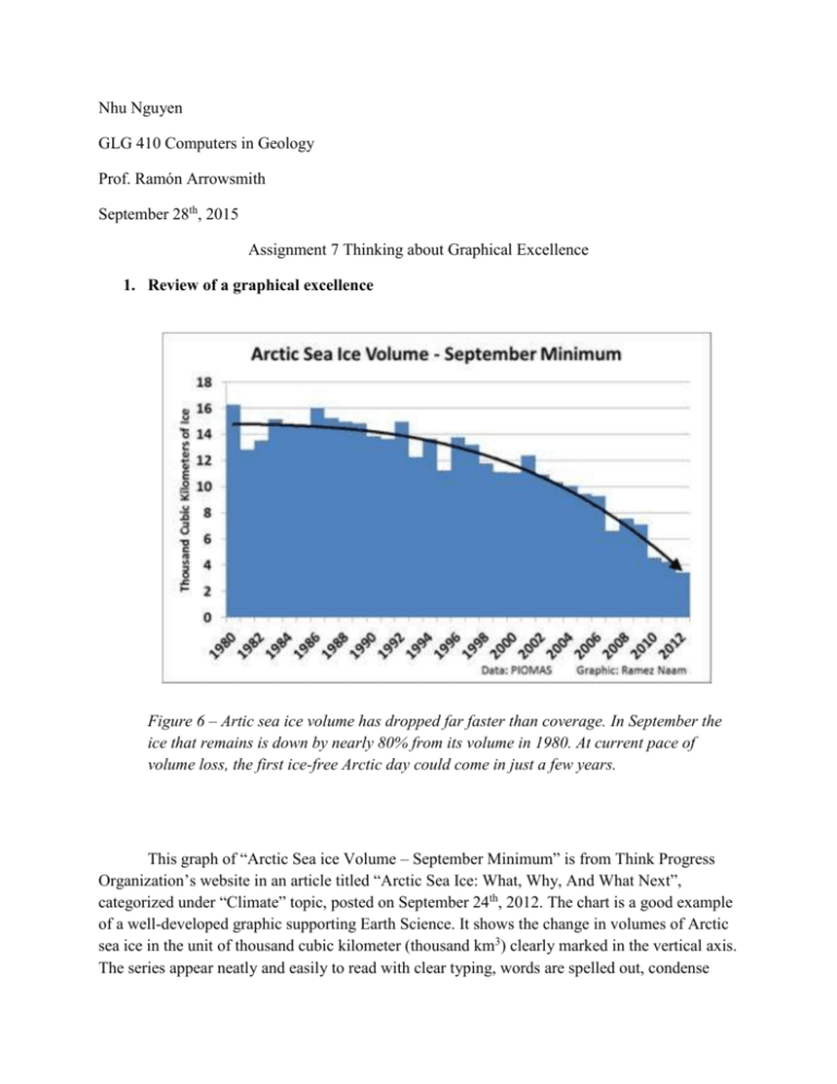
Nhu Nguyen GLG 410 Computers in Geology Prof. Ramón Arrowsmith September 28th, 2015 Assignment 7 Thinking about Graphical Excellence 1. Review of a graphical excellence Figure 6 – Artic sea ice volume has dropped far faster than coverage. In September the ice that remains is down by nearly 80% from its volume in 1980. At current pace of volume loss, the first ice-free Arctic day could come in just a few years. This graph of “Arctic Sea ice Volume – September Minimum” is from Think Progress Organization’s website in an article titled “Arctic Sea Ice: What, Why, And What Next”, categorized under “Climate” topic, posted on September 24th, 2012. The chart is a good example of a well-developed graphic supporting Earth Science. It shows the change in volumes of Arctic sea ice in the unit of thousand cubic kilometer (thousand km3) clearly marked in the vertical axis. The series appear neatly and easily to read with clear typing, words are spelled out, condense title indicates the least amount of ice every September of every year mentioned from 1980-2012 with data showed in even time intervals of every two years in the horizontal axis. Words and data are read from left to right with simple shading for the content: all blue continuously between data that could be visualized as the shape of a big chunk of ice that slowly decreases in size over time, supported by a trend line. The chart also has a reference (“Figure 6”) as when the author uses it in the article, with narrative caption explaining and summarizing the data showed. Another feature is that the chart does not need to be in color necessarily, to show its content; it can simply be viewed in black and white but can still sully express the author’s idea. Source: http://thinkprogress.org/climate/2012/09/24/894511/arctic-sea-ice-what-why-and-whatnext/ Review of a graphical mediocrity Above: Ice loss in the Arctic by region. Ice extent declined faster than normal in the Beaufort and Chukchi seas. The map in the bottom left corresponds to the regions plotted across the top of the graph. Colors in the bar graph correspond to August ice loss in different years. The chart above is from an article named “Arctic Sea Ice Extent Now Third Lowest on Record -- and Still Dropping” of WWF Climate Change Blog, posted on September 7th, 2010. This is an example of a poor-developed graphic. Firstly title is not clear, what do they mean by August “daily” ice loss? Do the data reflect everyday’s (of 30 days) ice loss because the chart does not seem like it function that way, or, do they just express data in average for August every mentioned year? Also, data in the chart is not showed in a proper order: data from 1979-2000 should be put first, not at last, in group of columns, then 2007 to 2010, since it is the first time interval in the series. Secondly, the chart measurement on the vertical axis does not go with any unit. Thirdly, values in the vertical axis do not necessary need to be in negative numbers as they are already expressed a “loss” value in an upside down chart that starts at 0 on top and get larger toward the bottom of the chart. Also about formatting, “Central Arctic” needs to be capitalized as it is in the little color map at the bottom left to be uniform. Lastly, the map shows many other regions in other colors that the chart does not cover, such as Alaska in green, Barents in orange, Greenland in purple, together with some white, brown, and yellow part. If these regions above are not going to be mentioned on the graph, they should not be named and colored separately like they were here, to avoid the crowded map and unnecessary attention of the reader. The area nearby can also be colored lighter to make the most important ideas more stand-out and abstract compared with other elements in the color-coded map. Sources: http://www.wwfblogs.org/climate/content/arctic-sea-ice-extent-7sep2010 2. Tufte’s “The Cognitive Style of Powerpoint” Summary Tufte’s “The Cognitive Style of Powerpoint” points out everything wrong with PowerPoint presentation software (PP), especially in the use of an alternate scientific report that require technical research-based evidence and analytical writing. The article started with several highlight sayings that are going to be analyzed later in the content giving the audience the first impression of how a bad presented project typically appear to be. At the beginning, the article introduces evidence that compares PP with alternative methods for presenting information through 10 case studies, an unbiased collection of 2000 PP slides, and 32 control samples from non-PP presentations: the study indicates that PP lessens the quality of analytically scientific-determined reports. Tufte tells the story of the IBM’s president of turning off an on-going PP during an employee’s presentation that concluded the age of plain boring annoying-bullets-full and repetitive slide-ware-overhead-projector presentation at IBM. Supported by several examples, especially one of a bad “analytical” PP report ussed by NASA engineers in a typical ready-made template with 6 different levels of hierarchy displayed by series of unnecessary bullets, vague expression, forced-to-fit content in an “arbitrary compartment”, repeated ambiguous word-choice, and inconsistent ways of writing measurement units indicating a carelessly non-professional in the user’s attitude while preparing the report, furthermore, the example, has proved that it is inappropriate, in every aspects, to use PP in lieu of a scientific report while referring a serious technical work, except as for a basic presenting tool, which can also be outdone by other more intellectual methods of presentation. Autosuggesting chart Wizard in PP is also a poor development as the content comes out could take up far too many chopped-up, disrupted, separated charts that show no connection to each other as when data was just simply presented in one single informative table that allow audience to make comparison between data sets. Tufte suggests a good presentation should come with some type of hand-out given prior to the talk at a form of a 7x11 in 4-page-folded paper that can help audiences building up outline and basic ideas knowing that audience can read 3 times as fast as the presenter talk. Ideas would be emphasized and explained better during the talk when audiences are already provided their own time of acquiring and criticizing main points of the presentation. I have only made 2 PP’s in my 4 years of college as they were specifically required by the instructors since I do not recognize typical all-text PP slides as a capable mean of presenting in classroom environment, except when in need of transporting a set of illustrations that support a talk or a lecture via overhead projector. Due to all the limited function, tight template, heavy appearance but ambiguous content: hard to read if too much information is presenting too quickly but boring to follow if too little data showed, a PP presentation can cause either overwhelming or unexciting in audience.
