More information can be found here
advertisement
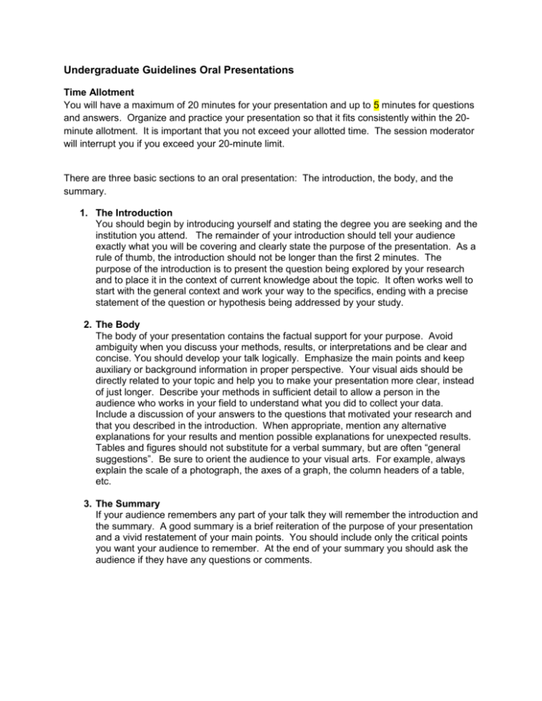
Undergraduate Guidelines Oral Presentations Time Allotment You will have a maximum of 20 minutes for your presentation and up to 5 minutes for questions and answers. Organize and practice your presentation so that it fits consistently within the 20minute allotment. It is important that you not exceed your allotted time. The session moderator will interrupt you if you exceed your 20-minute limit. There are three basic sections to an oral presentation: The introduction, the body, and the summary. 1. The Introduction You should begin by introducing yourself and stating the degree you are seeking and the institution you attend. The remainder of your introduction should tell your audience exactly what you will be covering and clearly state the purpose of the presentation. As a rule of thumb, the introduction should not be longer than the first 2 minutes. The purpose of the introduction is to present the question being explored by your research and to place it in the context of current knowledge about the topic. It often works well to start with the general context and work your way to the specifics, ending with a precise statement of the question or hypothesis being addressed by your study. 2. The Body The body of your presentation contains the factual support for your purpose. Avoid ambiguity when you discuss your methods, results, or interpretations and be clear and concise. You should develop your talk logically. Emphasize the main points and keep auxiliary or background information in proper perspective. Your visual aids should be directly related to your topic and help you to make your presentation more clear, instead of just longer. Describe your methods in sufficient detail to allow a person in the audience who works in your field to understand what you did to collect your data. Include a discussion of your answers to the questions that motivated your research and that you described in the introduction. When appropriate, mention any alternative explanations for your results and mention possible explanations for unexpected results. Tables and figures should not substitute for a verbal summary, but are often “general suggestions”. Be sure to orient the audience to your visual arts. For example, always explain the scale of a photograph, the axes of a graph, the column headers of a table, etc. 3. The Summary If your audience remembers any part of your talk they will remember the introduction and the summary. A good summary is a brief reiteration of the purpose of your presentation and a vivid restatement of your main points. You should include only the critical points you want your audience to remember. At the end of your summary you should ask the audience if they have any questions or comments. General Suggestions Use of Notes Some people read their presentations and this often makes for a very flat delivery. Remember a lecturer from your past that read one of her/his lectures for 40 minutes! Other people try to memorize their presentation, which often makes for a very stiff and tense presentation. This person might get very distraught if they did prepare and attempt to memorize the answer to every possible question that might come from the audience. The majority of good presenters use notes. You might try using notes printed on 3” by 5” cards. Cards are relatively inconspicuous and easy to hold. To avoid the tendency to read from notes, limit them to key phrases that bring to mind several sentences or an entire section of your presentation. You may also want to use the notes feature of your PowerPoint program to print the notes under each slide on your printout to ensure you are talking about the information that is shown on the screen to the audience. Use of the Podium There will be some type of podium or lectern provided for your presentation. Standing behind the podium will give a formal air to your talk while moving away will establish a friendlier relationship with your audience. Both of these styles are acceptable, so decide which will be more comfortable for you. Visual Aids There are various media available for visual presentations. We have required that all Oral presentations be in Microsoft PowerPoint format. Please note that your presentation will be given on our AMP PC, so ensure compatibility, especially if you do your presentation on a Mac. Visual aids are very effective communication tools and are essential in virtually every presentation. The majority of what your audience absorbs from your presentation will come from the visual presentation that you use. Therefore, you will increase the probability of maintaining your audience’s attention and interest if you use visual aids wisely. Your presentation will be loaded onto a laptop computer at the ANLSAMP office and we will have the laptop and projector setup for you. You will have a remote control to use for moving through the presentation. We also intend to supply a laser pointer for your use, but please bring one, if you have one, in case ours fails. A good visual aid should: 1. Aid to clarify, reinforce or highlight an idea. It should relevant to the subject of your presentation. 2. Be easy to read. Keep the content simple. Avoid complicated graphs or tables. 3. Be brief. Four or five lines with no more than six words per line is a guideline for a good textual visual aid. Your audience should be able to read and absorb the content within two minutes. You should spend the first fifteen to twenty seconds of that time just focusing the audience’s attention on your slide and explaining the layout. 4. Not overwhelm the audience with detail or color. Use color to highlight particular points or to group related items. 5. Present only highlights. A good visual aid will supplement, reinforce, and aid spoken material, not take its place, detract from it, or overwhelm it. 6. Be accessible and easily visible to the audience. Handouts If you would like the audience to have handouts of your presentation, please bring 10-15 copies with you. We will not be able to make copies of your handouts for you.
