Year-9-Curriculum-Overview-Summer-Half-Term-2
advertisement
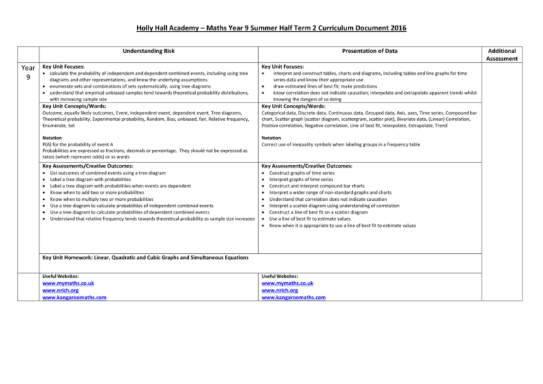
Holly Hall Academy – Maths Year 9 Summer Half Term 2 Curriculum Document 2016 Understanding Risk Year 9 Presentation of Data Key Unit Focuses: Key Unit Focuses: calculate the probability of independent and dependent combined events, including using tree diagrams and other representations, and know the underlying assumptions enumerate sets and combinations of sets systematically, using tree diagrams understand that empirical unbiased samples tend towards theoretical probability distributions, with increasing sample size Key Unit Concepts/Words: Key Unit Concepts/Words: Outcome, equally likely outcomes, Event, independent event, dependent event, Tree diagrams, Theoretical probability, Experimental probability, Random, Bias, unbiased, fair, Relative frequency, Enumerate, Set Categorical data, Discrete data, Continuous data, Grouped data, Axis, axes, Time series, Compound bar chart, Scatter graph (scatter diagram, scattergram, scatter plot), Bivariate data, (Linear) Correlation, Positive correlation, Negative correlation, Line of best fit, Interpolate, Extrapolate, Trend Notation P(A) for the probability of event A Probabilities are expressed as fractions, decimals or percentage. They should not be expressed as ratios (which represent odds) or as words Notation Correct use of inequality symbols when labeling groups in a frequency table Key Assessments/Creative Outcomes: Key Assessments/Creative Outcomes: List outcomes of combined events using a tree diagram Label a tree diagram with probabilities Label a tree diagram with probabilities when events are dependent Know when to add two or more probabilities Know when to multiply two or more probabilities Use a tree diagram to calculate probabilities of independent combined events Use a tree diagram to calculate probabilities of dependent combined events Understand that relative frequency tends towards theoretical probability as sample size increases interpret and construct tables, charts and diagrams, including tables and line graphs for time series data and know their appropriate use draw estimated lines of best fit; make predictions know correlation does not indicate causation; interpolate and extrapolate apparent trends whilst knowing the dangers of so doing Construct graphs of time series Interpret graphs of time series Construct and interpret compound bar charts Interpret a wider range of non-standard graphs and charts Understand that correlation does not indicate causation Interpret a scatter diagram using understanding of correlation Construct a line of best fit on a scatter diagram Use a line of best fit to estimate values Know when it is appropriate to use a line of best fit to estimate values Key Unit Homework: Linear, Quadratic and Cubic Graphs and Simultaneous Equations Useful Websites: Useful Websites: www.mymaths.co.uk www.nrich.org www.kangaroomaths.com www.mymaths.co.uk www.nrich.org www.kangaroomaths.com Additional Assessment
