Group C: ice elevation
advertisement
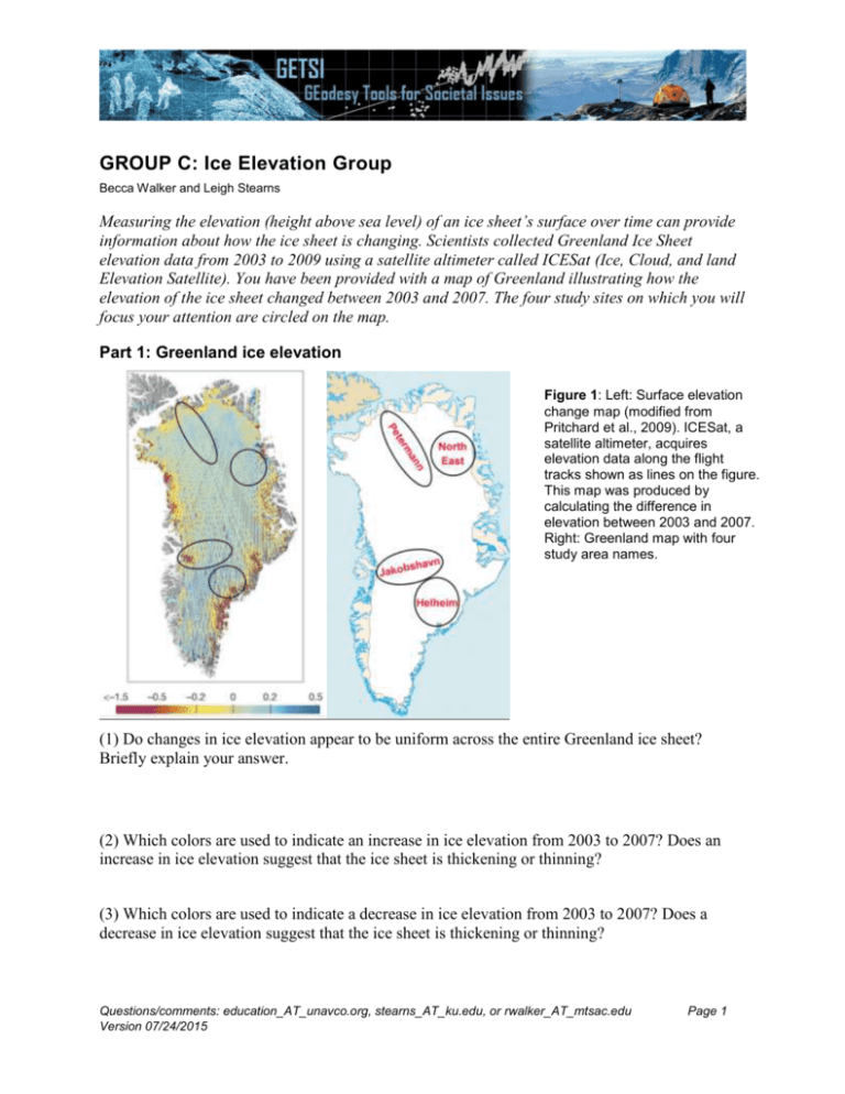
GROUP C: Ice Elevation Group Becca Walker and Leigh Stearns Measuring the elevation (height above sea level) of an ice sheet’s surface over time can provide information about how the ice sheet is changing. Scientists collected Greenland Ice Sheet elevation data from 2003 to 2009 using a satellite altimeter called ICESat (Ice, Cloud, and land Elevation Satellite). You have been provided with a map of Greenland illustrating how the elevation of the ice sheet changed between 2003 and 2007. The four study sites on which you will focus your attention are circled on the map. Part 1: Greenland ice elevation Figure 1: Left: Surface elevation change map (modified from Pritchard et al., 2009). ICESat, a satellite altimeter, acquires elevation data along the flight tracks shown as lines on the figure. This map was produced by calculating the difference in elevation between 2003 and 2007. Right: Greenland map with four study area names. (1) Do changes in ice elevation appear to be uniform across the entire Greenland ice sheet? Briefly explain your answer. (2) Which colors are used to indicate an increase in ice elevation from 2003 to 2007? Does an increase in ice elevation suggest that the ice sheet is thickening or thinning? (3) Which colors are used to indicate a decrease in ice elevation from 2003 to 2007? Does a decrease in ice elevation suggest that the ice sheet is thickening or thinning? Questions/comments: education_AT_unavco.org, stearns_AT_ku.edu, or rwalker_AT_mtsac.edu Version 07/24/2015 Page 1 Unit 3: Group C (ice elevation) (4) How are changes in ice elevations different near the coast compared to inland areas? Suggest a reason for this observation. Part 2: Greenland glacier ice elevation The map that you just studied shows ice sheet-wide data. Another way to understand changes in ice elevation is looking at time series data from specific locations on the ice sheet. A time series plot illustrates how a particular characteristic—in this case, ice elevation—changed over time. You have been provided with four time series plots, one for each study site circled on the Greenland map. These maps show elevation change at one point on the trunk of each glacier. Elevation data comes from both satellite (ICESat) and airborne altimeters (Csatho et al., 2014). Time-series for Jakobshavn Isbræ Glacier Time-series for Helheim Glacier Time-series for NE interior of Greenland Time-series for Petermann Glacier Figure 2: Elevation data for a point on the trunk of each glacier, as it changes over time. Elevation data is derived from both satellite (ICESat) and airborne altimeters, as compiled by Csatho et al. (2014). (5) Which study site(s)—choose one or more—showed an overall decrease in ice elevation from 2003 to 2012? Jakobshavn Isbræ Helheim NE interior Petermann Questions/comments: education_AT_unavco.org, stearns_AT_ku.edu, or rwalker_AT_mtsac.edu Version 07/24/2015 Page 2 Unit 3: Group C (ice elevation) (6) Which study site(s)—choose one or more—showed an overall increase in ice elevation from 2003 to 2012? Jakobshavn Isbræ Helheim NE interior Petermann (7) Which study site showed the greatest overall change in ice elevation from 2003 to 2012? (Choose ONE) Jakobshavn Isbræ Helheim NE interior Petermann (8) Which study site’s ice elevation changed the least from 2003 to 2012? (Choose ONE) Jakobshavn Isbræ Helheim NE interior Petermann (9) Which two study sites are most similar to one another? What do their time series have in common? (10) Propose two to three ideas about what could cause changes in an ice sheet’s elevation. Part 3: Greenland mass loss predictions Now that you have looked at some Greenland ice elevation data, it is time to predict where you would expect the greatest changes in ice mass to occur. An increase in ice mass indicates that a particular glacier is growing. In contrast, a glacier that exhibits a decrease in ice mass is shrinking. Instructions: Notice that on your blank map labeled “prediction,” you have been given a scale bar with different colors representing large decrease in ice mass, slight decrease in ice mass, no change in ice mass, slight increase in ice mass, and large increase in ice mass. Using this scale, please shade the four study sites circled on the map to reflect your predictions about how much relative ice mass change has occurred in these areas from 2003 to 2012. You have an identical blank map labeled “evidence.” On this map, please make some written notes in each of the 4 study sites about the evidence that you used to make your predictions. In other words, how has ice elevation changed in each study site, and how did you use this information to predict how ice mass in each of these study sites changed? You can use words like elevation increase, elevation decrease, thickening, thinning, etc. This map should support/justify the predictions that you made. When you are finished with these two maps, you should be able to present them to a someone in another group and explain to him/her your predictions for changes in ice mass and how you came up with your predictions. Questions/comments: education_AT_unavco.org, stearns_AT_ku.edu, or rwalker_AT_mtsac.edu Version 07/24/2015 Page 3 Unit 3: Group C (ice elevation) (11) How certain are you in your predictions? If you are uncertain, which additional pieces of information would be useful in making your predictions? (12) Which data set—air temperature or snowmelt—did you rely on more in making your predictions? Why? Questions/comments: education_AT_unavco.org, stearns_AT_ku.edu, or rwalker_AT_mtsac.edu Version 07/24/2015 Page 4
