File
advertisement
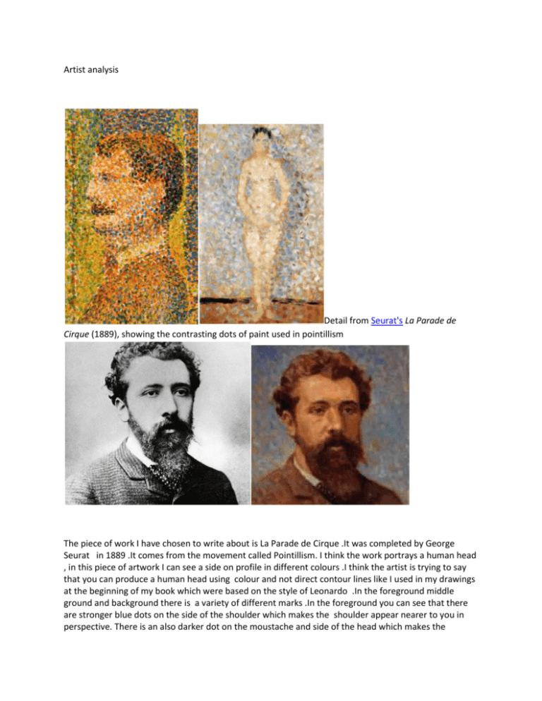
Artist analysis Detail from Seurat's La Parade de Cirque (1889), showing the contrasting dots of paint used in pointillism The piece of work I have chosen to write about is La Parade de Cirque .It was completed by George Seurat in 1889 .It comes from the movement called Pointillism. I think the work portrays a human head , in this piece of artwork I can see a side on profile in different colours .I think the artist is trying to say that you can produce a human head using colour and not direct contour lines like I used in my drawings at the beginning of my book which were based on the style of Leonardo .In the foreground middle ground and background there is a variety of different marks .In the foreground you can see that there are stronger blue dots on the side of the shoulder which makes the shoulder appear nearer to you in perspective. There is an also darker dot on the moustache and side of the head which makes the features appear nearer. In the middle ground the eyes are not as strong as the moustache and they appear further back. In the background you can see that there are really weaker green dots and they are quite yellow/green and this makes the area in the background weaker and further away because there are darker greens in the foreground just like around the side of the nose. The piece is painted drawn constructed from oil paint on canvas. The technique of has been used as I mentioned before is called Pointillism. What Seurat did was to create form by placing small dots of colour next to each other to create a pattern but from a distance you merge the dots together with your eyes .As you can see from the Seurat images The artist may have used to/because.The lines used in piece are really nonexistent and you can just see a faint outline which your eyes have to merge together around the silhouette of the portrait .The texture appears to be quite lumpy because the artist used thick oil paint and layered the dots on top of each other .Therefore the piece looks really colorful because what Seurat has done is combine complementary colours like orange and blue around the shoulder of the man and on parts of the face He also used red and green which are also opposite and he uses them on part of the face and the background to create more complementary contrast .The marks /textures/brushstrokes that have been used are overplayed so some colours are placed on top of each other or sometimes next to each other .The patterns are really amazing especially if you go close up and view them because you cannot see the face just patterns which when you go backwards you see parts of the face. So the pattern is quite abstract .They create an abstract effect. The shapes and form in the work are .The tone in the painting /drawing is actually quite mid tone because a lot of green and red is used but there is some dark tone around the shoulders and moustache .The colours are really strong .The use of colour in the work makes me feel quite happy because he has used warm colors like red and orange. The artist has used primary colours in the areas the artists has used complementary colours in his work and they are .They are situated in parts of the painting /sculpture /collage. I think the story behind this piece is that Seurat wanted to show people that you can mix dots of paint to create a profile of a man without using the normal way of painting like Leonardo did. I read that Seurat did four really famous paintings the most famous being “ASunday in the Park on the Island of La Grande Jatte” is his most well known work It’s really sad that he died at 31 because he could have produced more works .I think the artist wanted us to feel that colour harmony and form can be achieved by using small dots next to each other and I think he has done this in his work. .I think the artist is trying to say that you can create a piece of art just using optical dots .The piece of work makes me think of a dotted jigsaw or its like looking at pictures made of little pieces of powder like you see on the streets .The work makes me that I want to try and combine his pointillist technique in future pieces because I like the way he uses really strong colours but does not use outline but makes you have to stand back to really see the picture and if you go in close you just see pattern. It’s a little like a trick but I really like it. I chose to write about this piece of work because in our project “I Me Mine” we are looking at all aspects of portraiture and as we have already looked at monochrome we have to now examine colour .I like /dislike the work because .What works in this piece is that the complementary colours are really balanced .I has been inspired by this piece of work to produce a piece of work which will use the pointillist technique of placing small dots together and using complementary combinations. Using this analysis in my work Translating my work to the style of the artist. I have produced a copy of the artists work concentrating on aspects of his work. To do this I have used as a medium. In copying his work I had to understand his technique which is .During the teacher demonstration I realized that in order to copy the style I had to . First of all I had to . The next stages of the process were . Finally I produced a valid copy by I did make mistakes which were .I managed to rectify them by . I think my copy of the artist is reflective of his style because . If I could have completed the copy again I would have improved my technique by I have been inspired by the artists work because . The style of work fits into my project “I me Mine ‘because . The artist has inspired me to complete a copy in his style because . I have taken an aspect of the work and tried to use it in my work because . The aspect I have been most impressed with is the artist’s composition, colour combinations. Media use tonal arrangement (choose one or two) because Using the teacher demonstration and links to you tube techniques I have copied the artists style by . The artifacts I have used are similar to the artist’s objects because , if I could copy the object again in his style I would improve my work by . Gallery visit In order to get a better insight to my artist work I visited the museum. The museum is located in .it was built in and it houses a collection based on . The amount of people who visit the museum per year is . My artistic link was in the area of . I thought that the museum was .I completed a primary source drawing of in the museum which links to my project because When completing my primary source images I took some photographs. Artist analysis during the gallery visit The piece of work I have chosen to write about is .It was completed by in .It comes from the movement called. I think the work portrays , in this piece of artwork I can see .I think the artist is trying to say .In the foreground middle ground and background there is . The piece is painted drawn constructed from .The piece is made out of .The technique of has been used .The artist may have used to/because .The lines used in piece are .The texture appears to be Therefore the piece looks .The marks /textures/brushstrokes that have been used are .The patterns are .They create effect. The shapes and form in the work are .The tone in the painting /drawing is .The colours are .The use of colour in the work makes me feel. The artist has used primary colours in the areas The artists has used complementary colours in his work and they are .They are situated in parts of the painting /sculpture /collage. I think the story behind this piece is .I think the artist wanted us to feel /think .I think the artist is trying to say that .The piece of work makes me think of .The work makes me because. I chose to write about this piece of work because .I like /dislike the work because .What works in this piece is .I has been inspired by this piece of work to. Pointillism /ˈpwɛntɨlɪzəm/ is a technique of painting in which small, distinct dots of pure color are applied in patterns to form an image. Georges Seurat and Paul Signac developed the technique in 1886, branching from Impressionism. The term Pointillism was first coined by art critics in the late 1880s to ridicule the works of these artists, and is now used without its earlier mocking connotation.[1] Neo-impressionism and Divisionism are also terms used to describe this technique of painting called pointillism.[2] The technique relies on the ability of the eye and mind of the viewer to blend the color spots into a fuller range of tones. It is related to Divisionism, a more technical variant of the method. Divisionism is concerned with color theory, whereas pointillism is more focused on the specific style of brushwork used to apply the paint.[1] It is a technique with few serious practitioners today,[3] and is notably seen in the works of Seurat, Signac and Cross. However, see also Andy Warhol's early works, and pop art. Paul Signac, Femmes au Puits, 1892, showing a detail with constituent colors. Practice[edit] The practice of Pointillism is in sharp contrast to the traditional methods of blending pigments on a palette. Pointillism is analogous to the four-color CMYK printing process used by some color printers and large presses that place dots of Cyan (blue), Magenta (red), Yellow, and Key (black). Televisions and computer monitors use a similar technique to represent image colors using Red, Green, and Blue (RGB) colors. If red, blue, and green light (the additive primaries) are mixed, the result is something close to white light (see Prism (optics)). Painting is inherently subtractive, but pointillist colors often seem brighter than typical mixed subtractive colors. This may be partly because subtractive mixing of the pigments is avoided, and partly because some of the white canvas may be showing between the applied dots. The painting technique used for pointillist color mixing is at the expense of the traditional brushwork used to delineate texture. The majority of pointillism is done in oil paints. Anything may be used in its place, but oils are preferred for their thickness and tendency not to run or bleed.[4]
